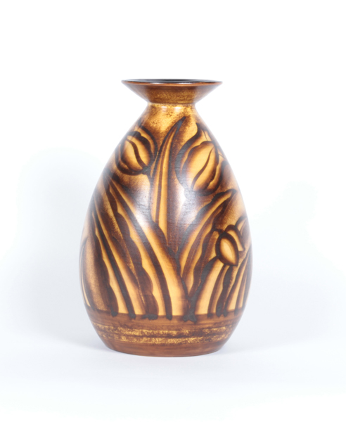
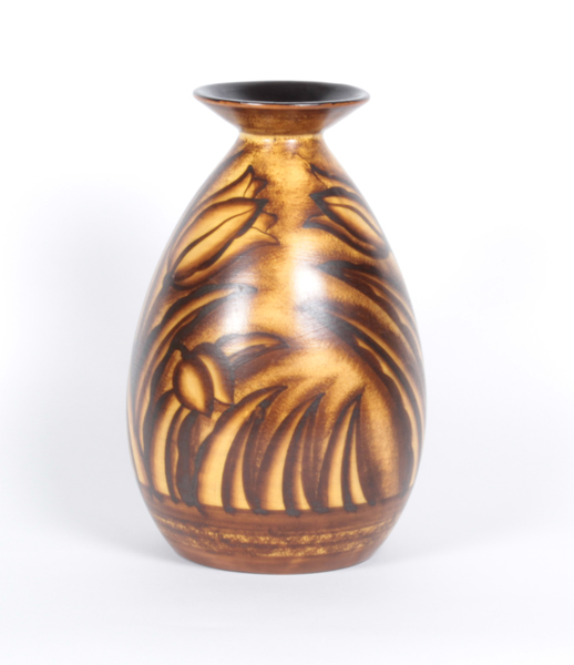
Charles Catteau / Boch Freres Keramis Belgium Glazed pottery vase c. 1930
More Information
Charles Catteau / Boch Freres Keramis Belgium Glazed pottery vase c. 1930
CHARLES CATTEAU (1880-1966)
BOCH FRERES KERAMIS La Louviere Belgium
Tulip vase c. 1930
Glazed earthenware
Marks: “Keramis” Made in Belgium , D. 2524 B, 945
H: 10 1/4″ x D: 6 1/2″
Charles Catteau could be regarded as one of the most versatile ceramic artists of his generation, especially for the style of Art Deco. Catteau advanced the forms, techniques and decoration of modern ceramics, creating an exceptionally original, new and decorative genre.
Hired as a ceramic decorator in Ecole Nationale de Sèvres from 1903 to 1904, he began producing designs that were rather traditional, based on the observation of nature, and showing the influence of Japonisme, characterized by pure lines and meticulous details. From 1904 to 1906, he worked in Nymphenburg Porzellan Manufaktur near Munich, a factory specializing in new hand painting procedures under a slip, as well as Art Nouveau.
In 1907 he finally moved to Louvière in Belgium where he was promoted to head of the decoration department at Boch Freres Keramis at the age of 27. This is where most of his exceptional talent came to the fore especially during the period between the two World Wars. Influenced by the great creative art movements of the time (Africanism, Japonisme, Cubism, Abstraction) and his observation of nature gave him inspiration for his designs, with the integration of plants, stylized animals and geometric motifs. The international avant-garde movements were also an influence leading to his use of purely abstract, geometric designs and intense colors. Charles Catteau was incredibly resourceful and explored various harmonies of form, techniques, designs, colors, shades, topics, variants and influences. In this way Catteau became a representative par excellence of Art Deco designs, giving it his personal touch. He was instrumental in introducing technical innovations during the 20’s and 30’s to aid mass production of ceramic products and expand availability of affordable products. During difficult times in Europe, he created vivid, colorful, original and uplifting ceramic wares.
Charles Cotteau motto was “Art for All” and he also taught decorative painting at the School of Industrial in Louvière. In 1925 he obtained international recognition in the exhibition of Decorative Arts in Paris. which helped raise the profile of Boch Freres. He remained at the company until he retired to Nice in 1946 .
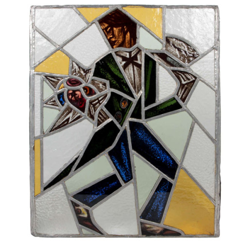
Reinhold Klaus / Carl Geyling Atelier Vienna “Cubist Man with top hat and flowers” stained glass window c. 1930
REINHOLD KLAUS (1881-1963) Vienna, Austria
CARL GEYLING ATELIER (founded 1841) Vienna, Austria
Man with tophat and flowers c. 1930
Window of stained and hand-painted leaded glass
Provenance: Estate of Carl Geyling (1814-1880), Vienna
H: 17 3/4″ x W: 14 1/2″
Reinhold Klaus studied from 1898-1902 with Alfred Roller at the Kaiserlich-Königliche Kunstgewerbeschule in Vienna. In 1914 Klaus married into the Carl Geyling family and became extensively involved with with stained glass painting. As early as 1918 Klaus worked on a stained glass window for the Siegestempel am Bisamberg in Vienna. In 1934 he became a professor of stained glass painting at the Kunstgewerbeschule, as well as creative director of the C. Geylings Erben glass painting company. Reinhold Klaus, a member of the Künstlerhaus since 1924 received many prizes and honors. He worked on commissions for the St. Veits cathedral in Prague, the St. Stephan cathedral in Vienna and many others.
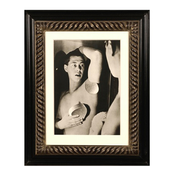
Herbert Bayer, Self Portrait, Gelatin silver print , 1932, printed later
HERBERT BAYER (1900-1985) Austria
Self portrait 1932 (printed later)
Silver gelatin print
Edition: 28/40
Signed: bayer 32 (in ink on bottom right corner)
Provenance: Kennedy Gallery, New York
H: 13 7/16” x W: 9 ½”
Framed size: H: 21 ½” x W: 17 ½”
Price: $16,000
Herbert Bayer (1900 – 1985) was an Austrian graphic designer, painter, photographer, and architect. Bayer apprenticed under the artist Georg Schmidthammer in Linz. Leaving the workshop to study at the Darmstadt Artists’ Colony, he became interested in Walter Gropius’s Bauhaus manifesto. After Bayer had studied for four years at the Bauhaus under such teachers as Wassily Kandinsky and László Moholy-Nagy, Gropius appointed Bayer director of printing and advertising. In the spirit of reductive minimalism, Bayer developed a crisp visual style and adopted use of all-lowercase, sans serif typefaces for most Bauhaus publications. Bayer is one of several typographers of the period including Kurt Schwitters and Jan Tschichold who experimented with the creation of a simplified more phonetic-based alphabet. Bayer designed the 1925 geometric sans-serif typeface, universal, now issued in digital form as Architype Bayer that bears comparison with the stylistically related typeface Architype Schwitters.
In 1928, Bayer left the Bauhaus to become art director of Vogue magazine’s Berlin office. He remained in Germany far later than most other progressives. In 1936 he designed a brochure for the Deutschland Ausstellung, an exhibition for tourists in Berlin during the 1936 Olympic Games. In 1938 he left Germany and settled in New York City where he had a long and distinguished career in nearly every aspect of the graphic arts. In 1946 Bayer relocated again. Hired by industrialist and visionary Walter Paepcke, Bayer moved to Aspen, Colorado as Paepcke promoted skiing as a popular sport. Bayer’s architectural work in the town included co-designing the Aspen Institute and restoring the Wheeler Opera House, but his production of promotional posters identified skiing with wit, excitement, and glamour. Bayer would remain associated with Aspen until the mid-1970s. Bayer gave the Denver Art Museum a collection of around 8,000 of his works. In 1959, he designed his “fonetik alfabet”, a phonetic alphabet, for English. It was sans-serif and without capital letters. He had special symbols for the endings -ed, -ory, -ing, and -ion, as well as the digraphs “ch”, “sh”, and “ng”. An underline indicated the doubling of a consonant in traditional orthography.