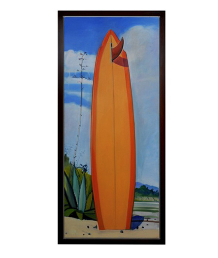
Hank Pitcher "Mr. Zogs board at Coal Oil Point" Oil on canvas, laid on board 2006
More Information
Hank Pitcher “Mr. Zogs board at Coal Oil Point” Oil on canvas, laid on board 2006
HANK PITCHER (b. 1949) U.S.A.
“Mr. Zogs board at Coal Oil Point” 2006
Oil on canvas, laid on board
Signed: Mr. Zogs board at Coal Oil Point (with chalk on back),
Hank pitcher 2006, Mr. Zogs Board at Coal Oil Point
For more information see: Hank Pitcher Surf, exhibit. cat. (Santa Barbara: Sullivan Goss Gallery, 2003); Surfboard Wax – A History, Jefferson “Zuma Jay” Wagner (Atglen, PA: Schiffer Publishing Ltd., 2005).
Canvas: H: 84” x W: 36”
Framed: H: 87” x W: 39”
Pitcher’s surfboard paintings are the symbol of California beach culture…strong, definite, positive and euphoric statements about life in California. The surfboard’s power as totem is seen in its power to convey identity: surfer, Californian, Hank Pitcher. All are identifiable from this symbolic representation. Hank Pitcher is the voice of California culture. At the beach, in the surf, approaching the foothills, in the mountains, on the spit of Point Conception, in the crags of Big Sur, at a beach campfire in Santa Barbara, Pitcher paints the icons of California’s culture.
Hank Pitcher’s paintings are grounded in a particular sense of place. He was born in Pasadena, California on July 20, 1949, but his family moved to Isla Vista, near Santa Barbara, when he was two years old. When they came to Isla Vista it was an outpost on the beach, and Goleta was a farm town where kids rode their horses down the avenue to buy candy at the store. He was a football star at San Marcos High School and was recruited by big-name universities. Instead of football, he chose to attend the College of Creative Studies, an alternative program within the University of California at Santa Barbara (UCSB) where he now teaches painting. He splits his time between painting and surfing, pursuing each with the commitment and energy of a linebacker.
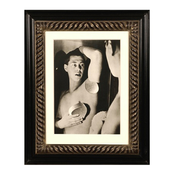
Herbert Bayer, Self Portrait, Gelatin silver print , 1932, printed later
HERBERT BAYER (1900-1985) Austria
Self portrait 1932 (printed later)
Silver gelatin print
Edition: 28/40
Signed: bayer 32 (in ink on bottom right corner)
Provenance: Kennedy Gallery, New York
H: 13 7/16” x W: 9 ½”
Framed size: H: 21 ½” x W: 17 ½”
Price: $16,000
Herbert Bayer (1900 – 1985) was an Austrian graphic designer, painter, photographer, and architect. Bayer apprenticed under the artist Georg Schmidthammer in Linz. Leaving the workshop to study at the Darmstadt Artists’ Colony, he became interested in Walter Gropius’s Bauhaus manifesto. After Bayer had studied for four years at the Bauhaus under such teachers as Wassily Kandinsky and László Moholy-Nagy, Gropius appointed Bayer director of printing and advertising. In the spirit of reductive minimalism, Bayer developed a crisp visual style and adopted use of all-lowercase, sans serif typefaces for most Bauhaus publications. Bayer is one of several typographers of the period including Kurt Schwitters and Jan Tschichold who experimented with the creation of a simplified more phonetic-based alphabet. Bayer designed the 1925 geometric sans-serif typeface, universal, now issued in digital form as Architype Bayer that bears comparison with the stylistically related typeface Architype Schwitters.
In 1928, Bayer left the Bauhaus to become art director of Vogue magazine’s Berlin office. He remained in Germany far later than most other progressives. In 1936 he designed a brochure for the Deutschland Ausstellung, an exhibition for tourists in Berlin during the 1936 Olympic Games. In 1938 he left Germany and settled in New York City where he had a long and distinguished career in nearly every aspect of the graphic arts. In 1946 Bayer relocated again. Hired by industrialist and visionary Walter Paepcke, Bayer moved to Aspen, Colorado as Paepcke promoted skiing as a popular sport. Bayer’s architectural work in the town included co-designing the Aspen Institute and restoring the Wheeler Opera House, but his production of promotional posters identified skiing with wit, excitement, and glamour. Bayer would remain associated with Aspen until the mid-1970s. Bayer gave the Denver Art Museum a collection of around 8,000 of his works. In 1959, he designed his “fonetik alfabet”, a phonetic alphabet, for English. It was sans-serif and without capital letters. He had special symbols for the endings -ed, -ory, -ing, and -ion, as well as the digraphs “ch”, “sh”, and “ng”. An underline indicated the doubling of a consonant in traditional orthography.
Art Deco “Fire Opal” necklace, frosted rock crystal round beads and four sided custom rock crystal bezels set in 18K yellow gold with 16 round–cut accent diamonds featuring five large natural fire opals (G.I.A certificate, dimension of each fire opal, 13.00 x 8.15 x 6.20mm for a TW of approx. 17.50 carats), c. 1940’s