Product Description
Max Ernst “Grande tête” pendant, cast and hand wrought 23K gold, made by Pierre Hugo, signed, original wood presentation box and certificate, No. 16 out of the edition of 24, c. 1970’s
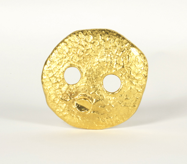


Max Ernst “Grande tête” pendant, cast and hand wrought 23K gold, made by Pierre Hugo, signed, original wood presentation box and certificate, No. 16 out of the edition of 24, c. 1970’s