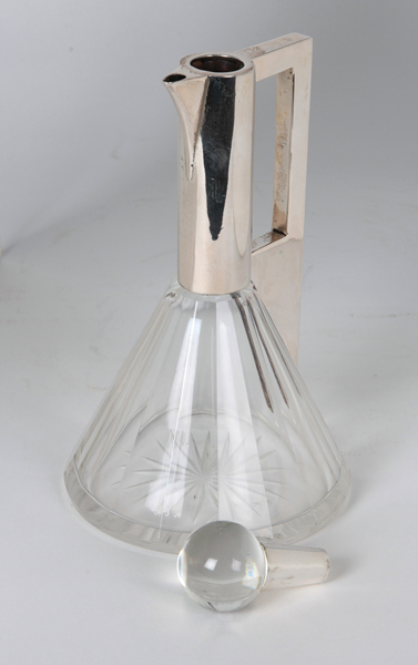
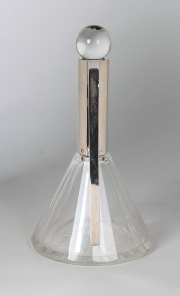
Frantisek Bibus Architectural Vienna Secession Decanter c. 1910
More Information
Frantisek Bibus Architectural Vienna Secession Decanter c. 1910
FRANTISEK BIBUS Czechoslovakia
Architectural covered decanter with spherical stopper c. 1910
Silver mount with a rectangular handle cut out on a cut paneled crystal body, round crystal silver mounted stopper.
Marks: FB (maker’s mark) in a rectangle cartouche, Vienna assay mark for 800 silver
For more information see: Blühender Jugendstil – Österreich (Art Nouveau in Blossom – Austria), Firmen und Marken (Companies and Marks), Waltraud Neuwirth, II (Vienna: Selbstverlag Neuwirth, 1991).
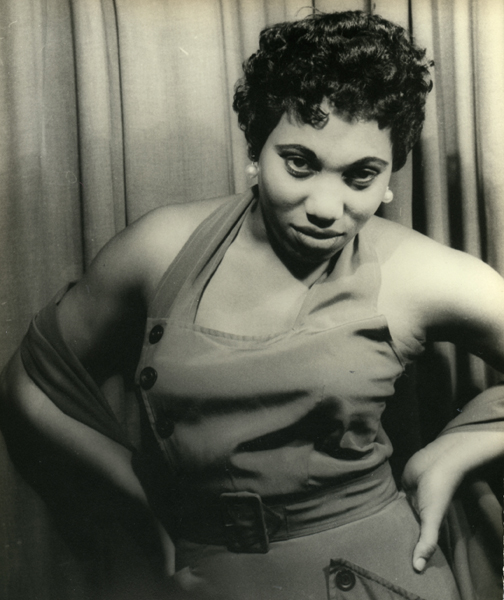
Signed: Leontyne Price as Bes, Porgy & Bess, XVII KK 20, May 19, 53 (in ink on back); PHOTOGRAPH BY CARL VAN VECHTEN, 101 CENTRAL PARK WEST, CANNOT BE REPRODUCED WITHOUT PERMISSION (ink stamp on back)
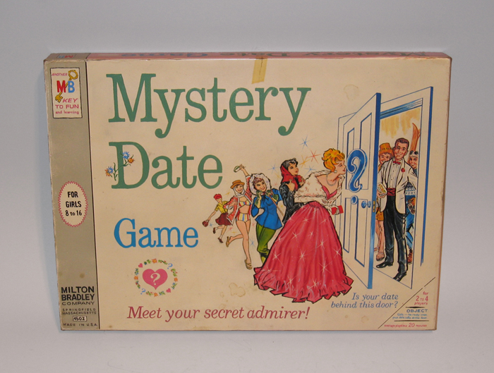
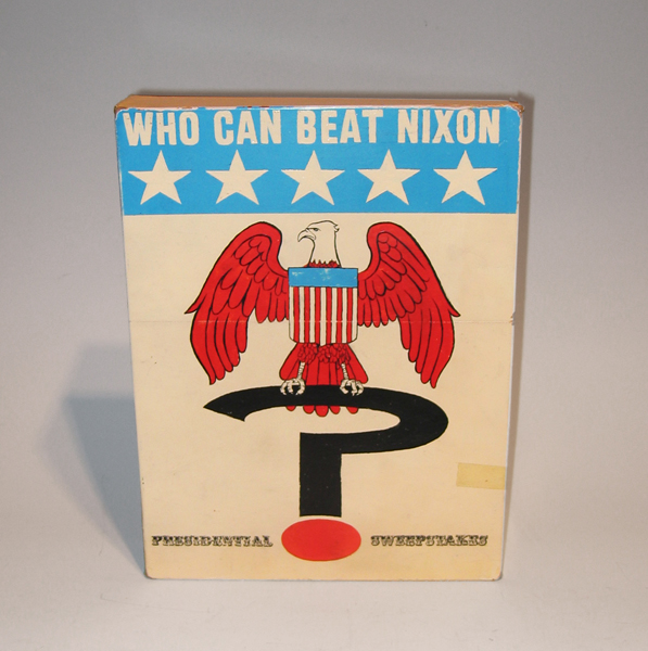
Tim Liddy Who Can Beat Nixon (1970) Presidential Sweepstakes 2006 Oil and enamel on copper, plywood back
TIM LIDDY
“Who Can Beat Nixon” (1970) Presidential Sweepstakes 2006
Oil and enamel on copper, plywood back
Signed in script: Tim Liddy “circa 1970” 2006, red circular ring
Provenance: William Shearburn Gallery (St. Louis, MO)
H: 11 ¾” x W: 9” x D: 2”
With his recent paintings, Liddy has both reasserted the construct of hyperrealist painting and developed a thoroughly unique advancement of that mode by extending the cultural reality of the indexed original. Based on the illustrated box lids of vintage board games, Liddy has recontextualized a subject, which evokes the underlying rules of life. Painted on copper or steel in the precise dimensions of the original, the metal is then manipulated to demonstrate the exact rips and tears from years of usage and includes trompe-l’oeil renditions of the scotch tape that might be holding the cardboard box together, the assorted stains, or the various graffiti of time. Liddy leaves no possibility of ambivalence, these works speak to a concurrent understanding of their original object identity and to themselves as works of art engaged in historical and psychological dialogue.