Product Description
French Retro “Bird” brooch set with a large oval gem quality “Rubellite”/ Tourmaline (approx. 9 carats TW, no heat), sapphires, diamonds and an emerald eye all set in 18K yellow gold, marked, c. 1940’s
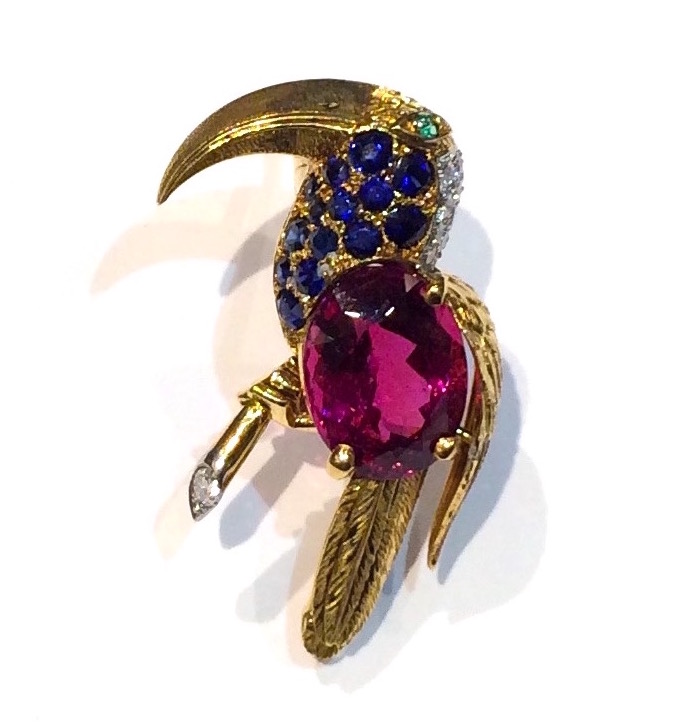


French Retro “Bird” brooch set with a large oval gem quality “Rubellite”/ Tourmaline (approx. 9 carats TW, no heat), sapphires, diamonds and an emerald eye all set in 18K yellow gold, marked, c. 1940’s