Jean E. Puiforcat / French Art Deco Sterling Box c.1930
More Information
Jean E. Puiforcat / French Art Deco Sterling Box c.1930
JEAN E. PUIFORCAT (1897-1945) France
ORFÈVRERIE PUIFORCAT Paris, France
Sterling silver with sterling and bone gear-like finial detail
Marks: JEAN E. PUIFORCAT, French Guarantee mark for 950/1000 pure silver, E.P. insignia (Emile Puiforcat)
For related works of Puiforcat see: Jean Puiforcat, Françoise de Bonneville (Paris: Editions du Regard, 1986) p.171; Jean Puiforcat: Orfèvre Sculpteur (Paris: Flammarion,1951).
H: 3 1/4″ x Dia: 3 1/2″
Jean E. Puiforcat is the most famous name of Art Deco silverwork. This is a gently tapered round footed and covered box of beautiful form and proportion with a contoured gear-like bone and silver finial. Overall it is a signature example of French Art Deco silver and dates from the late 1920’s and bears the early mark of Jean E. Puiforcat spelled out in addition to all of the appropriate French silver standard touchmarks. It is a really perfect example of French Art Deco silver by the French master of them all, Puiforcat!
Hubert Schmalix “Mount Washington” Oil on Canvas 2005/2006
HUBERT SCHMALIX (1952-) Austria
Mount Washington 2005/06
Oil on canvas
Signed and dated on back: Schmalix 05 06
Provenance: Hubert Schmalix Vienna
For related works by Hubert Schmalix see: Hubert Schmalix, Lóránd Hegyi exhibition catalog (Museum moderner Kunst Stiftung Ludwig Wien) November 19, 1994 – January 1995.
H: 69” x W: 51”
Hubert Schmalix was born in Graz, Austria, on December 17, 1952 and studied at the Vienna Art Academy from 1971 to 1976. By 1979 Schmalix was showing work at the forward-looking exhibition ‘Europa 79 – Kunst der 80er Jahre’ in Stuttgart. In 1983 the London Tate Gallery invited Schmalix to present work at ‘New Art’, an important survey of contemporary art. Schmalix has become well-known world-wide as an exponent of ‘New Art’, working with a retrospective glance at both classical art history and modern art. Schmalix focuses on the world of things and the human figure. Although the expressive gesture was the dominant feature of his 1980s work, it yielded early in the 1990s to stringent tectonic composition. In 1984 Hubert Schmalix went to the Philippines and on to the US, moving to Los Angeles in 1987. In 1986-87 Schmalix taught at the Academy for the Decorative and Applied Arts in Vienna and from 1997 he has been a professor at the Vienna Art Academy. Schmalix is a visiting professor at the University of California Los Angeles (UCLA). In 1993 his work was featured at the Venice Biennale and in 1998 he was awarded the Fine Art Prize of the City of Vienna. Schmalix has done several large fresco cycles in Salzburg and his work has been shown extensively at numerous international solo and group shows and most recently at Art Basel 2006.
Aram Gesar has been published internationally and has exhibited his photographic work in New York, San Francisco, Zurich and Geneva since 1977. As a producer, art director and photographer, Gesar created advertising campaigns for major corporations in the U.S. and Europe focusing on the fields of travel, banking, financial services, aerospace and motion pictures. He also created and produced documentaries on travel, aviation and yachting for national cable networks and the home video markets and television commercials and corporate programs for various U.S. and European corporations.
Gesar is currently one of the leading international experts on travel and air transport, and the founder and CEO of The Pyramid Media Group, which includes several magazines, newsletters, web sites, books, eBooks and other publications integrating a spectrum of business, travel and aviation content.
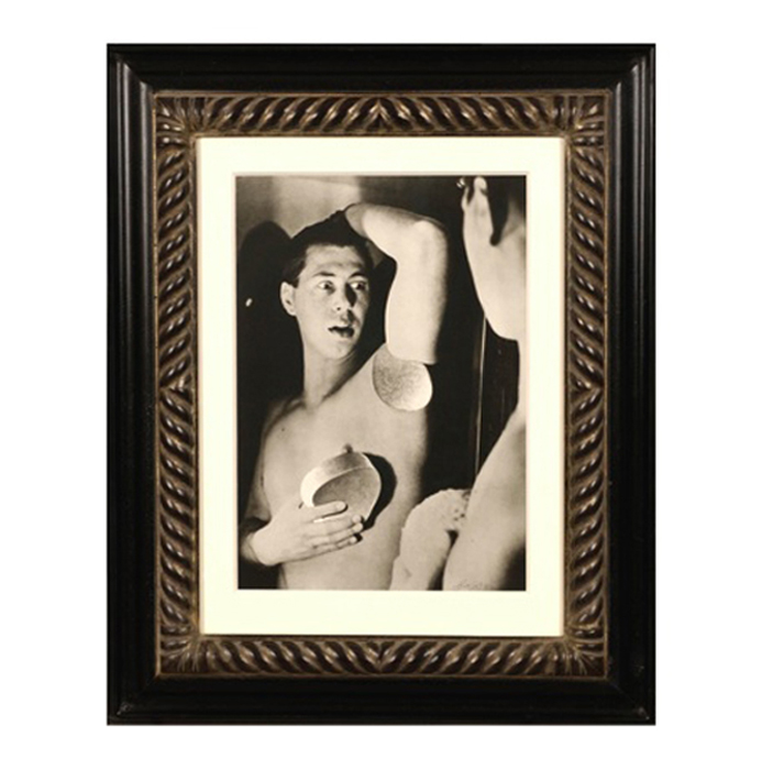
Herbert Bayer, Self Portrait, Gelatin silver print , 1932, printed later
HERBERT BAYER (1900-1985) Austria
Self portrait 1932 (printed later)
Silver gelatin print
Edition: 28/40
Signed: bayer 32 (in ink on bottom right corner)
Provenance: Kennedy Gallery, New York
H: 13 7/16” x W: 9 ½”
Framed size: H: 21 ½” x W: 17 ½”
Price: $16,000
Herbert Bayer (1900 – 1985) was an Austrian graphic designer, painter, photographer, and architect. Bayer apprenticed under the artist Georg Schmidthammer in Linz. Leaving the workshop to study at the Darmstadt Artists’ Colony, he became interested in Walter Gropius’s Bauhaus manifesto. After Bayer had studied for four years at the Bauhaus under such teachers as Wassily Kandinsky and László Moholy-Nagy, Gropius appointed Bayer director of printing and advertising. In the spirit of reductive minimalism, Bayer developed a crisp visual style and adopted use of all-lowercase, sans serif typefaces for most Bauhaus publications. Bayer is one of several typographers of the period including Kurt Schwitters and Jan Tschichold who experimented with the creation of a simplified more phonetic-based alphabet. Bayer designed the 1925 geometric sans-serif typeface, universal, now issued in digital form as Architype Bayer that bears comparison with the stylistically related typeface Architype Schwitters.
In 1928, Bayer left the Bauhaus to become art director of Vogue magazine’s Berlin office. He remained in Germany far later than most other progressives. In 1936 he designed a brochure for the Deutschland Ausstellung, an exhibition for tourists in Berlin during the 1936 Olympic Games. In 1938 he left Germany and settled in New York City where he had a long and distinguished career in nearly every aspect of the graphic arts. In 1946 Bayer relocated again. Hired by industrialist and visionary Walter Paepcke, Bayer moved to Aspen, Colorado as Paepcke promoted skiing as a popular sport. Bayer’s architectural work in the town included co-designing the Aspen Institute and restoring the Wheeler Opera House, but his production of promotional posters identified skiing with wit, excitement, and glamour. Bayer would remain associated with Aspen until the mid-1970s. Bayer gave the Denver Art Museum a collection of around 8,000 of his works. In 1959, he designed his “fonetik alfabet”, a phonetic alphabet, for English. It was sans-serif and without capital letters. He had special symbols for the endings -ed, -ory, -ing, and -ion, as well as the digraphs “ch”, “sh”, and “ng”. An underline indicated the doubling of a consonant in traditional orthography.