
Product Description
Marcello Fantoni Torched bronze and white plaster painted mirror 1950’s

MARCELLO FANTONI (1915-2011) Italy
Starburst mirror 1950’s
Torched bronze and original white plaster painted finish.
Marks: Fantoni, Firenze, Italy (hand script)
***This mirror has great style and character.
Overall dimension: H: 26″ x L: 33″ x D: 4″
Mirror dimension: H: 12″ x L: 17″
Price: $17,500
Born in Florence on October 1, 1915, Marcello Fantoni registered at the Institute of Art at Porta Romana in 1927 to attend the course The Art of Ceramics, which at that time was taught by the ceramist Carlo Guerrini, artistic director of the Cantagalli factory. Other teachers also contributed to his artistic formation including Libero Andreotti and Bruno Innocenti in sculpture and Gianni Vagnetti in the figure. He graduated in ’34 as a ‘maestro’ of art, and began working as a ceramist. In 1936, after having worked for a few months as the artistic director of a factory in Perugia, he established himself at Villa Fabbricotti in Florence and founded the Fantoni Ceramic studio. It’s production of serial and unique pieces had remarkable success at the Florentine Arts and Crafts Exhibit in ’37, revealing itself in line with the most recent tendencies, so much so that at the beginning of hostilities his production had already received notable artistic and commercial attention in Italy and abroad. After the war years, when Fantoni was involved in the resistance, in ’46 he began the creative and productive fervor that will allow him to enlarge his company, reaching at the beginning of the next decade the impressive size of over fifty collaborators. Among his employees were many students who, in ceramics and other fields, would become excellent artisans and even famous artists. In the following decades, especially between 1950 and the 70’s, the success of his work continued to increase, his unique pieces of sculpture and sculptural work, characterized by a design in step with the contemporary artistic currents, like archaic stylization inspired by Etruscan models, rendered modern because of their modern handling of materials, glazes and colors. For this original spirit of modernity, his works are in many private collections and in some of the most important museums of the world: in the United States his works can be seen at the Metropolitan Museum of Art of New York, the Brooklyn Museum, the Museum of Fine Art of Boston, the Currier Gallery, the Syracuse Museum. In Britain they are in the Victoria and Albert Museum of London, the City Art Gallery of Manchester, at Royal Scottish Museum of Edinburg. In Japan they are present at the Museum of Modern Art of Tokyo and Kyoto. In Italy they are represented at the International Museum of Ceramics in Faenza, the National Bargello Museum and at the Gabinetto Disegni e Stampe of the Uffizi. In his long and versatile career, Fantoni has completed works for churches, public and private buildings, schools, cinemas, theaters and ships cementing himself in both figurative and abstract ceramics and various metals, and qualifying himself also in the field of medalism. In 1970 he founded the International School of Ceramic Arts at his laboratory in via Bolognese in Florence. Fantoni died at the age of 95 in 2011.
Marcello Fantoni Torched bronze and white plaster painted mirror 1950’s

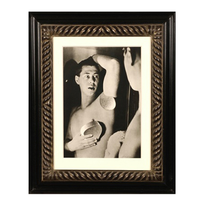
HERBERT BAYER (1900-1985) Austria
Self portrait 1932 (printed later)
Silver gelatin print
Edition: 28/40
Signed: bayer 32 (in ink on bottom right corner)
Provenance: Kennedy Gallery, New York
H: 13 7/16” x W: 9 ½”
Framed size: H: 21 ½” x W: 17 ½”
Price: $16,000
Herbert Bayer (1900 – 1985) was an Austrian graphic designer, painter, photographer, and architect. Bayer apprenticed under the artist Georg Schmidthammer in Linz. Leaving the workshop to study at the Darmstadt Artists’ Colony, he became interested in Walter Gropius’s Bauhaus manifesto. After Bayer had studied for four years at the Bauhaus under such teachers as Wassily Kandinsky and László Moholy-Nagy, Gropius appointed Bayer director of printing and advertising. In the spirit of reductive minimalism, Bayer developed a crisp visual style and adopted use of all-lowercase, sans serif typefaces for most Bauhaus publications. Bayer is one of several typographers of the period including Kurt Schwitters and Jan Tschichold who experimented with the creation of a simplified more phonetic-based alphabet. Bayer designed the 1925 geometric sans-serif typeface, universal, now issued in digital form as Architype Bayer that bears comparison with the stylistically related typeface Architype Schwitters.
In 1928, Bayer left the Bauhaus to become art director of Vogue magazine’s Berlin office. He remained in Germany far later than most other progressives. In 1936 he designed a brochure for the Deutschland Ausstellung, an exhibition for tourists in Berlin during the 1936 Olympic Games. In 1938 he left Germany and settled in New York City where he had a long and distinguished career in nearly every aspect of the graphic arts. In 1946 Bayer relocated again. Hired by industrialist and visionary Walter Paepcke, Bayer moved to Aspen, Colorado as Paepcke promoted skiing as a popular sport. Bayer’s architectural work in the town included co-designing the Aspen Institute and restoring the Wheeler Opera House, but his production of promotional posters identified skiing with wit, excitement, and glamour. Bayer would remain associated with Aspen until the mid-1970s. Bayer gave the Denver Art Museum a collection of around 8,000 of his works. In 1959, he designed his “fonetik alfabet”, a phonetic alphabet, for English. It was sans-serif and without capital letters. He had special symbols for the endings -ed, -ory, -ing, and -ion, as well as the digraphs “ch”, “sh”, and “ng”. An underline indicated the doubling of a consonant in traditional orthography.
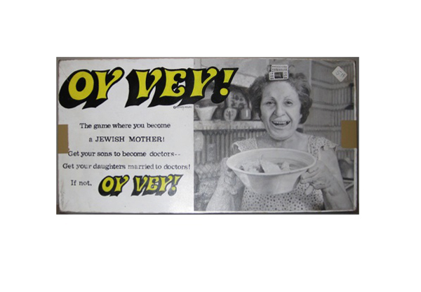
TIM LIDDY
“Oy Vey” (1979) The game where you become a JEWISH MOTHER! Get your sons to become doctors—Get your daughters married to doctors! If not, OY VEY! 2008
Oil and enamel on copper, plywood back
Signed in script: Tim Liddy, red circular ring, “circa 1979”, 2008
Provenance: William Shearburn Gallery, St. Louis, MO
H: 10 ¼” x W: 20 ½” x D: 1 ¾”
With his recent paintings, Liddy has both reasserted the construct of hyperrealist painting and developed a thoroughly unique advancement of that mode by extending the cultural reality of the indexed original. Based on the illustrated box lids of vintage board games, Liddy has recontextualized a subject, which evokes the underlying rules of life. Painted on copper or steel in the precise dimensions of the original, the metal is then manipulated to demonstrate the exact rips and tears from years of usage and includes trompe-l’oeil renditions of the scotch tape that might be holding the cardboard box together, the assorted stains, or the various graffiti of time. Liddy leaves no possibility of ambivalence, these works speak to a concurrent understanding of their original object identity and to themselves as works of art engaged in historical and psychological dialogue.
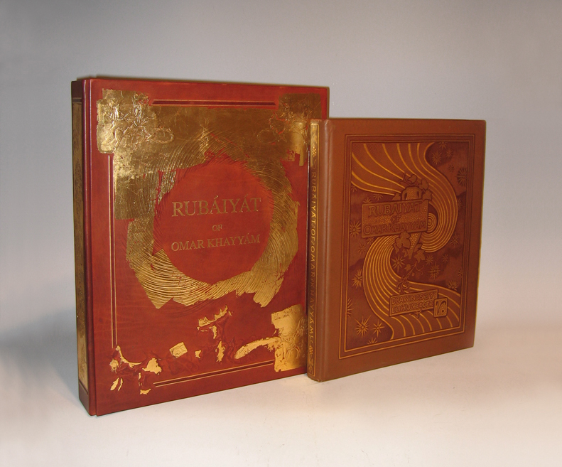
OMAR KHAYYÁM (1048 – 1123) Persia
“Rubáiyát” 1884
128pp. First edition bound in brown flat-weave cloth over beveled boards; front cover with gilt lettering, dark brown-stamped ruled borders, symbolist design of vase, vine, swirl and stars, rear cover without decoration; spine with gilt lettering and dark brown-stamped ruled borders and ornaments; signed in gilt & dark brown-stamp on front cover. Collection of poems originally written in the Persian language, “Rubáiyát” (derived from the Arabic root word for 4) means “quatrains”: verses of four lines.
Translated by Edward Fitzgerald
54 drawings by Elihu Vedder reproduced by Albertype process on facing pages (printed one side only)
Published by Houghton Mifflin and Company, Boston
Dimensions:
Book: H: 16” x W: 13 ¼” x D: 1 ¾”
Custom leather box 2008: H: 17 15/16” x W: 14 3/4” x D: 2 7/8”
Custom silk slipcase: H: 19 1/8” x W: 15 ½” x D: 4”
From the moment of its publication, Elihu Vedder’s Rubáiyát of Omar Khayyám achieved unparalleled success. The first edition appeared in Boston on 8 November 1884; six days later, it was sold out. Critics rushed to acclaim it as a masterwork of American art, and Vedder (1836-1923) as the master American artist who set the standard for the artist-designed book in America and England.
Written ca. 1120 by Persian poet-philosopher Omar Khayyam (1048-1131), the Rubaiyat is a collection of quatrains, or poems of four lines, intended to prove the futility of mathematics, science, and religion in determining the meaning of life. First translated from Persian to English in 1859 by Edward Fitzgerald, editions of Khayyam’s Rubaiyat have since appeared in numerous forms and languages, thebest-loved, best-known, and most elaborate being the 1884 edition illustrated and designed by Elihu Vedder.
Vedder was one of the first artists of his generation to train in Paris where he developed his signature Academic style and focused on what would become his favored subject: the classically proportioned female nude. In the years 1883 and 1884, he created 54 compositions to accompany the 1884 edition of Khayyam’s Rubaiyat (published by Houghton, Mifflin) – drawings that serve as a harmonious frame for the text. Living in Rome at the time, Vedder also designed the book’s cloth-bound cover, lining papers and eccentric hand-drawn letters. With his Academic and yet “visionary” style, Vedder was the ideal artist to interpret the Rubaiyat; he reconciled the critics who called for accurate depiction of observed reality with those who argued for feeling and emotion over objective form.
Additionally, Vedder arranged the verses to express the three stages of existence explored in the Rubaiyat — happiness and youth; death and darkness; and rebirth — as well as to fit his own romantic interpretation of the verses. Vedder’s drawings for the book combine traditional Christian symbols, classical figures, and mystical imagery of his own invention to evoke the mood of Khayyam’s poems. A prevalent device is his “cosmic swirl,” which, according to Vedder, represented the “gradual concentration of elements that combined to form life; the sudden pause through the reverse of the movement which marks the instant of life; and then the gradual, ever-widening dispersion again of those elements into space.”
Vedder’s edition of Khayyam’s Rubaiyat was an instant success, selling out only six days after its debut in Boston on November 8, 1884. With the Rubaiyat, Vedder set the standard for artist-designed books in America and England. Critics rushed to acclaim it as a masterwork, and Vedder as a major American artist.
The Brandywine River Museum presents decorative drawings and paintings created by a master nineteenth-century American artist in Elihu Vedder and the Rubáiyát of Omar Khayyám, on view from March 15 to May 18, 2008. The exhibition features more than 50 drawings with hand-lettered poems created by Vedder for his illustrated version of Khayyám’s literary work. Exclusively at the Brandywine River Museum, the exhibition also features major paintings by Vedder related to the illustrations for the i>Rubáiyát.
Elihu Vedder’s Rubáiyát was published in Boston in 1884 and its sensuous, decorative drawings so captivated the public that the first edition of the book sold out in six days. Critics rushed to acclaim it as a masterwork of American art, and Vedder as the master American artist. Vedder’s designs for the book-its cover, lining paper, drawings, and hand-drawn letters-are all done in chalk, pastel, pencil, and ink. The drawings set the standard for an artist-designed book in America and England in the 1880s. They are part of the Smithsonian American Art Museum’s permanent collection and were last shown in 1996.
The Rubáiyát was written in 1120 by the Persian mathematician, astronomer, and poet Omar Khayyám (1048-1131). “Rubáiyát” is the plural form of quatrain, or a verse unit of four lines. Since the first English translation was published in 1859, hundreds of editions have been produced. The poem expounds on the transience of existence and the uselessness of science and religion to untangle the knotted meanings of life. Pre-Raphaelite and aesthetic-movement writers immediately embraced the poem as a touchstone of the spiritual and poetic in a time of strident materialism.
As an ardent admirer of the verses, Vedder’s interest in the book went beyond the aesthetic to the personal. The tragic deaths of his sons (in 1872 and 1875) and births of two more children (a daughter in 1873 and a son in 1875) were remarkably explained, it seemed to Vedder, by the poet’s message regarding death, undiscoverable fate, and the renewal of life. He included images of himself and his family in several of the drawings.
The exhibition also features paintings by Vedder, including some that pre-dated the Rubáiyát and provided the basis for illustrations in it. Following the success of the Rubáiyát , Vedder continued to explore its themes and imagery in a number of paintings that he exhibited and sold. Among these are The Cup of Death (1885/1911), The Pleiades (1885), The Fates Gathering in the Stars (1887), and The Cup of Love (1887). The paintings are on loan from museums and private collections.
Elihu Vedder has often been described as an artist of haunting and poetic imagination, who created works of strength, beauty, and fantasy. Born in New York City in 1836, Vedder began painting seriously after visiting Europe in 1856 to study in Paris and Florence. He briefly returned to New York and opened a studio, which failed due to the onset of the Civil War. It was during his years in New York that he produced some of his most imaginative works. He was elected to the National Academy of Design in 1865. Vedder returned to Europe in 1866 and settled in Rome, only occasionally returning to the United States to execute commissions for decorative works, murals, and mosaics. He died in Rome in 1923.