Product Description
Paul Flato, signed, Important “Elizabeth Arden” Trompe L’oeil black suede and red leather “Wrapped Package” Necessaire containing silver, gold and enamel envelopes, postmarked New York, Dec. 31st, 1938
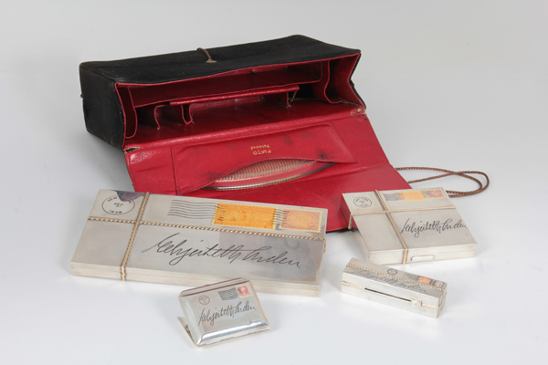


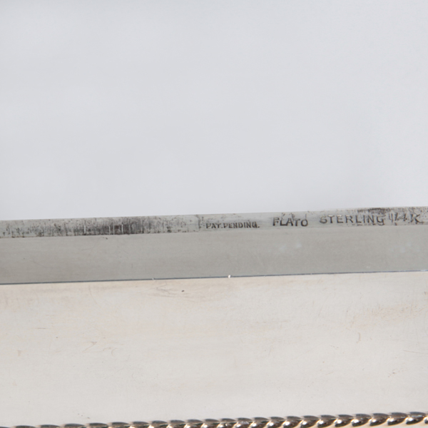


Paul Flato, signed, Important “Elizabeth Arden” Trompe L’oeil black suede and red leather “Wrapped Package” Necessaire containing silver, gold and enamel envelopes, postmarked New York, Dec. 31st, 1938