Robert Schellin American Studio Pottery Hand Thrown Floor Vase 1958
More Information
Robert Schellin American Studio Pottery Hand Thrown Floor Vase 1958
ROBERT SCHELLIN (1910 – 1985) USA
“Calligraphy” Floor Vase 1958
Hand thrown earthenware with a light and dark brown glaze with a stylized abstract calligraphic motif encircling the body
Marks: various marks and estate stamps Robert Schellin, Made in 1958, P88, C118 (paper labels)
For more information see: Schellin, A Retrospective (Milwaukee: School of Fine Arts, The University of Wisconsin, 1975); Who Was Who in American Art, (Madison, Conn.: Sound View Press, 1985), p. 547.
H: 23 1/2″ x Dia: 7″
Price: $9,000
Robert Schellin’s life as an artist was consistent, productive, and based on firm philosophical foundations. Regarding his own progress, he had always been aware, as a young art student and later as a mature artist, that deliberately narrowing the focus of his interests to assure a more constant public notice would run the risk of his becoming highly expert, but sterile in expression. From the beginning of art student days Schellin moved from very satisfying periods of drawing and painting to work in three-dimensional
Media, frequently in the medium of ceramics.
Schellin left the W.P.A. in 1937 to teach at the University of Wisconsin in Milwaukee. After a year he moved to East Orange, New Jersey, supervising art in the public schools. It was during this stay in the New York metropolitan area that he studied with Hans Hoffmann at his Eighth Street School and witnessed at first hand the changing art scene and the growing commercialism of the artists market. Robert Schellin later returned back to Milwaukee rejoining the faculty of the University of Wisconsin (UWM). His works have been exhibited for many years in Wisconsin and national shows including the Wisconsin State Fair; the Art Institute of Chicago, 1944; the Walker Art Center, Minneapolis, 1946; and the Milwaukee Art Institute numerous times between 1939-1960. He was included in the USIA European Traveling exhibition 1959-61.
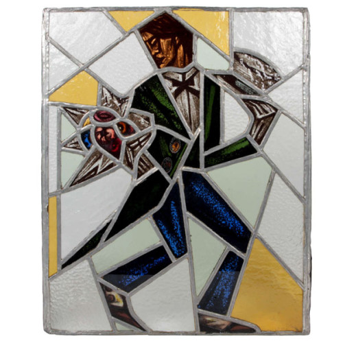
Reinhold Klaus / Carl Geyling Atelier Vienna “Cubist Man with top hat and flowers” stained glass window c. 1930
REINHOLD KLAUS (1881-1963) Vienna, Austria
CARL GEYLING ATELIER (founded 1841) Vienna, Austria
Man with tophat and flowers c. 1930
Window of stained and hand-painted leaded glass
Provenance: Estate of Carl Geyling (1814-1880), Vienna
H: 17 3/4″ x W: 14 1/2″
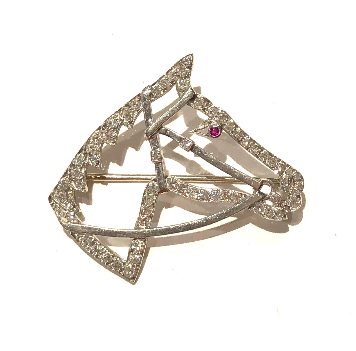
Reinhold Klaus studied from 1898-1902 with Alfred Roller at the Kaiserlich-Königliche Kunstgewerbeschule in Vienna. In 1914 Klaus married into the Carl Geyling family and became extensively involved with with stained glass painting. As early as 1918 Klaus worked on a stained glass window for the Siegestempel am Bisamberg in Vienna. In 1934 he became a professor of stained glass painting at the Kunstgewerbeschule, as well as creative director of the C. Geylings Erben glass painting company. Reinhold Klaus, a member of the Künstlerhaus since 1924 received many prizes and honors. He worked on commissions for the St. Veits cathedral in Prague, the St. Stephan cathedral in Vienna and many others.
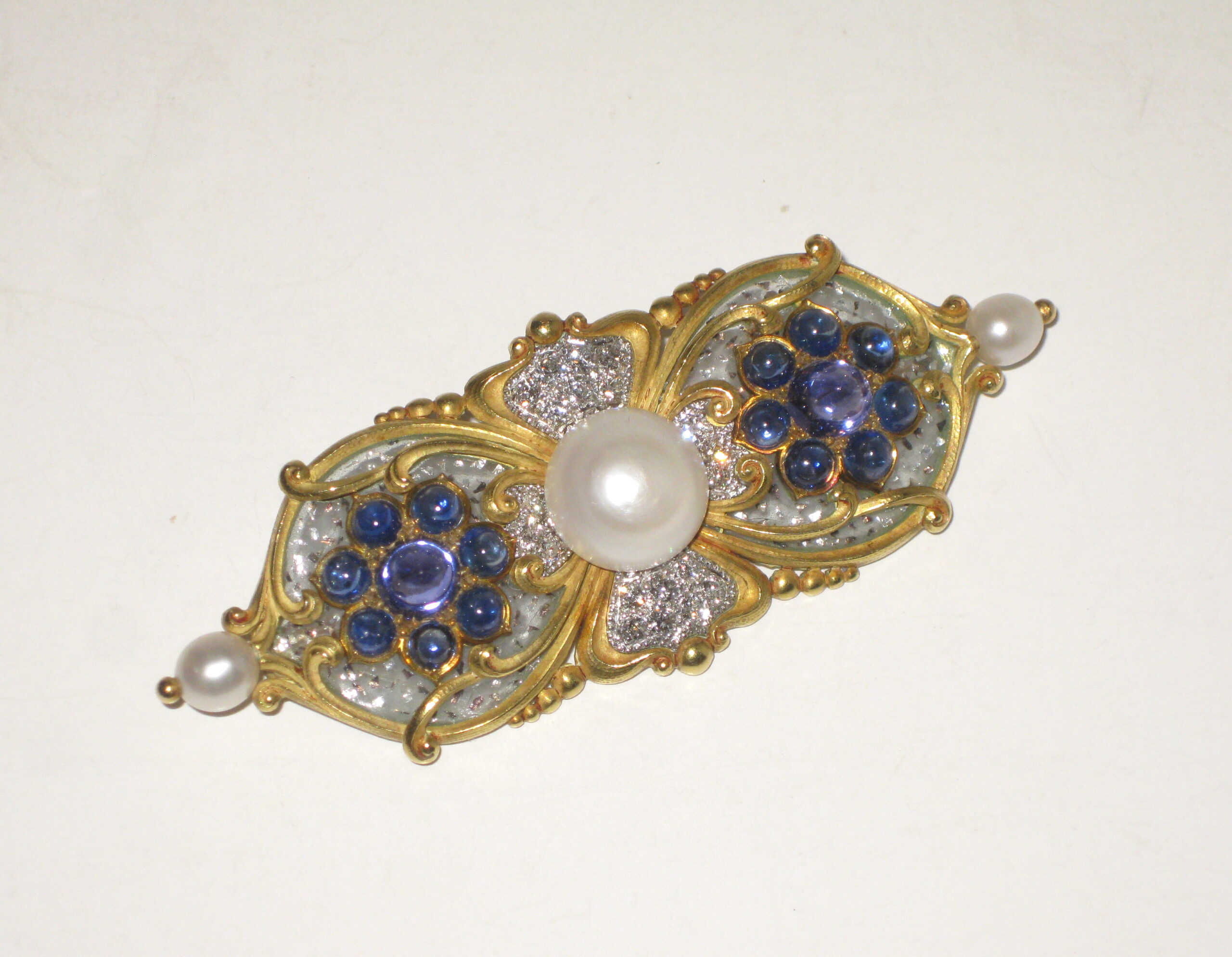
Marcus & Co. Art Nouveau brooch, “Tibula” shaped 18k yellow gold brooch set with three natural pearls, the natural center button pearl approx. 10 mm in diameter (G.I.A. certificate, 3 natural freshwater pearls, weight 24.90 grams, measurement range from 5.46 to 12.26mm), 16 sugarloaf cabochon sapphires, the two large and high dome middle sapphires with a purple hue, 20 pave set round diamonds all surrounded with clear plique-a-jour further trapped with platinum flakes, signed c. 1897