Robert Schellin American Studio Pottery Hand Thrown Floor Vase 1958
More Information
Robert Schellin American Studio Pottery Hand Thrown Floor Vase 1958
ROBERT SCHELLIN (1910 – 1985) USA
“Calligraphy” Floor Vase 1958
Hand thrown earthenware with a light and dark brown glaze with a stylized abstract calligraphic motif encircling the body
Marks: various marks and estate stamps Robert Schellin, Made in 1958, P88, C118 (paper labels)
For more information see: Schellin, A Retrospective (Milwaukee: School of Fine Arts, The University of Wisconsin, 1975); Who Was Who in American Art, (Madison, Conn.: Sound View Press, 1985), p. 547.
H: 23 1/2″ x Dia: 7″
Price: $9,000
Robert Schellin’s life as an artist was consistent, productive, and based on firm philosophical foundations. Regarding his own progress, he had always been aware, as a young art student and later as a mature artist, that deliberately narrowing the focus of his interests to assure a more constant public notice would run the risk of his becoming highly expert, but sterile in expression. From the beginning of art student days Schellin moved from very satisfying periods of drawing and painting to work in three-dimensional
Media, frequently in the medium of ceramics.
Schellin left the W.P.A. in 1937 to teach at the University of Wisconsin in Milwaukee. After a year he moved to East Orange, New Jersey, supervising art in the public schools. It was during this stay in the New York metropolitan area that he studied with Hans Hoffmann at his Eighth Street School and witnessed at first hand the changing art scene and the growing commercialism of the artists market. Robert Schellin later returned back to Milwaukee rejoining the faculty of the University of Wisconsin (UWM). His works have been exhibited for many years in Wisconsin and national shows including the Wisconsin State Fair; the Art Institute of Chicago, 1944; the Walker Art Center, Minneapolis, 1946; and the Milwaukee Art Institute numerous times between 1939-1960. He was included in the USIA European Traveling exhibition 1959-61.
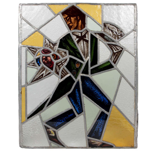
Reinhold Klaus / Carl Geyling Atelier Vienna “Cubist Man with top hat and flowers” stained glass window c. 1930
REINHOLD KLAUS (1881-1963) Vienna, Austria
CARL GEYLING ATELIER (founded 1841) Vienna, Austria
Man with tophat and flowers c. 1930
Window of stained and hand-painted leaded glass
Provenance: Estate of Carl Geyling (1814-1880), Vienna
H: 17 3/4″ x W: 14 1/2″
Reinhold Klaus studied from 1898-1902 with Alfred Roller at the Kaiserlich-Königliche Kunstgewerbeschule in Vienna. In 1914 Klaus married into the Carl Geyling family and became extensively involved with with stained glass painting. As early as 1918 Klaus worked on a stained glass window for the Siegestempel am Bisamberg in Vienna. In 1934 he became a professor of stained glass painting at the Kunstgewerbeschule, as well as creative director of the C. Geylings Erben glass painting company. Reinhold Klaus, a member of the Künstlerhaus since 1924 received many prizes and honors. He worked on commissions for the St. Veits cathedral in Prague, the St. Stephan cathedral in Vienna and many others.
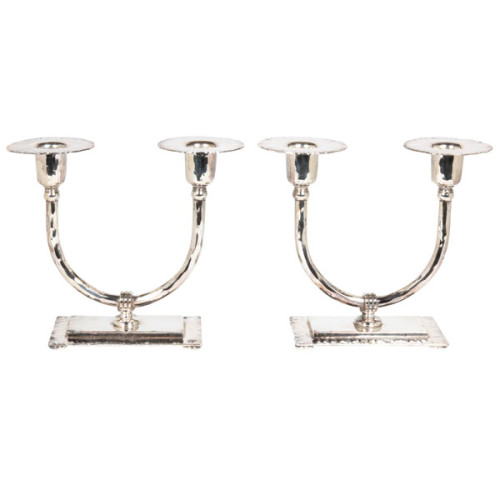
Roycroft / American Arts & Crafts Pair of Candlesticks c. 1915
ROYCROFT COPPER SHOP East Aurora, N.Y.
Pair of candlesticks c. 1915.
Hand wrought and textured copper, silver-plated.
Marks: impressed R, in orb with cross, ROYCROFT
For more information see: The American Arts & Crafts Movement in Western New York 1900-1928, Bruce A. Austin (Rochester Institute of Technology, 1992); Arts & Crafts Movement in New York State 1890’s – 1920’s, Coy Ludwig (Hamilton, N.Y.: Gallery Association of New York, 1983).
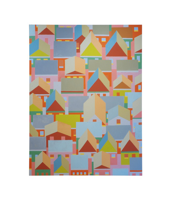
Hubert Schmalix “Mount Washington” Oil on Canvas 2005/2006
HUBERT SCHMALIX (1952-) Austria
Mount Washington 2005/06
Oil on canvas
Signed and dated on back: Schmalix 05 06
Provenance: Hubert Schmalix Vienna
For related works by Hubert Schmalix see: Hubert Schmalix, Lóránd Hegyi exhibition catalog (Museum moderner Kunst Stiftung Ludwig Wien) November 19, 1994 – January 1995.
H: 69” x W: 51”
Hubert Schmalix was born in Graz, Austria, on December 17, 1952 and studied at the Vienna Art Academy from 1971 to 1976. By 1979 Schmalix was showing work at the forward-looking exhibition ‘Europa 79 – Kunst der 80er Jahre’ in Stuttgart. In 1983 the London Tate Gallery invited Schmalix to present work at ‘New Art’, an important survey of contemporary art. Schmalix has become well-known world-wide as an exponent of ‘New Art’, working with a retrospective glance at both classical art history and modern art. Schmalix focuses on the world of things and the human figure. Although the expressive gesture was the dominant feature of his 1980s work, it yielded early in the 1990s to stringent tectonic composition. In 1984 Hubert Schmalix went to the Philippines and on to the US, moving to Los Angeles in 1987. In 1986-87 Schmalix taught at the Academy for the Decorative and Applied Arts in Vienna and from 1997 he has been a professor at the Vienna Art Academy. Schmalix is a visiting professor at the University of California Los Angeles (UCLA). In 1993 his work was featured at the Venice Biennale and in 1998 he was awarded the Fine Art Prize of the City of Vienna. Schmalix has done several large fresco cycles in Salzburg and his work has been shown extensively at numerous international solo and group shows and most recently at Art Basel 2006.
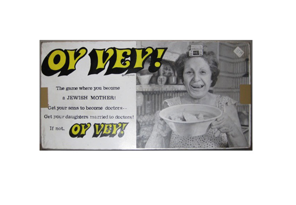
Tim Liddy Oy Vey (1979) The game where you become a JEWISH MOTHER! Get your sons to become doctors—Get your daughters married to doctors! If not, OY VEY! 2008 Oil and enamel on copper, plywood back
TIM LIDDY
“Oy Vey” (1979) The game where you become a JEWISH MOTHER! Get your sons to become doctors—Get your daughters married to doctors! If not, OY VEY! 2008
Oil and enamel on copper, plywood back
Signed in script: Tim Liddy, red circular ring, “circa 1979”, 2008
Provenance: William Shearburn Gallery, St. Louis, MO
H: 10 ¼” x W: 20 ½” x D: 1 ¾”
With his recent paintings, Liddy has both reasserted the construct of hyperrealist painting and developed a thoroughly unique advancement of that mode by extending the cultural reality of the indexed original. Based on the illustrated box lids of vintage board games, Liddy has recontextualized a subject, which evokes the underlying rules of life. Painted on copper or steel in the precise dimensions of the original, the metal is then manipulated to demonstrate the exact rips and tears from years of usage and includes trompe-l’oeil renditions of the scotch tape that might be holding the cardboard box together, the assorted stains, or the various graffiti of time. Liddy leaves no possibility of ambivalence, these works speak to a concurrent understanding of their original object identity and to themselves as works of art engaged in historical and psychological dialogue.