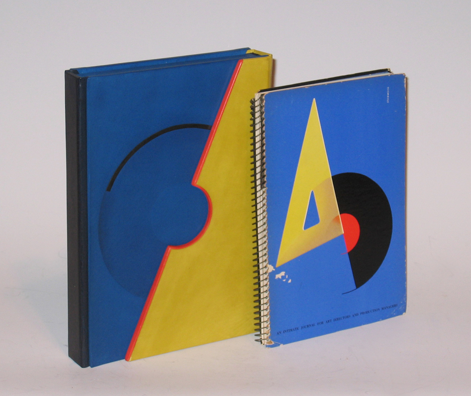
AD, “An Intimate Journal for Art Directors and Production Managers” 1941
More Information
AD, “An Intimate Journal for Art Directors and Production Managers” 1941
AD
“An Intimate Journal for Art Directors and Production Managers” 1941
Published by Steinweiss
Dimensions:
Book: H: 8 1/8” x W: 5 ¾”
Custom leather box: H: 9 1/16” x W: 6 9/16” x D: 1 7/16”
Custom silk slipcase: H: 12 9/16” x W: 9 3/16” x D: 2 ¾”
An Intimate Journal For Art Directors, production Managers, and their Associates
The Alex Steinweiss Issue
[Alex Steinweiss] Robert L. Leslie and Percy Seitlin [Editors]: A-D [AN INTIMATE JOURNAL FOR ART DIRECTORS, PRODUCTION MANAGERS, AND THEIR ASSOCIATES]. New York: The Composing Room/P.M. Publishing Co., June-July 1941 [Volume 7, No. 5]. Original edition. Spiral-bound paper-covered boards printed in 4-color letterpress. Screen-printed acetate frontis. Cover faintly creased. Interior contents unmarked and very clean. Letterpress cover designed by Alex Steinweiss. One of the hardest issues of PM/AD to find in collectible condition. A nearly fine copy.
This Steinweiss cover is widely recognized as a singular high point in American Graphic Design that has been reproduced in countless histories and anthologies.
5.5 x 8 digest with 68 [16] pages including numerous color and b/w reproductions. The artwork is reproduced in four-color letterpress, and magnificent b/w photo engraving. There is even a screen-printed acetate title page! Truly an increbible single issue of a trend-setting publication.
Contents for this issue:
• 16 page color profile of Alex Steinweiss, Art Director for Columbia Records (many examples of cutting edge streamline moderne graphics).
• Herbert Bayer’s Design Class: 13 b/w pages of student photomontages by William Taber, Gene Federico, E. G. Lukacs, Eleanor Mayer, Ernest Cabat, Jere Donovan, Fritz Brosius, Sol Benenson, David Weisman, Robert Pliskin, R. H. Blend, Eugene Zion, Edmund Marein.
• What is Taught and Why – A Footnote to the Recent Bayer Classwork Exhibit at the A-D Gallery.
• Designs in Glass by contemporary Artists from the Steuben Collection: 16 b/w pages including full-page reproductions of the art-glass work of Jean Cocteau, Salvador Dali, Raoul Dufy, Duncan Grant, Jean hugo, Peter Hurd, Fernand Leger, Aristide Maillol, Henri Matisse, Georgia oπKeefe and others.
• Peter Takal: 8 pages of b/w illustrations
• A-D Shorts mention Irving Pasternack , Herbert Roan, Bill Crawford, Leon Friend, Robert L. Leslie.
• Books Reviewed: Animal Drawing by John Skeaping; The Suicide Club by Robert Louis Stevenson
Nineteenth Annual of Advertising Art – 1940
• Trade advertising for Arrow Engraving Co., The Composing Room, Inc., Wilbar Photo Engraving Co. , Ludlow Typograph Co., Supreme Printing Service, Strathmore Paper Co., Reliance Reproduction Co., Flower Electrotypes, Pioneer Moss, Walker Rackliff, Fuchs and Lang Mfg. Co., Spiral, United Looseleaf Corp., Lumarith Protectoid.
In 1939, at the age of 23, Alex Steinweiss revolutionized the way records were packaged and marketed. As the first art director for the recently formed Columbia Records, Steinweiss saw a creative opportunity in the company’s packaging for its 78 rpm shellac records. The plain cardboard covers traditionally displayed only the title of the work and the artist. “They were so drab, so unattractive,” says Steinweiss, “I convinced the executives to let me design a few.” For what he saw as 12-inch by 12-inch canvasses inspired by French and German poster styles, he envisioned original works of art to project the beauty of the music inside. In 1947, for the first LP, Steinweiss invented a paperboard jacket, which has become the standard for the industry for nearly 50 years.
Alex Steinweiss was born in 1917 in Brooklyn, New York. His father loved music and instilled the passion in him. In 1930, Steinweiss entered Abraham Lincoln High School. His first artistic endeavors resulted in beautifully articulated marionettes. These brought him to the attention of the art department chair, Leon Friend, co-author of Graphic Design (1936), the first comprehensive American book on the subject.
Steinweiss’s first day in Friend’s class was a magical experience. “To see these young men painting letters with flat-tipped brushes was one of the great inspirations of my life,” he says, “I had to get involved with that!” He learned the principles of design and how to apply them through daily contact with the endless array of beautiful examples of poster design, typography, drawing, and calligraphy. Friend exposed Steinweiss to the works of the great graphic designers of the time, including Lucian Bernhard, A.M. Cassandre, and Joseph Binder.
Upon graduation from high school, the School Art League awarded Steinweiss a one-year scholarship to Parsons School of Design in New York. He almost left after the first year, convinced, in spite of the depression, that he would be able to get a job. Before quitting school, however, he wrote to illustrator Boris Artzybasheff, who, instead of offering employment, advised Steinweiss to finish school.
Steinweiss followed his advice. Afterward he presented himself, unannounced, to the New York studio of Lucian Bernhard, the German master of poster and type design. Bernhard’s son, Carl, answered the door with a rankled, “Don’t you know you’re supposed to call for an appointment?” But Steinweiss confidently handed him his portfolio and requested that the master peruse it. Carl glanced at the work, was impressed, and brought it to his father. A half an hour later, Bernhard came out of his office and informed Steinweiss that he had already phoned Joseph Binder, the Viennese poster maker who was looking for an assistant. Steinweiss worked for Binder for almost three years until he quit to form his own studio. Six months later he got a call from Robert L. Leslie, who recommended him as an art director to Columbia Records.
At Columbia, Steinweiss evolved a unique cover art style mingling musical and cultural symbols. His first cover, for a collection of Rodgers and Hart music, featured a theater marquee with the album’s title appearing in lights. He designed images for jazz recordings by Louis Armstrong and Earl Hines, and numerous classical, folk and pop recordings. Newsweek reported that sales of Brt/no Walter’s recording of Beethoven’s “Eroica” symphony “increased 895%” with its new Steinweiss cover.” His signature, the “Steinweiss scrawl,” became ubiquitous on album covers in the 1940s.
A-D magazine was the leading voice of the U. S. Graphic Arts Industry from its inception in 1934 (originally titled PM) to its end in 1942. As a publication produced by and for professionals, it spotlighted cutting-edge production technology, such as acetate inserts, 4-color letterpress printing, custom binding and the highest possible quality reproduction techniques (from engraving to plates). PM and A-D also championed the Modern movement by showcasing work from the vanguard of the European Avant-Garde well before this type of work was known to a wide audience.
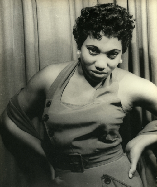
Signed: Leontyne Price as Bes, Porgy & Bess, XVII KK 20, May 19, 53 (in ink on back); PHOTOGRAPH BY CARL VAN VECHTEN, 101 CENTRAL PARK WEST, CANNOT BE REPRODUCED WITHOUT PERMISSION (ink stamp on back)
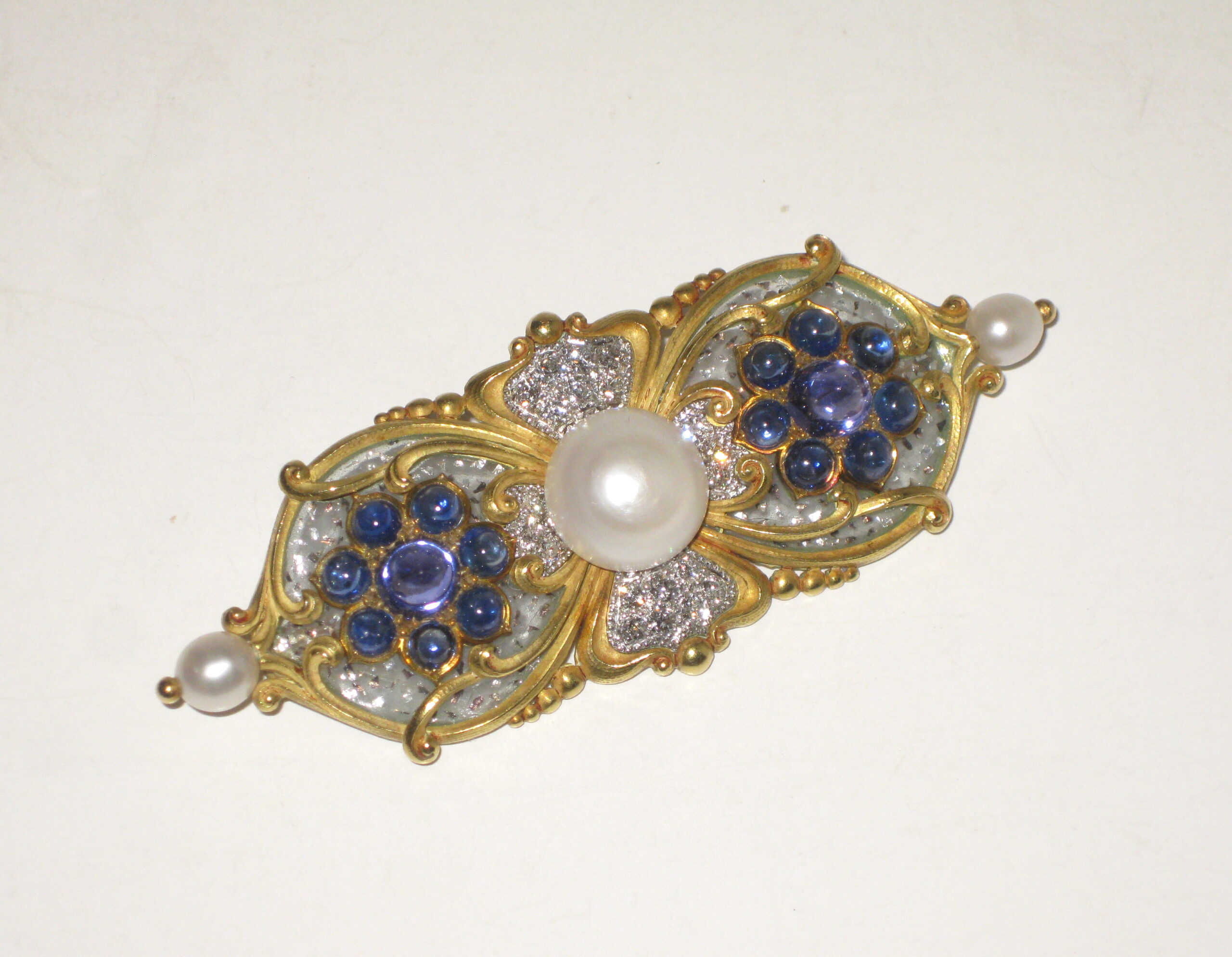
Marcus & Co. Art Nouveau brooch, “Tibula” shaped 18k yellow gold brooch set with three natural pearls, the natural center button pearl approx. 10 mm in diameter (G.I.A. certificate, 3 natural freshwater pearls, weight 24.90 grams, measurement range from 5.46 to 12.26mm), 16 sugarloaf cabochon sapphires, the two large and high dome middle sapphires with a purple hue, 20 pave set round diamonds all surrounded with clear plique-a-jour further trapped with platinum flakes, signed c. 1897
Aram Gesar has been published internationally and has exhibited his photographic work in New York, San Francisco, Zurich and Geneva since 1977. As a producer, art director and photographer, Gesar created advertising campaigns for major corporations in the U.S. and Europe focusing on the fields of travel, banking, financial services, aerospace and motion pictures. He also created and produced documentaries on travel, aviation and yachting for national cable networks and the home video markets and television commercials and corporate programs for various U.S. and European corporations.
Gesar is currently one of the leading international experts on travel and air transport, and the founder and CEO of The Pyramid Media Group, which includes several magazines, newsletters, web sites, books, eBooks and other publications integrating a spectrum of business, travel and aviation content.
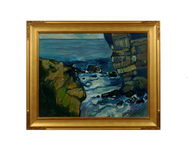
Peter Canty received his BA in art from the Chouniard Art Institute, Los Angeles (now California Institute of the Arts) and an MA from the University of California, Santa Cruz in 1969. Heavily influenced by the Post-Impressionist masters Van Gogh, Gauguin and Cezanne, in his own he words he describes his interest in landscapes, believing they are, “the best vehicle for motion, force, and color dynamics.” Although his work reference realistic subjects, Canty’s imagery is drawn strictly from his own imagination.