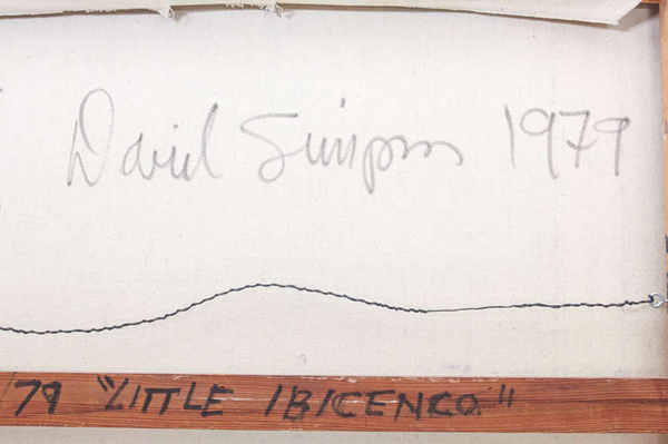
David Simpson "Little Ibicenco" - California Hard-Edge Abstract painting 1979
More Information
David Simpson “Little Ibicenco” – California Hard-Edge Abstract painting 1979
DAVID SIMPSON (1928-) California, US
“Little Ibicenco” – California Hard-Edge Abstract painting 1979
Acrylic on canvas
Marks: David Simpson (script signature) on back of canvas, 1979, #14/79 “Little Ibicenco”, two arrows
H: 29″ x W: 28 3/4″
David Simpson has explored varieties of abstraction since the early 1950s, enjoying acknowledgement and success in the art world. In 1963 he was chosen by New York’s Museum of Modern Art curator, Dorothy Miller, to appear in what turned out to be the last in her legendary series of group shows of contemporary American art. In 1964 he appeared in Clement Greenberg’s famous exhibition Post Painterly Abstraction at Los Angeles County Museum of Art. At that time Simpson painted landscape-derived abstractions and, in the 70s, he practiced a reductive but relational mode of abstraction. But with his discovery of a new acrylic medium in 1987, he was able to embrace finally and successfully the monochrome’s radicality.
Simpson uses an acrylic paint with interference properties. The paint is composed of titanium dioxide electronically coated with mica particles. Simpson tends to mix complementaries, but admits that orange and blue also work together well. He also mixes black acrylic with the interference pigments, finding that a little bit of black helps the colour jump out. Interference pigments cause optical effects that are comparable to iridescence. When you look at the painting from one angle, you receive one set of colour sensations. When you shift your position, you get another. As you move back and forth in front of the canvas – and the paintings make you want to do so – the experience changes. The change of light also dramatically affects the optical experience, and the play of light across the canvas surface is subtly kinetic.
***David Simpson was associated with the California Hard-Edge Movement.
Hard Edge Abstraction:
It encompasses rich solid colors, neatness of surface, and arranged forms all over the canvas. The Hard-edge painting style is related to Geometric abstraction, Post-painterly Abstraction, and Color Field painting. Hard edge is also a simply descriptive term, as applicable to past works as to future artistic production. The term refers to the abrupt transition across “hard edges” from one color area to another color area. Color within “color areas” is generally consistent, that is, homogenous. Hard-edged painting can be both figurative or nonrepresentational.
Important solo exhibitions include: Studio la Città, Verona (2008); Light Wells +, Charlotte Jackson Fine Art, Santa Fe (2007-08); Sonta Roesch Gallery, Houston (2007); Light Wells, Haines Gallery, San Francisco (2007); Iridescent Interference, Gallery Sonja Roesch, Houston (2005); Surrealist Landscape and other Departures, Haines Gallery, San Francisco (2005); Cheryl Haines Gallery, San Francisco (2004); James Kelly Contemporary, Santa Fe (2003); Artotek, Köln (2002); Renate Schröder Galerie, Köln (2002); Renate Schröder Galerie, Köln (2001); Studio la Città, Verona (2001); Modernism Gallery, San Francisco (2001); University Art Museum, San Francisco (2000); Renate Schröder Galerie, Köln (2000); Haines Gallery, San Francisco (2000).
Important group shows include: Galerie Lausberg, Dusseldorf (2007); West Coast Abstraction, Modernism Gallery, San Francisco (2007); Fundamental Abstraction, Haines Gallery, San Francisco (2007); The Panza Collection – An experience in light colour, Albright Knox Gallery, Buffalo, with catalogue (2007); Inneres Leuchten-Farbe als Malerei, Kunstverein Lingen Kunsthalle, Lingen (2005); Recent Paintings, Galleria G7, Bologna (2005); Je ne Regrette Rien, Studio la Città, Verona (2005); The Forman Collection, Albright Knox Gallery, Buffalo (2005); Modernism Gallery, San Francisco (2004); San Jose Museum of Art, San Jose, CA (2004); Albright Knox Art Gallery, N.Y. (2003); La percezione dello spazio , Palazzo della Gran Guardia, Verona (2002); Le stanze dell’arte , MART, Rovereto (curated by Gabriella Belli) (2002); Artisti americani ed europei dalla collezione Panza , Palazzo Ducale, Sassuolo (2001); Nebeneinander III (Painting Today – Overseas and Here ), Galerie Renate Schröder, Köln, with catalogue (2001); La collezione Panza di Biumo: artisti degli anni ’80 – ’90 , Museo del Palazzo Ducale, Gubbio, with catalogue (1997).
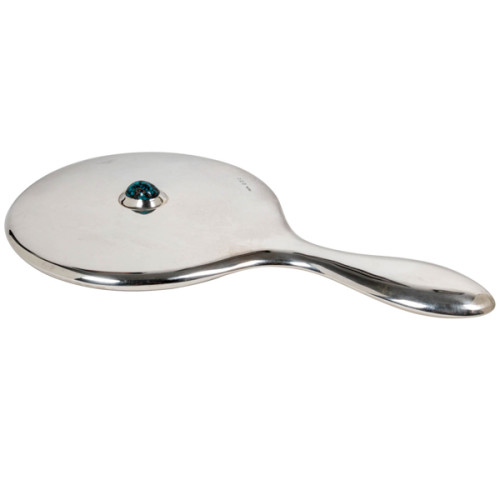
Archibald Knox / Liberty & Co. Sterling hand mirror 1908
ARCHIBALD KNOX (1864-1933) UK
LIBERTY & CO. London, UK
Hand mirror 1908
Sterling with large matrix cabochon turquoise
Marks: L & Co. cipher, Birmingham assay marks for 1908
Similar works with turquoise Illustrated: Archibald Knox, ed. by Stephen A. Martin (London: Academy Editions, 1995) ; Liberty Design 1874-1914, Barbara Morris (London: Pyramid Books, 1989) p. ; The Designs of Archibald Knox for Liberty & Co., A.J. Tilbrook (London: Ornament Press Ltd., 1976)
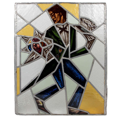
Reinhold Klaus / Carl Geyling Atelier Vienna “Cubist Man with top hat and flowers” stained glass window c. 1930
REINHOLD KLAUS (1881-1963) Vienna, Austria
CARL GEYLING ATELIER (founded 1841) Vienna, Austria
Man with tophat and flowers c. 1930
Window of stained and hand-painted leaded glass
Provenance: Estate of Carl Geyling (1814-1880), Vienna
H: 17 3/4″ x W: 14 1/2″
Reinhold Klaus studied from 1898-1902 with Alfred Roller at the Kaiserlich-Königliche Kunstgewerbeschule in Vienna. In 1914 Klaus married into the Carl Geyling family and became extensively involved with with stained glass painting. As early as 1918 Klaus worked on a stained glass window for the Siegestempel am Bisamberg in Vienna. In 1934 he became a professor of stained glass painting at the Kunstgewerbeschule, as well as creative director of the C. Geylings Erben glass painting company. Reinhold Klaus, a member of the Künstlerhaus since 1924 received many prizes and honors. He worked on commissions for the St. Veits cathedral in Prague, the St. Stephan cathedral in Vienna and many others.
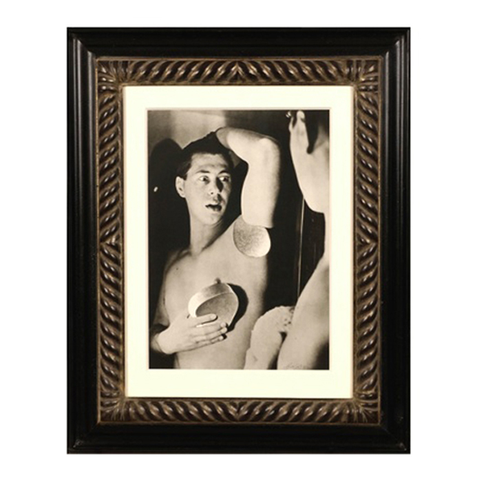
Herbert Bayer, Self Portrait, Gelatin silver print , 1932, printed later
HERBERT BAYER (1900-1985) Austria
Self portrait 1932 (printed later)
Silver gelatin print
Edition: 28/40
Signed: bayer 32 (in ink on bottom right corner)
Provenance: Kennedy Gallery, New York
H: 13 7/16” x W: 9 ½”
Framed size: H: 21 ½” x W: 17 ½”
Price: $16,000
Herbert Bayer (1900 – 1985) was an Austrian graphic designer, painter, photographer, and architect. Bayer apprenticed under the artist Georg Schmidthammer in Linz. Leaving the workshop to study at the Darmstadt Artists’ Colony, he became interested in Walter Gropius’s Bauhaus manifesto. After Bayer had studied for four years at the Bauhaus under such teachers as Wassily Kandinsky and László Moholy-Nagy, Gropius appointed Bayer director of printing and advertising. In the spirit of reductive minimalism, Bayer developed a crisp visual style and adopted use of all-lowercase, sans serif typefaces for most Bauhaus publications. Bayer is one of several typographers of the period including Kurt Schwitters and Jan Tschichold who experimented with the creation of a simplified more phonetic-based alphabet. Bayer designed the 1925 geometric sans-serif typeface, universal, now issued in digital form as Architype Bayer that bears comparison with the stylistically related typeface Architype Schwitters.
In 1928, Bayer left the Bauhaus to become art director of Vogue magazine’s Berlin office. He remained in Germany far later than most other progressives. In 1936 he designed a brochure for the Deutschland Ausstellung, an exhibition for tourists in Berlin during the 1936 Olympic Games. In 1938 he left Germany and settled in New York City where he had a long and distinguished career in nearly every aspect of the graphic arts. In 1946 Bayer relocated again. Hired by industrialist and visionary Walter Paepcke, Bayer moved to Aspen, Colorado as Paepcke promoted skiing as a popular sport. Bayer’s architectural work in the town included co-designing the Aspen Institute and restoring the Wheeler Opera House, but his production of promotional posters identified skiing with wit, excitement, and glamour. Bayer would remain associated with Aspen until the mid-1970s. Bayer gave the Denver Art Museum a collection of around 8,000 of his works. In 1959, he designed his “fonetik alfabet”, a phonetic alphabet, for English. It was sans-serif and without capital letters. He had special symbols for the endings -ed, -ory, -ing, and -ion, as well as the digraphs “ch”, “sh”, and “ng”. An underline indicated the doubling of a consonant in traditional orthography.
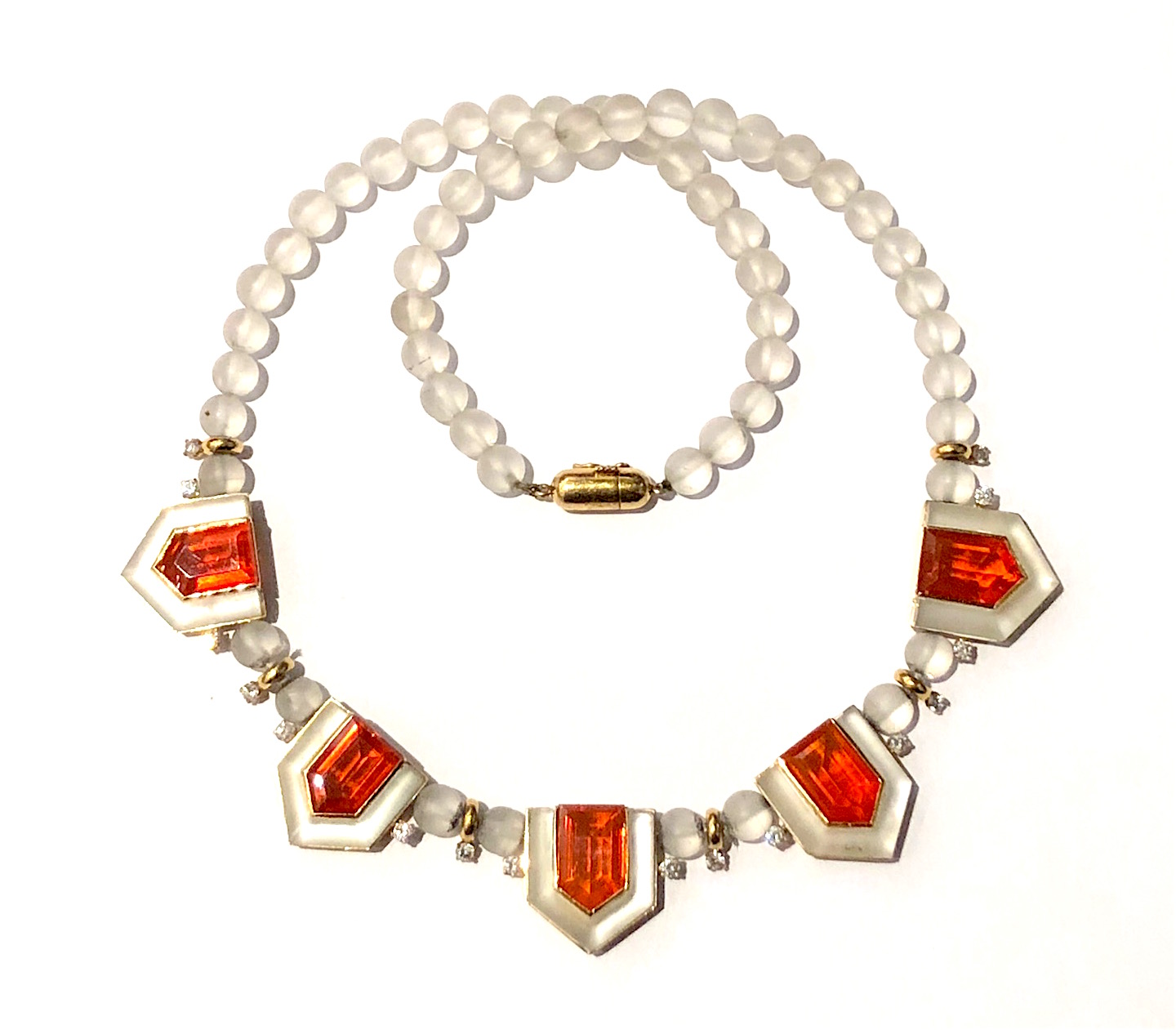
Art Deco “Fire Opal” necklace, frosted rock crystal round beads and four sided custom rock crystal bezels set in 18K yellow gold with 16 round–cut accent diamonds featuring five large natural fire opals (G.I.A certificate, dimension of each fire opal, 13.00 x 8.15 x 6.20mm for a TW of approx. 17.50 carats), c. 1940’s