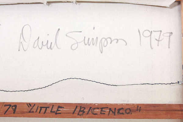
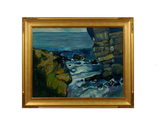
David Simpson "Little Ibicenco" - California Hard-Edge Abstract painting 1979
More Information
David Simpson “Little Ibicenco” – California Hard-Edge Abstract painting 1979
DAVID SIMPSON (1928-) California, US
“Little Ibicenco” – California Hard-Edge Abstract painting 1979
Acrylic on canvas
Marks: David Simpson (script signature) on back of canvas, 1979, #14/79 “Little Ibicenco”, two arrows
H: 29″ x W: 28 3/4″
David Simpson has explored varieties of abstraction since the early 1950s, enjoying acknowledgement and success in the art world. In 1963 he was chosen by New York’s Museum of Modern Art curator, Dorothy Miller, to appear in what turned out to be the last in her legendary series of group shows of contemporary American art. In 1964 he appeared in Clement Greenberg’s famous exhibition Post Painterly Abstraction at Los Angeles County Museum of Art. At that time Simpson painted landscape-derived abstractions and, in the 70s, he practiced a reductive but relational mode of abstraction. But with his discovery of a new acrylic medium in 1987, he was able to embrace finally and successfully the monochrome’s radicality.
Simpson uses an acrylic paint with interference properties. The paint is composed of titanium dioxide electronically coated with mica particles. Simpson tends to mix complementaries, but admits that orange and blue also work together well. He also mixes black acrylic with the interference pigments, finding that a little bit of black helps the colour jump out. Interference pigments cause optical effects that are comparable to iridescence. When you look at the painting from one angle, you receive one set of colour sensations. When you shift your position, you get another. As you move back and forth in front of the canvas – and the paintings make you want to do so – the experience changes. The change of light also dramatically affects the optical experience, and the play of light across the canvas surface is subtly kinetic.
***David Simpson was associated with the California Hard-Edge Movement.
Hard Edge Abstraction:
It encompasses rich solid colors, neatness of surface, and arranged forms all over the canvas. The Hard-edge painting style is related to Geometric abstraction, Post-painterly Abstraction, and Color Field painting. Hard edge is also a simply descriptive term, as applicable to past works as to future artistic production. The term refers to the abrupt transition across “hard edges” from one color area to another color area. Color within “color areas” is generally consistent, that is, homogenous. Hard-edged painting can be both figurative or nonrepresentational.
Important solo exhibitions include: Studio la Città, Verona (2008); Light Wells +, Charlotte Jackson Fine Art, Santa Fe (2007-08); Sonta Roesch Gallery, Houston (2007); Light Wells, Haines Gallery, San Francisco (2007); Iridescent Interference, Gallery Sonja Roesch, Houston (2005); Surrealist Landscape and other Departures, Haines Gallery, San Francisco (2005); Cheryl Haines Gallery, San Francisco (2004); James Kelly Contemporary, Santa Fe (2003); Artotek, Köln (2002); Renate Schröder Galerie, Köln (2002); Renate Schröder Galerie, Köln (2001); Studio la Città, Verona (2001); Modernism Gallery, San Francisco (2001); University Art Museum, San Francisco (2000); Renate Schröder Galerie, Köln (2000); Haines Gallery, San Francisco (2000).
Important group shows include: Galerie Lausberg, Dusseldorf (2007); West Coast Abstraction, Modernism Gallery, San Francisco (2007); Fundamental Abstraction, Haines Gallery, San Francisco (2007); The Panza Collection – An experience in light colour, Albright Knox Gallery, Buffalo, with catalogue (2007); Inneres Leuchten-Farbe als Malerei, Kunstverein Lingen Kunsthalle, Lingen (2005); Recent Paintings, Galleria G7, Bologna (2005); Je ne Regrette Rien, Studio la Città, Verona (2005); The Forman Collection, Albright Knox Gallery, Buffalo (2005); Modernism Gallery, San Francisco (2004); San Jose Museum of Art, San Jose, CA (2004); Albright Knox Art Gallery, N.Y. (2003); La percezione dello spazio , Palazzo della Gran Guardia, Verona (2002); Le stanze dell’arte , MART, Rovereto (curated by Gabriella Belli) (2002); Artisti americani ed europei dalla collezione Panza , Palazzo Ducale, Sassuolo (2001); Nebeneinander III (Painting Today – Overseas and Here ), Galerie Renate Schröder, Köln, with catalogue (2001); La collezione Panza di Biumo: artisti degli anni ’80 – ’90 , Museo del Palazzo Ducale, Gubbio, with catalogue (1997).
Peter Canty received his BA in art from the Chouniard Art Institute, Los Angeles (now California Institute of the Arts) and an MA from the University of California, Santa Cruz in 1969. Heavily influenced by the Post-Impressionist masters Van Gogh, Gauguin and Cezanne, in his own he words he describes his interest in landscapes, believing they are, “the best vehicle for motion, force, and color dynamics.” Although his work reference realistic subjects, Canty’s imagery is drawn strictly from his own imagination.
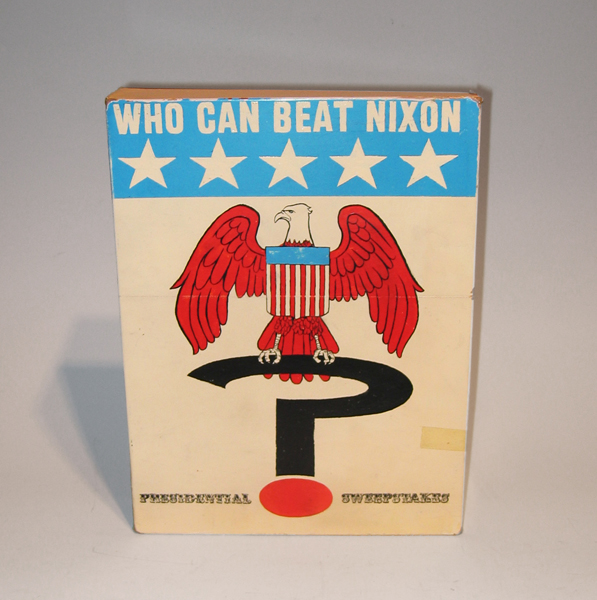
Tim Liddy Who Can Beat Nixon (1970) Presidential Sweepstakes 2006 Oil and enamel on copper, plywood back
TIM LIDDY
“Who Can Beat Nixon” (1970) Presidential Sweepstakes 2006
Oil and enamel on copper, plywood back
Signed in script: Tim Liddy “circa 1970” 2006, red circular ring
Provenance: William Shearburn Gallery (St. Louis, MO)
H: 11 ¾” x W: 9” x D: 2”
With his recent paintings, Liddy has both reasserted the construct of hyperrealist painting and developed a thoroughly unique advancement of that mode by extending the cultural reality of the indexed original. Based on the illustrated box lids of vintage board games, Liddy has recontextualized a subject, which evokes the underlying rules of life. Painted on copper or steel in the precise dimensions of the original, the metal is then manipulated to demonstrate the exact rips and tears from years of usage and includes trompe-l’oeil renditions of the scotch tape that might be holding the cardboard box together, the assorted stains, or the various graffiti of time. Liddy leaves no possibility of ambivalence, these works speak to a concurrent understanding of their original object identity and to themselves as works of art engaged in historical and psychological dialogue.
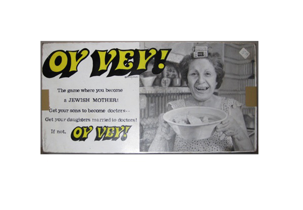
Tim Liddy Oy Vey (1979) The game where you become a JEWISH MOTHER! Get your sons to become doctors—Get your daughters married to doctors! If not, OY VEY! 2008 Oil and enamel on copper, plywood back
TIM LIDDY
“Oy Vey” (1979) The game where you become a JEWISH MOTHER! Get your sons to become doctors—Get your daughters married to doctors! If not, OY VEY! 2008
Oil and enamel on copper, plywood back
Signed in script: Tim Liddy, red circular ring, “circa 1979”, 2008
Provenance: William Shearburn Gallery, St. Louis, MO
H: 10 ¼” x W: 20 ½” x D: 1 ¾”
With his recent paintings, Liddy has both reasserted the construct of hyperrealist painting and developed a thoroughly unique advancement of that mode by extending the cultural reality of the indexed original. Based on the illustrated box lids of vintage board games, Liddy has recontextualized a subject, which evokes the underlying rules of life. Painted on copper or steel in the precise dimensions of the original, the metal is then manipulated to demonstrate the exact rips and tears from years of usage and includes trompe-l’oeil renditions of the scotch tape that might be holding the cardboard box together, the assorted stains, or the various graffiti of time. Liddy leaves no possibility of ambivalence, these works speak to a concurrent understanding of their original object identity and to themselves as works of art engaged in historical and psychological dialogue.