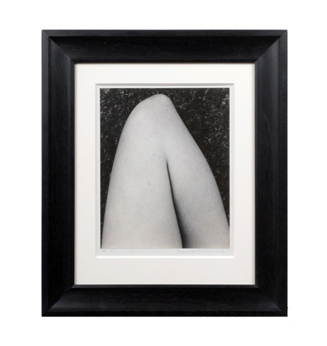
Signed: 12-40. Edward Weston 1935 (pencil below photo)
Framed H: 17” x W: 14 9/16”
Edward Henry Weston was an American photographer, and co-founder of Group f/64. Most of his work was done using an 8 by 10 inch view camera. Weston was renowned as one of the masters of 20th century photography. His legacy includes several thousand carefully composed, superbly printed photographs that have influenced photographers around the world for 60 years. Photographing natural landscapes and forms such as artichoke, shells, and rocks, using large-format cameras and available light. The subtle use of tones and the sculptural formal design of his works have become the standards by which much later photographic practice has been judged.
Ansel Adams has written: “Weston is, in the real sense, one of the few creative artists of today. He has recreated the matter-forms and forces of nature; he has made these forms eloquent of the fundamental unity of the world. His work illuminates man’s inner journey toward perfection of the spirit.”
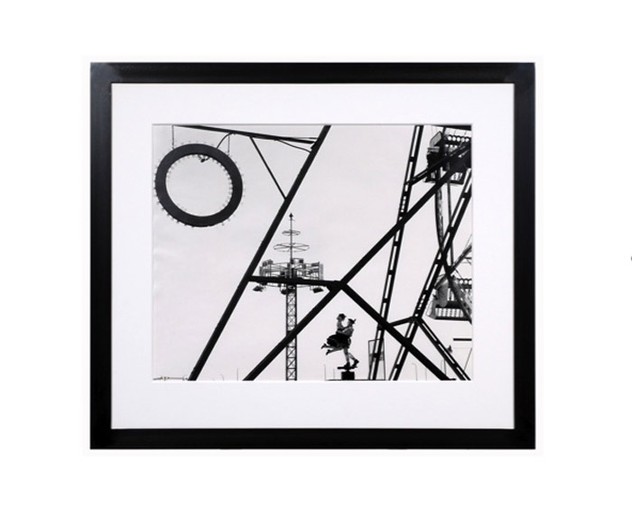
Grant Mudford, Long Beach, Gelatin Silver Print 1979
GRANT MUDFORD (1944- ) Australia
Long Beach 1979
Gelatin silver print
Signed: Long Beach 1979, LB-24/2 (in pencil on back); Grant Mudford 1980 (script in ink)
Framed size: H: 28 ¼” x W: 32 7/16”
Price: $29,000
“Since he moved to Los Angeles from Australia in the late 1970s, Grant Mudford has composed photographs that crisply examine the streamlined geometries of West Coast architecture and landscape. Mudford has zeroed in on the abstract formal relationships lurking within the designs of gas stations, strip malls and apartment buildings. The geometrical arrangements highlighted in his photographs of the masterful modernist structures of Rudolf Schindler and Craig Ellwood have disclosed a link between their midcentury architecture and the contemporaneous hard-edge abstractions of L.A. painters John McLaughlin and Lorser Feitelson.” – Art in America, “Grand Mudford at Rosamund Felsen, September 2003
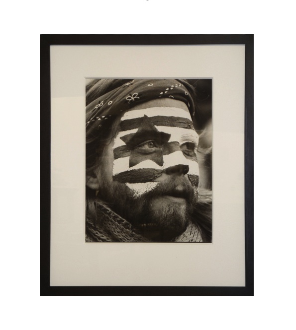
Barry L. Thumma, Face of America, Gelatin silver print 1980
BARRY L. THUMMA (1947-2003) USA
Face of America 1980
Gelatin silver print
Size: H: 13 3/8” x W: 11”
Size (with board): H: 14” x W: 11”
Size (framed): H: 21 ¼” x W: 17”
Price: $2,750
Barry L. Thumma, a former New Era photographer, covered four presidents as White House photographer for The Associated Press. In his 20-year career with the AP, he traveled on more than 100 Air Force One flights to photograph presidents Jimmy Carter, Ronald Reagan, George H.W. Bush and Bill Clinton. He also photographed Pope John Paul II, Jerry Falwell, Mikhail Gorbachev, Michael Deaver, Alan Greenspan and Donald Rumsfeld, among other personalities and politicians of his time. He was a member of the White House News Photographers Association. Thumma began his career in 1967 as a part-time photographer for the Lancaster New Era. He joined the Associated Press in 1973 in Cincinnati, where he covered the Reds and the Bengals. After two years as the Ohio photo editor, Thumma moved to Washington, D.C. to cover the White House. He also captured heartbreaking images of the famine in Ethiopia, NASA space flight operations and troop actions in the field.
Louviere & Vanessa, Chlorofemina, Neque (from “As if…”) 2005 Mixed media, pigment print, wax mixed with pigment, Edition: 2/5 (printed in 2008)
JEFF LOUVIERE (b.1971) USA
VANESSA S. BROWN (b.1970) USA
Chlorofemina, Neque (from “As if…”) 2005
Mixed media, pigment print, wax mixed with pigment
Edition: 2/5 (printed in 2008)
Signed: Louviere and Vanessa
Image H: 53” x W: 45”
Price: $35,000
“By collaborating, we put ourselves in the midst of alternating currents of decision and production, action and responsibility, decay and clarity-capturing the moment between ‘has been ‘ and ‘what will be.'”
Jeff Louviere has a background in graphic design and art direction, winning several national and international awards. Vanessa S. Brown was 12 when she made her first photographs, and was exhibiting at 17. Her work gained international acclaim even before she earned her BFA from Rochester Institute of Technology. Louviere received his MFA from Savannah College of Art and Design, and it was in Savannah, Georgia that Jeff and Vanessa met. Their first collaboration was a series of photo storyboards for a film they had written together. The two moved to New Orleans in 1998 and have been exhibiting nationally ever since.
Jeff Louviere and Vanessa Brown have been collaborating on photographic images and movies since they first met in the mid-90s. Under the moniker Louviere+Vanessa they have created moody, atmospheric visuals with various equipment, including scanners, 8mm film, destroyed negatives, wax and even blood, utilizing the Holga medium format camera, altering the negatives and creating assemblages