Lawrence Hunter Hand Wrought Brass and Walnut Punch Set c.1965
More Information
Lawrence Hunter Hand Wrought Brass and Walnut Punch Set c.1965
LAWRENCE HUNTER, San Diego, California
Punch Bowl set c.1965
Hand hammered and hand wrought large asymmetric punch bowl with matching ladle, turned walnut pedestal platter and twenty four hand wrought brass and walnut pedestal shape goblets
Marks: HUNTER spelled out within a large outline of an H (name logo and monogram mark on all pieces)
Punchbowl H: 13 ½” x Dia: 16”
Cups: H: 5” x Dia: 3 ½”
Serving tray: H: 2 ¾” x Dia: 17 ¾”
Price: $11,500
By repute, this elaborate punch set was a custom commissioned work for a West Coast collector and likewise was purchased directly from Larry Hunter in the mid-1960’s for $2,500.
Lawrence “Larry” Hunter grew up in San Diego and received a BA from San Diego State College in the late 1950s. As an undergraduate, Hunter studied with John Dirks, who founded the furniture design program at San Diego State College, and Ilse Ruocco. While completing an MA at University of California, Los Angeles, Hunter worked in clay and was a teaching assistant for Laura Andreson. Hunter was hired to teach general crafts and design classes at San Diego State in 1962, and later inherited the furniture design program from Dirks.
Hunter was a member of the Allied Craftsmen of San Diego and exhibited furniture regularly in the California Design series at the Pasadena Art Museum and the California Crafts series at the Crocker Art Gallery in Sacramento. Hunter led the San Diego State furniture design program until the late 1980s, helping the furniture program to become a vital part of the community. Featured artists will include Toza and Ruth Radakovich, Rhoda Lopez, Jack Hopkins, Arline Fisch, Ellamarie and Jackson Woolley, Larry Hunter, Kay Whitcomb, Ilse Ruocco, and James Hubbell. It was at this same time that Constantine’s, a New York fine wood merchant, offered plans for clocks with wooden works; that John Gaughan made a skeletal grandfather’s clock with wooden works; and that Larry Hunter, who taught at San Diego State, used the clock form to explore kinetic sculpture within a functional format. Hunter eschewed the older traditional adornment of the case and focused upon visible works so that people could watch time actually move.
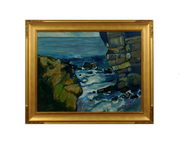
Peter Canty received his BA in art from the Chouniard Art Institute, Los Angeles (now California Institute of the Arts) and an MA from the University of California, Santa Cruz in 1969. Heavily influenced by the Post-Impressionist masters Van Gogh, Gauguin and Cezanne, in his own he words he describes his interest in landscapes, believing they are, “the best vehicle for motion, force, and color dynamics.” Although his work reference realistic subjects, Canty’s imagery is drawn strictly from his own imagination.
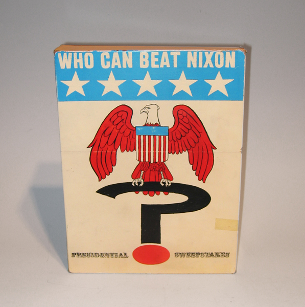
Tim Liddy Who Can Beat Nixon (1970) Presidential Sweepstakes 2006 Oil and enamel on copper, plywood back
TIM LIDDY
“Who Can Beat Nixon” (1970) Presidential Sweepstakes 2006
Oil and enamel on copper, plywood back
Signed in script: Tim Liddy “circa 1970” 2006, red circular ring
Provenance: William Shearburn Gallery (St. Louis, MO)
H: 11 ¾” x W: 9” x D: 2”
With his recent paintings, Liddy has both reasserted the construct of hyperrealist painting and developed a thoroughly unique advancement of that mode by extending the cultural reality of the indexed original. Based on the illustrated box lids of vintage board games, Liddy has recontextualized a subject, which evokes the underlying rules of life. Painted on copper or steel in the precise dimensions of the original, the metal is then manipulated to demonstrate the exact rips and tears from years of usage and includes trompe-l’oeil renditions of the scotch tape that might be holding the cardboard box together, the assorted stains, or the various graffiti of time. Liddy leaves no possibility of ambivalence, these works speak to a concurrent understanding of their original object identity and to themselves as works of art engaged in historical and psychological dialogue.
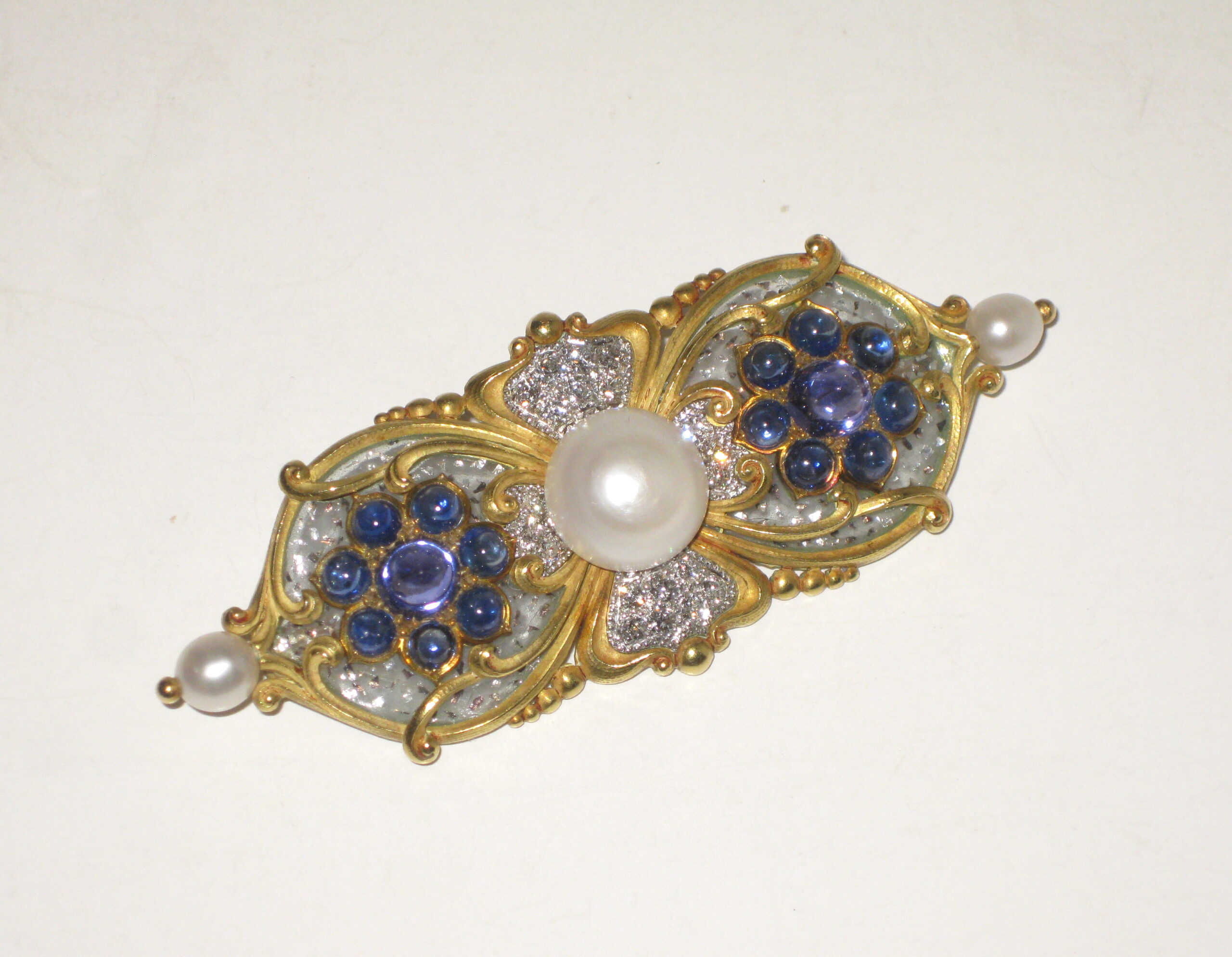
Marcus & Co. Art Nouveau brooch, “Tibula” shaped 18k yellow gold brooch set with three natural pearls, the natural center button pearl approx. 10 mm in diameter (G.I.A. certificate, 3 natural freshwater pearls, weight 24.90 grams, measurement range from 5.46 to 12.26mm), 16 sugarloaf cabochon sapphires, the two large and high dome middle sapphires with a purple hue, 20 pave set round diamonds all surrounded with clear plique-a-jour further trapped with platinum flakes, signed c. 1897
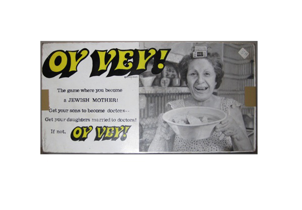
Tim Liddy Oy Vey (1979) The game where you become a JEWISH MOTHER! Get your sons to become doctors—Get your daughters married to doctors! If not, OY VEY! 2008 Oil and enamel on copper, plywood back
TIM LIDDY
“Oy Vey” (1979) The game where you become a JEWISH MOTHER! Get your sons to become doctors—Get your daughters married to doctors! If not, OY VEY! 2008
Oil and enamel on copper, plywood back
Signed in script: Tim Liddy, red circular ring, “circa 1979”, 2008
Provenance: William Shearburn Gallery, St. Louis, MO
H: 10 ¼” x W: 20 ½” x D: 1 ¾”
With his recent paintings, Liddy has both reasserted the construct of hyperrealist painting and developed a thoroughly unique advancement of that mode by extending the cultural reality of the indexed original. Based on the illustrated box lids of vintage board games, Liddy has recontextualized a subject, which evokes the underlying rules of life. Painted on copper or steel in the precise dimensions of the original, the metal is then manipulated to demonstrate the exact rips and tears from years of usage and includes trompe-l’oeil renditions of the scotch tape that might be holding the cardboard box together, the assorted stains, or the various graffiti of time. Liddy leaves no possibility of ambivalence, these works speak to a concurrent understanding of their original object identity and to themselves as works of art engaged in historical and psychological dialogue.




 @hd_jewels