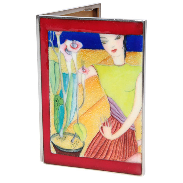
Paul Laszlo Rare Art Deco Enameled Sterling Cigarette Case c.1925
More Information
Paul Laszlo Rare Art Deco Enameled Sterling Cigarette Case c.1925
PAUL LÁSZLÓ (1900-1993) Austria / USA
MARIA ROTT (enamel) Vienna, Austria
Enameled sterling cigarette case c.1925
Hand painted foil backed and colorful fired enamel scene with a figure and a flowering plant all within a red enamel border on sterling
Marks: Paul Laszlo (on inside edge, rubbed), RS in a cartouche (Vienna maker’s mark), STERLING
H: 4″ x W: 3″ x D: 3/8″
Matching enamel dresser set by Paul Laszlo illustrated: “Kunsthandwerk” Band 62, Heft 5, February 1930
Born in Budapest, the architect Paul Laszlo studied in Vienna, Paris and Berlin before setting up an office in Vienna. By 1927, Laszlo had moved to Stuttgart where he quickly made a name for himself across Europe. In 1936, he relocated to Beverly Hills, California, which had become a haven for many artists and designers seeking artistic freedom. There he quietly found work designing modern homes and interiors, often for Hollywood celebrities. Laszlo created textiles, lamps, as well as custom furniture for his modernist homes and corporate interiors. His comfortable, yet elegant designs pay tribute to the modern luxury and easy livability of the early to mid 20th Century interiors of Vienna.
This enamel on sterling case really is one of the very best fired enamel examples of its type. It has a wonderful range of beautifully toned and colored enamel with foil backing in some areas which also gives it extra luminosity and metallic glow. It is in perfect condition and the detail and masterful artistic quality of the painting is also extremely fine and exquisitely rendered.
It has all the style and characteristics of the accomplished Neue Shachlichkeit (or New Realism / Objectivity) painting style Laszlo would have been familiar with and exposed to either in Berlin or Stuttgart as well as the New Realism style in Vogue in Vienna, where Laszlo also worked in the 1920’s. Considering the difficulty in controlling fired enamel, this exceptional Laszlo enameled case is a bargain by comparison of the price per square inch of a comparable painting on canvas such as a Christian Schad or Otto Dix! In fact, paintings are vastly more simple to execute and immediately rendered by comparison to a fired enamel “painting” on sterling like this exceptional case which would require a very lengthy and tedious process to accomplish a work of this caliber.
Paul Laszlo left Germany for America in 1936 and established a successful design firm in Beverly Hills, became an American citizen and lived happily in Southern California for the rest of his life.
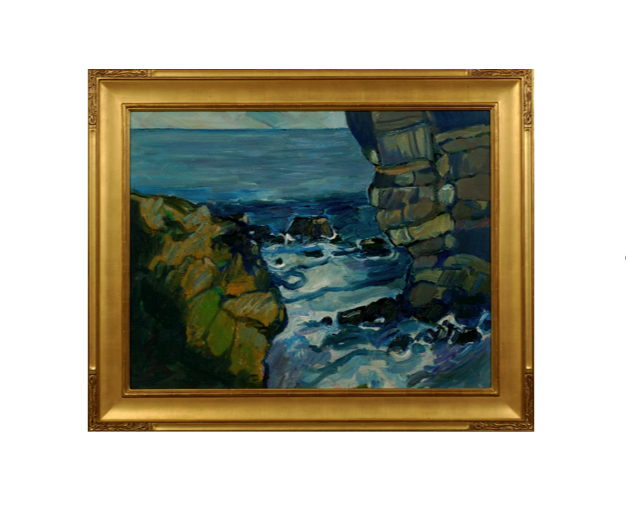
Peter Canty received his BA in art from the Chouniard Art Institute, Los Angeles (now California Institute of the Arts) and an MA from the University of California, Santa Cruz in 1969. Heavily influenced by the Post-Impressionist masters Van Gogh, Gauguin and Cezanne, in his own he words he describes his interest in landscapes, believing they are, “the best vehicle for motion, force, and color dynamics.” Although his work reference realistic subjects, Canty’s imagery is drawn strictly from his own imagination.
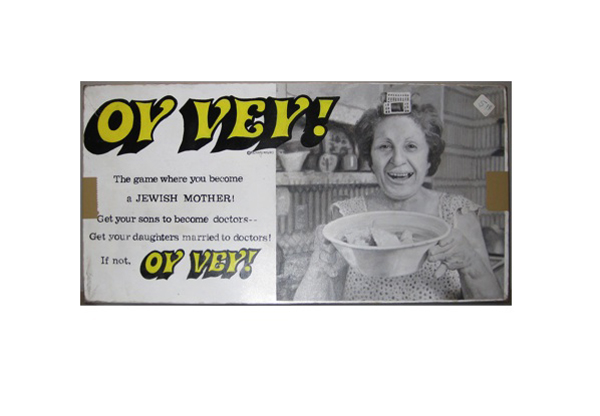
Tim Liddy Oy Vey (1979) The game where you become a JEWISH MOTHER! Get your sons to become doctors—Get your daughters married to doctors! If not, OY VEY! 2008 Oil and enamel on copper, plywood back
TIM LIDDY
“Oy Vey” (1979) The game where you become a JEWISH MOTHER! Get your sons to become doctors—Get your daughters married to doctors! If not, OY VEY! 2008
Oil and enamel on copper, plywood back
Signed in script: Tim Liddy, red circular ring, “circa 1979”, 2008
Provenance: William Shearburn Gallery, St. Louis, MO
H: 10 ¼” x W: 20 ½” x D: 1 ¾”
With his recent paintings, Liddy has both reasserted the construct of hyperrealist painting and developed a thoroughly unique advancement of that mode by extending the cultural reality of the indexed original. Based on the illustrated box lids of vintage board games, Liddy has recontextualized a subject, which evokes the underlying rules of life. Painted on copper or steel in the precise dimensions of the original, the metal is then manipulated to demonstrate the exact rips and tears from years of usage and includes trompe-l’oeil renditions of the scotch tape that might be holding the cardboard box together, the assorted stains, or the various graffiti of time. Liddy leaves no possibility of ambivalence, these works speak to a concurrent understanding of their original object identity and to themselves as works of art engaged in historical and psychological dialogue.
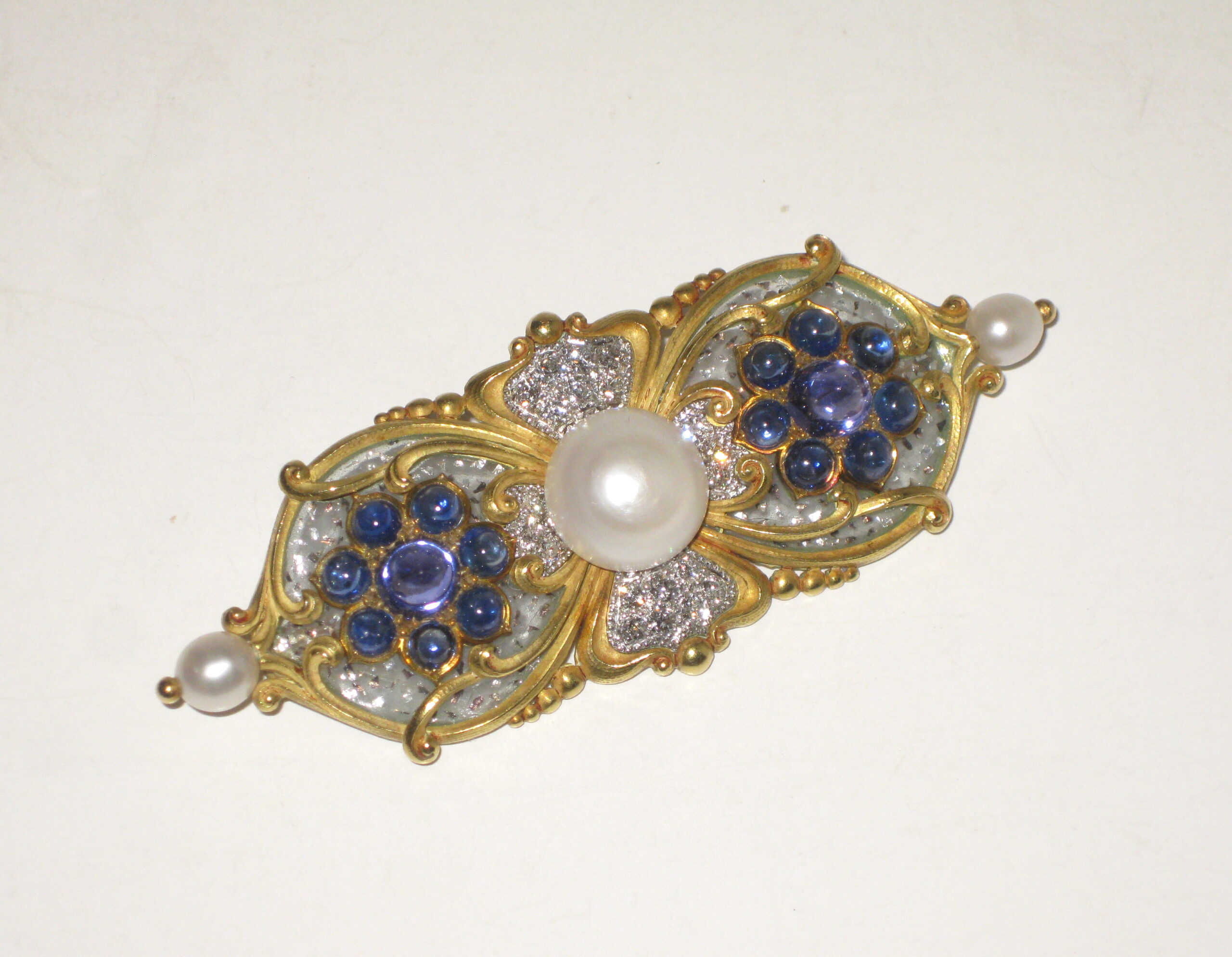
Marcus & Co. Art Nouveau brooch, “Tibula” shaped 18k yellow gold brooch set with three natural pearls, the natural center button pearl approx. 10 mm in diameter (G.I.A. certificate, 3 natural freshwater pearls, weight 24.90 grams, measurement range from 5.46 to 12.26mm), 16 sugarloaf cabochon sapphires, the two large and high dome middle sapphires with a purple hue, 20 pave set round diamonds all surrounded with clear plique-a-jour further trapped with platinum flakes, signed c. 1897
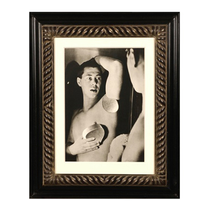
Herbert Bayer, Self Portrait, Gelatin silver print , 1932, printed later
HERBERT BAYER (1900-1985) Austria
Self portrait 1932 (printed later)
Silver gelatin print
Edition: 28/40
Signed: bayer 32 (in ink on bottom right corner)
Provenance: Kennedy Gallery, New York
H: 13 7/16” x W: 9 ½”
Framed size: H: 21 ½” x W: 17 ½”
Price: $16,000
Herbert Bayer (1900 – 1985) was an Austrian graphic designer, painter, photographer, and architect. Bayer apprenticed under the artist Georg Schmidthammer in Linz. Leaving the workshop to study at the Darmstadt Artists’ Colony, he became interested in Walter Gropius’s Bauhaus manifesto. After Bayer had studied for four years at the Bauhaus under such teachers as Wassily Kandinsky and László Moholy-Nagy, Gropius appointed Bayer director of printing and advertising. In the spirit of reductive minimalism, Bayer developed a crisp visual style and adopted use of all-lowercase, sans serif typefaces for most Bauhaus publications. Bayer is one of several typographers of the period including Kurt Schwitters and Jan Tschichold who experimented with the creation of a simplified more phonetic-based alphabet. Bayer designed the 1925 geometric sans-serif typeface, universal, now issued in digital form as Architype Bayer that bears comparison with the stylistically related typeface Architype Schwitters.
In 1928, Bayer left the Bauhaus to become art director of Vogue magazine’s Berlin office. He remained in Germany far later than most other progressives. In 1936 he designed a brochure for the Deutschland Ausstellung, an exhibition for tourists in Berlin during the 1936 Olympic Games. In 1938 he left Germany and settled in New York City where he had a long and distinguished career in nearly every aspect of the graphic arts. In 1946 Bayer relocated again. Hired by industrialist and visionary Walter Paepcke, Bayer moved to Aspen, Colorado as Paepcke promoted skiing as a popular sport. Bayer’s architectural work in the town included co-designing the Aspen Institute and restoring the Wheeler Opera House, but his production of promotional posters identified skiing with wit, excitement, and glamour. Bayer would remain associated with Aspen until the mid-1970s. Bayer gave the Denver Art Museum a collection of around 8,000 of his works. In 1959, he designed his “fonetik alfabet”, a phonetic alphabet, for English. It was sans-serif and without capital letters. He had special symbols for the endings -ed, -ory, -ing, and -ion, as well as the digraphs “ch”, “sh”, and “ng”. An underline indicated the doubling of a consonant in traditional orthography.