Product Description
Peter Shire Memphis Group California Art Pottery Rare Early “Peach Tea Set” 1980

PETER SHIRE (b. 1947) USA
Rare and early “California Peach” teaset 1980
Handmade earthenware with polychrome glazes
Made by Shire at his studio in Echo Park, California
Signed: Shire 1980 EXP (painted on base of each)
Model illustrated: Tempest in a Teapot, the Ceramic Art of Peter Shire, Norman M. Klein et al. (New York: Rizzoli, 1991) p. 11.
Teapot H: 10” x W: 11 1/4” x D: 5 1/2”
Pair of teacups H: 7 3/4” & 8”
Price: $8,500
Peter Shire (born 1947) is a Los Angeles artist. Shire was born in the Echo Park district of Los Angeles, where he currently lives and works. His sculpture, furniture and ceramics have been exhibited in the United States, Italy, France, Japan and Poland; Shire has been associated with the Memphis Group of designers, has worked on the Design Team for the XXIII Olympiad with the American Institute of Architects, and has designed public sculptures in Los Angeles and other California cities. Shire has been honored by awards for his contribution to the cultural life of the City of Los Angeles.
Peter Shire Memphis Group California Art Pottery Rare Early “Peach Tea Set” 1980
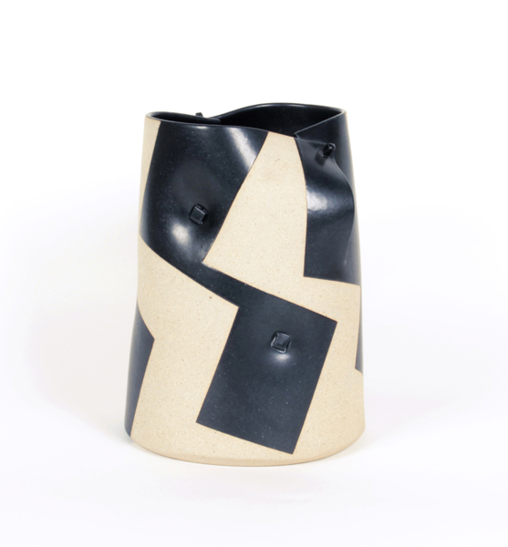
GUSTAVO PEREZ Mexico
Stoneware vase 2000
Black, randomly positioned rectangles on a cream / sandy base with a pinned overlap detail
Signed: GP 2000-68
H: 9 1/4″ x D: 6 1/2″
Price: $5,500
Gustavo Pérez makes vessels that are simple, smooth and symmetrical. Their elegance is due to the precision of the incised lines and other markings on the pots. While using the same clay body—sand colored stoneware—throughout his work, the artist achieves a wide range of form and pattern and includes slowly undulating walls beneath the subtly incised surfaces.
Gustavo Pérez works are incessantly experimental. There have been parallel lines, calligraphic traces, geometric cuts into the surface, minimalist vessels, recollections of pre-Hispanic vases and references to other ancient cultures.
The ceramics of Gustavo Pérez are distinguished by eliminating superfluous details, by synthesis of his elements. During the past two decades he has created a visual language that seems closely aligned with music. Pure in form, with a significant structure, completely abstract and without specific associations, his language of line, the bending of forms, and the definition of the vessel mark his work as a distinctive voice. The form is not just a container or a receptacle; it is architecture.
FONTANA ARTE Milan, Italy
“Glass fruit” bookends c. 1950
Glass, chromium-plated brass
For more information see: Fontana Arte, Una storia Trasparente, Laura Falconi (Milan: Skira, 1998).
H: 5” x W: 3 3/8” x D: 5”
Price: $3,500
DAVID SIMPSON (1928-) California, US
“Little Ibicenco” – California Hard-Edge Abstract painting 1979
Acrylic on canvas
Marks: David Simpson (script signature) on back of canvas, 1979, #14/79 “Little Ibicenco”, two arrows
H: 29″ x W: 28 3/4″
David Simpson has explored varieties of abstraction since the early 1950s, enjoying acknowledgement and success in the art world. In 1963 he was chosen by New York’s Museum of Modern Art curator, Dorothy Miller, to appear in what turned out to be the last in her legendary series of group shows of contemporary American art. In 1964 he appeared in Clement Greenberg’s famous exhibition Post Painterly Abstraction at Los Angeles County Museum of Art. At that time Simpson painted landscape-derived abstractions and, in the 70s, he practiced a reductive but relational mode of abstraction. But with his discovery of a new acrylic medium in 1987, he was able to embrace finally and successfully the monochrome’s radicality.
Simpson uses an acrylic paint with interference properties. The paint is composed of titanium dioxide electronically coated with mica particles. Simpson tends to mix complementaries, but admits that orange and blue also work together well. He also mixes black acrylic with the interference pigments, finding that a little bit of black helps the colour jump out. Interference pigments cause optical effects that are comparable to iridescence. When you look at the painting from one angle, you receive one set of colour sensations. When you shift your position, you get another. As you move back and forth in front of the canvas – and the paintings make you want to do so – the experience changes. The change of light also dramatically affects the optical experience, and the play of light across the canvas surface is subtly kinetic.
***David Simpson was associated with the California Hard-Edge Movement.
Hard Edge Abstraction:
It encompasses rich solid colors, neatness of surface, and arranged forms all over the canvas. The Hard-edge painting style is related to Geometric abstraction, Post-painterly Abstraction, and Color Field painting. Hard edge is also a simply descriptive term, as applicable to past works as to future artistic production. The term refers to the abrupt transition across “hard edges” from one color area to another color area. Color within “color areas” is generally consistent, that is, homogenous. Hard-edged painting can be both figurative or nonrepresentational.
Important solo exhibitions include: Studio la Città, Verona (2008); Light Wells +, Charlotte Jackson Fine Art, Santa Fe (2007-08); Sonta Roesch Gallery, Houston (2007); Light Wells, Haines Gallery, San Francisco (2007); Iridescent Interference, Gallery Sonja Roesch, Houston (2005); Surrealist Landscape and other Departures, Haines Gallery, San Francisco (2005); Cheryl Haines Gallery, San Francisco (2004); James Kelly Contemporary, Santa Fe (2003); Artotek, Köln (2002); Renate Schröder Galerie, Köln (2002); Renate Schröder Galerie, Köln (2001); Studio la Città, Verona (2001); Modernism Gallery, San Francisco (2001); University Art Museum, San Francisco (2000); Renate Schröder Galerie, Köln (2000); Haines Gallery, San Francisco (2000).
Important group shows include: Galerie Lausberg, Dusseldorf (2007); West Coast Abstraction, Modernism Gallery, San Francisco (2007); Fundamental Abstraction, Haines Gallery, San Francisco (2007); The Panza Collection – An experience in light colour, Albright Knox Gallery, Buffalo, with catalogue (2007); Inneres Leuchten-Farbe als Malerei, Kunstverein Lingen Kunsthalle, Lingen (2005); Recent Paintings, Galleria G7, Bologna (2005); Je ne Regrette Rien, Studio la Città, Verona (2005); The Forman Collection, Albright Knox Gallery, Buffalo (2005); Modernism Gallery, San Francisco (2004); San Jose Museum of Art, San Jose, CA (2004); Albright Knox Art Gallery, N.Y. (2003); La percezione dello spazio , Palazzo della Gran Guardia, Verona (2002); Le stanze dell’arte , MART, Rovereto (curated by Gabriella Belli) (2002); Artisti americani ed europei dalla collezione Panza , Palazzo Ducale, Sassuolo (2001); Nebeneinander III (Painting Today – Overseas and Here ), Galerie Renate Schröder, Köln, with catalogue (2001); La collezione Panza di Biumo: artisti degli anni ’80 – ’90 , Museo del Palazzo Ducale, Gubbio, with catalogue (1997).
DIDIER GARDILLOU France
Trompe L’Oeil Porcelain “Plat des moules et serviette” c. 2008
High fired porcelain with a matte and shiny glaze, blue border detail on the napkin and realistically painted mussels.
Marks: DG (Didier Gardillou) monogram
H: 4 1/2″ x D: 10″ x W: 11″
Price: $5,450
Didier Gardillou is a master porcelain artist who creates Trompe L’Oeil masterpieces. He revived the antique craft of the porcelain florist. This technique and style first appeared in France in the 1740’s at the Manufactory of Vincennes, which in time would move and become known as the Royal Manufactory of Sèvres Porcelain.