Tommi Parzinger / American Art Deco Coffee Table circa 1939
More Information
Tommi Parzinger / American Art Deco Coffee Table circa 1939
TOMMI PARZINGER (1903-1981) Germany/USA
PARZINGER, INC. New York
Coffee table c.1939
Carved and ceruse oak with an incised diamond pattern pewter top
Illustrated: Arts and Decoration, June 1940
***This table was originally priced at $80 during the period, as it appears in the Arts and Decoration vintage illustration from 1940.
For other examples of Parzinger’s work see: Town & Country, Vol. 54, “Counter Points”, December 1939, p. 31; Town & Country, Vol. 95, “Counter Points”, June 1940, p. 19; The Studio, 1938, “For the Table”, p.107-09; The Studio, 1942, “Tommi Parzinger, Designer of Modern Interiors and Silver”, p.37; Decorative Art, Studio Yearbook (London & New York: The Studio Publications, 1952-53), p. 98; Craft in the Machine Age, ed. Janet Kardon (New York: American Craft Museum, 1995) p.128, 134, 183, 241.
H: 12” x L: 42” x D: 14”
Price: $34,500
This is a wonderful and rare coffee table by Tommi Parzinger in beautifully detailed ceruse oak with a diamond pattern pewter inset top. This table was
completely handmade and dates from 1940, shortly after Parzinger opened his first eponymous gallery on East 57th Street. It is low and lean with exquisite Neoclassical Revival carved details and a silhouette that calls to mind an American take on Jean Michel Frank’s sober and refined elegance of the same time period. The cross-hatch carving with tassels on the two long sides and the related top corner details also have a charm reminiscent of Parzinger’s affable personality and effervescent design sensibility.
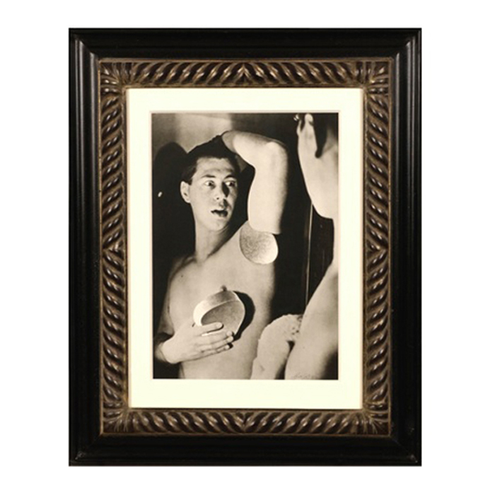
Herbert Bayer, Self Portrait, Gelatin silver print , 1932, printed later
HERBERT BAYER (1900-1985) Austria
Self portrait 1932 (printed later)
Silver gelatin print
Edition: 28/40
Signed: bayer 32 (in ink on bottom right corner)
Provenance: Kennedy Gallery, New York
H: 13 7/16” x W: 9 ½”
Framed size: H: 21 ½” x W: 17 ½”
Price: $16,000
Herbert Bayer (1900 – 1985) was an Austrian graphic designer, painter, photographer, and architect. Bayer apprenticed under the artist Georg Schmidthammer in Linz. Leaving the workshop to study at the Darmstadt Artists’ Colony, he became interested in Walter Gropius’s Bauhaus manifesto. After Bayer had studied for four years at the Bauhaus under such teachers as Wassily Kandinsky and László Moholy-Nagy, Gropius appointed Bayer director of printing and advertising. In the spirit of reductive minimalism, Bayer developed a crisp visual style and adopted use of all-lowercase, sans serif typefaces for most Bauhaus publications. Bayer is one of several typographers of the period including Kurt Schwitters and Jan Tschichold who experimented with the creation of a simplified more phonetic-based alphabet. Bayer designed the 1925 geometric sans-serif typeface, universal, now issued in digital form as Architype Bayer that bears comparison with the stylistically related typeface Architype Schwitters.
In 1928, Bayer left the Bauhaus to become art director of Vogue magazine’s Berlin office. He remained in Germany far later than most other progressives. In 1936 he designed a brochure for the Deutschland Ausstellung, an exhibition for tourists in Berlin during the 1936 Olympic Games. In 1938 he left Germany and settled in New York City where he had a long and distinguished career in nearly every aspect of the graphic arts. In 1946 Bayer relocated again. Hired by industrialist and visionary Walter Paepcke, Bayer moved to Aspen, Colorado as Paepcke promoted skiing as a popular sport. Bayer’s architectural work in the town included co-designing the Aspen Institute and restoring the Wheeler Opera House, but his production of promotional posters identified skiing with wit, excitement, and glamour. Bayer would remain associated with Aspen until the mid-1970s. Bayer gave the Denver Art Museum a collection of around 8,000 of his works. In 1959, he designed his “fonetik alfabet”, a phonetic alphabet, for English. It was sans-serif and without capital letters. He had special symbols for the endings -ed, -ory, -ing, and -ion, as well as the digraphs “ch”, “sh”, and “ng”. An underline indicated the doubling of a consonant in traditional orthography.