Product Description
Archibald Knox / Liberty & Co. Tudric charger / tray c. 1902-05

ARCHIBALD KNOX (1864-1933) UK
LIBERTY & CO. London
Tudric charger c. 1902-05
Pewter with abstract Celtic design in bas-relief
Marks: TUDRIC, 0163, Made in England
Illustrated: Archibald Knox, ed. Stephen A. Martin (London: Artmedia Press, 2001) p 203
Drawing illustrated: Archibald Knox, ed. by Stephen A. Martin (London: Academy Editions, 1995) p 137;
D: 9 9/10”
This British avant-garde charger demonstrates the profound influence of Celtic ornament upon Knox and his highly individual and sophisticated use of these ancient graphic devices of interlocking loops and tendrils.
Archibald Knox / Liberty & Co. Tudric charger / tray c. 1902-05
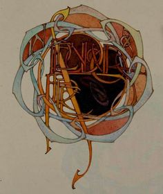
ANDRE LANSKOY (1902-1976) France
MAURICE BEAUFUME
PIERRE LECUIRE
“Cortege” 1959
64pp, 25 illustrations by Andre Lanskoy and Maurice Beaufume
Cortège is now often compared to “Jazz” as perhaps the finest example of
pochoir in the postwar period. Printed on Arches Vellum paper.
Dimensions:
Book: H: 18” x W: 13 3/8” x D: 1 7/8”
Custom leather box 2008: H: 20 ¼” x W: 15” x D: 4 ½”
Custom silk slipcase: H: 21 ½” x W: 15 5/8” x D: 5 3/8”
The artworks of André Lanskoy (1902-1976) are more than abstractions—they are juxtapositions of shapes, assemblages of colors and studies that explore the interfacing of language with visual imagery. A pioneer of Tachism, an artistic movement of the 1940s and 1950s also known as Art Informel or Lyrical Abstraction, Lanskoy emphasized the spontaneous in his paintings, combining surges of pure color with more subtle modulations. His efforts to translate language into abstract visual messages are most evident in two of his bold projects: a rare screen-printed textile and his vivid collages for Pierre Lecuire’s book, Cortège.
Born in Moscow, Lanskoy spent his youth in Russia; in 1921, he moved to Paris and studied at the Académie de la Grande-Chaumière. His first non-figurative works were painted in 1937, with his first Parisian exhibition of abstractions in 1944. As a painter, Lanskoy gave primacy to color, and this holds true for his textile design, Egypte. In 1946, French industrialist Jean Bauret invited several Tachist artists—including Serge Poliakoff, André Beaudin and Henri Michaux—to experiment with designs for furnishing textiles. One of Lanskoy’s contributions to this series was an expressive interpretation of the complex pictorial characters of ancient Egyptian hieroglyphics. The relationship between the Egyptian writing system and his own glyphs is mainly conceptual: the symbols Lanskoy invented have no inherent meaning, yet their careful placement suggests a text that is meant to be read. Contrasting with the neutral ground, the centered, vertical column is a grid of rectangular cells containing six repeating compilations of mysterious, hieroglyphic-inspired shapes. These cartouche-like compartments are bordered on each side by narrow strips of color blocks with voided linear abstractions. The intense purple and teal hues and vibrant reds and yellow are typical of Lanskoy’s exaltation of color.
Working within the theme of synthesizing language, color and form, Lanskoy tried his hand at an exciting tradition: the livre d’artiste. His first project was a collaboration with poet Pierre Lecuire; their masterpiece Cortège, arguably one of the finest artist-books ever produced, is a dazzling symbiosis of literary and visual material. Lecuire first met Lanskoy in 1948; ten years later, he would enlist his friend to illustrate the long prose poem. At Lecuire’s suggestion, Lanskoy created a series of twenty-four compositions for the book in the papiers collés method; his challenge was to interpret Lecuire’s writing into bold, graphic statements. The author’s opening lines set the tone for Lanskoy’s luminous color harmonies: “This book is a cortège. It has its colors, action and animation. It blazes, it proclaims one knows not which passion, which justice; it flows like the course of a navigation….” As he achieved with Egypte, the vibrant, saturated tints of the abstractions on these particular plates create a language of their own, while the lively arrangement of crisp and jagged forms shows an affinity with the rhythmic cadence of communication.
Remarkable for their dense bursts of color and unfamiliar shapes, the series of collages was masterfully executed in pochoir by colorist Maurice Beaufumé under Lanskoy’s personal direction. The bold, oversized text was printed by Marthe Fequet and Pierre Baudier, and Cortège was released in Paris, December 1959
NIGEL COATES (b. 1949) England
BRANSON COATES ARCHITECTURE London
“Genie” stool 1988
Carved and sandblasted solid ash seat on twisted mild steel legs
Marks: NIGEL COATES GENIE STOOL
Illustrated: 1000 chairs, Charlotte & Peter Fiell (Cologne: Taschen Verlag, 1997), p. 615.
H: 26: x D: 13 1/2″
Price: $9,500
British architect and designer. He studied at Nottingham University and the Architectural Association, London, where he graduated in 1974 and subsequently taught until 1989. In 1983 he formed the group NATO (Narrative Architecture Today) with a group of former students and began to practice independently; two years later he went into partnership with Doug Branson (b 1951). Coates became known for his fluid and lively graphic style and the overt theatricality of his designs. His proposals for the redevelopment of London, involving sophisticated allegories of popular culture, were shown in two exhibitions: ArkAlbion (1984), with drawings of new development areas such as County Hall and the Isle of Dogs, and Ecstacity (1992), with computer simulations and video clips. In the renovation (1980) of his own flat in London he juxtaposed the original, ornate late 19th-century interior with ‘found’ furniture and decorative objects. The publication of this project brought Coates to the attention of Japanese clients who were seeking fashionable Western designers, and he carried out several projects in Japan that became increasingly theatrical: in Tokyo the Metropole Restaurant (1985) evokes a European café, while the Parco Café Bongo (1986) juxtaposes classical English furniture with an imitation aeroplane wing mounted on the ceiling; and the Arca di Noè (1988), Sapporo, is an eclectic mixture of classical motifs and a concrete boat. Coates’s radical approach was dissipated in later British works, such as a series of London shops: one for Katharine Hamnett in Sloane Street (1988) has a shop front formed of aquaria, and one for Jigsaw in Knightsbridge (1992) has its shop front formed of a two-storey copper column in the shape of a phallus. In 1992 he began designing an extension to the Geffrye Museum, London.
Coates was an influential teacher at the Architectural Association from 78- 86, and has lectured extensively abroad. In 1995 he was appointed Professor of Architectural Design at the Royal College of Art and now divides his time equally between the college and his office. Nigel Coates furniture is represented in the Modern Furniture Collection of the Victoria & Albert Museum, London.
“I go for architecture that overlays and enhances. By blending observation and wit with reason, I want my work to generate a sense of the unexpected, and the seemingly spontaneous.”