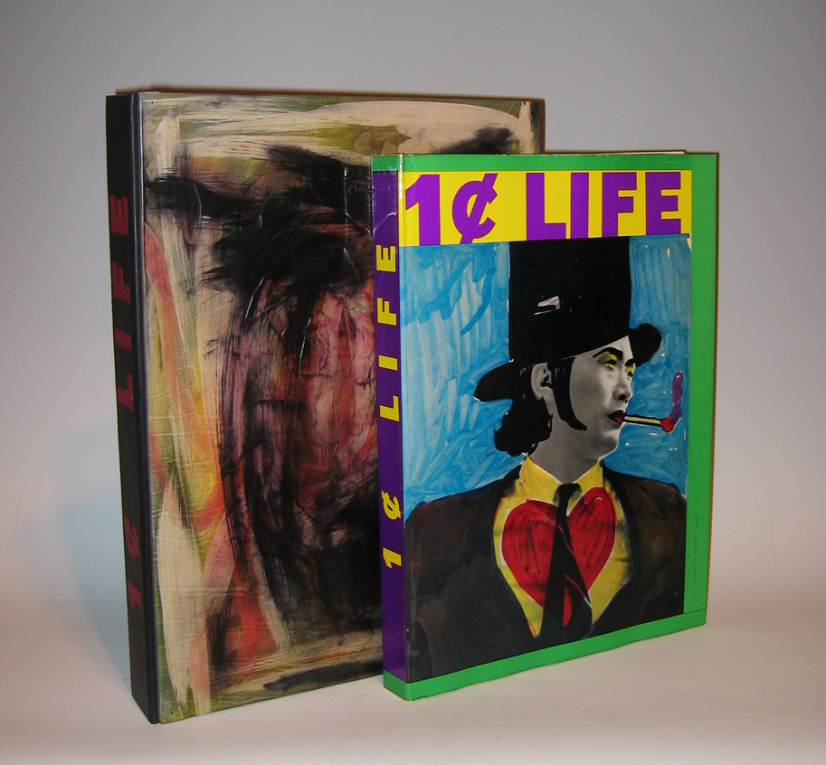
68 Original Pop-Art & Cobra Graphics
Limited edition of 2000 copies, Elephant Folio, 176 pages
Edited by Sam Francis (1923-1994)
Published by E.W. Kornfeld, Bern, Switzerland
Dimensions:
Book: H: 16 3/8” x W: 12”
Custom leather box: H: 18 1/16” x W: 13” x D: 2 7/16”
Custom silk slipcase” H: 19 1/8” x W: 13 7/8” x D: 3 3/16”
Artists that contributed original graphic work illustrating Walasse Ting’s poetry for this volume include: Pierre Alechinsky (5), Karel Appel (5), Enrico Baj (2), Alan Davie (3), Jim Dine (2), Sam Francis (6), Robert Indiana (2), Alfred Jensen (3), Asger Jorn (2), Allan Kaprow, Alfred Leslie (2), Roy Lichtenstein (2 + cover), Joan Mitchell, Claes Oldenburg (3), Mel Ramos (2), Robert Rauschenberg (2), James Rosenquist, Bram Van Velde, Andy Warhol, and Tom Wesselman (2).
Walasse Ting, born in Shanghai, is a self-taught painter, sculptor, graphic artist and poet. Leaving China in 1949 to travel, he reached Paris in 1953 and became acquainted with artists Karel Appel, Asger Jorn and Pierre Alechinsky, members of the avant-garde group known as COBRA. Since 1963, he has lived in New York.
“Ting wanted to publish the most international illustrated book, intended to illustrate his text, uniting tachisme, neo-dadaisme, pop art, and all other artistic movements. The idea was born from global experience, close contact with culture, pseudo-culture, primitive existential worries, urban erotic and eastern wisdom.. It was a Herculean task, for which only a Chinese would have been able to muster the perseverance” – E. W. Kornfeld.
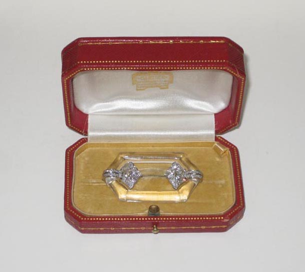
Cartier Art Deco brooch, carved rock crystal with a fancy platinum mount set with diamonds, original leather box, signed c. 1925
Cartier Art Deco brooch, carved rock crystal with a fancy platinum mount set with two European and cushion cut diamonds (approx. 3 carats TW) further set with two European and cushion cut diamonds (approx. 1 carat TW) with diamond pave work filling out the surrounding floral motif, original leather box, signed and numbered, c. 1925
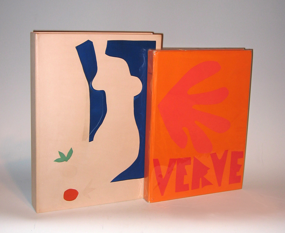
HENRI MATISSE (1869-1954) France
“Verve” Vol. IX No. 35 & 36 1958
Revue artistique et littéraire paraissant quatre fois par an
Created and editioned at the Mourlot Studio, Paris.
Published by E. Tériade, Paris 1958.
Dimensions:
Book: H 14 1/2” x W: 10 11/16”
Custom leather box: H: 15 13/16” x W: 11 5/8” x D: 2 1/16”
Custom linen case: H: 16 3/4” x 12 5/16” x D: 2 5/8”
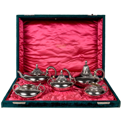
Gorham Sterling “Exotic” Tea and Coffee Set in Original Presentation Chest 1880
GORHAM MFG. CO SILVERSMITHS Providence, RI
“Exotic” tea and coffee set in original Gorham presentation chest 1880
Sterling silver 5-piece service with “butler” finish, bright-cut chasing and repoussé surface in the Far Eastern exotic style with elephant trunk spouts and handle forms, tent-like splayed lids, interior gilding, engraved conjoined initials, bone spacers in the original deep teal velvet-covered presentation chest with hot pink silk- satin interior
Marks: Gorham marks, STERLING, 1560, “M” (date mark for 1880)
Lid of case interior stamped in gold: Gorham Mfg. Co., Sterling Silver, Union Square, NY
For related pieces and further information see: Gorham Silver 1831-1981, Charles H. Carpenter, Jr., Chapter 6, “Innovation and Fantasy”, p. 94-121 (New York: Dodd, Mead & Company, 1982); In Pursuit of Beauty: Americans and the Aesthetic Movement, Chapter 8,“Metalwork: An Eclectic Aesthetic” by David Hanks, p.253-294 (New York: The Metropolitan Museum of Art / Rizzoli, 1987); Silver in America, 1840-1940: A Century of Splendor, Charles L. Venable, Chapter 6, “Consumption and Design” p.123-204, (New York: Dallas Museum of Art, Harry N. Abrams, Inc., 1995).
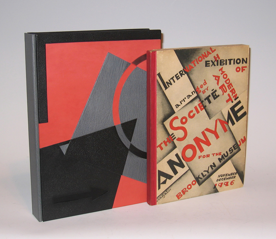
Katherine S. Dreier, “International Exhibition of Modern Art 1926”, Arranged by The Societe Anonyme for the Brooklyn Museum 1926
KATHERINE S. DREIER (1877-1952)
“International Exhibition of Modern Art 1926” 1926
Arranged by The Societe Anonyme for the Brooklyn Museum
Published by Societe Anonyme, New York
Dimensions:
Book: H: 10 1/16” x W: 7 ½”
Custom leather box: H: 11 ¼” x W: 8 ¼” x D: 1 9/16”
Custom silk slipcase: H: 12” x W: 8 5/8” x D: 2 1/8”
Katherine Sophie Dreier was born on 10 September 1877 in Brooklyn, New York to Dorothea Adelheid and John Caspar Theodor Dreier, both immigrants from Bremen, Germany; she was the youngest of five children. Early on, Dreier manifested her dual interests in social issues and art. She was treasurer of the German Home for Recreation of Women and Children and helped to found the Little Italy Neighborhood Association in Brooklyn, New York. She studied art privately, then at the Brooklyn Art School and at Pratt Institute, and then with Walter Shirlaw (with whom Dreier’s sister, Dorothea, also studied). There was a strong identification in the Dreier home with German culture, and the family often traveled to Europe to visit relatives. Between 1907 and 1914, Dreier spent much of her time abroad, traveling, studying art, and exhibiting her work in one-artist shows. In New York, in 1916, through her work with the Society of Independent Artists, Dreier met Marcel Duchamp. He was to become a close friend and colleague, and an important figure in the history of the Societe Anonyme. In January 1920, Dreier, Duchamp, and Man Ray met in Dreier’s apartment in New York City to found the Societe Anonyme, a society to promote modern art among the American public. Dreier had wanted to call the society “The Modern Ark,” but Man Ray later claimed that he was the one to suggest the French phrase for “incorporated” instead. Dreier added the subtitle “Museum of Modern Art: 1920.” The Societe Anonyme sponsored many lectures, concerts, publications, and exhibitions concerning modern art, including the International Exhibition of Modern Art at the Brooklyn Museum in 1926. In spite of a major membership campaign in 1925, the Societe’s headquarters in New York City closed in 1928, and from this point on, the Societe Anonyme existed only through Dreier’s efforts. She continued to organize events that were sponsored by the Societe, and she accumulated artwork to add to the Societe Anonyme’s collection. In 1939, Dreier began developing a plan to open the Country Museum at her house in West Redding, Connecticut (the Haven), which would house the Societe Anonyme’s collection of artwork, as well as her private collection. After little success with other potential investors, Dreier approached Yale University about funding and maintaining the museum. Yale was hesitant, because of the high costs of renovating the Haven and maintaining it as a fire-proof museum, and instead offered as a compromise to take over the Societe Anonyme’s collection if it were moved to the Yale Art Gallery. Dreier agreed, and she began sending the collection to Yale in October 1941. In 1942, Dreier was still adamant about her desire to open the Country Museum and to use her private collection as its basis. She continued her attempts to convince Yale to fund her project, but when Yale gave a final negative answer in April, Dreier decided to sell the Haven. In April 1946, she moved to a new home, Laurel Manor, in Milford, Connecticut. She continued to add artwork to the Societe Anonyme collection at Yale, through purchases and through gifts from artists and friends. In 1947, she attempted to reopen membership to the Societe Anonyme and printed a brochure, but Yale blocked distribution of the brochure because of the ambiguous connection between Yale and the membership campaign. In 1948, Dreier and Duchamp decided to limit the activities of the Societe to working on a catalog of the collection and to acquiring artwork. On the thirtieth anniversary of the Societe Anonyme’s first exhibition, 30 April 1950, Dreier and Duchamp hosted a dinner at the New Haven Lawn Club, where they formally dissolved the Societe Anonyme. In June, a catalog of the Societe’s collection at Yale, Collection of the Societe Anonyme: Museum of Modern Art 1920, was published. Dreier died on 29 March 1952.