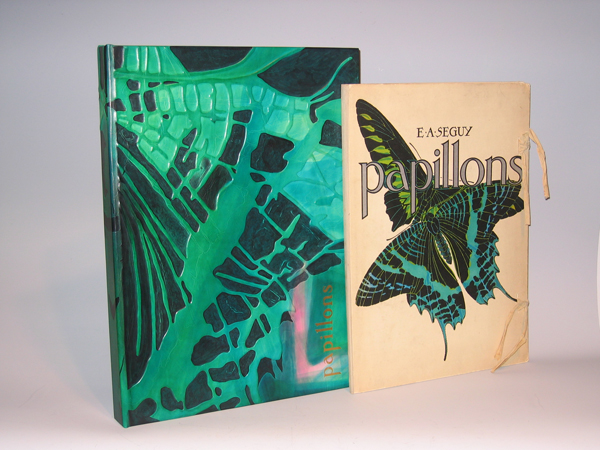
Twenty pochoir over photogravure plates (hand painted collotypes) in paper portfolio with cotton ties
Pochoir is process by which rich color is applied layer by layer by hand with the aid of stencils, resulting in intense hues similar to those in stained glass windows.
Published by Editions Duchartre et Van Buggenhoudt, Paris, France
Dimensions:
Book: H: 18” x W: 13 1/8” x D: 1 ½”
Custom leather box: H: 20” x W: 14 5/8” x D: 1 ¾”
Brilliantly and boldly colored butterflies from around the world are shown in interesting arrangements in pochoir prints from a set of 20 by the French designer and author E.A. Seguy. Plates 1 to 16 show large specimens in colorful arrangements, often overlapping, emphasizing colors, and patterns and shapes of wings and wing veins. Plates 17 through 20 are composite uses of butterfly patterns, in geometric boxes, like fabric or wallpaper designs.
In his foreword to Papillons, Seguy describes the prints as “un monde somptueux de formes et de couleurs” — a world of sumptuous forms and colors. He explains that they are intended to provide a record of rare, exotic specimens from museums and private collections, within an aesthetic context, thereby making them more widely accessible as inspiration for decorative arts designers. Nonetheless, Seguy based his images of butterflies and insects on illustrations in scientific publications, thereby maintaining scientific accuracy. They were enlarged up to 10 to 15 times to reveal intricacies of their design not visible without magnification. Also included with the set was a Table Des Noms Scientifiques [Table of Scientific Names], providing the technical species and genus names as well as the countries or regions of habitat for the species shown in Plates 1 through 16.
Eugene Alain Seguy produced eleven albums of illustrations and designs from the turn of the century to the 1930s, and his style reflected the influences of both Art Nouveau and Art Deco. His various color portfolios of visual ideas for artists and designers often featured motifs based on the natural world, including flowers, foliage, crystals and animals. Although his compositions were design oriented, he made the depictions scientifically accurate. His later works showed an increased interest in geometric and cubist designs. The prints in the portfolios were produced using the pochoir technique characterized by rich, intense color. This printing process, utilized in the early 20th century for high quality prints, involved applying colors to each plate with a number of stencils. Seguy’s works include Les Fleurs et Leurs Applications Decoratives (1900), Samarkande – 20 Compositions en Couleurs dans le Style Oriental (1914), Floreal (1920), Papillons (1924), Insectes (1924), Primavera –Dessins et Coloris Nouveaux (1929), Suggestions (1930), and Prismes – 40 Planches de Dessins et Coloris Nouveaux (1931).
Collections of prints like those produced by Seguy provided source material for designers of fabrics, wallpaper, ceramics, book illustrations, posters, and advertisements, and were popular in the late 19th and early 20th century. The leading Victorian publication of this type was Owen Jones’s Grammar of Ornament, first issued in a folio edition in London in 1856. Other trendsetting styles in art, design, decoration and fashion in the second half of the 19th century, and early 20th century, came from Paris, Austria, and Germany, and many such print collections were published there, including designs by Emile Belet, Armand Guérinet, Ernst Haeckel, Arsène Herbinier, and Anton Seder. To search our site for more Art Nouveau designs by such artists please type “Art Nouveau” into our search engine.
Editions Duchartre et Van Buggenhoudt was a publisher located at 15 Rue Ernest-Cresson, Paris. The series also was published by Tolmer Editeur, 13 Quai d’Danjou, Paris.
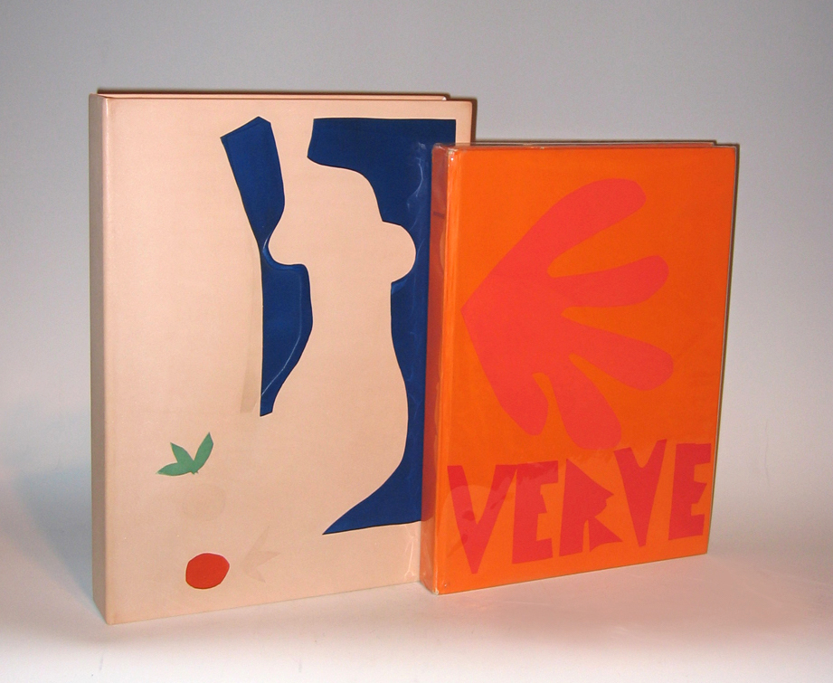
HENRI MATISSE (1869-1954) France
“Verve” Vol. IX No. 35 & 36 1958
Revue artistique et littéraire paraissant quatre fois par an
Created and editioned at the Mourlot Studio, Paris.
Published by E. Tériade, Paris 1958.
Dimensions:
Book: H 14 1/2” x W: 10 11/16”
Custom leather box: H: 15 13/16” x W: 11 5/8” x D: 2 1/16”
Custom linen case: H: 16 3/4” x 12 5/16” x D: 2 5/8”