Product Description
Asprey & Co., Important Cardinal Sculpture gem set with natural rubies, 18K gold and amethyst quartz, signed, 1980


ASPREY & CO. LTD. (founded 1781) London, UK
Important Natural Ruby Gem Set 18K Gold Cardinal Bird Sculpture 1980
Finely chased and chiseled 18K yellow and white gold realistically rendered sculpture of a Cardinal bird set with
85+ carats (approx.) of natural gem quality oval and round cut Burmese rubies (GIA certificate) further heightened with enamel eyes and blackened gold face plumage details, the 18K gold and natural ruby cardinal sets atop a natural Amethyst crystal “mountain rock” with a tooled and gilt (script mark) on the leather under-pad.
Marks: A & Co. (in a quatrefoil), Crown mark, 750 (gold standard mark) Lion’s head (London assay mark) “F” date mark for 1980, tooled and gilt Asprey (script mark) on the leather under-pad
Provenance: Privately commissioned by the Sultan of Brunei’s younger brother, Prince Jefri Bolkiah who also later became the owner of Asprey & Co in the 1995. This rare sculptural 18K gold and natural ruby Cardinal was handmade by the finest jewelers and work masters in the workshop of the London Asprey & Co. located above the flagship store at 167 New Bond Street.
H: 3 ¾” x L: 5 3/4” x W: 1 ½”(Cardinal only)
H: 6” x W: 6 ¾” x D: 5 ¾” (with Cardinal atop natural Amethyst crystal rock)
As one might guess, a large part of the animal symbolism of the cardinal comes from the brilliant red color of the males. In fact, its name is derived from the royal red vestments worn by Catholic cardinals. This shock of red, especially against the stark backdrop of winter snow, is a magnificent sight. The male cardinal reminds us passion, warmth and vibrancy is available to us – even under the cloak of Winter’s grey clouds. Interestingly, the more bold and bright his color is, the more successful the cardinal will be at prolonging his lineage. Dull colored male cardinals are less likely to mate successfully than bright colored ones. True to the fire of his color, the crimson cardinal has got some major spunk. He will aggressively defend his territory, and fight attackers with ferocity. Indeed, they have been known to fight ghost males (their reflections) in mirrors for hours on end. Both male and female give us glorious songs. Along with peeps and pips and warbles, the tuned ear can also hear “cheer, cheer, cheer!” Very appropriate to the animal symbolism of cardinals, because they are a delight to both eyes and ears. The cardinal makes a fantastic animal totem. It reminds us to hold ourselves with pride, not ego pride but rather the cardinal asks us to stand a little taller, be a bit more regal and step into our natural confidence as if we were born to lead with grace and nobility. Those who attract the cardinal as their totem are naturally energetic, love life, and happily help others where and when they can!
Asprey & Co., Important Cardinal Sculpture gem set with natural rubies, 18K gold and amethyst quartz, signed, 1980
OMAR KHAYYÁM (1048 – 1123) Persia
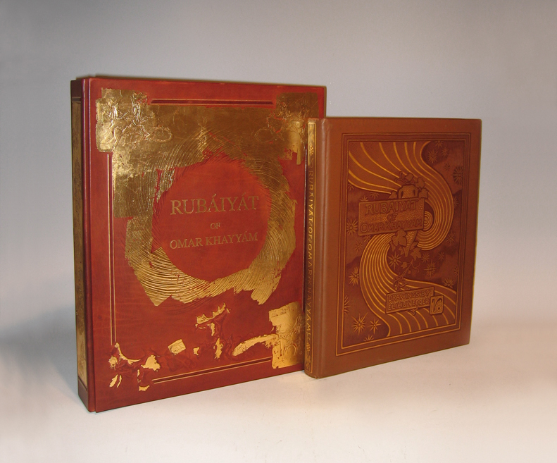
“Rubáiyát” 1884
128pp. First edition bound in brown flat-weave cloth over beveled boards; front cover with gilt lettering, dark brown-stamped ruled borders, symbolist design of vase, vine, swirl and stars, rear cover without decoration; spine with gilt lettering and dark brown-stamped ruled borders and ornaments; signed in gilt & dark brown-stamp on front cover. Collection of poems originally written in the Persian language, “Rubáiyát” (derived from the Arabic root word for 4) means “quatrains”: verses of four lines.
Translated by Edward Fitzgerald
54 drawings by Elihu Vedder reproduced by Albertype process on facing pages (printed one side only)
Published by Houghton Mifflin and Company, Boston
Dimensions:
Book: H: 16” x W: 13 ¼” x D: 1 ¾”
Custom leather box 2008: H: 17 15/16” x W: 14 3/4” x D: 2 7/8”
Custom silk slipcase: H: 19 1/8” x W: 15 ½” x D: 4”
From the moment of its publication, Elihu Vedder’s Rubáiyát of Omar Khayyám achieved unparalleled success. The first edition appeared in Boston on 8 November 1884; six days later, it was sold out. Critics rushed to acclaim it as a masterwork of American art, and Vedder (1836-1923) as the master American artist who set the standard for the artist-designed book in America and England.
Written ca. 1120 by Persian poet-philosopher Omar Khayyam (1048-1131), the Rubaiyat is a collection of quatrains, or poems of four lines, intended to prove the futility of mathematics, science, and religion in determining the meaning of life. First translated from Persian to English in 1859 by Edward Fitzgerald, editions of Khayyam’s Rubaiyat have since appeared in numerous forms and languages, thebest-loved, best-known, and most elaborate being the 1884 edition illustrated and designed by Elihu Vedder.
Vedder was one of the first artists of his generation to train in Paris where he developed his signature Academic style and focused on what would become his favored subject: the classically proportioned female nude. In the years 1883 and 1884, he created 54 compositions to accompany the 1884 edition of Khayyam’s Rubaiyat (published by Houghton, Mifflin) – drawings that serve as a harmonious frame for the text. Living in Rome at the time, Vedder also designed the book’s cloth-bound cover, lining papers and eccentric hand-drawn letters. With his Academic and yet “visionary” style, Vedder was the ideal artist to interpret the Rubaiyat; he reconciled the critics who called for accurate depiction of observed reality with those who argued for feeling and emotion over objective form.
Additionally, Vedder arranged the verses to express the three stages of existence explored in the Rubaiyat — happiness and youth; death and darkness; and rebirth — as well as to fit his own romantic interpretation of the verses. Vedder’s drawings for the book combine traditional Christian symbols, classical figures, and mystical imagery of his own invention to evoke the mood of Khayyam’s poems. A prevalent device is his “cosmic swirl,” which, according to Vedder, represented the “gradual concentration of elements that combined to form life; the sudden pause through the reverse of the movement which marks the instant of life; and then the gradual, ever-widening dispersion again of those elements into space.”
Vedder’s edition of Khayyam’s Rubaiyat was an instant success, selling out only six days after its debut in Boston on November 8, 1884. With the Rubaiyat, Vedder set the standard for artist-designed books in America and England. Critics rushed to acclaim it as a masterwork, and Vedder as a major American artist.
The Brandywine River Museum presents decorative drawings and paintings created by a master nineteenth-century American artist in Elihu Vedder and the Rubáiyát of Omar Khayyám, on view from March 15 to May 18, 2008. The exhibition features more than 50 drawings with hand-lettered poems created by Vedder for his illustrated version of Khayyám’s literary work. Exclusively at the Brandywine River Museum, the exhibition also features major paintings by Vedder related to the illustrations for the i>Rubáiyát.
Elihu Vedder’s Rubáiyát was published in Boston in 1884 and its sensuous, decorative drawings so captivated the public that the first edition of the book sold out in six days. Critics rushed to acclaim it as a masterwork of American art, and Vedder as the master American artist. Vedder’s designs for the book-its cover, lining paper, drawings, and hand-drawn letters-are all done in chalk, pastel, pencil, and ink. The drawings set the standard for an artist-designed book in America and England in the 1880s. They are part of the Smithsonian American Art Museum’s permanent collection and were last shown in 1996.
The Rubáiyát was written in 1120 by the Persian mathematician, astronomer, and poet Omar Khayyám (1048-1131). “Rubáiyát” is the plural form of quatrain, or a verse unit of four lines. Since the first English translation was published in 1859, hundreds of editions have been produced. The poem expounds on the transience of existence and the uselessness of science and religion to untangle the knotted meanings of life. Pre-Raphaelite and aesthetic-movement writers immediately embraced the poem as a touchstone of the spiritual and poetic in a time of strident materialism.
As an ardent admirer of the verses, Vedder’s interest in the book went beyond the aesthetic to the personal. The tragic deaths of his sons (in 1872 and 1875) and births of two more children (a daughter in 1873 and a son in 1875) were remarkably explained, it seemed to Vedder, by the poet’s message regarding death, undiscoverable fate, and the renewal of life. He included images of himself and his family in several of the drawings.
The exhibition also features paintings by Vedder, including some that pre-dated the Rubáiyát and provided the basis for illustrations in it. Following the success of the Rubáiyát , Vedder continued to explore its themes and imagery in a number of paintings that he exhibited and sold. Among these are The Cup of Death (1885/1911), The Pleiades (1885), The Fates Gathering in the Stars (1887), and The Cup of Love (1887). The paintings are on loan from museums and private collections.
Elihu Vedder has often been described as an artist of haunting and poetic imagination, who created works of strength, beauty, and fantasy. Born in New York City in 1836, Vedder began painting seriously after visiting Europe in 1856 to study in Paris and Florence. He briefly returned to New York and opened a studio, which failed due to the onset of the Civil War. It was during his years in New York that he produced some of his most imaginative works. He was elected to the National Academy of Design in 1865. Vedder returned to Europe in 1866 and settled in Rome, only occasionally returning to the United States to execute commissions for decorative works, murals, and mosaics. He died in Rome in 1923.
HERBERT BAYER (1900-1985) Austria
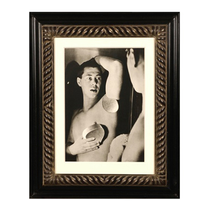
Self portrait 1932 (printed later)
Silver gelatin print
Edition: 28/40
Signed: bayer 32 (in ink on bottom right corner)
Provenance: Kennedy Gallery, New York
H: 13 7/16” x W: 9 ½”
Framed size: H: 21 ½” x W: 17 ½”
Price: $16,000
Herbert Bayer (1900 – 1985) was an Austrian graphic designer, painter, photographer, and architect. Bayer apprenticed under the artist Georg Schmidthammer in Linz. Leaving the workshop to study at the Darmstadt Artists’ Colony, he became interested in Walter Gropius’s Bauhaus manifesto. After Bayer had studied for four years at the Bauhaus under such teachers as Wassily Kandinsky and László Moholy-Nagy, Gropius appointed Bayer director of printing and advertising. In the spirit of reductive minimalism, Bayer developed a crisp visual style and adopted use of all-lowercase, sans serif typefaces for most Bauhaus publications. Bayer is one of several typographers of the period including Kurt Schwitters and Jan Tschichold who experimented with the creation of a simplified more phonetic-based alphabet. Bayer designed the 1925 geometric sans-serif typeface, universal, now issued in digital form as Architype Bayer that bears comparison with the stylistically related typeface Architype Schwitters.
In 1928, Bayer left the Bauhaus to become art director of Vogue magazine’s Berlin office. He remained in Germany far later than most other progressives. In 1936 he designed a brochure for the Deutschland Ausstellung, an exhibition for tourists in Berlin during the 1936 Olympic Games. In 1938 he left Germany and settled in New York City where he had a long and distinguished career in nearly every aspect of the graphic arts. In 1946 Bayer relocated again. Hired by industrialist and visionary Walter Paepcke, Bayer moved to Aspen, Colorado as Paepcke promoted skiing as a popular sport. Bayer’s architectural work in the town included co-designing the Aspen Institute and restoring the Wheeler Opera House, but his production of promotional posters identified skiing with wit, excitement, and glamour. Bayer would remain associated with Aspen until the mid-1970s. Bayer gave the Denver Art Museum a collection of around 8,000 of his works. In 1959, he designed his “fonetik alfabet”, a phonetic alphabet, for English. It was sans-serif and without capital letters. He had special symbols for the endings -ed, -ory, -ing, and -ion, as well as the digraphs “ch”, “sh”, and “ng”. An underline indicated the doubling of a consonant in traditional orthography.
CARL VAN VECHTEN (1880-1964) USA
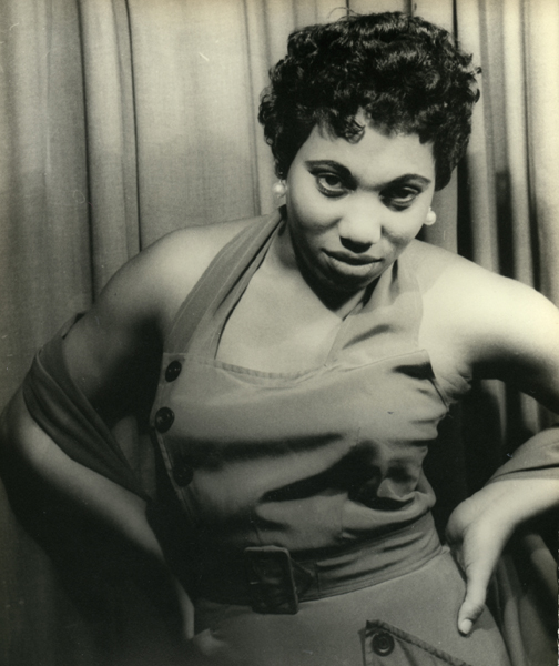
Leontyne Price 1953
Signed: Leontyne Price as Bes, Porgy & Bess, XVII KK 20, May 19, 53 (in ink on back); PHOTOGRAPH BY CARL VAN VECHTEN, 101 CENTRAL PARK WEST, CANNOT BE REPRODUCED WITHOUT PERMISSION (ink stamp on back)
Size: H: 9 5/8” x W: 7 1/8”
