Product Description
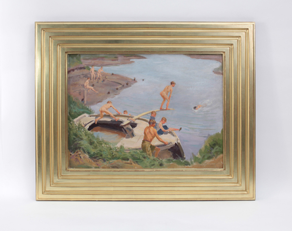
Edmund F. Ward “The Swimming Hole” Oil on canvas c. 1930

EDMUND F. WARD (b. 1892 – 1991) USA
“The Swimming Hole” c. 1930
Oil on canvas
Marks: signed Edm. F. Ward (lower right); partial labels verso:Westchester Arts and Crafts Guild; 4 Edmund F. Ward
For more information on the artist see: Who Was Who in American Art,Peter Hastings Falk, ed. (Madison, Conn.: Sound View Press, 1985), p. 658.
Canvas H: 18” x W: 24”
Framed H: 27 9/16” x W: 33 9/16”
Price: $14,000
Ward studied at the Arts Student’s League with Edward Dufner, George Bridgeman, and Thomas Fogarty. He was an illustrator for several national magazines and books. In 1925, Ward exhibited an award winning work at the Art Institute of Chicago. He is perhaps best known for his WPA mural in the Federal Building, White Plains, New York.
Edmund F. Ward “The Swimming Hole” Oil on canvas c. 1930
HERBERT BAYER (1900-1985) Austria
Self portrait 1932 (printed later)
Silver gelatin print
Edition: 28/40
Signed: bayer 32 (in ink on bottom right corner)
Provenance: Kennedy Gallery, New York
H: 13 7/16” x W: 9 ½”
Framed size: H: 21 ½” x W: 17 ½”
Price: $16,000
Herbert Bayer (1900 – 1985) was an Austrian graphic designer, painter, photographer, and architect. Bayer apprenticed under the artist Georg Schmidthammer in Linz. Leaving the workshop to study at the Darmstadt Artists’ Colony, he became interested in Walter Gropius’s Bauhaus manifesto. After Bayer had studied for four years at the Bauhaus under such teachers as Wassily Kandinsky and László Moholy-Nagy, Gropius appointed Bayer director of printing and advertising. In the spirit of reductive minimalism, Bayer developed a crisp visual style and adopted use of all-lowercase, sans serif typefaces for most Bauhaus publications. Bayer is one of several typographers of the period including Kurt Schwitters and Jan Tschichold who experimented with the creation of a simplified more phonetic-based alphabet. Bayer designed the 1925 geometric sans-serif typeface, universal, now issued in digital form as Architype Bayer that bears comparison with the stylistically related typeface Architype Schwitters.
In 1928, Bayer left the Bauhaus to become art director of Vogue magazine’s Berlin office. He remained in Germany far later than most other progressives. In 1936 he designed a brochure for the Deutschland Ausstellung, an exhibition for tourists in Berlin during the 1936 Olympic Games. In 1938 he left Germany and settled in New York City where he had a long and distinguished career in nearly every aspect of the graphic arts. In 1946 Bayer relocated again. Hired by industrialist and visionary Walter Paepcke, Bayer moved to Aspen, Colorado as Paepcke promoted skiing as a popular sport. Bayer’s architectural work in the town included co-designing the Aspen Institute and restoring the Wheeler Opera House, but his production of promotional posters identified skiing with wit, excitement, and glamour. Bayer would remain associated with Aspen until the mid-1970s. Bayer gave the Denver Art Museum a collection of around 8,000 of his works. In 1959, he designed his “fonetik alfabet”, a phonetic alphabet, for English. It was sans-serif and without capital letters. He had special symbols for the endings -ed, -ory, -ing, and -ion, as well as the digraphs “ch”, “sh”, and “ng”. An underline indicated the doubling of a consonant in traditional orthography.
KARL BENJAMIN (1925-2012) USA
Geometricized figure 1954
Oil on canvas
Signed: Benjamin 54 (lower left)
For more information see: Dictionnaire des Peintres, Sculpteurs, Dessinateurs et Graveurs, Vol. 1 to 10, E. Bénézit (Paris: Librairie Gründ, 1976).
Canvas: H: 17″ x W: 6″
Framed: H: 24 1/2″ x W: 13 1/2″
Karl Benjamin was born in Chicago, IL in 1925. He received his BA from the University of Redlands, CA and his MFA at Claremont Graduate School, CA. Benjamin belonged to the Hard Edge group of West Coast painters led by John McLaughlin during the 1950s, 60s and early 70s. He was awarded the National Endowment for the Arts Grant for Visual Arts in both 1983 and 1989. His work has been featured in numerous museum exhibitions and is included in the public collections of the Los Angeles County Museum of Art; Museum of Contemporary Art, Los Angeles; Museum of Modern Art, Israel; Oakland Museum, Oakland, CA; San Francisco Museum of Modern Art, CA; Seattle Art Museum, WA; and the Whitney Museum of American Art, NY, among others. For many years, Benjamin taught painting at Pomona College and Claremont Graduate School, and currently is Professor Emeritus. He lived in Claremont, CA.
ROSE CABAT (1914-2015) USA
“Feelie” c. 1980-85
Thin walled porcelain vessel with a silky satiny matte drip glaze
Signed: incised CABAT on bottom
For more information on Rose Cabat see: Rose Erni Cabat Retrospective 1936-1986 (Tuscon, AZ: Tuscon Museum of Art, 1986)
H: 4 3/4″
Price: $2,500
Rose Cabat is an American studio ceramicist living in Tucson. Considered one of the most important ceramic artists of the Mid-century Modernist movement, Cabat is best known for her innovative glazes on small porcelain pots called “feelies” which she developed in the 1960s. Her organic forms often resemble the shape of onions and figs, and her glazes range from organic to jewel tones. Cabat was born in 1914 in the Bronx, New York, began to work in ceramics in the late 1930′s, and moved to Arizona in 1942, where she continued to make innovative ceramics.
Feelies:
Feelies are described as onion, fig, cucumber, and saucer-shaped ceramic vases terminating in an upward closed neck. Bruce Block, an avid collector, has described them as sensual and tactile with a very specific unforgettable texture, spiritual seeming to contain a type of energy. Rose Cabat had developed a silky satiny glaze, and it wasn’t until around 1960 that she had hit upon the first of the appropriate form, svelte and sleek to match the glaze. She exclaimed, “Now this one’s a feelie.”, coining the term. Upon developing the new glazes, she felt that she needed new forms to apply the glazes to, different from what she made before, “craft fair” style coiled heads and wind bells. She is quoted as saying, “The old things did not look good … I wanted simpler shapes that went with the glazes.”They are typically globular in shape, tightening down to a minuscule neck glazed to a satin surface. The tactile experience is most important. The nature of the neck is such that it is closed, so narrow that it cannot hold anything. Cabat would reply when asked why the necks of her feelies are so narrow, “A vase can hold weeds or flowers, but can’t it just be a spot of beauty?”