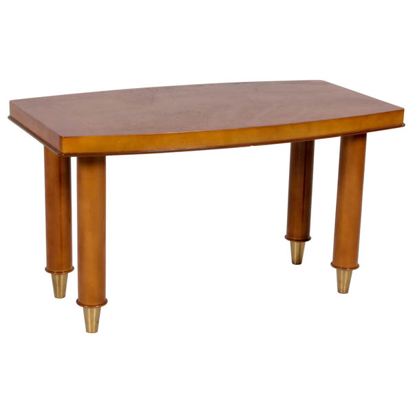
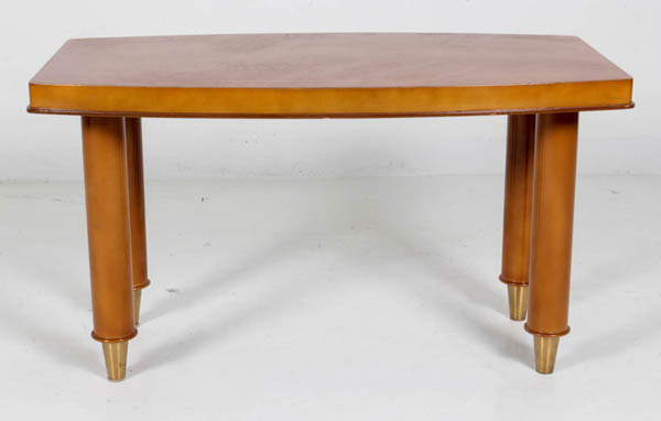
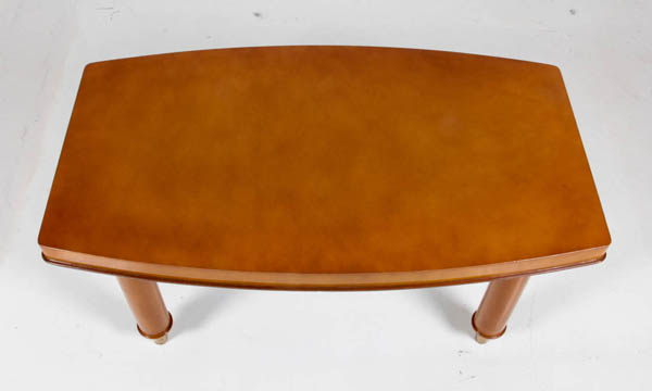
Signed: B. SPADE, DECORATEUR, PARIS (metal plaque)
H: 17 5/8″ x W: 31 5/8″ x D: 18″
After WWI, Marseilles-native Batistin Spade started a workshop for cabinetry and textile design. During the years between the wars he gained recognition for his refined and sumptuous furniture and interiors. The designer worked on some 30 ocean liners, including the Île de France (1926) and the Normandie (1935). In the early 40s, Mobilier National chose Spade to create office interiors for numerous ambassadors and government officials.
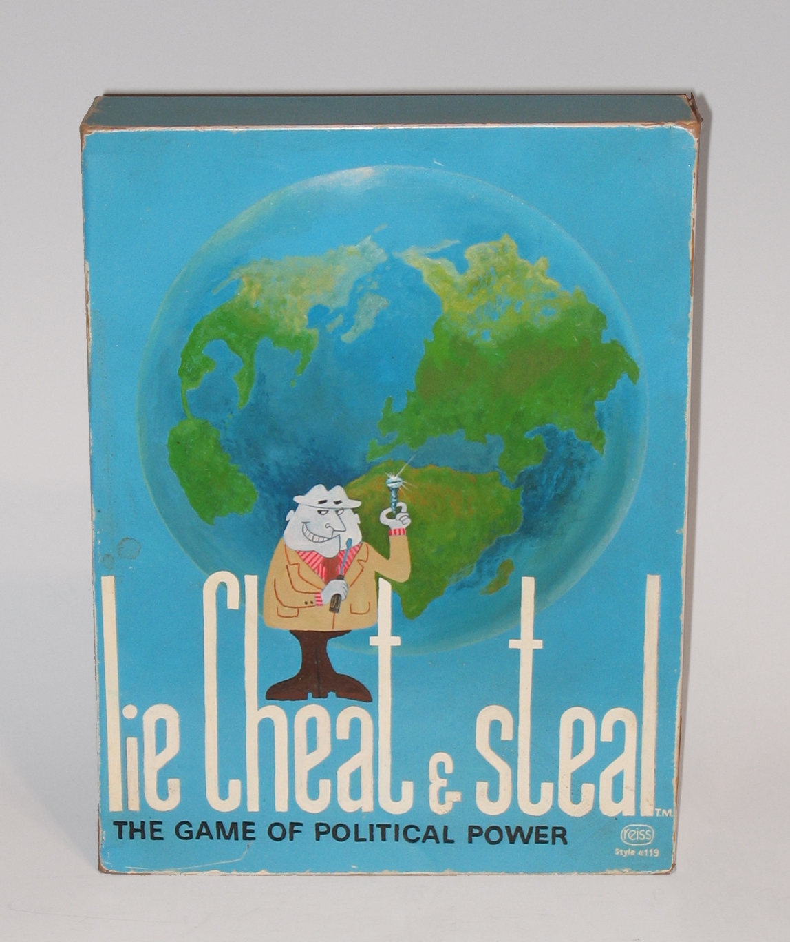
Tim Liddy, Lie Cheat and Steal (1971) The Game of Political Power Oil and enamel on copper, plywood back 2006
TIM LIDDY (b. 1963) Missouri
“Lie Cheat and Steal” (1971) The Game of Political Power 2006
Oil and enamel on copper, plywood back
Signed in script: Tim Liddy “circa 1971” 2006, red circular ring
Provenance: William Shearburn Gallery (St. Louis, MO)
H: 12” x W: 9” x D: 2”
With his recent paintings, Liddy has both reasserted the construct of hyperrealist painting and developed a thoroughly unique advancement of that mode by extending the cultural reality of the indexed original. Based on the illustrated box lids of vintage board games, Liddy has recontextualized a subject, which evokes the underlying rules of life. Painted on copper or steel in the precise dimensions of the original, the metal is then manipulated to demonstrate the exact rips and tears from years of usage and includes trompe-l’oeil renditions of the scotch tape that might be holding the cardboard box together, the assorted stains, or the various graffiti of time. Liddy leaves no possibility of ambivalence, these works speak to a concurrent understanding of their original object identity and to themselves as works of art engaged in historical and psychological dialogue.
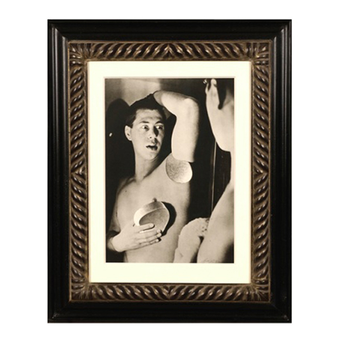
Herbert Bayer, Self Portrait, Gelatin silver print , 1932, printed later
HERBERT BAYER (1900-1985) Austria
Self portrait 1932 (printed later)
Silver gelatin print
Edition: 28/40
Signed: bayer 32 (in ink on bottom right corner)
Provenance: Kennedy Gallery, New York
H: 13 7/16” x W: 9 ½”
Framed size: H: 21 ½” x W: 17 ½”
Price: $16,000
Herbert Bayer (1900 – 1985) was an Austrian graphic designer, painter, photographer, and architect. Bayer apprenticed under the artist Georg Schmidthammer in Linz. Leaving the workshop to study at the Darmstadt Artists’ Colony, he became interested in Walter Gropius’s Bauhaus manifesto. After Bayer had studied for four years at the Bauhaus under such teachers as Wassily Kandinsky and László Moholy-Nagy, Gropius appointed Bayer director of printing and advertising. In the spirit of reductive minimalism, Bayer developed a crisp visual style and adopted use of all-lowercase, sans serif typefaces for most Bauhaus publications. Bayer is one of several typographers of the period including Kurt Schwitters and Jan Tschichold who experimented with the creation of a simplified more phonetic-based alphabet. Bayer designed the 1925 geometric sans-serif typeface, universal, now issued in digital form as Architype Bayer that bears comparison with the stylistically related typeface Architype Schwitters.
In 1928, Bayer left the Bauhaus to become art director of Vogue magazine’s Berlin office. He remained in Germany far later than most other progressives. In 1936 he designed a brochure for the Deutschland Ausstellung, an exhibition for tourists in Berlin during the 1936 Olympic Games. In 1938 he left Germany and settled in New York City where he had a long and distinguished career in nearly every aspect of the graphic arts. In 1946 Bayer relocated again. Hired by industrialist and visionary Walter Paepcke, Bayer moved to Aspen, Colorado as Paepcke promoted skiing as a popular sport. Bayer’s architectural work in the town included co-designing the Aspen Institute and restoring the Wheeler Opera House, but his production of promotional posters identified skiing with wit, excitement, and glamour. Bayer would remain associated with Aspen until the mid-1970s. Bayer gave the Denver Art Museum a collection of around 8,000 of his works. In 1959, he designed his “fonetik alfabet”, a phonetic alphabet, for English. It was sans-serif and without capital letters. He had special symbols for the endings -ed, -ory, -ing, and -ion, as well as the digraphs “ch”, “sh”, and “ng”. An underline indicated the doubling of a consonant in traditional orthography.
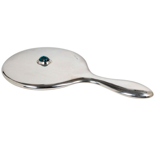
Archibald Knox / Liberty & Co. Sterling hand mirror 1908
ARCHIBALD KNOX (1864-1933) UK
LIBERTY & CO. London, UK
Hand mirror 1908
Sterling with large matrix cabochon turquoise
Marks: L & Co. cipher, Birmingham assay marks for 1908
Similar works with turquoise Illustrated: Archibald Knox, ed. by Stephen A. Martin (London: Academy Editions, 1995) ; Liberty Design 1874-1914, Barbara Morris (London: Pyramid Books, 1989) p. ; The Designs of Archibald Knox for Liberty & Co., A.J. Tilbrook (London: Ornament Press Ltd., 1976)
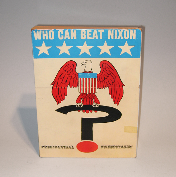
Tim Liddy Who Can Beat Nixon (1970) Presidential Sweepstakes 2006 Oil and enamel on copper, plywood back
TIM LIDDY
“Who Can Beat Nixon” (1970) Presidential Sweepstakes 2006
Oil and enamel on copper, plywood back
Signed in script: Tim Liddy “circa 1970” 2006, red circular ring
Provenance: William Shearburn Gallery (St. Louis, MO)
H: 11 ¾” x W: 9” x D: 2”
With his recent paintings, Liddy has both reasserted the construct of hyperrealist painting and developed a thoroughly unique advancement of that mode by extending the cultural reality of the indexed original. Based on the illustrated box lids of vintage board games, Liddy has recontextualized a subject, which evokes the underlying rules of life. Painted on copper or steel in the precise dimensions of the original, the metal is then manipulated to demonstrate the exact rips and tears from years of usage and includes trompe-l’oeil renditions of the scotch tape that might be holding the cardboard box together, the assorted stains, or the various graffiti of time. Liddy leaves no possibility of ambivalence, these works speak to a concurrent understanding of their original object identity and to themselves as works of art engaged in historical and psychological dialogue.