Product Description
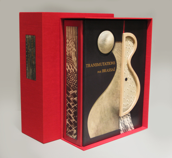
Brassai, “Transmutations 1934-35” 1967

BRASSAÏ (1899-1984) Austria-Hungary
“Transmutations 1934-35” 1967
Published by Lacoste: Galerie Les Contards, France.
12 gelatin silver prints each flush-mounted to a presentation folder with printed sequential number and title, with colophon contained in a linen covered, velvet lined clamshell folio with gilt lettering on the spine.
Signed and numbered 32 in ink on the colophon. This work is from an edition of 100. The titles include: I. Femme-fruit; II. Sevillane denudee; III. Odalisque; IV. Femme-mandoline; V. Femme-amphore; VI. Fille de Joie se Deshabillant; VII. Visage mineral; VIII. Tentation de Saint Antoine; IX. Jeune fille revant; X. Offrande; XI. Femme aux voiles; XII. Fete foraine.
Dimensions:
Book: H: 15 ½” x W: 12” x D: 1 ½”
Custom leather box: H: 17 ¾” x W: 13 ½” x D: 4 ½”
Custom silk slipcase: H: 18 ¾” x W: 14 ¼” x D: 6”
Brassai, “Transmutations 1934-35” 1967
Brassaï (1899-1984) Austria-Hungary [now Romania]
Paul Morand (1888-1976) France
“Paris de Nuit” (Paris After Dark) 1933
Published by Arts et métiers graphiques, Paris
Dimensions:
Book: H: 9 13/16” x W: 7 9/16”
Custom leather box: H: 10 5/8” x W: 8 5/8” x D: 1 3/8”
Custom silk slipcase: H: 11 21/32” x W: 9 5/8” x D: 2 7/16”
Brassaï is the pseudonym of Guyla Halász from Transylvania (Hungarian at the time of his birth, but currently part of Romania). Brassaï literally means: from Brasso (his native village). He decided to use this pseudonym in 1932, the year in which Paris de nuit was published. He had already been living in Paris for eight years, where he wrote articles for German magazines and met photographers such as Atget and André Kertész. Not until 1930 did he first begin to take photographs himself, immediately discovering his main subject: Paris.
He moved into an apartment on the corner of the Rue de la Glacière and the Boulevard Auguste-Blanqui in 1928, where Raymond Queneau also lived. He would go out at night with Queneau or other nocturnal people such as Léon-Paul Fargue, but Brassaï usually just walked through the abandoned streets and alleys of the city. He could only take 24 photographs per walk because the stack of glass photo plates would otherwise grow too heavy.
His nocturnal journeys yielded a wealth of photographs, which by now have gained the status of icons of modern photography. They were first published on 2 December 1932 by Arts et metiers graphiques, which was Charles Peignot’s publishing business. He was also the founder of the magazine Arts et metiers graphiques (1927-1939) in which articles on design, typography, illustration and advertising appeared. It was printed in an edition of 4000 copies: there were also printers associated with the editing staff, like Léon Pichon. Peignot was the president of type foundry Deberny et Peignot, and were in contact with the Union des Artistes Modernes (Cocteau, Gide, Sonia Delaunay, Maximilien Vox and others) and with poster designers such as Cassandre.
The first review of Paris de nuit was published in a Dutch newspaper, the Nieuwe Rotterdamsche Courant of 29 December 1932. An English edition of the photo book appeared in 1933 from Batsford Gallery in London. The photographs were also exhibited. Many photo books were to follow, including a book in 1960 about the graffiti on Parisian walls, which he had documented in his photographs since 1930. Not without reason did Henry Miller call him ‘the eye of Paris’. Jean Paulhan actually asserted that Brassaï had more than two eyes.
ARCHIBALD KNOX (1864-1933) UK
LIBERTY & CO. London
Extremely rare and important grand clock by Archibald Knox for Liberty & Co. This is the largest of all of the Tudric models designed and is inset with abalone shell on the sides, the front corners and on the hands of the clock.
Marks: TUDRIC, 098
Illustrated: The Designs of Archibald Knox for Liberty & Co., A..J. Tilbrook (London: Ornament Press Ltd., 1976) pg. 88; The Liberty Style, (Japan: Hida Takayama Museum of Arts, 1999) fig. 168, p 114; Archibald Knox, ed. by Stephen A. Martin (London: Academy Editions, 1995) p. 88.
H: 15″ x W: 7″ x D: 5″
***This is the largest clock designed by Archibald Knox for
Liberty & Co. and one of only three models known.
ART OF THE SIXTIES
“Die Kunst der sechziger Jahre im Wallraf – Richarts Museum Köln” 1969
Published by Gert von der Osten und Horst Keller.
Designed by Wolf Vostell.
First edition.
Dimensions:
Book: H: 12” x W: 10”
Custom leather box: H: 14” x W: 11 1/2” x D: 3 1/2”
Custom linen slipcase: H: 15” x W: 12 1/8” x D: 4”
This famous and striking exhibition catalogue is a work of art. Wolf Vostell designed the catalogue for the Ludwig collection of contemporary art, given as a permanent loan to the Wallraf-Richartz Museum in Cologne. The work of 92 artists is represented, including objects by Dine, Dubuffet, Hockney, Jasper Johns, Lichtenstein, Oldenburg, Picasso, Rauschenberg, Vostell, Warhol, and Wols.
ANDRE LANSKOY (1902-1976) France
MAURICE BEAUFUME
PIERRE LECUIRE
“Cortege” 1959
64pp, 25 illustrations by Andre Lanskoy and Maurice Beaufume
Cortège is now often compared to “Jazz” as perhaps the finest example of
pochoir in the postwar period. Printed on Arches Vellum paper.
Dimensions:
Book: H: 18” x W: 13 3/8” x D: 1 7/8”
Custom leather box 2008: H: 20 ¼” x W: 15” x D: 4 ½”
Custom silk slipcase: H: 21 ½” x W: 15 5/8” x D: 5 3/8”
The artworks of André Lanskoy (1902-1976) are more than abstractions—they are juxtapositions of shapes, assemblages of colors and studies that explore the interfacing of language with visual imagery. A pioneer of Tachism, an artistic movement of the 1940s and 1950s also known as Art Informel or Lyrical Abstraction, Lanskoy emphasized the spontaneous in his paintings, combining surges of pure color with more subtle modulations. His efforts to translate language into abstract visual messages are most evident in two of his bold projects: a rare screen-printed textile and his vivid collages for Pierre Lecuire’s book, Cortège.
Born in Moscow, Lanskoy spent his youth in Russia; in 1921, he moved to Paris and studied at the Académie de la Grande-Chaumière. His first non-figurative works were painted in 1937, with his first Parisian exhibition of abstractions in 1944. As a painter, Lanskoy gave primacy to color, and this holds true for his textile design, Egypte. In 1946, French industrialist Jean Bauret invited several Tachist artists—including Serge Poliakoff, André Beaudin and Henri Michaux—to experiment with designs for furnishing textiles. One of Lanskoy’s contributions to this series was an expressive interpretation of the complex pictorial characters of ancient Egyptian hieroglyphics. The relationship between the Egyptian writing system and his own glyphs is mainly conceptual: the symbols Lanskoy invented have no inherent meaning, yet their careful placement suggests a text that is meant to be read. Contrasting with the neutral ground, the centered, vertical column is a grid of rectangular cells containing six repeating compilations of mysterious, hieroglyphic-inspired shapes. These cartouche-like compartments are bordered on each side by narrow strips of color blocks with voided linear abstractions. The intense purple and teal hues and vibrant reds and yellow are typical of Lanskoy’s exaltation of color.
Working within the theme of synthesizing language, color and form, Lanskoy tried his hand at an exciting tradition: the livre d’artiste. His first project was a collaboration with poet Pierre Lecuire; their masterpiece Cortège, arguably one of the finest artist-books ever produced, is a dazzling symbiosis of literary and visual material. Lecuire first met Lanskoy in 1948; ten years later, he would enlist his friend to illustrate the long prose poem. At Lecuire’s suggestion, Lanskoy created a series of twenty-four compositions for the book in the papiers collés method; his challenge was to interpret Lecuire’s writing into bold, graphic statements. The author’s opening lines set the tone for Lanskoy’s luminous color harmonies: “This book is a cortège. It has its colors, action and animation. It blazes, it proclaims one knows not which passion, which justice; it flows like the course of a navigation….” As he achieved with Egypte, the vibrant, saturated tints of the abstractions on these particular plates create a language of their own, while the lively arrangement of crisp and jagged forms shows an affinity with the rhythmic cadence of communication.
Remarkable for their dense bursts of color and unfamiliar shapes, the series of collages was masterfully executed in pochoir by colorist Maurice Beaufumé under Lanskoy’s personal direction. The bold, oversized text was printed by Marthe Fequet and Pierre Baudier, and Cortège was released in Paris, December 1959