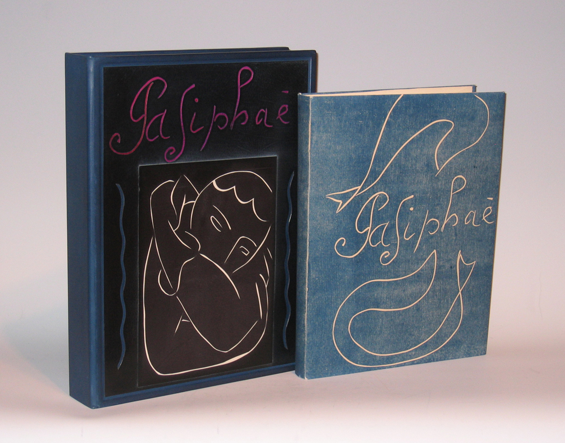
HENRI MATISSE (1869-1954) France
“Pasiphae” 1944
Limited edition No. 48/250.
Published by Martin Fabiani, Paris.
Dimensions:
Book: H: 13 3/16” x W: 10 3/8”
Custom leather box: H: 15 1/4” x W: 11 11/16” x D: 2 5/8”
Custom cloth slipcase: H: 16 1/8” x W: 12 3/16” x D: 3”
Signed by Matisse on the justification page.
Matisse’s Pasiphae is a singularly thrilling work and the plates were destroyed after the printing of this edition.
“A Contemporary retelling of the story of Parisphae and the Minoan bull was the impetus for one of Matisse’s most intensive printmaking experiences. Working with linoleum, a fairly easy material to use, Matisse cut many blocks of each image to achieve the perfect flow of line and relationship of forms. Intent on matching the spirit and ambience of the classical tale, Matisse took as his model ancient Greek playground vase painting”.
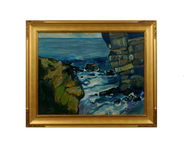
Peter Canty received his BA in art from the Chouniard Art Institute, Los Angeles (now California Institute of the Arts) and an MA from the University of California, Santa Cruz in 1969. Heavily influenced by the Post-Impressionist masters Van Gogh, Gauguin and Cezanne, in his own he words he describes his interest in landscapes, believing they are, “the best vehicle for motion, force, and color dynamics.” Although his work reference realistic subjects, Canty’s imagery is drawn strictly from his own imagination.
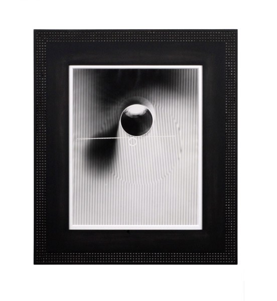
György Kepes, Abstraction, Gelatin silver print, 1942
GYÖRGY KEPES (1906-2001) Hungary/USA
Abstraction 1942
Silver gelatin print
Signed: 9 (in a circle, on back); Gyorgy Kepes 1942 (in ink on back)
György Kepes was a Hungarian-born painter, designer, educator and art theorist. After emigrating to the U.S. in 1937, he taught design at the New Bauhaus (later the School of Design, then Institute of Design, then Illinois Institute of Design or IIT) in Chicago. In 1947 He founded the Center for Advanced Visual Studies at the Massachusetts Institute of Technology (MIT) where he taught until his retirement in 1974.