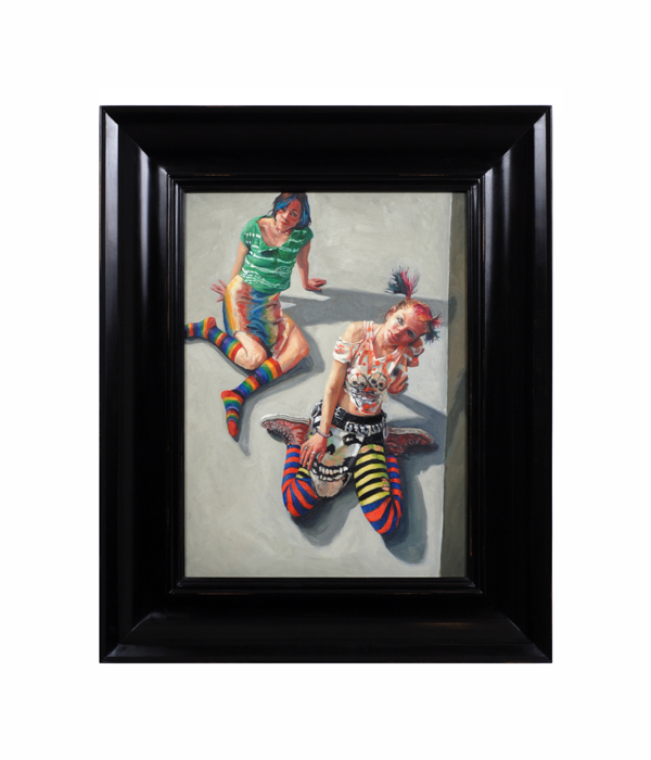
Jack Richard Smith "10003" Blackoil, wax, lead salts on copper 2006
More Information
Jack Richard Smith “10003” Blackoil, wax, lead salts on copper 2006
JACK SMITH (1950-) Taos, NM
“10003” 2006
Blackoil, wax, lead salts on copper, ebonized wood frame
For more information on Jack Smith see: “Taos Portraits” by Jack Smith, May 14th – August 15th, 2004, exhibition catalogue (Taos, NM: Harwood Museum of Art, University of New Mexico)
Canvas: H: 18” x W: 13 3/16”
Framed: H: 25 1/4” x W: 20 7/16”
Jack Smith was born in 1950. At age 16, he began his training at the Interlochen Arts Academy in Michigan before moving to Ohio to attend Columbus College of Art and Design. He also studied for a brief time at the Instituto de Allende, at San Miguel de Allende, GTO, Mexico. He now resides in New Mexico. Reflecting a profound knowledge of art history and and an alchemist’s sense of the painting craft, contemporary painter Jack Smith has forged his own place amongst the most powerful of contemporary portraitists working in America. Incorporating blackoil, wax, lead salts, and copper Smith’s small format portraits and paintings are detailed and intimate depictions of creative individuals and charged tableaux. Smith’s singular style of portraits glow with a warm inner light and present honest, straightforward images that speak of personal narratives.Jack Smith recently received a prestigious Past Achievement Award from the Peter and Madeleine Martin Foundation for the Creative Arts, following an important solo exhibition titled, Jack Smith: The Taos Portraits at the Harwood Museum of Art at the University of New Mexico in 2004. The exhibition featured fifty portraits of Taos, New Mexico residents, executed between 2000 and 2003. The series was intended as a visual biography of this unique artistic community at the turn of the century. Smith’s subjects range from the famous to the infamous – including artists, writers, art patrons, Native peoples, and street peoples.
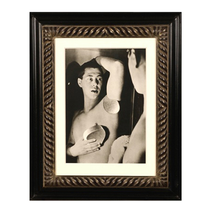
Herbert Bayer, Self Portrait, Gelatin silver print , 1932, printed later
HERBERT BAYER (1900-1985) Austria
Self portrait 1932 (printed later)
Silver gelatin print
Edition: 28/40
Signed: bayer 32 (in ink on bottom right corner)
Provenance: Kennedy Gallery, New York
H: 13 7/16” x W: 9 ½”
Framed size: H: 21 ½” x W: 17 ½”
Price: $16,000
Herbert Bayer (1900 – 1985) was an Austrian graphic designer, painter, photographer, and architect. Bayer apprenticed under the artist Georg Schmidthammer in Linz. Leaving the workshop to study at the Darmstadt Artists’ Colony, he became interested in Walter Gropius’s Bauhaus manifesto. After Bayer had studied for four years at the Bauhaus under such teachers as Wassily Kandinsky and László Moholy-Nagy, Gropius appointed Bayer director of printing and advertising. In the spirit of reductive minimalism, Bayer developed a crisp visual style and adopted use of all-lowercase, sans serif typefaces for most Bauhaus publications. Bayer is one of several typographers of the period including Kurt Schwitters and Jan Tschichold who experimented with the creation of a simplified more phonetic-based alphabet. Bayer designed the 1925 geometric sans-serif typeface, universal, now issued in digital form as Architype Bayer that bears comparison with the stylistically related typeface Architype Schwitters.
In 1928, Bayer left the Bauhaus to become art director of Vogue magazine’s Berlin office. He remained in Germany far later than most other progressives. In 1936 he designed a brochure for the Deutschland Ausstellung, an exhibition for tourists in Berlin during the 1936 Olympic Games. In 1938 he left Germany and settled in New York City where he had a long and distinguished career in nearly every aspect of the graphic arts. In 1946 Bayer relocated again. Hired by industrialist and visionary Walter Paepcke, Bayer moved to Aspen, Colorado as Paepcke promoted skiing as a popular sport. Bayer’s architectural work in the town included co-designing the Aspen Institute and restoring the Wheeler Opera House, but his production of promotional posters identified skiing with wit, excitement, and glamour. Bayer would remain associated with Aspen until the mid-1970s. Bayer gave the Denver Art Museum a collection of around 8,000 of his works. In 1959, he designed his “fonetik alfabet”, a phonetic alphabet, for English. It was sans-serif and without capital letters. He had special symbols for the endings -ed, -ory, -ing, and -ion, as well as the digraphs “ch”, “sh”, and “ng”. An underline indicated the doubling of a consonant in traditional orthography.