Product Description
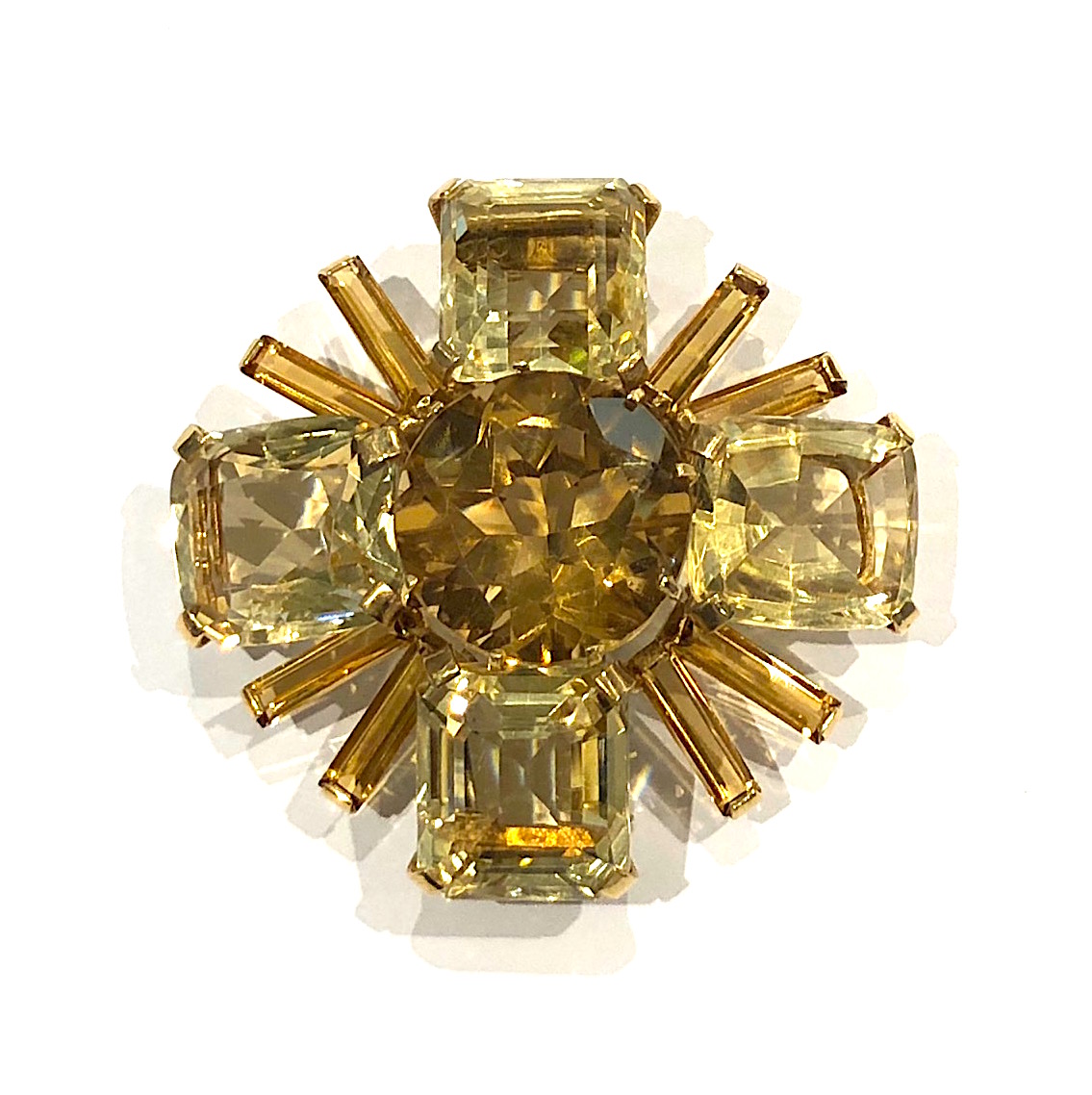
Seaman Schepps, New York “Maltese Cross” brooch, one large round cut central citrine set with four square step-cut citrines, four baguette citrines in a radiating pattern all set in 14K yellow gold, signed, c. 1940’s

An immigrant’s son, who grew up in the tenements of New York’s Lower East Side, Seaman Schepps rose to prominence in the 1930s with jewelry designs that challenged the status quo and defined a new style for the American woman. With his chunky brooches, “barbaric” bracelets and “bubble” earrings, Schepps pioneered a unique style of jewelry whose sense of splendor offered a new perspective to the world of fine jewelry.
Witty, over-the-top and flattering, Schepps’ jewelry embodied style and originality and was featured on the covers of Vogue, Harper’s Bazaar, Look and other magazines. It appealed to a myriad of clients from Katherine Hepburn to Andy Warhol to the Duchess of Windsor and greatly influenced his contemporaries. Today, some 50 years after his death, he continues to inspire modern jewelers.
Through the 1930s, and into the 40s and 50s, new clients flocked to him at his store on Madison Avenue. Often clients wanted a one-of-a-kind bauble and commissioned Schepps to incorporate their old jewelry into a fresh new design. Frequently this led to landmark decisions that helped distinguish Schepps as an extraordinary talent. His client list included Coco Chanel, Elsa Schiaparelli, the Duchess of Windsor, and members of the Du Pont, Mellon and Rockefeller families. By serving these most powerful and influential individuals, Schepps became known as “America’s Court Jeweler”.
Seaman Schepps, New York “Maltese Cross” brooch, one large round cut central citrine set with four square step-cut citrines, four baguette citrines in a radiating pattern all set in 14K yellow gold, signed, c. 1940’s
HERBERT BAYER (1900-1985) Austria
Self portrait 1932 (printed later)
Silver gelatin print
Edition: 28/40
Signed: bayer 32 (in ink on bottom right corner)
Provenance: Kennedy Gallery, New York
H: 13 7/16” x W: 9 ½”
Framed size: H: 21 ½” x W: 17 ½”
Price: $16,000
Herbert Bayer (1900 – 1985) was an Austrian graphic designer, painter, photographer, and architect. Bayer apprenticed under the artist Georg Schmidthammer in Linz. Leaving the workshop to study at the Darmstadt Artists’ Colony, he became interested in Walter Gropius’s Bauhaus manifesto. After Bayer had studied for four years at the Bauhaus under such teachers as Wassily Kandinsky and László Moholy-Nagy, Gropius appointed Bayer director of printing and advertising. In the spirit of reductive minimalism, Bayer developed a crisp visual style and adopted use of all-lowercase, sans serif typefaces for most Bauhaus publications. Bayer is one of several typographers of the period including Kurt Schwitters and Jan Tschichold who experimented with the creation of a simplified more phonetic-based alphabet. Bayer designed the 1925 geometric sans-serif typeface, universal, now issued in digital form as Architype Bayer that bears comparison with the stylistically related typeface Architype Schwitters.
In 1928, Bayer left the Bauhaus to become art director of Vogue magazine’s Berlin office. He remained in Germany far later than most other progressives. In 1936 he designed a brochure for the Deutschland Ausstellung, an exhibition for tourists in Berlin during the 1936 Olympic Games. In 1938 he left Germany and settled in New York City where he had a long and distinguished career in nearly every aspect of the graphic arts. In 1946 Bayer relocated again. Hired by industrialist and visionary Walter Paepcke, Bayer moved to Aspen, Colorado as Paepcke promoted skiing as a popular sport. Bayer’s architectural work in the town included co-designing the Aspen Institute and restoring the Wheeler Opera House, but his production of promotional posters identified skiing with wit, excitement, and glamour. Bayer would remain associated with Aspen until the mid-1970s. Bayer gave the Denver Art Museum a collection of around 8,000 of his works. In 1959, he designed his “fonetik alfabet”, a phonetic alphabet, for English. It was sans-serif and without capital letters. He had special symbols for the endings -ed, -ory, -ing, and -ion, as well as the digraphs “ch”, “sh”, and “ng”. An underline indicated the doubling of a consonant in traditional orthography.
ARRIGO VARETTONI DE MOLIN (1902-1985)
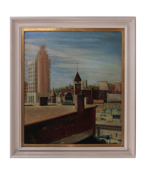
Passaic Rooftops 1932
Oil on canvas
Signed: A V de Molin ’32
Listed: Who’s Who in America, Series II, no. 11 (November 1, 1941) p. 6.
Exhibited: New Jersey State Annual, Montclair Art Museum, 1934
Canvas: H: 39” x W: 35”
TIM LIDDY
“Oy Vey” (1979) The game where you become a JEWISH MOTHER! Get your sons to become doctors—Get your daughters married to doctors! If not, OY VEY! 2008
Oil and enamel on copper, plywood back
Signed in script: Tim Liddy, red circular ring, “circa 1979”, 2008
Provenance: William Shearburn Gallery, St. Louis, MO
H: 10 ¼” x W: 20 ½” x D: 1 ¾”
With his recent paintings, Liddy has both reasserted the construct of hyperrealist painting and developed a thoroughly unique advancement of that mode by extending the cultural reality of the indexed original. Based on the illustrated box lids of vintage board games, Liddy has recontextualized a subject, which evokes the underlying rules of life. Painted on copper or steel in the precise dimensions of the original, the metal is then manipulated to demonstrate the exact rips and tears from years of usage and includes trompe-l’oeil renditions of the scotch tape that might be holding the cardboard box together, the assorted stains, or the various graffiti of time. Liddy leaves no possibility of ambivalence, these works speak to a concurrent understanding of their original object identity and to themselves as works of art engaged in historical and psychological dialogue.