


Product Description
Maison Ostertag Important French Art Deco Jewel Mounted Covered Box c.1925

MAISON OSTERTAG (Place Vendome, Paris) 1920’s and 30’s
ARNOLD OSTERTAG (Jeweler / Designer)
VERGER FRERES (maker)
Art Deco jewel mounted mechanical covered box c. 1925
Of rectangular stepped form, the black enamel box hinged and accented at the top with a gold bezel mounted sugar loaf shaped coral; spring loaded to pull down and reveal a cinnabar red enamel interior, the exterior with gold champlevé set highly stylized geometric initials and further ornamented with geometric square cut out gold applied handles embellished with salmon coral beads and red enamel bands, all resting on a recessed agate base and conforming black onyx base punctuated with a gold bezel mounted sugar loaf shaped coral on each corner.
Marks: Ostertag (on a gold plaque inset into the underside of the onyx base)
H: 4″ x W: 3 1/2″ x D: 3 1/2″
Arnold Ostertag was a Swiss-born jeweler who became a dominant force in the creation of fine jewels and objects in Paris during the 1920s and 30s. After studying dentistry in Chicago, Ostertag embarked on a world tour and, while traveling through India, became fascinated by jewels. He later settled in Paris and opened a very successful salon on the Place Vendome. In design and quality, Ostertag’s jewels, which frequently featured Indian themes, rivaled the production of many of the most famous Parisian jewelry houses. In fact, the renowned clockmaker George Verger/Verger Freres, produced wonderful clocks and mechanical objects for Ostertag, as well as for many other world renowned jewelers and likely masterminded the mechanism of the Art Deco box above. In addition to making pieces for Ostertag, Maison Verger made pieces for Cartier, LaCloche, Marzo, Boucheron, Hermes, Van Cleef & Arpels, Chaumet, Mauboussin, etc. Arnold Ostertag was popular on the international front and made many trips to America spending time in both New York, as well as Los Angeles where he befriended many Hollywood stars. He also received commissions during his trips to make exquisite custom jewelry and precious jeweled objects such as this fine Art Deco box.
Maison Ostertag Important French Art Deco Jewel Mounted Covered Box c.1925
OMAR KHAYYÁM (1048 – 1123) Persia
“Rubáiyát” 1884
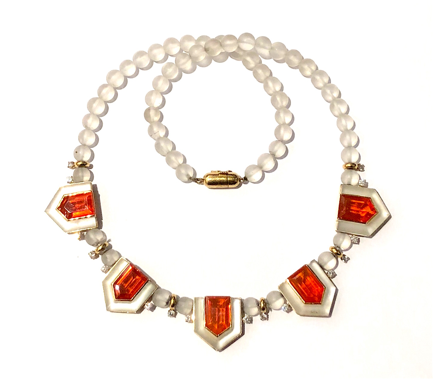
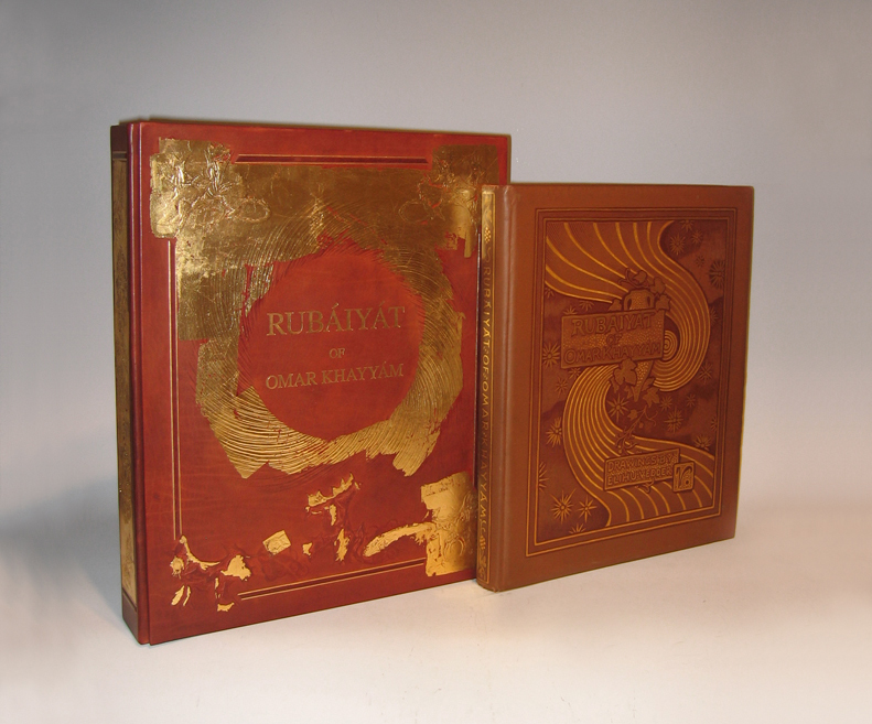
128pp. First edition bound in brown flat-weave cloth over beveled boards; front cover with gilt lettering, dark brown-stamped ruled borders, symbolist design of vase, vine, swirl and stars, rear cover without decoration; spine with gilt lettering and dark brown-stamped ruled borders and ornaments; signed in gilt & dark brown-stamp on front cover. Collection of poems originally written in the Persian language, “Rubáiyát” (derived from the Arabic root word for 4) means “quatrains”: verses of four lines.
Translated by Edward Fitzgerald
54 drawings by Elihu Vedder reproduced by Albertype process on facing pages (printed one side only)
Published by Houghton Mifflin and Company, Boston
Dimensions:
Book: H: 16” x W: 13 ¼” x D: 1 ¾”
Custom leather box 2008: H: 17 15/16” x W: 14 3/4” x D: 2 7/8”
Custom silk slipcase: H: 19 1/8” x W: 15 ½” x D: 4”
From the moment of its publication, Elihu Vedder’s Rubáiyát of Omar Khayyám achieved unparalleled success. The first edition appeared in Boston on 8 November 1884; six days later, it was sold out. Critics rushed to acclaim it as a masterwork of American art, and Vedder (1836-1923) as the master American artist who set the standard for the artist-designed book in America and England.
Written ca. 1120 by Persian poet-philosopher Omar Khayyam (1048-1131), the Rubaiyat is a collection of quatrains, or poems of four lines, intended to prove the futility of mathematics, science, and religion in determining the meaning of life. First translated from Persian to English in 1859 by Edward Fitzgerald, editions of Khayyam’s Rubaiyat have since appeared in numerous forms and languages, thebest-loved, best-known, and most elaborate being the 1884 edition illustrated and designed by Elihu Vedder.
Vedder was one of the first artists of his generation to train in Paris where he developed his signature Academic style and focused on what would become his favored subject: the classically proportioned female nude. In the years 1883 and 1884, he created 54 compositions to accompany the 1884 edition of Khayyam’s Rubaiyat (published by Houghton, Mifflin) – drawings that serve as a harmonious frame for the text. Living in Rome at the time, Vedder also designed the book’s cloth-bound cover, lining papers and eccentric hand-drawn letters. With his Academic and yet “visionary” style, Vedder was the ideal artist to interpret the Rubaiyat; he reconciled the critics who called for accurate depiction of observed reality with those who argued for feeling and emotion over objective form.
Additionally, Vedder arranged the verses to express the three stages of existence explored in the Rubaiyat — happiness and youth; death and darkness; and rebirth — as well as to fit his own romantic interpretation of the verses. Vedder’s drawings for the book combine traditional Christian symbols, classical figures, and mystical imagery of his own invention to evoke the mood of Khayyam’s poems. A prevalent device is his “cosmic swirl,” which, according to Vedder, represented the “gradual concentration of elements that combined to form life; the sudden pause through the reverse of the movement which marks the instant of life; and then the gradual, ever-widening dispersion again of those elements into space.”
Vedder’s edition of Khayyam’s Rubaiyat was an instant success, selling out only six days after its debut in Boston on November 8, 1884. With the Rubaiyat, Vedder set the standard for artist-designed books in America and England. Critics rushed to acclaim it as a masterwork, and Vedder as a major American artist.
The Brandywine River Museum presents decorative drawings and paintings created by a master nineteenth-century American artist in Elihu Vedder and the Rubáiyát of Omar Khayyám, on view from March 15 to May 18, 2008. The exhibition features more than 50 drawings with hand-lettered poems created by Vedder for his illustrated version of Khayyám’s literary work. Exclusively at the Brandywine River Museum, the exhibition also features major paintings by Vedder related to the illustrations for the i>Rubáiyát.
Elihu Vedder’s Rubáiyát was published in Boston in 1884 and its sensuous, decorative drawings so captivated the public that the first edition of the book sold out in six days. Critics rushed to acclaim it as a masterwork of American art, and Vedder as the master American artist. Vedder’s designs for the book-its cover, lining paper, drawings, and hand-drawn letters-are all done in chalk, pastel, pencil, and ink. The drawings set the standard for an artist-designed book in America and England in the 1880s. They are part of the Smithsonian American Art Museum’s permanent collection and were last shown in 1996.
The Rubáiyát was written in 1120 by the Persian mathematician, astronomer, and poet Omar Khayyám (1048-1131). “Rubáiyát” is the plural form of quatrain, or a verse unit of four lines. Since the first English translation was published in 1859, hundreds of editions have been produced. The poem expounds on the transience of existence and the uselessness of science and religion to untangle the knotted meanings of life. Pre-Raphaelite and aesthetic-movement writers immediately embraced the poem as a touchstone of the spiritual and poetic in a time of strident materialism.
As an ardent admirer of the verses, Vedder’s interest in the book went beyond the aesthetic to the personal. The tragic deaths of his sons (in 1872 and 1875) and births of two more children (a daughter in 1873 and a son in 1875) were remarkably explained, it seemed to Vedder, by the poet’s message regarding death, undiscoverable fate, and the renewal of life. He included images of himself and his family in several of the drawings.
The exhibition also features paintings by Vedder, including some that pre-dated the Rubáiyát and provided the basis for illustrations in it. Following the success of the Rubáiyát , Vedder continued to explore its themes and imagery in a number of paintings that he exhibited and sold. Among these are The Cup of Death (1885/1911), The Pleiades (1885), The Fates Gathering in the Stars (1887), and The Cup of Love (1887). The paintings are on loan from museums and private collections.
Elihu Vedder has often been described as an artist of haunting and poetic imagination, who created works of strength, beauty, and fantasy. Born in New York City in 1836, Vedder began painting seriously after visiting Europe in 1856 to study in Paris and Florence. He briefly returned to New York and opened a studio, which failed due to the onset of the Civil War. It was during his years in New York that he produced some of his most imaginative works. He was elected to the National Academy of Design in 1865. Vedder returned to Europe in 1866 and settled in Rome, only occasionally returning to the United States to execute commissions for decorative works, murals, and mosaics. He died in Rome in 1923.

ARAM GESAR USA
Venetian Blinds 1979
Ciba-chrome print, maple frame
Signed: 790069, LXXIX (on back)
Framed size: H: 17 9/16” x W: 23 ½”
Price: $24,000
Aram Gesar has been published internationally and has exhibited his photographic work in New York, San Francisco, Zurich and Geneva since 1977. As a producer, art director and photographer, Gesar created advertising campaigns for major corporations in the U.S. and Europe focusing on the fields of travel, banking, financial services, aerospace and motion pictures. He also created and produced documentaries on travel, aviation and yachting for national cable networks and the home video markets and television commercials and corporate programs for various U.S. and European corporations.
Gesar is currently one of the leading international experts on travel and air transport, and the founder and CEO of The Pyramid Media Group, which includes several magazines, newsletters, web sites, books, eBooks and other publications integrating a spectrum of business, travel and aviation content.
 @hd_jewels