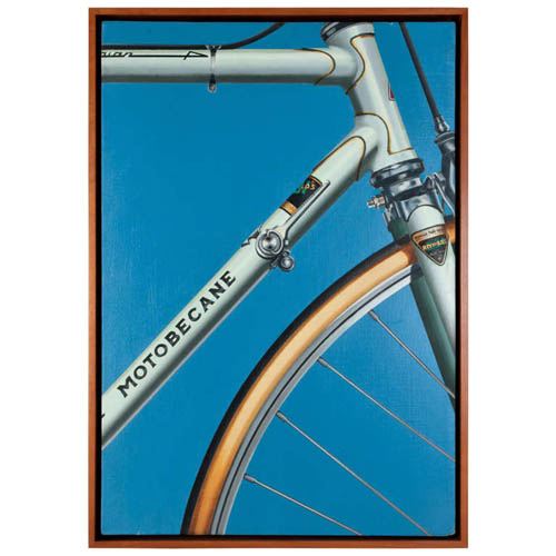
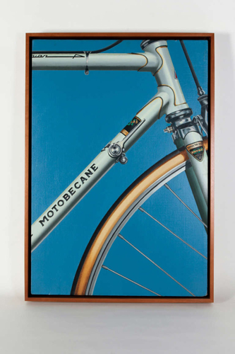
Belgian art dealer Isy Brachot coined the French word Hyperréalisme, meaning Hyperrealism, as the title of a major exhibition and catalogue at his gallery in Brussels in 1973. The exhibition was dominated by such American Photorealists as Ralph Goings, Chuck Close, Don Eddy, Robert Bechtle and Richard McLean; but it included such influential European artists as Gnoli, Richter, Klapheck and Delcol. Since then, Hyperealisme has been used by European artists and dealers to apply to painters influenced by the Photorealists. However, Hyperrealism is contrasted with the literal approach found in traditional photorealist paintings of the late 20th century. Hyperrealist painters and sculptors use photographic images as a reference source from which to create a more definitive and detailed rendering, one that often, unlike Photorealism, is narrative and emotive in its depictions. Strict Photorealist painters tended to imitate photographic images, omitting or abstracting certain finite detail to maintain a consistent over-all pictorial design. They often omitted human emotion, political value, and narrative elements. Since it evolved from Pop Art, the photorealistic style of painting was uniquely tight, precise, and sharply mechanical with an emphasis on mundane, everyday imagery. Hyperrealism, although photographic in essence, often entails a softer, much more complex focus on the subject depicted, presenting it as a living, tangible object. These objects and scenes in Hyperrealism paintings and sculptures are meticulously detailed to create the illusion of a reality not seen in the original photo. That is not to say they’re surreal, as the illusion is a convincing depiction of (simulated) reality. Textures, surfaces, lighting effects, and shadows appear clearer and more distinct than the reference photo or even the actual subject itself.
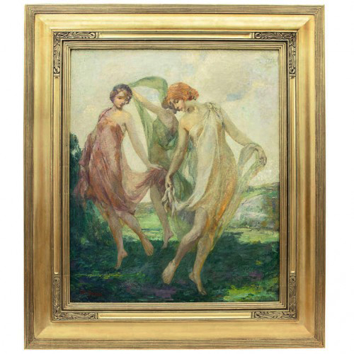
Louis F. Berneker, The Three Graces, Oil on Canvas c. 1910
LOUIS F. BERNEKER (1872-1937) USA
“The Three Graces” c. 1910
Oil on canvas, gilt Arts & Crafts style frame
Signed: Louis F. Berneker (lower left)
For more information see: Who Was Who in American Art
(Madison, Conn.: Sound View Press, 1985) p. 50
Canvas: H: 25 1/8” x W: 30 1/8”
Frame: H: 35 5/8” x W: 40 5/8”
Born in Cincinnati, Ohio, Louis Berneker first began his art training at the St. Louis School of Fine Art. From 1903 to 1904, he studied at the prestigious Académie Julian in Paris under J.P. Laurens. Upon his return to the United States, he lived primarily in New York City and later in Gloucester, Massachusetts, where he died in 1937. An accomplished painter in oils and watercolors, he was a member of the New York Watercolor Club, American Watercolor Society, the National Arts Club, and an associate member of the National Academy of Design. In 1930, the painter won prizes for works exhibited at both the National Academy of Design and Allied Artists of America’s juried shows. Berneker exhibited his work at the Pennsylvania Academy of the Fine Arts from 1910 to 1914 and again in 1921, as well as at the National Academy of Design in 1930 (prize), Art Institute of Chicago, and the Society of Independent Artists. His works are housed in the Church of St. Gregory the Great, New York City; the Belmont Theatre, both in New York City, the Chicago Theatre, and the Dallas Art Academy.
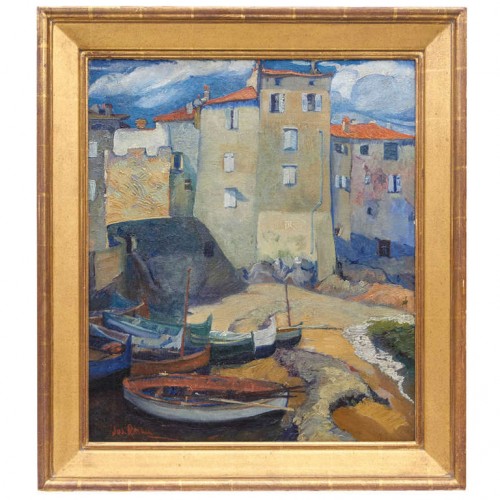
Joseph Raskin, Seaside scene, Oil on Canvas c. 1920 -1925
JOSEPH RASKIN (1897-1981) USA
Seaside scene c. 1920 -1925
Oil on canvas, gold leaf frame
Signed: Jos. Raskin (lower left)
For more information see: Who Was Who in American Art,
(Madison, Conn.: Sound View Press, 1985), p. 505
Canvas: 25 1/4” x 21 1/4”
Frame: 31 1/4” x 26 3/4”
Price: $35,000
Born in Nogaisk, Russia, Joseph Raskin made a name for himself as a painter in New York City, where he was also recognized as an etcher, teacher and writer. He studied at the National Academy of Design and, in 1921, received a fellowship from the Louis Comfort Tiffany Foundation. A member of the American Artists Congress, Raskin’s work was exhibited at the Schervee Gallery (Boston) in 1927, Tricker Gallery in 1939, the Schneider-Gabriel Gallery in 1941, Steinway Hall in 1942, and the American Artists Association in 1945. Raskin’s work may be found in several museum collections including the Carnegie Institute in Pittsburgh, the Pennsylvania Academy of Fine Arts in Philadelphia, the Virginia Museum of Fine Arts in Richmond, and the Corcoran Gallery of Art and National Academy of Design, both in Washington, D.C.
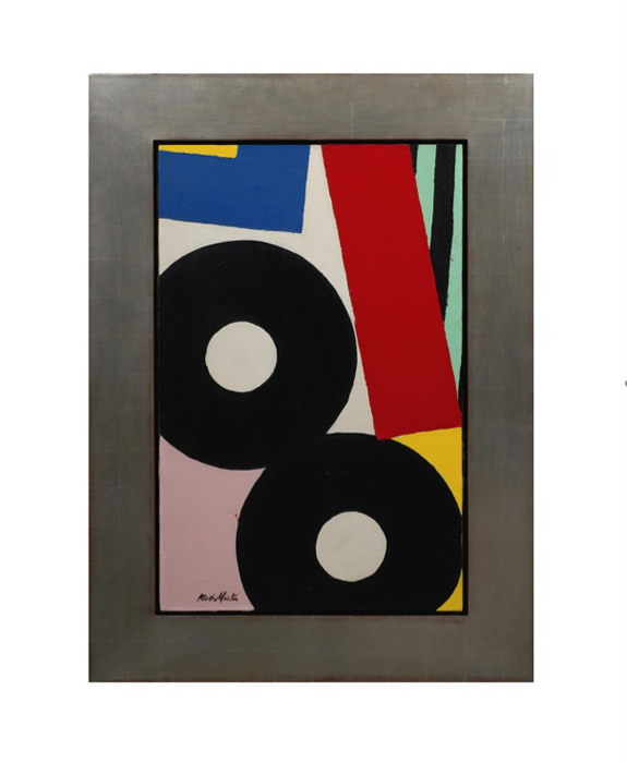
Knox Martin, “Eight”, Magna and oil on canvas 1958
KNOX MARTIN (1923-) USA
Eight 1958
Magna and oil on canvas
Signed: Knox Martin on lower left on front of canvas, Knox M on back of canvas
Marks: From: CORE, 38 Park Row, New York 38, NY, To: Martin, Knox, Eight, 1958, Magna/Oil, 30×40, 700. (paper label), Fischbach Gallery, 799 Madison Avenue, New York 21, Knox Martin, Eight, C.O.R.E., Price $700 (paper label), Mr. Ned L. Pines, 605 Park Ave., New York 21, NY (address label).
Exhibited: Fischbach Gallery, New York 1963; I. Jankowski Gallery, New York, 1975
Provenance: Personal Collection of the artist; Private Collection New York
Canvas: H: 40 1/4” x W: 26 1/4””
Framed: H: 52 3/8” x W: 38 3/8”
From 1957 to about 1964, the spirit of art in New York City was moving in directions for which Abstract Expressionism had not prepared us. By 1965, the strokes, swipes, drips, and splatters of New York painting had given way to cool, laconic representations of the most ordinary of ordinary objects. It was a transformation in artistic culture in which intellectual rewards replaced, or at least supplemented, visual ones, and the whole philosophical face of art was beginning to disclose itself in a particularly vivid way. I saw Knox Martin’s paintings as embodying this transformative moment. In them, I thought, the tension between the two rival philosophies of art could be felt. the way I saw them: they appeared at first glance to be collages, made of large, irregular, overlapping swatches of patterned cloth. Some of the swatches were striped, some appeared to be decorated with circles. It must be conceded that stripes and circles belong to the vocabulary of one kind of abstract art, while the irregular shapes, which felt as though they had been torn from bolts of material, belonged to another.
So one might properly claim that Martin was synthesizing an expressionist abstraction with a geometrical one. For me, however, Knox’s stripes and circles evoked the life of the circus: the striped tents, the loudly patterned costume of clowns. And Martin’s colors—pistachio, raspberry, banana—were festive and impudent. That is why I felt that the paintings referred to vernacular reality, as much so as Campbell Soup cans or Coca Cola bottles. The circus was a recurring theme in modernist art, and I thought it appropriate for late modernist painting to reduce the circus to patterned rags expressive of its raucous gaiety.
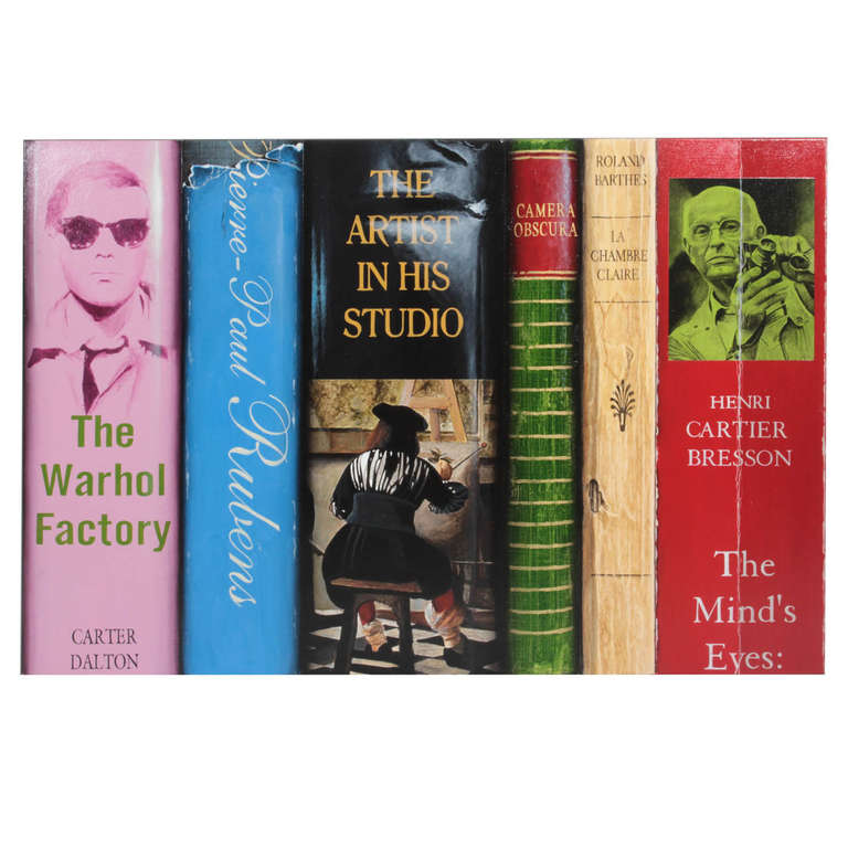
Paul Beliveau “Les humanites CCLXXXIX” Hyperrealist painting 2007
PAUL BELIVEAU (1954-) Québec, Canada
“Les humanites CCLXXXIX” 2007
Acrylic on canvas
Signed and dated: Paul Beliveau 2007 (script signature on the back of canvas)
H: 40” x W: 60”
Born in 1954, Paul Béliveau attained his Bachelor’s degree in Visual Arts from Laval University in 1977. Recognized for his expertise in drawing, engraving and painting he has since then had more than sixty solo exhibitions across Canada and the United States. The recipient of numerous prizes in visual arts and of multiple grants from the Canada Council as well as the Ministère des Affaires Culturelles du Québec has taken part in several commitees and juries as specialist in the visual arts. “By openly integrating into the compositions an iconography from the past and proceeding through citation and retrospection, he reveals the phenomenon of metamorphosis upon which imagination itself is based. In this way he brings to light the very principles of the mechanics of creation. Imagination, which consists as it were in the transfer of a perceptible representation onto an image belonging to another reality, thus sees itself in the presented. Consequently it is not the images themselves but the unique process of creative development which accords Paul Béliveau’s works their originality.” (Dany Quine, L’oeuvre du temps)

 @hd_jewels
Reviews
There are no reviews yet, would you like to submit yours?