Rare Book Collection
Rare Book Collection
-
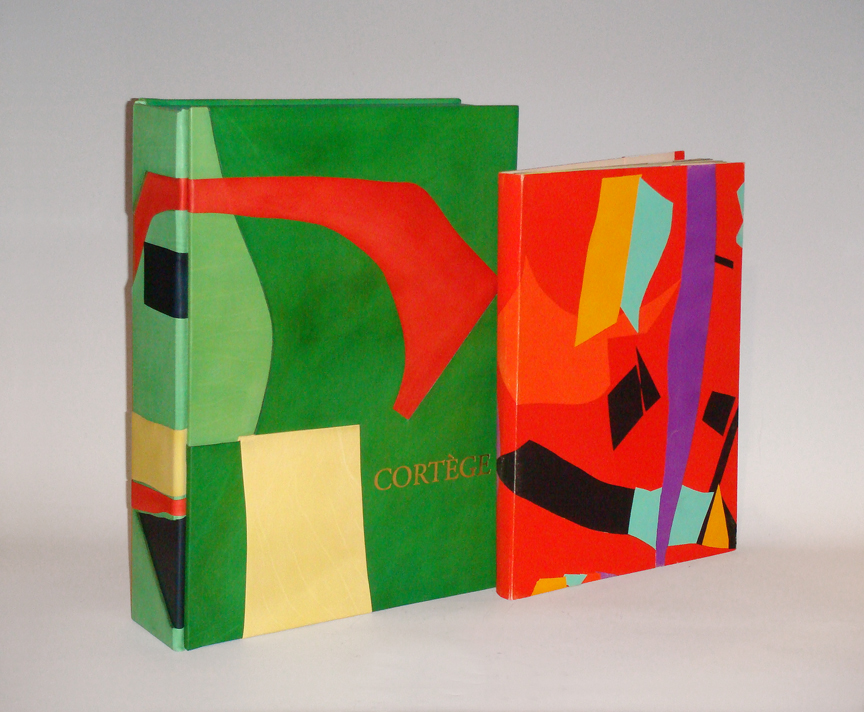
Andre Lanskoy, Maurice Beaufume, Pierre Lecuire, “Cortege” 1959
ANDRE LANSKOY (1902-1976) France
MAURICE BEAUFUME
PIERRE LECUIRE“Cortege” 1959
64pp, 25 illustrations by Andre Lanskoy and Maurice Beaufume
Cortège is now often compared to “Jazz” as perhaps the finest example of
pochoir in the postwar period. Printed on Arches Vellum paper.Dimensions:
Book: H: 18” x W: 13 3/8” x D: 1 7/8”
Custom leather box 2008: H: 20 ¼” x W: 15” x D: 4 ½”
Custom silk slipcase: H: 21 ½” x W: 15 5/8” x D: 5 3/8”The artworks of André Lanskoy (1902-1976) are more than abstractions—they are juxtapositions of shapes, assemblages of colors and studies that explore the interfacing of language with visual imagery. A pioneer of Tachism, an artistic movement of the 1940s and 1950s also known as Art Informel or Lyrical Abstraction, Lanskoy emphasized the spontaneous in his paintings, combining surges of pure color with more subtle modulations. His efforts to translate language into abstract visual messages are most evident in two of his bold projects: a rare screen-printed textile and his vivid collages for Pierre Lecuire’s book, Cortège.
Born in Moscow, Lanskoy spent his youth in Russia; in 1921, he moved to Paris and studied at the Académie de la Grande-Chaumière. His first non-figurative works were painted in 1937, with his first Parisian exhibition of abstractions in 1944. As a painter, Lanskoy gave primacy to color, and this holds true for his textile design, Egypte. In 1946, French industrialist Jean Bauret invited several Tachist artists—including Serge Poliakoff, André Beaudin and Henri Michaux—to experiment with designs for furnishing textiles. One of Lanskoy’s contributions to this series was an expressive interpretation of the complex pictorial characters of ancient Egyptian hieroglyphics. The relationship between the Egyptian writing system and his own glyphs is mainly conceptual: the symbols Lanskoy invented have no inherent meaning, yet their careful placement suggests a text that is meant to be read. Contrasting with the neutral ground, the centered, vertical column is a grid of rectangular cells containing six repeating compilations of mysterious, hieroglyphic-inspired shapes. These cartouche-like compartments are bordered on each side by narrow strips of color blocks with voided linear abstractions. The intense purple and teal hues and vibrant reds and yellow are typical of Lanskoy’s exaltation of color.
Working within the theme of synthesizing language, color and form, Lanskoy tried his hand at an exciting tradition: the livre d’artiste. His first project was a collaboration with poet Pierre Lecuire; their masterpiece Cortège, arguably one of the finest artist-books ever produced, is a dazzling symbiosis of literary and visual material. Lecuire first met Lanskoy in 1948; ten years later, he would enlist his friend to illustrate the long prose poem. At Lecuire’s suggestion, Lanskoy created a series of twenty-four compositions for the book in the papiers collés method; his challenge was to interpret Lecuire’s writing into bold, graphic statements. The author’s opening lines set the tone for Lanskoy’s luminous color harmonies: “This book is a cortège. It has its colors, action and animation. It blazes, it proclaims one knows not which passion, which justice; it flows like the course of a navigation….” As he achieved with Egypte, the vibrant, saturated tints of the abstractions on these particular plates create a language of their own, while the lively arrangement of crisp and jagged forms shows an affinity with the rhythmic cadence of communication.
Remarkable for their dense bursts of color and unfamiliar shapes, the series of collages was masterfully executed in pochoir by colorist Maurice Beaufumé under Lanskoy’s personal direction. The bold, oversized text was printed by Marthe Fequet and Pierre Baudier, and Cortège was released in Paris, December 1959 -
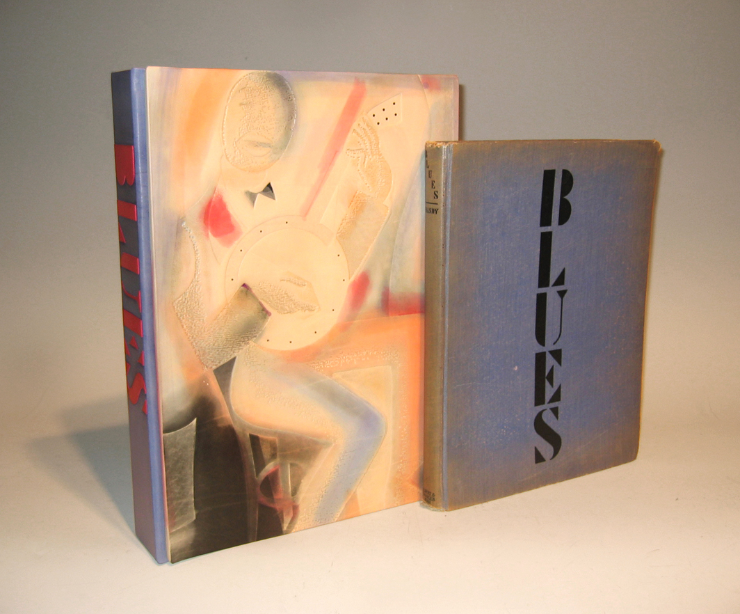
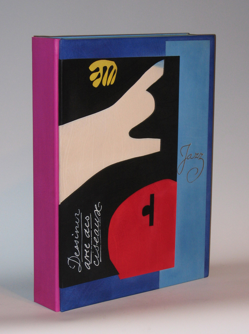
W.C. Handy, “Blues – An Anthology” 1926
W.C. HANDY ed. (1973-1958) USA
“Blues – An Anthology” 1926
180pp. bound in blue cloth with original dust jacket. Very scarce work, considered the most famous blues collection in history, it includes historical notes, tunes and arrangements, notes for each song, a bibliography, and a chart of guitar chords.
With an introduction and notes by Abbe Niles
Illustrations by Miguel Covarrubias
Published by Albert & Charles Boni, New YorkDimensions:
Book: H: 11 ¾” x W: 9 1/8” x D: 1”
Custom leather box 2008: H: 13 13/16” x W: 10 3/8” x D: 2 7/16”
Custom silk slipcase: H: 15” x W: 11 1/8” x D: 3 3/8”William Christopher Handy was a composer, musician and a music publisher. He was sometimes called the “Father of the Blues” and was credited with helping popularize blues music. Handy was a seminal figure in the development of American songwriting. His compositions assimilated folk tunes, blues, spirituals, minstrel songs, and elements of European music and forged a new sound in American popular commercial music. Born in Florence, Alabama, Handy began arranging music when in grade school. By the turn of the century, he had toured or was touring with a number of minstrel acts and bands. He became a leading bandleader in Memphis, Tennessee, and eventually wrote such classics as “The Memphis Blues” (1912), “The St. Louis Blues” (1914), and “Beale Street Blues” (1916). In addition to his songwriting, Handy also founded an important and influential music publishing concern, the Pace and Handy Music Company, in 1913. Finally, Handy’s books and writings, such as his autobiography, Father of the Blues (1941), and Blues: An Anthology (1926), comprise an important contribution to American culture. In 1979, New York City joined the list of institutions and municipalities to honor Handy by naming a stretch of West 52nd Street in Manhattan “W.C. Handy Place.”
-
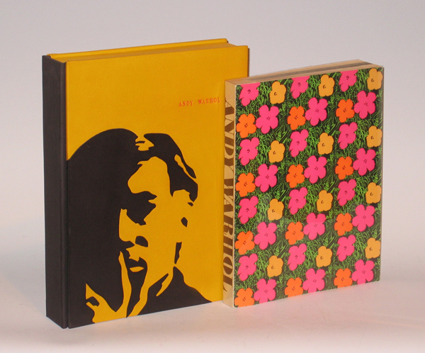
Andy Warhol, “Andy Warhol: Published on the Occasion of The Andy Warhol Exhibition at Moderna Museet in Stockholm February to March 1968” 1970
ANDY WARHOL (1928-1987) New York, NY
“Andy Warhol: Published on the Occasion of The Andy Warhol Exhibition at Moderna Museet in Stockholm February to March 1968” 1970
Published by Moderna Museet Stockholm, Boston Book and Art, Boston, MA, 1970. Printed in Sweden.
Dimensions:
Book: H: 10 3/4” x W: 8 5/16”
Custom leather box: H: 12 1/8” x W: 9 7/16” x D: 2”
Custom cloth case: H: 13” x W: 10” x D: 2 11/16”One of the rarest of Warhol exhibition catalogs. This is the 3rd edition of the catalog that was published for a major exhibition of the late artists work that was held in Stockholm. There is no text except for some of Warhol’s famous quotes and 100’s of black & white photos of his work and wonderful photos of his superstars, life and work at the factory and stills and candids from his influential underground films. The covers are illustrated with full color photos of his famous flower silk screens.
-
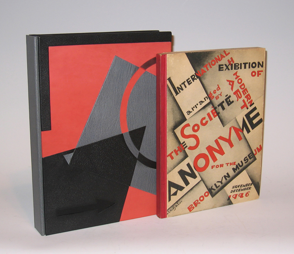
Katherine S. Dreier, “International Exhibition of Modern Art 1926”, Arranged by The Societe Anonyme for the Brooklyn Museum 1926
KATHERINE S. DREIER (1877-1952)
“International Exhibition of Modern Art 1926” 1926
Arranged by The Societe Anonyme for the Brooklyn Museum
Published by Societe Anonyme, New YorkDimensions:
Book: H: 10 1/16” x W: 7 ½”
Custom leather box: H: 11 ¼” x W: 8 ¼” x D: 1 9/16”
Custom silk slipcase: H: 12” x W: 8 5/8” x D: 2 1/8”Katherine Sophie Dreier was born on 10 September 1877 in Brooklyn, New York to Dorothea Adelheid and John Caspar Theodor Dreier, both immigrants from Bremen, Germany; she was the youngest of five children. Early on, Dreier manifested her dual interests in social issues and art. She was treasurer of the German Home for Recreation of Women and Children and helped to found the Little Italy Neighborhood Association in Brooklyn, New York. She studied art privately, then at the Brooklyn Art School and at Pratt Institute, and then with Walter Shirlaw (with whom Dreier’s sister, Dorothea, also studied). There was a strong identification in the Dreier home with German culture, and the family often traveled to Europe to visit relatives. Between 1907 and 1914, Dreier spent much of her time abroad, traveling, studying art, and exhibiting her work in one-artist shows. In New York, in 1916, through her work with the Society of Independent Artists, Dreier met Marcel Duchamp. He was to become a close friend and colleague, and an important figure in the history of the Societe Anonyme. In January 1920, Dreier, Duchamp, and Man Ray met in Dreier’s apartment in New York City to found the Societe Anonyme, a society to promote modern art among the American public. Dreier had wanted to call the society “The Modern Ark,” but Man Ray later claimed that he was the one to suggest the French phrase for “incorporated” instead. Dreier added the subtitle “Museum of Modern Art: 1920.” The Societe Anonyme sponsored many lectures, concerts, publications, and exhibitions concerning modern art, including the International Exhibition of Modern Art at the Brooklyn Museum in 1926. In spite of a major membership campaign in 1925, the Societe’s headquarters in New York City closed in 1928, and from this point on, the Societe Anonyme existed only through Dreier’s efforts. She continued to organize events that were sponsored by the Societe, and she accumulated artwork to add to the Societe Anonyme’s collection. In 1939, Dreier began developing a plan to open the Country Museum at her house in West Redding, Connecticut (the Haven), which would house the Societe Anonyme’s collection of artwork, as well as her private collection. After little success with other potential investors, Dreier approached Yale University about funding and maintaining the museum. Yale was hesitant, because of the high costs of renovating the Haven and maintaining it as a fire-proof museum, and instead offered as a compromise to take over the Societe Anonyme’s collection if it were moved to the Yale Art Gallery. Dreier agreed, and she began sending the collection to Yale in October 1941. In 1942, Dreier was still adamant about her desire to open the Country Museum and to use her private collection as its basis. She continued her attempts to convince Yale to fund her project, but when Yale gave a final negative answer in April, Dreier decided to sell the Haven. In April 1946, she moved to a new home, Laurel Manor, in Milford, Connecticut. She continued to add artwork to the Societe Anonyme collection at Yale, through purchases and through gifts from artists and friends. In 1947, she attempted to reopen membership to the Societe Anonyme and printed a brochure, but Yale blocked distribution of the brochure because of the ambiguous connection between Yale and the membership campaign. In 1948, Dreier and Duchamp decided to limit the activities of the Societe to working on a catalog of the collection and to acquiring artwork. On the thirtieth anniversary of the Societe Anonyme’s first exhibition, 30 April 1950, Dreier and Duchamp hosted a dinner at the New Haven Lawn Club, where they formally dissolved the Societe Anonyme. In June, a catalog of the Societe’s collection at Yale, Collection of the Societe Anonyme: Museum of Modern Art 1920, was published. Dreier died on 29 March 1952.
-
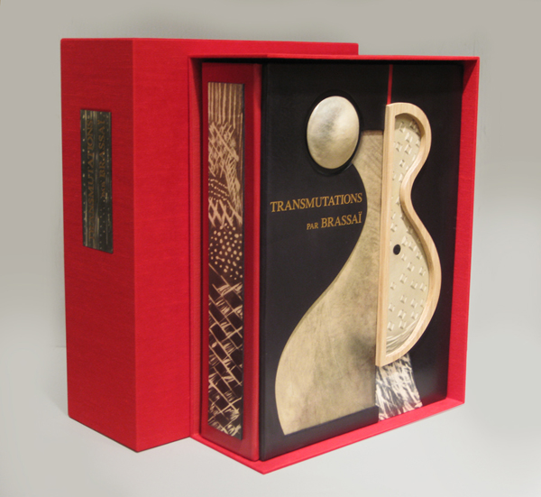
Brassai, “Transmutations 1934-35” 1967
BRASSAÏ (1899-1984) Austria-Hungary
“Transmutations 1934-35” 1967
Published by Lacoste: Galerie Les Contards, France.
12 gelatin silver prints each flush-mounted to a presentation folder with printed sequential number and title, with colophon contained in a linen covered, velvet lined clamshell folio with gilt lettering on the spine.Signed and numbered 32 in ink on the colophon. This work is from an edition of 100. The titles include: I. Femme-fruit; II. Sevillane denudee; III. Odalisque; IV. Femme-mandoline; V. Femme-amphore; VI. Fille de Joie se Deshabillant; VII. Visage mineral; VIII. Tentation de Saint Antoine; IX. Jeune fille revant; X. Offrande; XI. Femme aux voiles; XII. Fete foraine.
Dimensions:
Book: H: 15 ½” x W: 12” x D: 1 ½”
Custom leather box: H: 17 ¾” x W: 13 ½” x D: 4 ½”
Custom silk slipcase: H: 18 ¾” x W: 14 ¼” x D: 6”
-
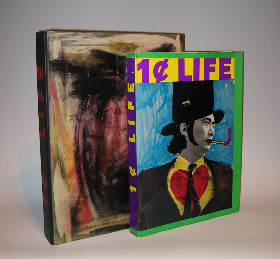
Walasse Ting “One Cent Life”, 68 Original Pop-Art & Cobra Graphics 1964
WALASSE TING (1929-) China / USA
“ONE CENT LIFE” 1964
68 Original Pop-Art & Cobra Graphics
Limited edition of 2000 copies, Elephant Folio, 176 pages
Edited by Sam Francis (1923-1994)
Published by E.W. Kornfeld, Bern, SwitzerlandDimensions:
Book: H: 16 3/8” x W: 12”
Custom leather box: H: 18 1/16” x W: 13” x D: 2 7/16”
Custom silk slipcase” H: 19 1/8” x W: 13 7/8” x D: 3 3/16”Artists that contributed original graphic work illustrating Walasse Ting’s poetry for this volume include: Pierre Alechinsky (5), Karel Appel (5), Enrico Baj (2), Alan Davie (3), Jim Dine (2), Sam Francis (6), Robert Indiana (2), Alfred Jensen (3), Asger Jorn (2), Allan Kaprow, Alfred Leslie (2), Roy Lichtenstein (2 + cover), Joan Mitchell, Claes Oldenburg (3), Mel Ramos (2), Robert Rauschenberg (2), James Rosenquist, Bram Van Velde, Andy Warhol, and Tom Wesselman (2).
Walasse Ting, born in Shanghai, is a self-taught painter, sculptor, graphic artist and poet. Leaving China in 1949 to travel, he reached Paris in 1953 and became acquainted with artists Karel Appel, Asger Jorn and Pierre Alechinsky, members of the avant-garde group known as COBRA. Since 1963, he has lived in New York.
“Ting wanted to publish the most international illustrated book, intended to illustrate his text, uniting tachisme, neo-dadaisme, pop art, and all other artistic movements. The idea was born from global experience, close contact with culture, pseudo-culture, primitive existential worries, urban erotic and eastern wisdom.. It was a Herculean task, for which only a Chinese would have been able to muster the perseverance” – E. W. Kornfeld.
-
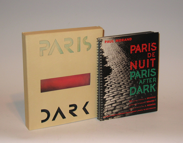
Brassai / Paul Morand “Paris de Nuit” (Paris After Dark) 1933
Brassaï (1899-1984) Austria-Hungary [now Romania]
Paul Morand (1888-1976) France
“Paris de Nuit” (Paris After Dark) 1933
Published by Arts et métiers graphiques, Paris
Dimensions:
Book: H: 9 13/16” x W: 7 9/16”
Custom leather box: H: 10 5/8” x W: 8 5/8” x D: 1 3/8”
Custom silk slipcase: H: 11 21/32” x W: 9 5/8” x D: 2 7/16”
Brassaï is the pseudonym of Guyla Halász from Transylvania (Hungarian at the time of his birth, but currently part of Romania). Brassaï literally means: from Brasso (his native village). He decided to use this pseudonym in 1932, the year in which Paris de nuit was published. He had already been living in Paris for eight years, where he wrote articles for German magazines and met photographers such as Atget and André Kertész. Not until 1930 did he first begin to take photographs himself, immediately discovering his main subject: Paris.
He moved into an apartment on the corner of the Rue de la Glacière and the Boulevard Auguste-Blanqui in 1928, where Raymond Queneau also lived. He would go out at night with Queneau or other nocturnal people such as Léon-Paul Fargue, but Brassaï usually just walked through the abandoned streets and alleys of the city. He could only take 24 photographs per walk because the stack of glass photo plates would otherwise grow too heavy.
His nocturnal journeys yielded a wealth of photographs, which by now have gained the status of icons of modern photography. They were first published on 2 December 1932 by Arts et metiers graphiques, which was Charles Peignot’s publishing business. He was also the founder of the magazine Arts et metiers graphiques (1927-1939) in which articles on design, typography, illustration and advertising appeared. It was printed in an edition of 4000 copies: there were also printers associated with the editing staff, like Léon Pichon. Peignot was the president of type foundry Deberny et Peignot, and were in contact with the Union des Artistes Modernes (Cocteau, Gide, Sonia Delaunay, Maximilien Vox and others) and with poster designers such as Cassandre.
The first review of Paris de nuit was published in a Dutch newspaper, the Nieuwe Rotterdamsche Courant of 29 December 1932. An English edition of the photo book appeared in 1933 from Batsford Gallery in London. The photographs were also exhibited. Many photo books were to follow, including a book in 1960 about the graffiti on Parisian walls, which he had documented in his photographs since 1930. Not without reason did Henry Miller call him ‘the eye of Paris’. Jean Paulhan actually asserted that Brassaï had more than two eyes.
-
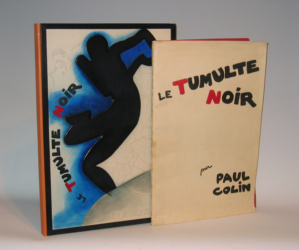
Paul Colin, “Le Tumulte Noir” portfolio 1929
PAUL COLIN (1892-1985) France
“Le Tumulte Noir” portfolio 1929
Color lithographs, limited edition of 500, in original wraps
Published by Éditions d’art, Succès: Paris, 1929Dimensions:
Book: H: 19 11/16” x W: 13 1/16”
Custom leather box: H: 21” x W: 14 3/8” x D: 1 5/16”
Custom silk slipcase: H: 21 ¼” x W: 14 1/16” x D: 1 11/16” -
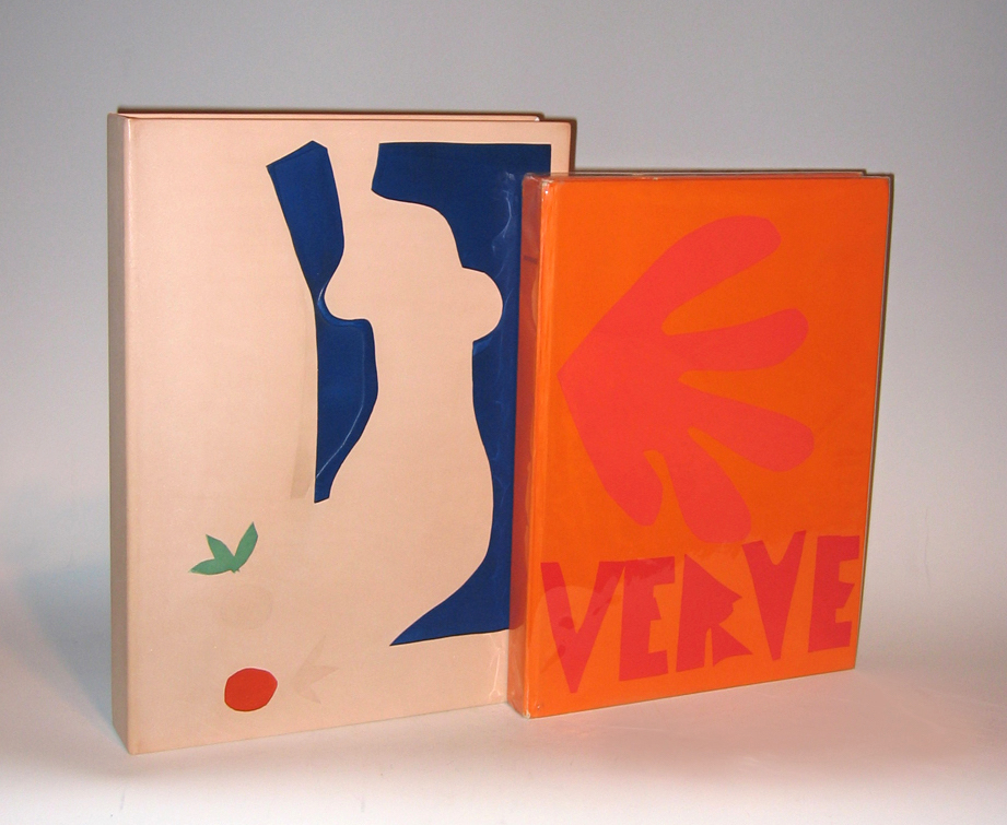
Henri Matisse “Verve” Vol. IX No. 35 & 36, 1958
HENRI MATISSE (1869-1954) France
“Verve” Vol. IX No. 35 & 36 1958
Revue artistique et littéraire paraissant quatre fois par an
Created and editioned at the Mourlot Studio, Paris.
Published by E. Tériade, Paris 1958.Dimensions:
Book: H 14 1/2” x W: 10 11/16”
Custom leather box: H: 15 13/16” x W: 11 5/8” x D: 2 1/16”
Custom linen case: H: 16 3/4” x 12 5/16” x D: 2 5/8” -
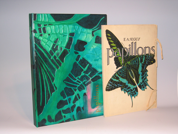
E. A. Seguy, “Papillons” portfolio c. 1925
E. A. SEGUY (1890-1985) France
“Papillons” portfolio c. 1925
Twenty pochoir over photogravure plates (hand painted collotypes) in paper portfolio with cotton ties
Pochoir is process by which rich color is applied layer by layer by hand with the aid of stencils, resulting in intense hues similar to those in stained glass windows.
Published by Editions Duchartre et Van Buggenhoudt, Paris, FranceDimensions:
Book: H: 18” x W: 13 1/8” x D: 1 ½”
Custom leather box: H: 20” x W: 14 5/8” x D: 1 ¾”Brilliantly and boldly colored butterflies from around the world are shown in interesting arrangements in pochoir prints from a set of 20 by the French designer and author E.A. Seguy. Plates 1 to 16 show large specimens in colorful arrangements, often overlapping, emphasizing colors, and patterns and shapes of wings and wing veins. Plates 17 through 20 are composite uses of butterfly patterns, in geometric boxes, like fabric or wallpaper designs.
In his foreword to Papillons, Seguy describes the prints as “un monde somptueux de formes et de couleurs” — a world of sumptuous forms and colors. He explains that they are intended to provide a record of rare, exotic specimens from museums and private collections, within an aesthetic context, thereby making them more widely accessible as inspiration for decorative arts designers. Nonetheless, Seguy based his images of butterflies and insects on illustrations in scientific publications, thereby maintaining scientific accuracy. They were enlarged up to 10 to 15 times to reveal intricacies of their design not visible without magnification. Also included with the set was a Table Des Noms Scientifiques [Table of Scientific Names], providing the technical species and genus names as well as the countries or regions of habitat for the species shown in Plates 1 through 16.
Eugene Alain Seguy produced eleven albums of illustrations and designs from the turn of the century to the 1930s, and his style reflected the influences of both Art Nouveau and Art Deco. His various color portfolios of visual ideas for artists and designers often featured motifs based on the natural world, including flowers, foliage, crystals and animals. Although his compositions were design oriented, he made the depictions scientifically accurate. His later works showed an increased interest in geometric and cubist designs. The prints in the portfolios were produced using the pochoir technique characterized by rich, intense color. This printing process, utilized in the early 20th century for high quality prints, involved applying colors to each plate with a number of stencils. Seguy’s works include Les Fleurs et Leurs Applications Decoratives (1900), Samarkande – 20 Compositions en Couleurs dans le Style Oriental (1914), Floreal (1920), Papillons (1924), Insectes (1924), Primavera –Dessins et Coloris Nouveaux (1929), Suggestions (1930), and Prismes – 40 Planches de Dessins et Coloris Nouveaux (1931).
Collections of prints like those produced by Seguy provided source material for designers of fabrics, wallpaper, ceramics, book illustrations, posters, and advertisements, and were popular in the late 19th and early 20th century. The leading Victorian publication of this type was Owen Jones’s Grammar of Ornament, first issued in a folio edition in London in 1856. Other trendsetting styles in art, design, decoration and fashion in the second half of the 19th century, and early 20th century, came from Paris, Austria, and Germany, and many such print collections were published there, including designs by Emile Belet, Armand Guérinet, Ernst Haeckel, Arsène Herbinier, and Anton Seder. To search our site for more Art Nouveau designs by such artists please type “Art Nouveau” into our search engine.
Editions Duchartre et Van Buggenhoudt was a publisher located at 15 Rue Ernest-Cresson, Paris. The series also was published by Tolmer Editeur, 13 Quai d’Danjou, Paris.
-
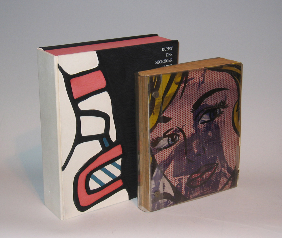
ART OF THE SIXTIES, “Die Kunst der sechziger Jahre im Wallraf – Richarts Museum Köln” 1969
ART OF THE SIXTIES
“Die Kunst der sechziger Jahre im Wallraf – Richarts Museum Köln” 1969
Published by Gert von der Osten und Horst Keller.
Designed by Wolf Vostell.
First edition.Dimensions:
Book: H: 12” x W: 10”
Custom leather box: H: 14” x W: 11 1/2” x D: 3 1/2”
Custom linen slipcase: H: 15” x W: 12 1/8” x D: 4”This famous and striking exhibition catalogue is a work of art. Wolf Vostell designed the catalogue for the Ludwig collection of contemporary art, given as a permanent loan to the Wallraf-Richartz Museum in Cologne. The work of 92 artists is represented, including objects by Dine, Dubuffet, Hockney, Jasper Johns, Lichtenstein, Oldenburg, Picasso, Rauschenberg, Vostell, Warhol, and Wols.
-
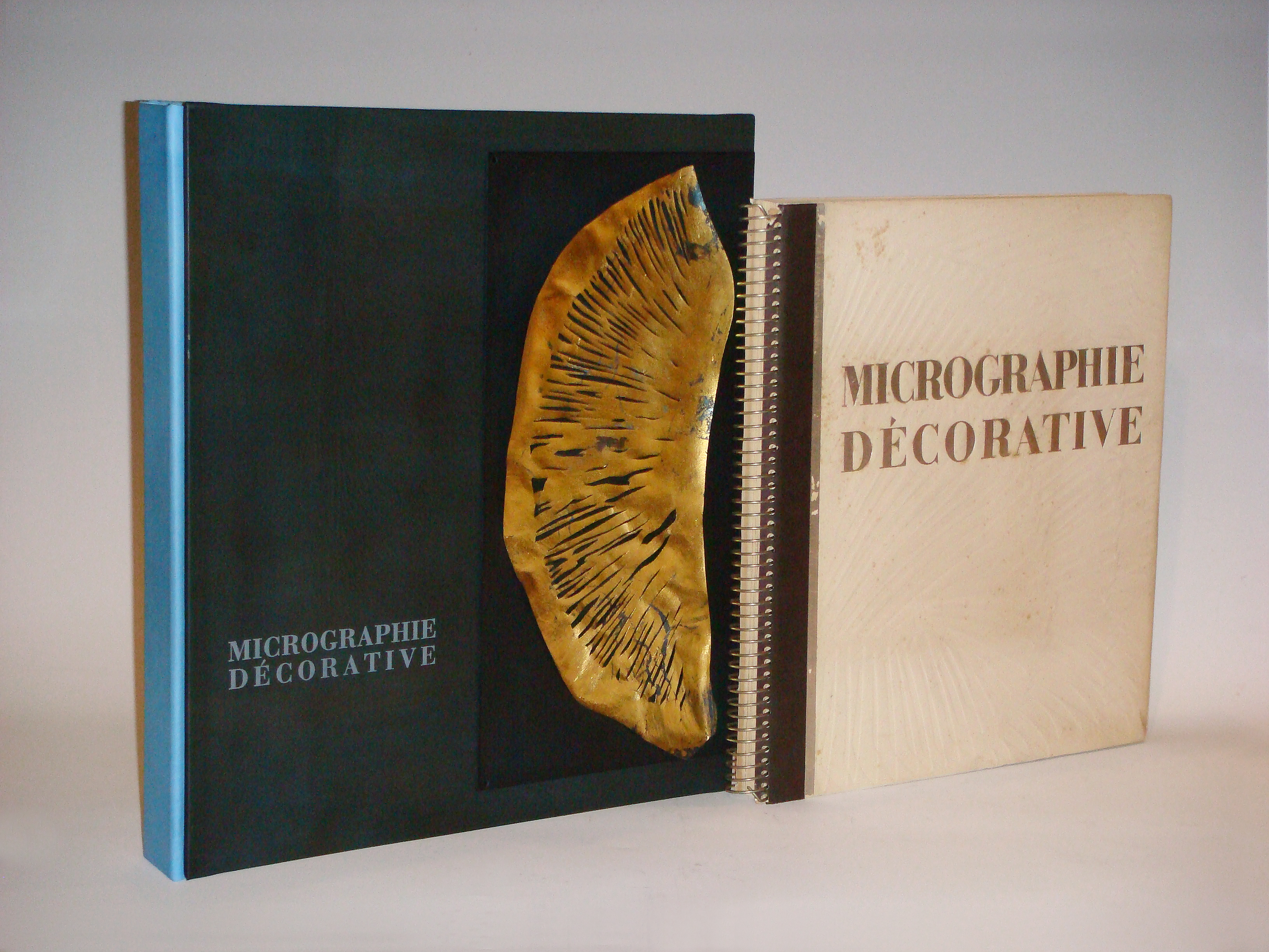
Laure Albin-Guillot, “Micrographie Decorative” 1931
LAURE ALBIN-GUILLOT (1879-1962) France
Micrographie Decorative 1931
Preface by M. Paul Leon, 20 photogravure plates in a variety of inks and papers, including silver and gold foil, all tipped-in and matted, text in French, limited to 300 numbered copies, folio, spiral-bound bds.
Published by Draeger Freres, Paris.Micrographie Décorative was created as a tribute to Laure's husband after his death.
Dimensions:
Book: H: 16 ¾” x W: 15” x D: 1 3/8”
Custom leather box 2008: H: 19” x W: 16 5/8” x D: 2 5/8”
Custom silk slipcase: H: 20 1/8” x W: 17 ¼” x D: 4”Albin-Guillot, Laure (née Meffredi; 1879-1962), French photographer who became interested in photography soon after her marriage in 1897 to the physician/scientist Dr Albin Guillot. At first, her husband's circle of friends, which included architects, writers, and politicians, provided her with portrait subjects. During the 1920s and 1930s she was engaged by the design precepts of the New Vision, and produced more sharply focused close-ups of objects for clients like Bon Marché and Renault. At the same time, she continued to create soft-focus pictorialist nudes that appeared in artistic photography journals and as illustrations in volumes of poetry. Many of her images were exhibited during the 1920s and reproduced in Arts et métiers graphiques. At a time when many photographers were indifferent to the quality of prints intended for reproduction, Albin-Guillot sought to invest hers with artistry and individuality. Engrossed by her husband's lifelong research in micrography, in 1931, in collaboration with Pierre Fresson, she published in his memory a volume of 24 photomicrographs of crystals, exquisitely printed on various coloured and metallic papers. Later, she and Fresson also collaborated on similar works, which were used as decoration on the liner Normandie.