Post-War to Present Paintings
Post-War to Present Paintings
-
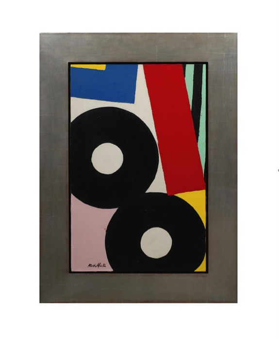
Knox Martin, “Eight”, Magna and oil on canvas 1958
KNOX MARTIN (1923-) USA
Eight 1958
Magna and oil on canvas
Signed: Knox Martin on lower left on front of canvas, Knox M on back of canvas
Marks: From: CORE, 38 Park Row, New York 38, NY, To: Martin, Knox, Eight, 1958, Magna/Oil, 30×40, 700. (paper label), Fischbach Gallery, 799 Madison Avenue, New York 21, Knox Martin, Eight, C.O.R.E., Price $700 (paper label), Mr. Ned L. Pines, 605 Park Ave., New York 21, NY (address label).
Exhibited: Fischbach Gallery, New York 1963; I. Jankowski Gallery, New York, 1975
Provenance: Personal Collection of the artist; Private Collection New York
Canvas: H: 40 1/4” x W: 26 1/4””
Framed: H: 52 3/8” x W: 38 3/8”
From 1957 to about 1964, the spirit of art in New York City was moving in directions for which Abstract Expressionism had not prepared us. By 1965, the strokes, swipes, drips, and splatters of New York painting had given way to cool, laconic representations of the most ordinary of ordinary objects. It was a transformation in artistic culture in which intellectual rewards replaced, or at least supplemented, visual ones, and the whole philosophical face of art was beginning to disclose itself in a particularly vivid way. I saw Knox Martin’s paintings as embodying this transformative moment. In them, I thought, the tension between the two rival philosophies of art could be felt. the way I saw them: they appeared at first glance to be collages, made of large, irregular, overlapping swatches of patterned cloth. Some of the swatches were striped, some appeared to be decorated with circles. It must be conceded that stripes and circles belong to the vocabulary of one kind of abstract art, while the irregular shapes, which felt as though they had been torn from bolts of material, belonged to another.
So one might properly claim that Martin was synthesizing an expressionist abstraction with a geometrical one. For me, however, Knox’s stripes and circles evoked the life of the circus: the striped tents, the loudly patterned costume of clowns. And Martin’s colors—pistachio, raspberry, banana—were festive and impudent. That is why I felt that the paintings referred to vernacular reality, as much so as Campbell Soup cans or Coca Cola bottles. The circus was a recurring theme in modernist art, and I thought it appropriate for late modernist painting to reduce the circus to patterned rags expressive of its raucous gaiety.
-
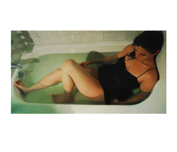
Alyssa Monks “Push” Oil on Canvas 2006
ALYSSA MONKS (b.1977) USA
Push 2006
Oil on canvas
Signed: Alyssa Monks 2006 (on lower back of canvas)
Exhibited: DFN Gallery, New York 2006
Illustrated: American Art Collector, May 2006, p. 155
H: 30” x W: 56”
“Push” is somewhat of a response to the long tradition of bathtub paintings where a nude woman is displayed. However, the figure is me, the painter, so that the subject is also the artist, juxtaposing the objectification of women in that tradition. Also, the figure wears a black negligee and red lipstick, white makeup gently drips down the cheek, closing the door on naturalism.
At the New York Academy of Art, Alyssa Monks studied with Vincent Desiderio, Wade Schuman, Brenda Zlamany, John Jacobsmeyer, Harvey Citron, Deane Keller, Edward Schmidt, Steven Assael, Lisa Bartolozzi, Patrick Connors, Peter Cox, Jon DeMartin, Leonid Lerman, and Hong Nian Zhang. Alyssa’s sensibility of paint and color allows one to be seduced into the illusion of each image. Striving for anatomical and realistic accuracy, it is her intention to elicit a serious confrontation. The work requires attention to detail and a slow and rich execution. It is this artist’s concern to visually relate the contemporary human experience with sensitivity, empathy, and integrity.
-
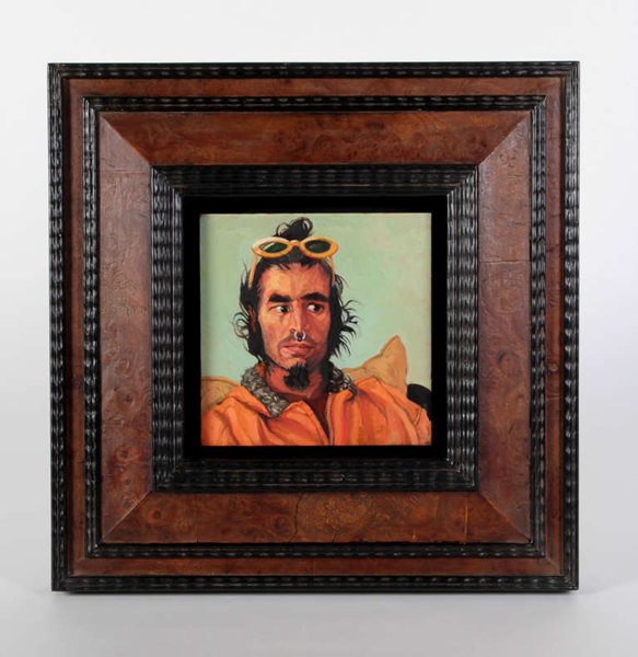
Jack Richard Smith “Spiros Antonopoulos” Oil on Copper 2004
JACK RICHARD SMITH (1950-) Taos, NM
“Spiros Antonopoulos” 2004
Blackoil, wax, lead salts on copper, burl wood and ebonized wood Dutch old master style frame
Exhibited: “Taos Portraits” by Jack Smith, Harwood Museum of Art, University of New Mexico, Taos, New Mexico, May 14th – August 15th, 2004
Illustrated: “Taos Portraits” by Jack Smith, May 14th – August 15th, 2004, exhibition catalogue (Taos, NM: Harwood Museum of Art, University of New Mexico) illustr. 16
Painting: 6” x 6”
Framed: 13 3/4” x 13 11/16”Price: $14,500
Incorporating blackoil, wax, lead salts, and copper Smith’s small format portraits and paintings are detailed and intimate depictions of creative individuals and charged tableaux. Smith’s singular style of portraits glow with a warm inner light and present honest, straightforward images that speak of personal narratives. Smith’s interest in miniatures developed first as a matter of convenience. In 1982, while preparing for a winter of travel in Mexico, he experienced logistical problems traveling with the larger size painting materials he was using at the time. The solution seemed to be a block of watercolor paper and casein, a milk base paint of versatile possibilities and vehement drying power. Suddenly, his paintings went from three by five feet to three by five inches. The history of oil painting, principally centered around the Dutch schools and their development of a method called black oil painting, often executed in miniature, also captured his interest. Black oil, an oleoresin comprised of white beeswax, raw linseed oil and litharge of lead, suspends the pigment above the painting ground, which was traditionally wood panel, linen or copper plate. This medium seems to suspend the pigment, allowing light to penetrate and reflect from the surface and illuminate the imaged from behind, a sort of light from within. The small format is an act of compression that requires the viewer to draw in close to a more intimate proximity and will, if the painting works, hopefully approach Joseph Campbell’s description of art as an “object of fascination” to engage the viewer and stop for a moment one’s busy mind. Jack Smith was born in 1950. At age 16, he began his training at the Interlochen Arts Academy in Michigan before moving to Ohio to attend Columbus College of Art and Design. He also studied for a brief time at the Instituto de Allende, at San Miguel de Allende, GTO, Mexico. He now resides in New Mexico. Reflecting a profound knowledge of art history and and an alchemist’s sense of the painting craft, contemporary painter Jack Smith has forged his own place amongst the most powerful of contemporary portraitists working in America. Jack Smith recently received a prestigious Past Achievement Award from the Peter and Madeleine Martin Foundation for the Creative Arts, following an important solo exhibition titled, Jack Smith: The Taos Portraits at the Harwood Museum of Art at the University of New Mexico in 2004. The exhibition featured fifty portraits of Taos, New Mexico residents, executed between 2000 and 2003. The series was intended as a visual biography of this unique artistic community at the turn of the century. Smith’s subjects range from the famous to the infamous — including artists, writers, art patrons, Native peoples, and street peoples. Spiros Antonopoulos’s (he always dropped the s in Spiros when saying his name) past is a little sketchy. I understand that he was trained as a musician and through that came to the world of computers, which he mastered immediately given his hot tub size brain pan. He also told me once that he had “done lots of drugs and some porn movies” while in college. Before we met he used to drive by my house in Arroyo Hondo, NM when he lived above us on the ridge road called Atalaya, about fifteen miles north of Taos and would make funny faces at me through the smudged window of his ghostly, lowrider station wagon. He was wildly eccentric dresser and had a selection of sunglasses that Elton would envy, mostly a thrift store wardrobe kind of guy. As I mentioned before, he tended to remind me of a mad computer geek samurai, which I tried to capture in this portrait. I’ve heard he now lives in the East Village and has forsaken his aforementioned life for obsessive Bikram yoga…… and that’s where the trail gets cold. The Taos portrait series was executed from 1999 to 2003 and was intended as a visual biography of this peculiar valley and town of Taos, NM. The subjects range from famous artists, writers and political activists to street people and what we affectionately call “sage bunnies”, or, folks that live out in the hinterlands in a grow hole with a goat or two and come to town once a month for provisions and bathe in patchuli oil, I presume, to save water. I would have liked to have had more of these folks but lining them up proved problematic as they tend to live in a parallel universe called locally, “the land of poco tiempo”, or “little time” , a condition caused, in their case, by smoking too much cheeba. This same time thing is true of my attempts at several more Native American friends from the pueblo…… it is something I greatly admire about them, unless of course you are scheduling a portrait sitting for the fourth time and they just had to go to Walmart without warning. But then “this is Taos” as John Nichols mentions in the forward to theexhibition catalogue and it is often referred to as an “open air asylum” for a myriad of good reasons. I thought it would be interesting to look back at some future time and see the weft and warp of the tapestry of Taos at the turn of themillennium. I could easily have done three hundred, but one must stop somewhere. The show was hanging in conjunction with Wayne Theibauld’s “City/ Country” exhibition at the Harwood Museum in Taos, New Mexico, June to September, 2004. – as told by Jack Smith, May 2006
-
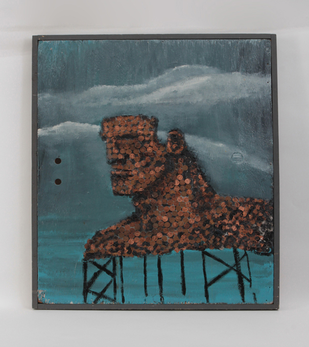
Robert Loughlin, “The Founder of the Empire”, Oil paint and pennies on plywood panel 1985
For more information on Robert Loughlin see: http://www.nytimes.com/2015/10/02/fashion/mens-style/the-legacy-of-robert-loughlin-artist-behind-the-brute.html?mwrsm=Email
-
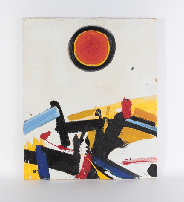
Giuseppe Napoli “Shamballa” Oil on board 1965
GIUSEPPE NAPOLI (1929-1967) Italian / American
“Shamballa” 1965
Oil on board
Signed: Napoli (scrafitto on front), Giuseppe Napoli 1965 “Shamballa”
(on back of board), Giuseppe Napoli (signed twice on stretcher)
H: 24” x W: 20”
A profoundly dynamic Abstract Expressionist painting by New York artist, Giuseppe Napoli. The painting is painted on board which is affixed to stretcher bars by staples.
Giuseppe Napoli was part of the New York School of the 1950’s and 60’s working out of a small studio in Greenwich Village. Napoli participated in numerous exhibitions but unfortunately his career was cut short by his suicide in 1967 the result of suffering from periods of depression.
Just as “Starry Night” is widely considered to have reflected the mental state of Van Gogh shortly before his death; this painting may also have reflected the mental state of Giuseppe Napoli who ended his own life only two years after creating this remarkable painting. The vigorous, heavy impasto, the ominous sun made impotent by the bold black ring that surrounds it and the jumbled landscape below, could be symbolic of the hope-against-hope, that eventually prevailed.
-
Paul Beliveau “Les humanites CCLXXXIX” Hyperrealist painting 2007
PAUL BELIVEAU (1954-) Québec, Canada
“Les humanites CCLXXXIX” 2007
Acrylic on canvas
Signed and dated: Paul Beliveau 2007 (script signature on the back of canvas)
H: 40” x W: 60”
Born in 1954, Paul Béliveau attained his Bachelor’s degree in Visual Arts from Laval University in 1977. Recognized for his expertise in drawing, engraving and painting he has since then had more than sixty solo exhibitions across Canada and the United States. The recipient of numerous prizes in visual arts and of multiple grants from the Canada Council as well as the Ministère des Affaires Culturelles du Québec has taken part in several commitees and juries as specialist in the visual arts. “By openly integrating into the compositions an iconography from the past and proceeding through citation and retrospection, he reveals the phenomenon of metamorphosis upon which imagination itself is based. In this way he brings to light the very principles of the mechanics of creation. Imagination, which consists as it were in the transfer of a perceptible representation onto an image belonging to another reality, thus sees itself in the presented. Consequently it is not the images themselves but the unique process of creative development which accords Paul Béliveau’s works their originality.” (Dany Quine, L’oeuvre du temps)
-
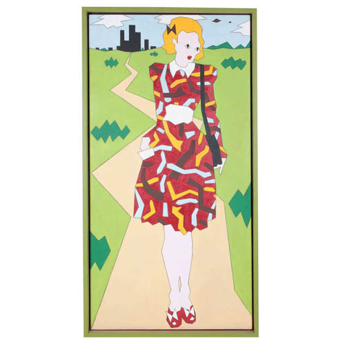
Duggie Fields, “Girl with Shoulder Bag”, Oil on linen 1970
DUGGIE FIELDS (1945-) London, UK
“Girl with Shoulder Bag” 1970
Oil on linen, custom wood and green lacquer Shadow box frame
Marks: “Girl with Shoulder Bag”, Winter 1970 (Dougie Field)
Canvas: H: 72” x W: 36”
Framed: H: 74 1/2″ x W: 38 1/2″Duggie Fields was born in 1945 and brought up in the village of Tidworth. He spent his youth in the countryside, moving to the outer suburbs of London in his adolescence. He studied architecture, briefly, at Regent Street Polytechnic before going to Chelsea School of Art in 1964 where he stayed for four years, before leaving with a scholarship that took him on his first visit to the United States. As a student his work moved from Minimal, Conceptual and Constructivist phases to a more hard-edge post-Pop figuration. By the middle of the 1970s his work included many elements that were later defined as Post-Modernism. In 1983 in Tokyo, sponsored by the Shiseido Corporation, a gallery was created specially for his show, and the artist and his work were simultaneously featured in a television, magazine, billlboard and subway advertising campaign throughout the country. He started working with digital media in the late 1990’s describing his work in progress as Maximalist. Selected One-Man Exhibitions 1971 Hamet Gallery, London 1972 Bear Lane Gallery, Oxford; 1975 Kinsman-Morrison Gallery, London 1979 Kyle Gallery, London; 1980 lkon Gallery, Birmingham; Midland Group, Nottingham; New 57 Gallery, Edinburgh; Roundhouse Gallery, London 1982 Spacex Gallery, Exeter; B2 Gallery London 1983 Shiseido Exhibition, Tokyo 1987 Albermarle Gallery, London 1991 Rempire Gallery, New York 2000 Random Retrospective, Virtual Gallery, DuggieFields Selected Group Exhibitions 1976 New London in New York, Hal Bromm Gallery, New York 1979 The Figurative Show, Nicola Jacobs Gallery, London; Masks, The Ebury Gallery, London; Culture Shock, The Midland Group, Nottingham; Art and Artifice, B2 Gallery, London 1983 Taste, Victoria and Albert Museum, London 1984 The Male Nude, Homeworks Gallery, London 1985 Image-Codes, Art about Fashion, The Australian Centre for Contemporary Art, Melbourne; VisualAid, Royal Academy, London l986 The Embellishment of the Statue of Liberty, Cooper Hewitt Museum/Barney’s New York 1987 Twenty Artists Twenty Techniques, Albemarle Gallery, London 1989 Fashion and Surrealism, Victoria and Albert Museum, London 1988 Het Mannelisknaakt, Gallery Bruns, Amsterdsm, St. Judes Gallery, London 1990 Universal Language, Rempire Gallery, New York 1993 Tranche d’Art Contemporain Anglais, Tutesaal, Luxemburg 1998 Exquisite Corpse, Jibby Beane, London 1999 Art 1999, Jibby Beane, London; Flesh, Blains Fine Art, London Nerve, I.C.A. London 2000 Art 2000, Jibby Beane, London Up &Co., New York
-
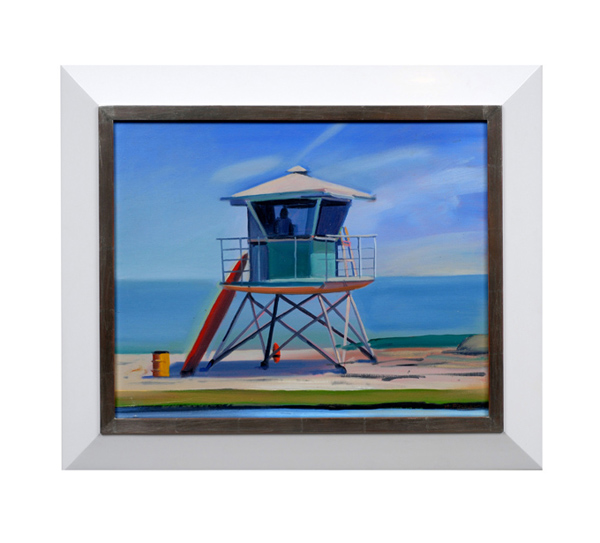
Hank Pitcher, “Life Guard Tower”, Oil on canvas c. 2002
HANK PITCHER (b. 1949) U.S.A.
“Life Guard Tower” c. 2002
Oil on canvas
Signed (on back)
For more information see: Hank Pitcher Surf, exhibit. cat. (Santa Barbara: Sullivan Goss Gallery, 2003); Surfboard Wax – A History, Jefferson “Zuma Jay” Wagner (Atglen, PA: Schiffer Publishing Ltd., 2005).
Canvas H: 15 7/8” x W: 19 7/8”
Framed: H: 21 3/8” x W: 25 3/8”
Pitcher’s surfboard paintings are the symbol of California beach culture…strong, definite, positive and euphoric statements about life in California. The surfboard’s power as totem is seen in its power to convey identity: surfer, Californian, Hank Pitcher. All are identifiable from this symbolic representation. Hank Pitcher is the voice of California culture. At the beach, in the surf, approaching the foothills, in the mountains, on the spit of Point Conception, in the crags of Big Sur, at a beach campfire in Santa Barbara, Pitcher paints the icons of California’s culture.
Hank Pitcher’s paintings are grounded in a particular sense of place. He was born in Pasadena, California on July 20, 1949, but his family moved to Isla Vista, near Santa Barbara, when he was two years old. When they came to Isla Vista it was an outpost on the beach, and Goleta was a farm town where kids rode their horses down the avenue to buy candy at the store. He was a football star at San Marcos High School and was recruited by big-name universities. Instead of football, he chose to attend the College of Creative Studies, an alternative program within the University of California at Santa Barbara (UCSB) where he now teaches painting. He splits his time between painting and surfing, pursuing each with the commitment and energy of a linebacker.
-
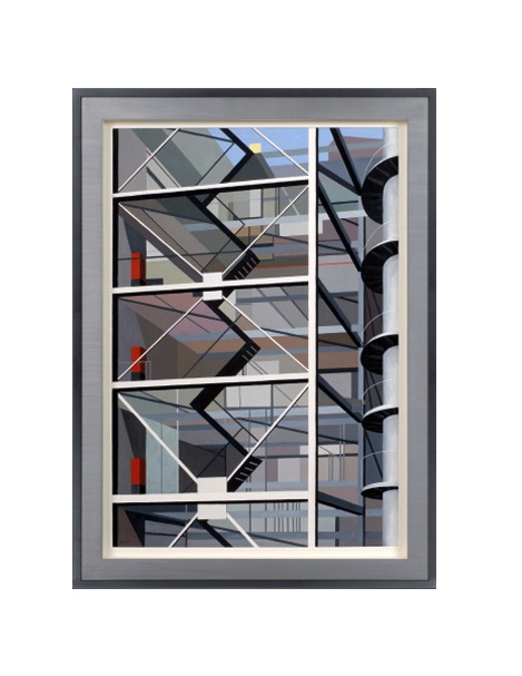
Richard Harold Redvers Taylor, “Modernist building staircase”, Gouache on paper c. 1949
RICHARD HAROLD REDVERS TAYLOR (1900-1975) United Kingdom
Modernist building staircase c. 1949
Gouache on paper, metal and wood frame
Signed: RHRT (lower left)
Marks: Gimpel Fils exhibition label (on back)
Exhibited: “An Exhibition in the Kettle’s Yard Loan Gallery: Sculpture & Painter,
14 February – 10 March, 1972” Gimpel Fils, London
Framed: H: 41 7/16” x W: 30 5/16”
Richard Harold Redvers Taylor (1900-1975) was born in Brighton on March 14th, 1900 and educated at Brighton College and Heatherleys School of Fine Art, Chelsea. His father, Harold Taylor, was a headmaster. Redvers Taylor retired from the Army (where he specialized in topographical surveying in Africa) in 1937 but was recalled for war service. In 1946 he began a new career as a professional painter. Between 1948 and 1958 Taylor was given a series of six one-man shows by Lefevre and Gimple Fils in London. In the 1960’s he turned to sculpture, and in 1972 an exhibition of his sculpture and paintings was held at the Kettle’s Yard Loan Gallery in Cambridge. His work is held in the permanent collection at the Beith Uri V Rami Museum in Israel. Louise Taylor (née Hayden), his wife, was an American and the adopted daughter and heiress of Alice B. Toklas, the companion of Gertrude Stein. Louise Taylor died on 21 July 1977.
Purism, otherwise known as l’esprit nouveau was directly inspired by a spare, functionalist aesthetic and is closely associated with the work of Le Corbusier and his circle in Paris in the second quarter of the 20th Century. In America this purist style was known as Precisionism, which explored similar imaginary during the late 1920’s and 30’s with artists like Charles Sheeler, Charles Demuth and Ralston Crawford at the forefront of this movement. In England, the Vorticist movement (1912-1915) was founded by Wyndham Lewis and others and was the precursor to the Purist movement in Great Britain in the 1930’s and 1940’s. Redvers Taylor created geometrical landscapes while reducing volumes to colored planes and outlines to ridges. His artwork combines depth and perspective with flattened cubist fields of color. Architecture of industrial buildings was his favorite subject, whereas people and nature were usually absent from his compositions.
-
Robert Breer “Untitled” Oil on canvas 1950
ROBERT BREER (1926-2011) USA
Untitled 1950
Oil on canvas, white-gold leaf and lacquer frame
Marks: Untitled, 1950, Robert Breer, 26×32, No. 29 in a circle (paper label)
Provenance: Robert Breer, Private Collection, Chicago
Canvas: H: 25 3/4” x W: 32”
Framed: H: 32 1/4” x W: 39″
“Breer acknowledges his respect for this purist, “cubist” cinema, which uses geometric shapes moving in time and space”
Robert Breer’s career as an artist and animator spans 50 years and his creative explorations have made him an international figure. He began his artistic pursuits as a painter while living in Paris from 1949-59. Using an old Bolex 16mm camera, his first films, such as “Form Phases”, were simple stop-motion studies based on his abstract paintings.
Breer has always been fascinated by the mechanics of film. Perhaps it was his father’s fascination with 3-D work that inspired Breer to tinker with early mechanical cinematic devices. His father was an engineer and designer of the legendary Chrysler Airflow automobile in 1934 and built a 3-D camera to film all the family vacations. After studying engineering at Stanford, Breer changed his focus toward handcrafted arts and began experimenting with flip books. These animations, done on ordinary 4″ by 6″ file cards have become the standard for all of Breer’s work in fim.
Like many of his generation, Breer did early work influenced by the various European modern art movements of the early 20th century, ranging from the abstract forms of the Russian Constructivists and the structuralist formulas of the Bauhaus, to the nonsensical universe of the Dadaists. As a result of his association with the Denise René Gallery, which specialized in geometric art, he saw the abstract films of such pioneers as Hans Richter, Viking Eggeling, Walter Ruttmann and Fernand Léger. Breer acknowledges his respect for this purist, “cubist” cinema, which uses geometric shapes moving in time and space.
In 1955, he helped organize and exhibited in a show in Paris entitled “Le Mouvement” (The Movement), which paved the way for new cinema aesthetics. During this period, Breer also met the poet Allen Ginsberg and introduced him to his film “Recreation” (1956), which made use of frame-by-frame experiments in a non-narrative structure. Although Breer resisted being labeled a beatnik, the film does capture some aspects of beat poetry and music.
When Breer returned to the United States in the late 1950s, the American avant-garde was thriving and films by Kenneth Anger, Stan Brakhage, Peter Kubelka and Maria Menken were creating a new visionary movement. Breer found kindred spirits within the New York experimental scene. As Pop Art emerged as a phenomenon in the 1960s, Breer befriended Claes Oldenburg and others. He worked on the TV show, “David Brinkley’s Journal”, filming pieces on art shows in Europe; at the same time, he made his debut documentary on the sculptor Jean Tinguely in 1961.
-
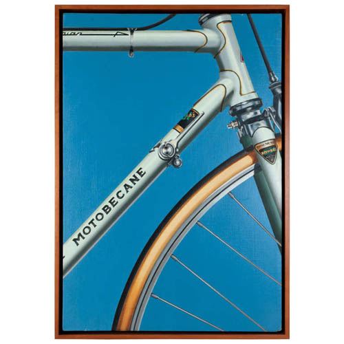
Jeffrey Hartman “Motobecane” Oil on canvas 1978
JEFFREY HARTMAN USA
“Motobecane” 1978
Oil on canvas
Signed: “Jeffrey Hartman ‘78”, “© 78 HARTMAN” (on the back)
Framed H: 26 1/2” x W: 18 1/2”
Price: $18,000
Belgian art dealer Isy Brachot coined the French word Hyperréalisme, meaning Hyperrealism, as the title of a major exhibition and catalogue at his gallery in Brussels in 1973. The exhibition was dominated by such American Photorealists as Ralph Goings, Chuck Close, Don Eddy, Robert Bechtle and Richard McLean; but it included such influential European artists as Gnoli, Richter, Klapheck and Delcol. Since then, Hyperealisme has been used by European artists and dealers to apply to painters influenced by the Photorealists. However, Hyperrealism is contrasted with the literal approach found in traditional photorealist paintings of the late 20th century. Hyperrealist painters and sculptors use photographic images as a reference source from which to create a more definitive and detailed rendering, one that often, unlike Photorealism, is narrative and emotive in its depictions. Strict Photorealist painters tended to imitate photographic images, omitting or abstracting certain finite detail to maintain a consistent over-all pictorial design. They often omitted human emotion, political value, and narrative elements. Since it evolved from Pop Art, the photorealistic style of painting was uniquely tight, precise, and sharply mechanical with an emphasis on mundane, everyday imagery. Hyperrealism, although photographic in essence, often entails a softer, much more complex focus on the subject depicted, presenting it as a living, tangible object. These objects and scenes in Hyperrealism paintings and sculptures are meticulously detailed to create the illusion of a reality not seen in the original photo. That is not to say they’re surreal, as the illusion is a convincing depiction of (simulated) reality. Textures, surfaces, lighting effects, and shadows appear clearer and more distinct than the reference photo or even the actual subject itself.
-
Hubert Schmalix “Häuserbild” Oil on Canvas 1989
HUBERT SCHMALIX (1952-) Austria
Häuserbild 1989
Oil on canvas
Signed and dated on back: Schmalix 89
Exhibited: Galerie Krinzinger Vienna 1990 (Solo exhibition)
Illustrated: Nach Schiele, Tobias G. Natter and Thomas Trummer (Köln, Germany: Atelier Augarten, DuMont, 2006), p 142.
Provenance: Private Collection Vienna
For related works by Hubert Schmalix see: Hubert Schmalix, Lóránd Hegyi exhibition catalog (Museum Moderner Kunst StiftungLudwig Wien) November 19, 1994 – January 1995.
H: 85” x W: 49”
Hubert Schmalix was born in Graz, Austria, on December 17, 1952 and studied at the Vienna Art Academy from 1971 to 1976. By 1979 Schmalix was showing work at the forward-looking exhibition ‘Europa 79 – Kunst der 80er Jahre’ in Stuttgart. In 1983 the London Tate Gallery invited Schmalix to present work at ‘New Art’, an important survey of contemporary art. Schmalix has become well-known world-wide as an exponent of ‘New Art’, working with a retrospective glance at both classical art history and modern art. Schmalix focuses on the world of things and the human figure. Although the expressive gesture was the dominant feature of his 1980s work, it yielded early in the 1990s to stringent tectonic composition. In 1984 Hubert Schmalix went to the Philippines and on to the US, moving to Los Angeles in 1987. In 1986-87 Schmalix taught at the Academy for the Decorative and Applied Arts in Vienna and from 1997 he has been a professor at the Vienna Art Academy. Schmalix is a visiting professor at the University of California Los Angeles (UCLA). In 1993 his work was featured at the Venice Biennale and in 1998 he was awarded the Fine Art Prize of the City of Vienna. Schmalix has done several large fresco cycles in Salzburg and his work has been shown extensively at numerous international solo and group shows and most recently at Art Basel 2006.
The Kunstforum in Vienna is dedicating a major retrospective show to Hubert Schmalix from May 6th – July 12th, 2015.
“I’m not nervous or angry when I paint, but well rested and concentrated. Each stroke of the brush is important! I’ve painted a whole lot of beautiful pictures this way.” (Hubert Schmalix)