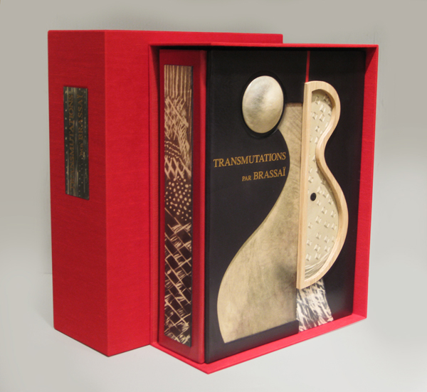
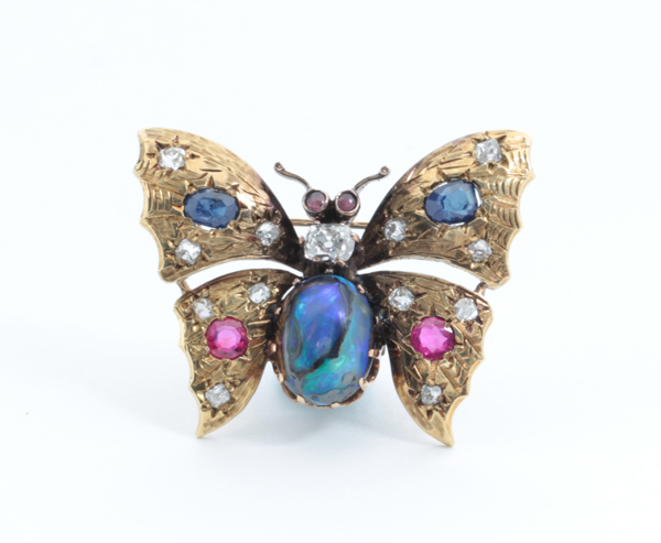
BRASSAÏ (1899-1984) Austria-Hungary
“Transmutations 1934-35” 1967
Published by Lacoste: Galerie Les Contards, France.
12 gelatin silver prints each flush-mounted to a presentation folder with printed sequential number and title, with colophon contained in a linen covered, velvet lined clamshell folio with gilt lettering on the spine.
Signed and numbered 32 in ink on the colophon. This work is from an edition of 100. The titles include: I. Femme-fruit; II. Sevillane denudee; III. Odalisque; IV. Femme-mandoline; V. Femme-amphore; VI. Fille de Joie se Deshabillant; VII. Visage mineral; VIII. Tentation de Saint Antoine; IX. Jeune fille revant; X. Offrande; XI. Femme aux voiles; XII. Fete foraine.
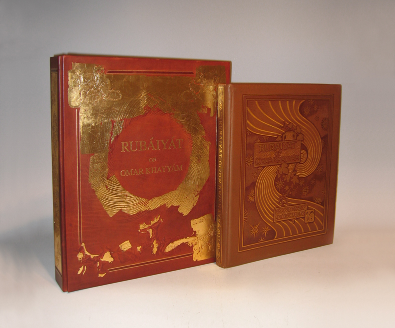
128pp. First edition bound in brown flat-weave cloth over beveled boards; front cover with gilt lettering, dark brown-stamped ruled borders, symbolist design of vase, vine, swirl and stars, rear cover without decoration; spine with gilt lettering and dark brown-stamped ruled borders and ornaments; signed in gilt & dark brown-stamp on front cover. Collection of poems originally written in the Persian language, “Rubáiyát” (derived from the Arabic root word for 4) means “quatrains”: verses of four lines.
Translated by Edward Fitzgerald
54 drawings by Elihu Vedder reproduced by Albertype process on facing pages (printed one side only)
Published by Houghton Mifflin and Company, Boston
Dimensions:
Book: H: 16” x W: 13 ¼” x D: 1 ¾”
Custom leather box 2008: H: 17 15/16” x W: 14 3/4” x D: 2 7/8”
Custom silk slipcase: H: 19 1/8” x W: 15 ½” x D: 4”
From the moment of its publication, Elihu Vedder’s Rubáiyát of Omar Khayyám achieved unparalleled success. The first edition appeared in Boston on 8 November 1884; six days later, it was sold out. Critics rushed to acclaim it as a masterwork of American art, and Vedder (1836-1923) as the master American artist who set the standard for the artist-designed book in America and England.
Written ca. 1120 by Persian poet-philosopher Omar Khayyam (1048-1131), the Rubaiyat is a collection of quatrains, or poems of four lines, intended to prove the futility of mathematics, science, and religion in determining the meaning of life. First translated from Persian to English in 1859 by Edward Fitzgerald, editions of Khayyam’s Rubaiyat have since appeared in numerous forms and languages, thebest-loved, best-known, and most elaborate being the 1884 edition illustrated and designed by Elihu Vedder.
Vedder was one of the first artists of his generation to train in Paris where he developed his signature Academic style and focused on what would become his favored subject: the classically proportioned female nude. In the years 1883 and 1884, he created 54 compositions to accompany the 1884 edition of Khayyam’s Rubaiyat (published by Houghton, Mifflin) – drawings that serve as a harmonious frame for the text. Living in Rome at the time, Vedder also designed the book’s cloth-bound cover, lining papers and eccentric hand-drawn letters. With his Academic and yet “visionary” style, Vedder was the ideal artist to interpret the Rubaiyat; he reconciled the critics who called for accurate depiction of observed reality with those who argued for feeling and emotion over objective form.
Additionally, Vedder arranged the verses to express the three stages of existence explored in the Rubaiyat — happiness and youth; death and darkness; and rebirth — as well as to fit his own romantic interpretation of the verses. Vedder’s drawings for the book combine traditional Christian symbols, classical figures, and mystical imagery of his own invention to evoke the mood of Khayyam’s poems. A prevalent device is his “cosmic swirl,” which, according to Vedder, represented the “gradual concentration of elements that combined to form life; the sudden pause through the reverse of the movement which marks the instant of life; and then the gradual, ever-widening dispersion again of those elements into space.”
Vedder’s edition of Khayyam’s Rubaiyat was an instant success, selling out only six days after its debut in Boston on November 8, 1884. With the Rubaiyat, Vedder set the standard for artist-designed books in America and England. Critics rushed to acclaim it as a masterwork, and Vedder as a major American artist.
The Brandywine River Museum presents decorative drawings and paintings created by a master nineteenth-century American artist in Elihu Vedder and the Rubáiyát of Omar Khayyám, on view from March 15 to May 18, 2008. The exhibition features more than 50 drawings with hand-lettered poems created by Vedder for his illustrated version of Khayyám’s literary work. Exclusively at the Brandywine River Museum, the exhibition also features major paintings by Vedder related to the illustrations for the i>Rubáiyát.
Elihu Vedder’s Rubáiyát was published in Boston in 1884 and its sensuous, decorative drawings so captivated the public that the first edition of the book sold out in six days. Critics rushed to acclaim it as a masterwork of American art, and Vedder as the master American artist. Vedder’s designs for the book-its cover, lining paper, drawings, and hand-drawn letters-are all done in chalk, pastel, pencil, and ink. The drawings set the standard for an artist-designed book in America and England in the 1880s. They are part of the Smithsonian American Art Museum’s permanent collection and were last shown in 1996.
The Rubáiyát was written in 1120 by the Persian mathematician, astronomer, and poet Omar Khayyám (1048-1131). “Rubáiyát” is the plural form of quatrain, or a verse unit of four lines. Since the first English translation was published in 1859, hundreds of editions have been produced. The poem expounds on the transience of existence and the uselessness of science and religion to untangle the knotted meanings of life. Pre-Raphaelite and aesthetic-movement writers immediately embraced the poem as a touchstone of the spiritual and poetic in a time of strident materialism.
As an ardent admirer of the verses, Vedder’s interest in the book went beyond the aesthetic to the personal. The tragic deaths of his sons (in 1872 and 1875) and births of two more children (a daughter in 1873 and a son in 1875) were remarkably explained, it seemed to Vedder, by the poet’s message regarding death, undiscoverable fate, and the renewal of life. He included images of himself and his family in several of the drawings.
The exhibition also features paintings by Vedder, including some that pre-dated the Rubáiyát and provided the basis for illustrations in it. Following the success of the Rubáiyát , Vedder continued to explore its themes and imagery in a number of paintings that he exhibited and sold. Among these are The Cup of Death (1885/1911), The Pleiades (1885), The Fates Gathering in the Stars (1887), and The Cup of Love (1887). The paintings are on loan from museums and private collections.
Elihu Vedder has often been described as an artist of haunting and poetic imagination, who created works of strength, beauty, and fantasy. Born in New York City in 1836, Vedder began painting seriously after visiting Europe in 1856 to study in Paris and Florence. He briefly returned to New York and opened a studio, which failed due to the onset of the Civil War. It was during his years in New York that he produced some of his most imaginative works. He was elected to the National Academy of Design in 1865. Vedder returned to Europe in 1866 and settled in Rome, only occasionally returning to the United States to execute commissions for decorative works, murals, and mosaics. He died in Rome in 1923.
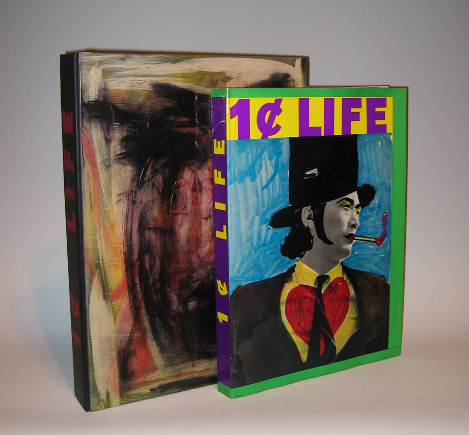
68 Original Pop-Art & Cobra Graphics
Limited edition of 2000 copies, Elephant Folio, 176 pages
Edited by Sam Francis (1923-1994)
Published by E.W. Kornfeld, Bern, Switzerland
Dimensions:
Book: H: 16 3/8” x W: 12”
Custom leather box: H: 18 1/16” x W: 13” x D: 2 7/16”
Custom silk slipcase” H: 19 1/8” x W: 13 7/8” x D: 3 3/16”
Artists that contributed original graphic work illustrating Walasse Ting’s poetry for this volume include: Pierre Alechinsky (5), Karel Appel (5), Enrico Baj (2), Alan Davie (3), Jim Dine (2), Sam Francis (6), Robert Indiana (2), Alfred Jensen (3), Asger Jorn (2), Allan Kaprow, Alfred Leslie (2), Roy Lichtenstein (2 + cover), Joan Mitchell, Claes Oldenburg (3), Mel Ramos (2), Robert Rauschenberg (2), James Rosenquist, Bram Van Velde, Andy Warhol, and Tom Wesselman (2).
Walasse Ting, born in Shanghai, is a self-taught painter, sculptor, graphic artist and poet. Leaving China in 1949 to travel, he reached Paris in 1953 and became acquainted with artists Karel Appel, Asger Jorn and Pierre Alechinsky, members of the avant-garde group known as COBRA. Since 1963, he has lived in New York.
“Ting wanted to publish the most international illustrated book, intended to illustrate his text, uniting tachisme, neo-dadaisme, pop art, and all other artistic movements. The idea was born from global experience, close contact with culture, pseudo-culture, primitive existential worries, urban erotic and eastern wisdom.. It was a Herculean task, for which only a Chinese would have been able to muster the perseverance” – E. W. Kornfeld.
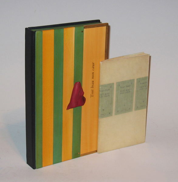
Well-known as a writer, critic, collage artist, friend to the Dada and Surrealist movements and bookbinder, Hugnet wrote and illustrated many books, though rarely in the lithographic medium. This is a reissue of his poems first published in 1946, illustrated with his own lithographs.
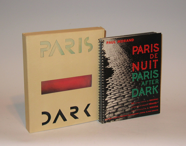
Brassai / Paul Morand “Paris de Nuit” (Paris After Dark) 1933
Brassaï (1899-1984) Austria-Hungary [now Romania]
Paul Morand (1888-1976) France
“Paris de Nuit” (Paris After Dark) 1933
Published by Arts et métiers graphiques, Paris
Dimensions:
Book: H: 9 13/16” x W: 7 9/16”
Custom leather box: H: 10 5/8” x W: 8 5/8” x D: 1 3/8”
Custom silk slipcase: H: 11 21/32” x W: 9 5/8” x D: 2 7/16”
Brassaï is the pseudonym of Guyla Halász from Transylvania (Hungarian at the time of his birth, but currently part of Romania). Brassaï literally means: from Brasso (his native village). He decided to use this pseudonym in 1932, the year in which Paris de nuit was published. He had already been living in Paris for eight years, where he wrote articles for German magazines and met photographers such as Atget and André Kertész. Not until 1930 did he first begin to take photographs himself, immediately discovering his main subject: Paris.
He moved into an apartment on the corner of the Rue de la Glacière and the Boulevard Auguste-Blanqui in 1928, where Raymond Queneau also lived. He would go out at night with Queneau or other nocturnal people such as Léon-Paul Fargue, but Brassaï usually just walked through the abandoned streets and alleys of the city. He could only take 24 photographs per walk because the stack of glass photo plates would otherwise grow too heavy.
His nocturnal journeys yielded a wealth of photographs, which by now have gained the status of icons of modern photography. They were first published on 2 December 1932 by Arts et metiers graphiques, which was Charles Peignot’s publishing business. He was also the founder of the magazine Arts et metiers graphiques (1927-1939) in which articles on design, typography, illustration and advertising appeared. It was printed in an edition of 4000 copies: there were also printers associated with the editing staff, like Léon Pichon. Peignot was the president of type foundry Deberny et Peignot, and were in contact with the Union des Artistes Modernes (Cocteau, Gide, Sonia Delaunay, Maximilien Vox and others) and with poster designers such as Cassandre.
The first review of Paris de nuit was published in a Dutch newspaper, the Nieuwe Rotterdamsche Courant of 29 December 1932. An English edition of the photo book appeared in 1933 from Batsford Gallery in London. The photographs were also exhibited. Many photo books were to follow, including a book in 1960 about the graffiti on Parisian walls, which he had documented in his photographs since 1930. Not without reason did Henry Miller call him ‘the eye of Paris’. Jean Paulhan actually asserted that Brassaï had more than two eyes.
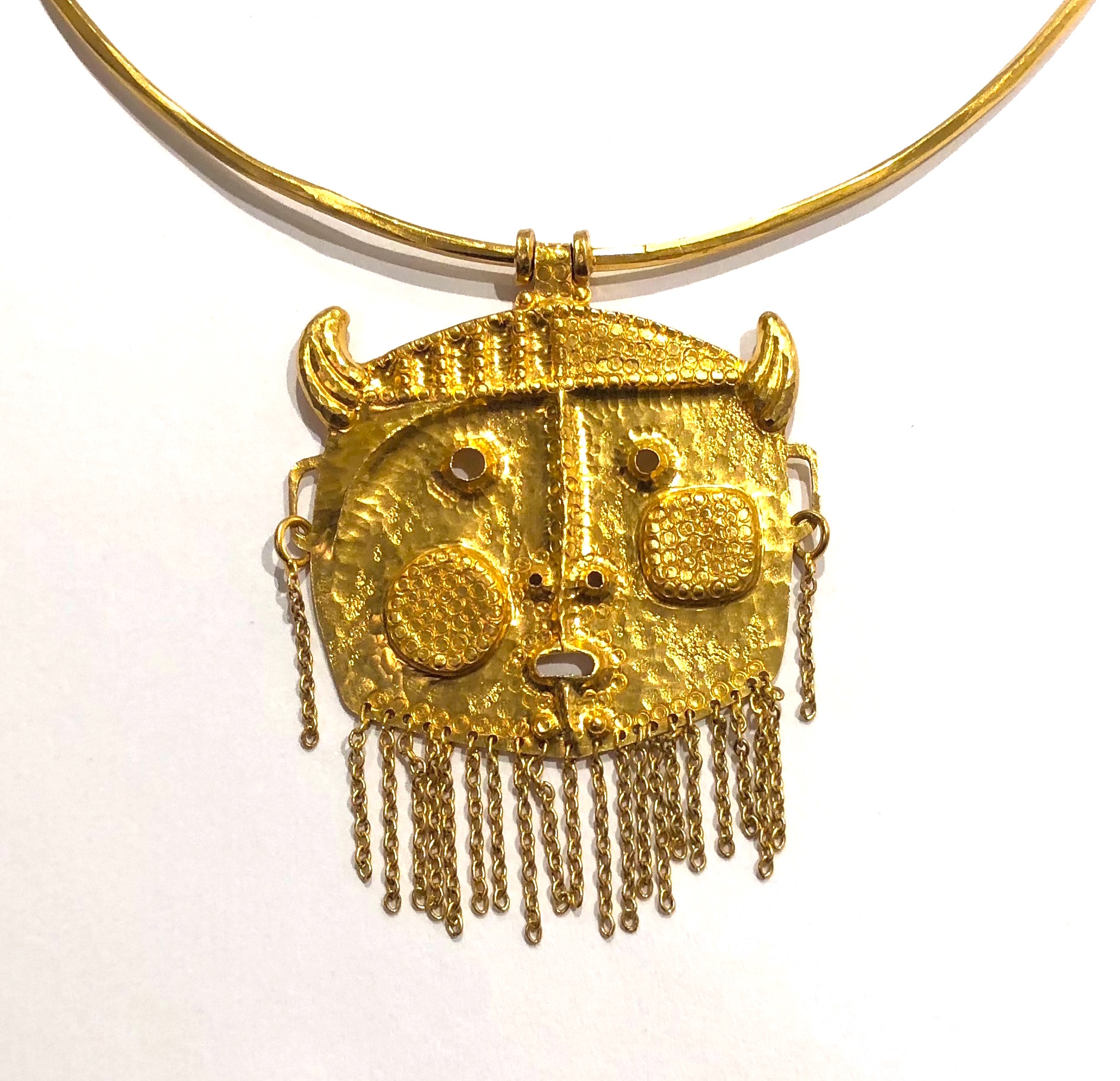
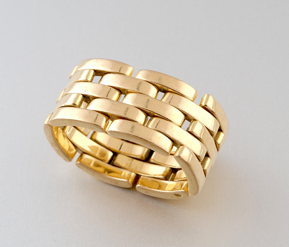
Tapio Wirkkala / Nils Westerback, Pendant Necklace, Lap-gold (18K gold or higher) pendant head with a rigid necklace, marked, 1970
TAPIO WIRKKALA (1915-1985) Finland
NILS WESTERBACK Finland
Pendant Necklace 1970
Lap-gold (18K gold or higher) pendant head with a rigid necklace
Makers: Tapio Wirkkala and Nils Westerback
Marks: 750, three crowns symbols
Model illustrated in: The Art of Jewelry, Graham Hughes (New York: The Viking Press, Inc., 1972), p. 135; Scandinavian Design, Charlotte and Peter Fiell (Köln: TASCHEN, 2002) p. 675; Marianne Aav, Rosa Barovier Mentasti and Gordon Bowyer, et al., Tapio Wirkkala – eye, hand and thought, exh. cat., Museum of Art and Design, Helsinki, 2000, p. 194, fig. 342 and p. 370
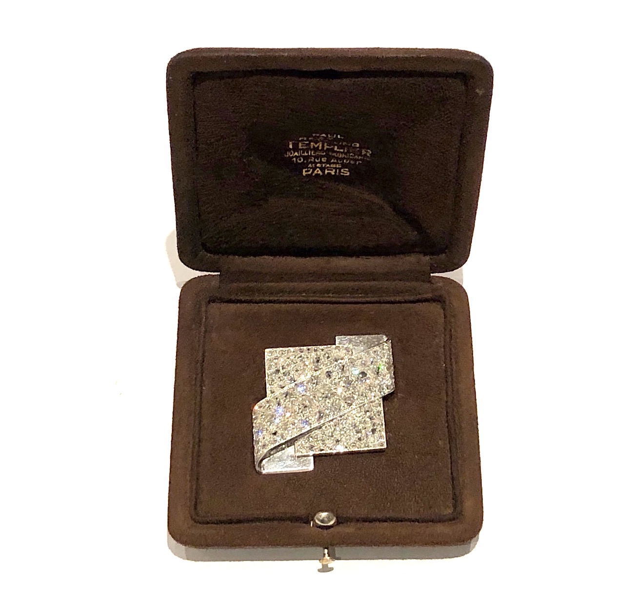
Raymond Templier, Paris (1891-1968) Extraordinary and important “Modernist” brooch in in a strong overlapping geometric design in platinum and set with dramatic European-cut diamonds (approx. 13 carats TW), signed: Raymond Templier, French Dog’s head assay mark for platinum, illustrated in the monograph on Raymond Templier (see image below), original signed with gold embossing on the interior of the brown suede presentation box, c. 1935
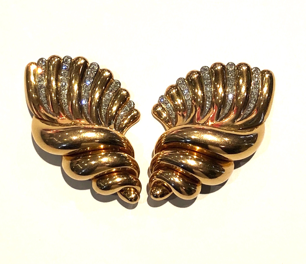
French Art Deco stylized swirl “Seashell” clip / brooches with the maker’s mark of Pierre Maillard in 18k gold set with 82 round-cut diamonds (approximately 4 carats TW), marked: P and M (maker’s mark of Pierre Maillard, rue St. Martin, 75003, Paris) in a diamond poincon, (2x), French Eagle’s head assay mark for 18k gold (4x), c. 1938
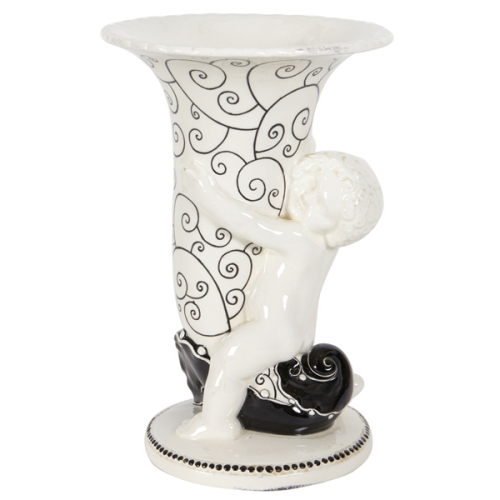
Michael Powolny / Wiener Keramik Vienna Secession “Putto” vase c.1910
MICHAEL POWOLNY (1871-1954) Austria
BERTOLD LÖFFLER (1874-1960) Austria
WIENER KERAMIK Vienna
Putto mit Füllhornvase c. 1910
Glazed white earthenware handpainted with black enamel.
Marks: MP (impressed artist’s monogram), WK (impressed firm logo in a square)
Exhibited: Frühjahrsausstellung Österreichischer Kunstgewerbe in Österreichisches Museum für Kunst und Industrie (today the MAK museum), Vienna, 1912.
Model illustrated: Deutsche Kunst und Dekoration, Vol. XXXI, October 1912 March 1913, n.p.; Deutsche Kunst und Dekoration, Vol. XXXIII, October 1913-March 1914, n.p.; The Studio Yearbook of Decorative Art 1913 (London, 1913), p. 218; Wiener Keramik, L.W. Rochowanski (Leipzig and Wien: Thyrsos Verlag, 1923) n.p.; Michael Powolny: Keramik und Glas aus Wien 1900 bis 1950, Elisabeth Frottier (Vienna: Böhlau Verlag, 1990) 1912 photograph with the horse sculpture displayed in vitrine from Frühjahrsausstellung Österreichischer Kunstgewerbe, illus. 4, p. 15, illus. 16, p. 33, cat. no. WV 132.
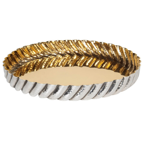
Josef Hoffmann / Wiener Werkstaette Fluted serving tray c. 1928
JOSEF HOFFMANN (1870-1956) Austria
WIENER WERKSTÄTTE (1903-1932) Vienna
Fluted serving tray c. 1928
Handwrought silver plated brass, gilt interior, hand hammered swirled fluting, scalloped edge
Marks: MADE IN AUSTRIA (in a square), JH monogram, WIENER WERK STÄTTE (in a square)
Model illustrated: Josef Hoffmann: Ornament zwischen Hoffnung und Verbrechen (Wien: Herausgeber, 1987) p. 185.
Related models illustrated: Wiener Werkstätte Design in Vienna 1903-1932, Werner J. Schweiger (New York,1984) pp. 62,66; Josef Hoffmann Designs, ed. Peter Noever, MAK and Prestel-Verlag: Munich, 1992) pp. 172, 174, 189.
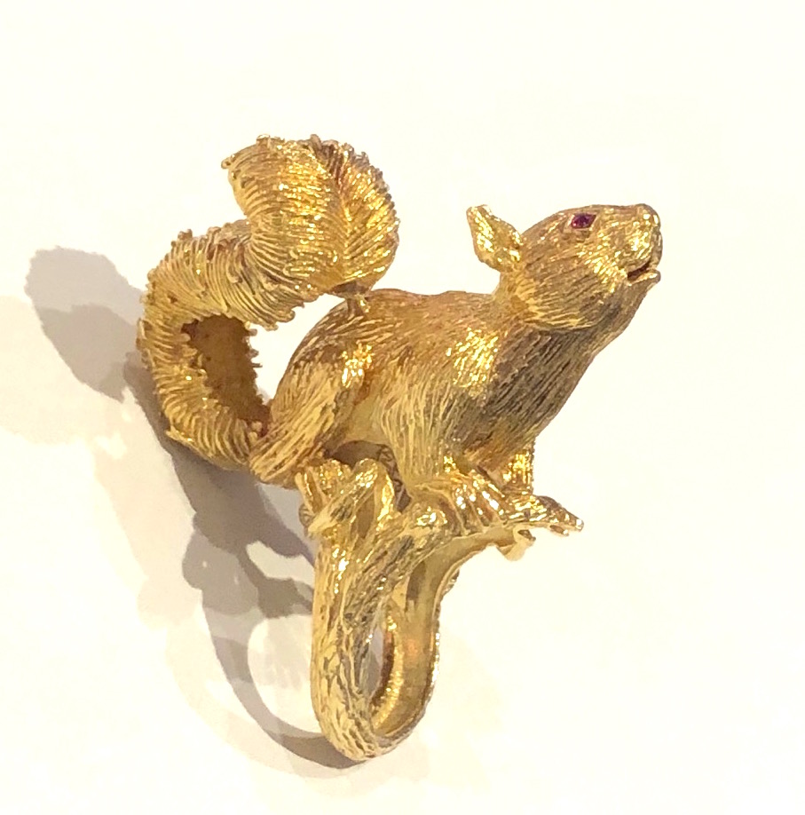
Kurt Wayne (born in Vienna, 1909-1990, New York) statement “Squirrel” ring in highly textured 18k gold and set with ruby eyes, signed: (Copyright mark) KW 1969, KW 18k, 1969
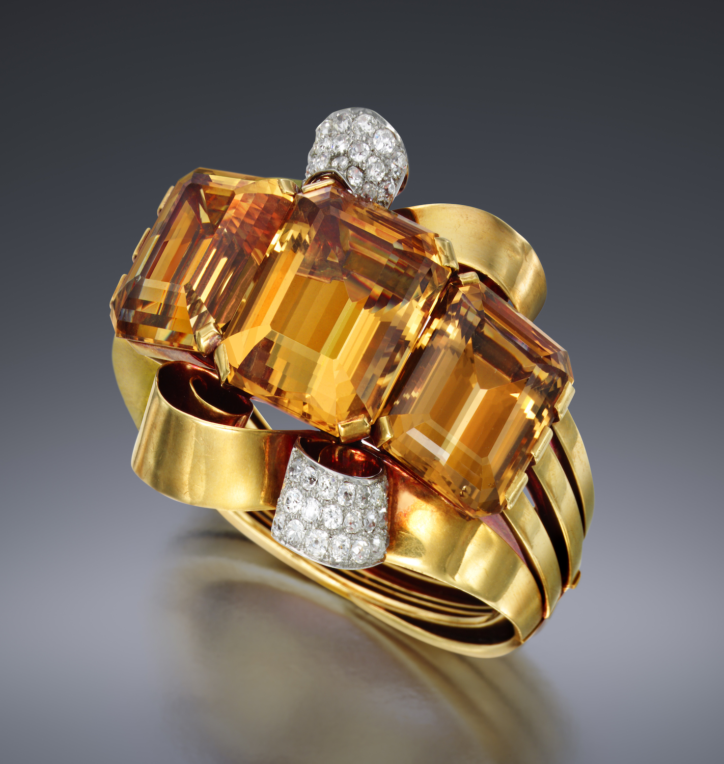
Paul Flato (attr.) “Dolores del Rio” cuff bracelet, 3 large rectangular citrines (approx. 200+ carats) and pave diamonds (approx. 9 carats TW) set in 18K yellow gold and platinum,(G.I.A. certificate) c. 1940
Provenance: Dolores del Rio
Illustrated: “The Impossible Collection of Jewelry” by Vivienne Becker(Assouline, 2015)
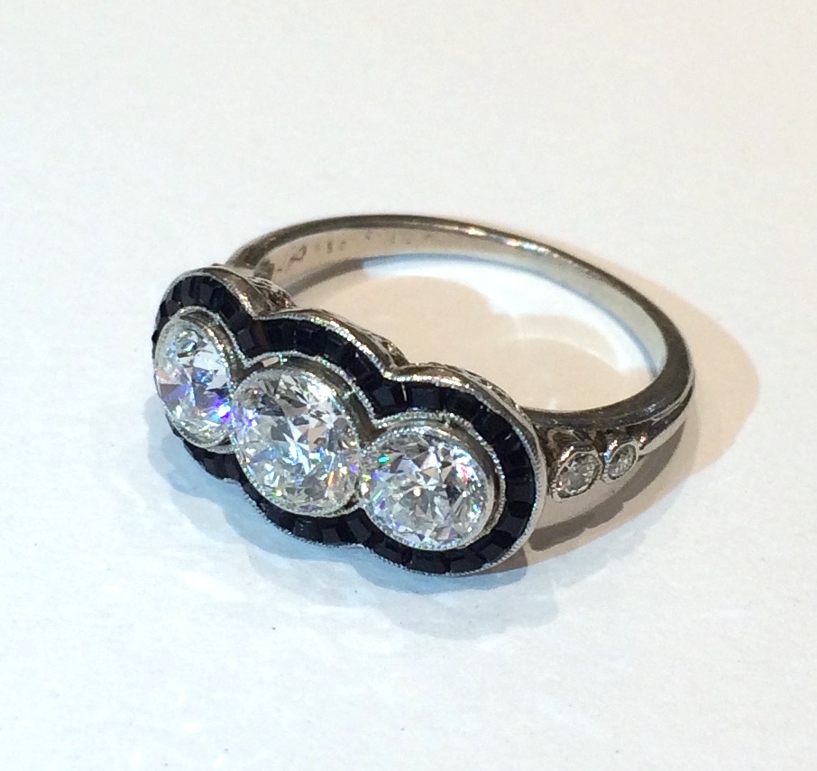
Shreve & Co., San Francisco Art Deco ring set with a trio of round cut diamonds (approx. 2 1/4 carats TW) set in platinum with caliber cut onyx surrounding the three diamonds and further set with four round cut diamonds flanking either side of the ring shank, signed: Shreve & Co., 950, Platinum, c.1930
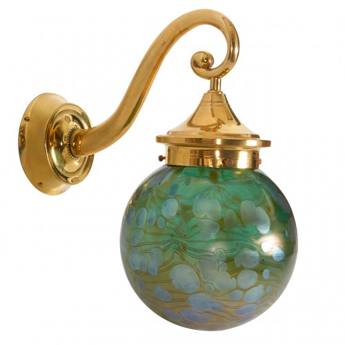
Josef Hoffmann / Wiener Werkstätte / Loetz globe Vienna Secession sonce c.1915
JOSEF HOFFMANN (1870 – 1956) Austria
JOH. LÖTZ WITWE Klostermühle, Bohemia
WIENER WERKSTÄTTE (1903-1931) Vienna
Wall sconce with Loetz globe c. 1915
Polished brass, wall arm in the form of volute with pearl ribbon, handblown Lötz glass, cobalt Phänomen Gre
Marks: JH, WIENER WERKSTÄTTE
For more information see: Wiener Werkstätte: 1903-1932 Gabriele Fahr-Becker (Cologne: Taschen, 1994); Wiener Werkstätte Design in Vienna 1903-1932, Werner J. Schweiger (New York,1984); Josef Hoffmann Designs, ed. Peter Noever, MAK and Prestel-Verlag: Munich, 1992); Wiener Werkstätte by Gabriele Fahr-Becker.
Extension from the wall forward: 11 ½”
H top of arch to bottom of globe: 11 ¼”
Diameter of globe: 6 1/2”
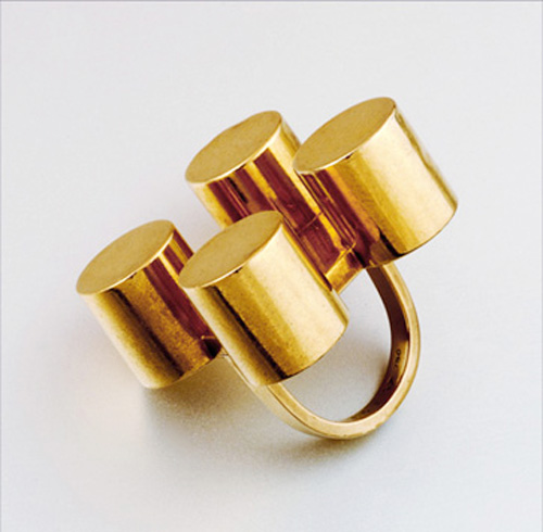
Ettore Sottsass / Walter de Mario, 18K gold architectural ring, signed, 1964
ETTORE SOTTSASS Italy
WALTER DE MARIO (maker) Italy
Architecural ring 1964
18K gold
Signed: ES1, 750, Walter de Mario touch mark
Illustrated: Ettore Sottsass, Centre Georges Pompidou, Paris, 1994, p. 65
Exhibited: Ettore Sottsass, Centre Pompidou, Paris, April 27-September 5, 1994; Barbara Radice, Ettore Sottsass: A Critical Biography, New York, 1993 p. 144-145 (for related drawings)
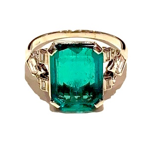
American Art Deco rare “Colombia Emerald” solitaire ring set with a gem quality, rectangular step-cut natural emerald of 4.72 carats (Colombian origin, natural, minor oil clarity enhancement, Certificate) set in an iridium platinum mounting and further set with two diamond-shaped diamonds (approx. .40 of a carat TW), four baguette diamonds (approx. .10 of a carat TW) and four round-cut diamonds (approx. .15 of a carat TW), marked: 10% iridium platinum, c.1930
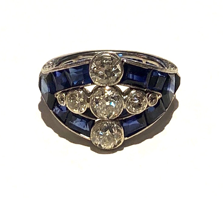
American Art Deco “Triple Diamond” and sapphire ring set with seven round-cut diamonds (approx. 1.20 carats TW) and further set with 24 emerald, square and mixed–cut sapphires (approx. 3.50 carats TW) encircling the ring and all in a finely engraved platinum mounting, c. 1930
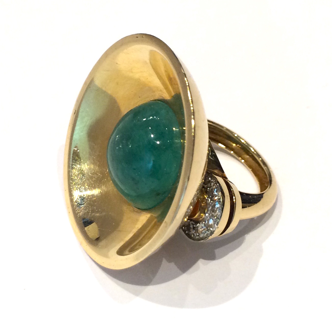
American Art Deco, cabochon emerald (approx. 14 carats TW) 18K rose gold ring with a large concave half dome surround and ring shank with two flanges on either side further set with 14 diamonds (approx. 1.50 carats TW), c. 1935
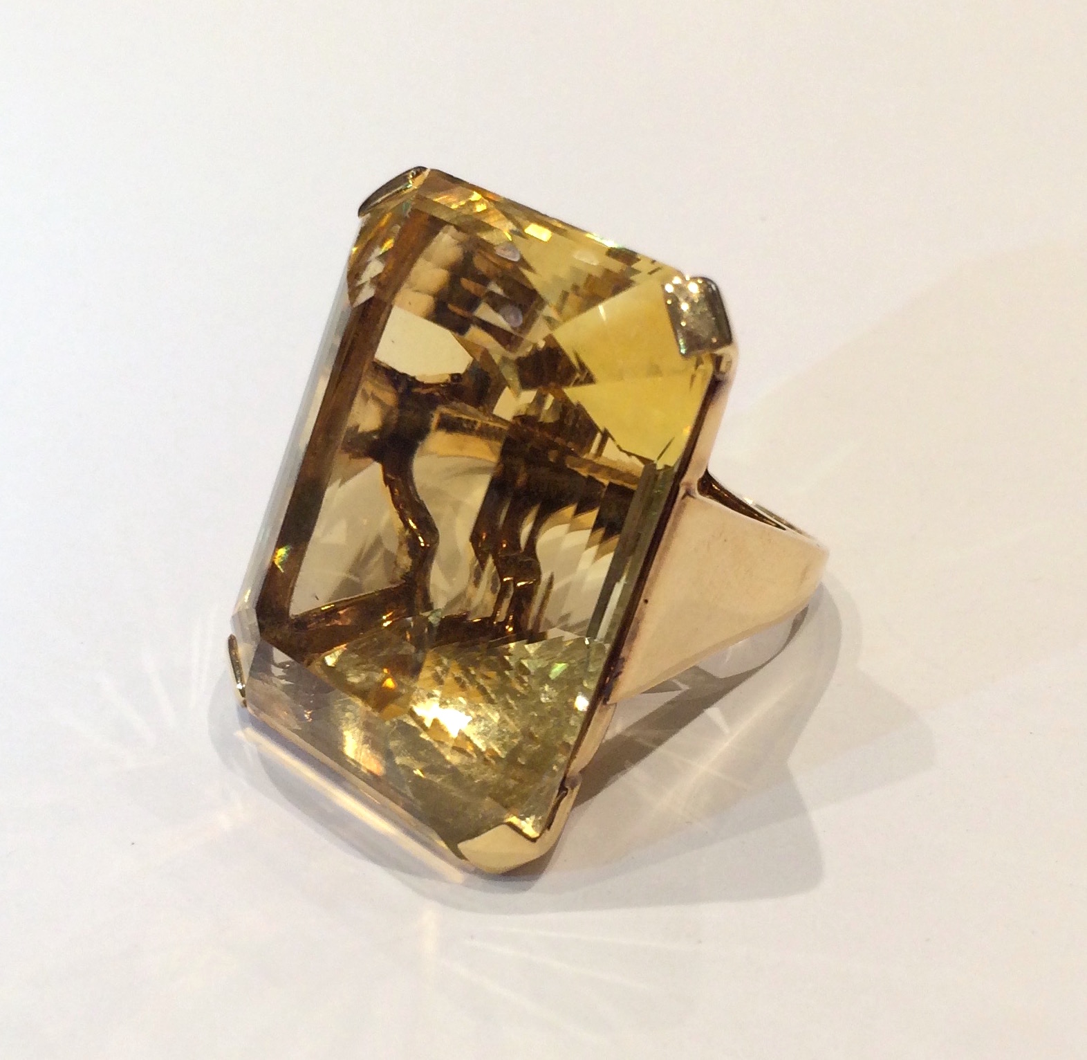
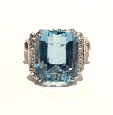
American Art Deco ring set with a large gem quality emerald step-cut aquamarine (approx. 15 carats by calculation with the dimensions of 17mm x 13mm x 10mm depth) and 10 round cut diamonds (approx. half of a carat TW) all set in a platinum “Bow tie” design mount, signed: FFF framed with a triangle facing in on either side (maker’s mark), Plat (platinum mark), c.1935
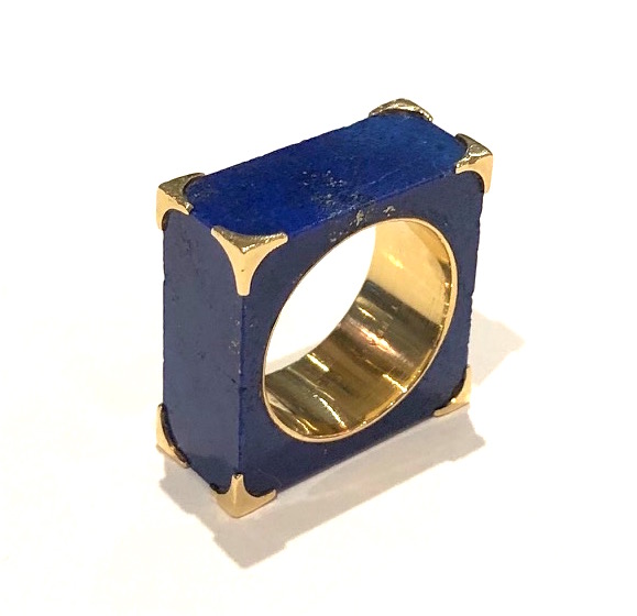
Tiffany & Co., Paris, / Georland, Paris, (Georges Richard and Roland Bouder) solid squared block of lapis lazuli in the shape of a ring and mounted in all eight corners and on the interior of the ring hole in 18k yellow gold, signed: Tiffany France 18k, Ste and a G with a Cornucopia between in a diamond poincon (maker’s mark for Georland), French Eagle’s head assay mark for 18k gold, pre-1952 (when Tiffany & Co. closed their Paris store)
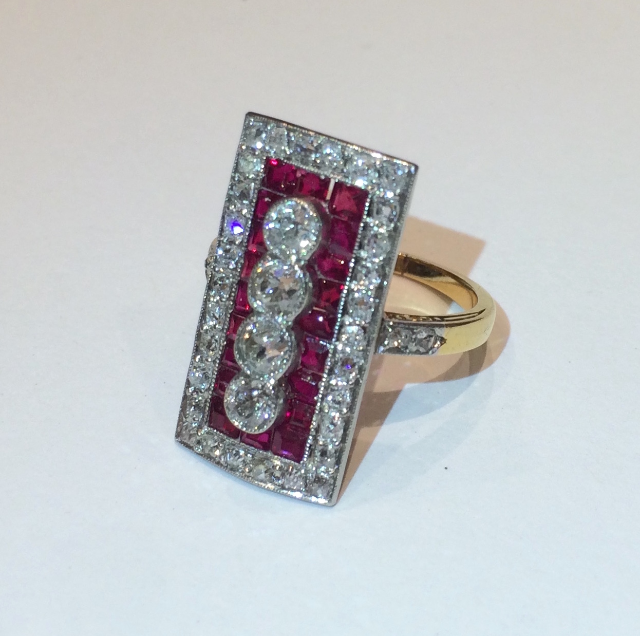
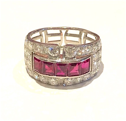
Art Deco ruby and diamond ring set in platinum topped 18k yellow gold, four round diamonds (approx. 1 carat TW) set with 20 square and caliber cut natural rubies (approx. 3 carats TW) further set with 34 round diamonds (approx. 2.50 carats TW) c.1920
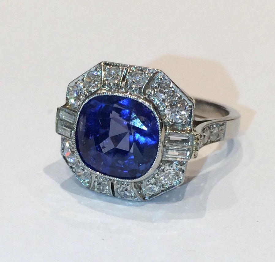
Art Deco cushion shape natural Burmese sapphire ring (approx. 7 carats TW, G.I.A. certificate, no heat) set in an intricate platinum mount with 4 baguette diamonds and 16 round diamonds (approx. 4 carats), c. 1930
Art Deco cushion shape natural Burmese sapphire ring (approx. 7 carats TW, G.I.A. certificate, 10.00 x 9.70 x 8.00mm, no heat) set in an intricate platinum mount with 4 baguette diamonds and 16 round diamonds (approx. 4 carats), c. 1930
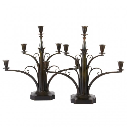
Just Andersen, Denmark Pair of Five-Branch Art Deco Candelabra c.1925
Just Andersen (1884-1943), Denmark.
Pair of five-branch Art Deco candelabra, circa 1925.
Cast and wrought bronze with original rich brown and green patina.
Marks: Denmark just in a triangular cartouche, No. B180.
For more information see: “Just Andersen: Manden og Vaerket” by Svend Rindholt in Samleren: Tidskrift for Kunst og Kunstindustri (Attende Aargang, 1941) pp. 171-194; Dansk Biografisk Leksikon. Første Bind (Copenhagen: Gyldendal, 1979) p. 199. The Design Encyclopedia. Mel Byars (New York: John Wiley & Sons, Inc., 1994) p. 23.
H: 17 5/16″ x W: 17 1/2″
By repute this pair of candelabra were exhibited in the Danish section at the Paris 1925 Exposition.
Just Andersen was a designer and craftsman for Georg Jensen until 1918 when he left to open his own studio. These candelabra are exquisite and remarkable examples of Danish Art Deco design and a testament to the artist’s consummate craftsmanship. Andersen’s bronzes are characterized by rich, deep patination and superlative casting quality and surfaces.
Cartier Art Deco brooch, carved rock crystal with a fancy platinum mount set with diamonds, original leather box, signed c. 1925
Cartier Art Deco brooch, carved rock crystal with a fancy platinum mount set with two European and cushion cut diamonds (approx. 3 carats TW) further set with two European and cushion cut diamonds (approx. 1 carat TW) with diamond pave work filling out the surrounding floral motif, original leather box, signed and numbered, c. 1925
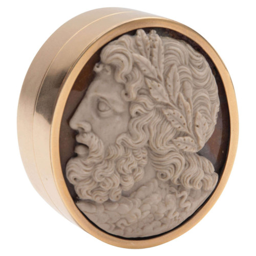
Faberge (attr.) Oval gold (18K rose gold) box with an extremely fine and intricately carved agate cameo medallion of Zeus, c. 1895
For a related oval gold and cameo medallion box in the Russian National Museum presented in the original Iosif Marschak Kiev box see: Illustration #560 “Faberge / Cartier” by Geza von Habsburg (2003)
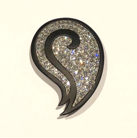
Marsh & Co. San Francisco, “Paisley” brooch with a blackened steel dramatic outline on an elaborate 18k gold frame and back in the shape of a paisley pave set with full cut round diamonds of (approx. 3.5-4 carats TW), c. 1950’s
G.T. Marsh was established in 1876 in San Francisco, CA as one of the first purveyors of Japanese art and antiques. In the early 30’s Marsh, with the help of his Italian bench jeweler settled on a unique style that will always be indicative of the firm. Instead of using gold or platinum, the jeweler, who was interested in gun-smithing, created a line of jewels using sandblasted steel finished with gun bluing. This resulted in a rich dark mat black finish. Chased or milegrained white gold or platinum offset pearls, jade or diamonds set against the black ground of the steel. Movement also played a part in the design. Hinged pearls or gemstones added yet another distinct element to the work or exceptionally strong contrasting graphics. The use of diamonds on a grander scale with the dramatic outline of a classic paisley form, places this brooch mid-century and at a time when Marsh’s Jewelry boutique was particularly flourishing in the Bay area.
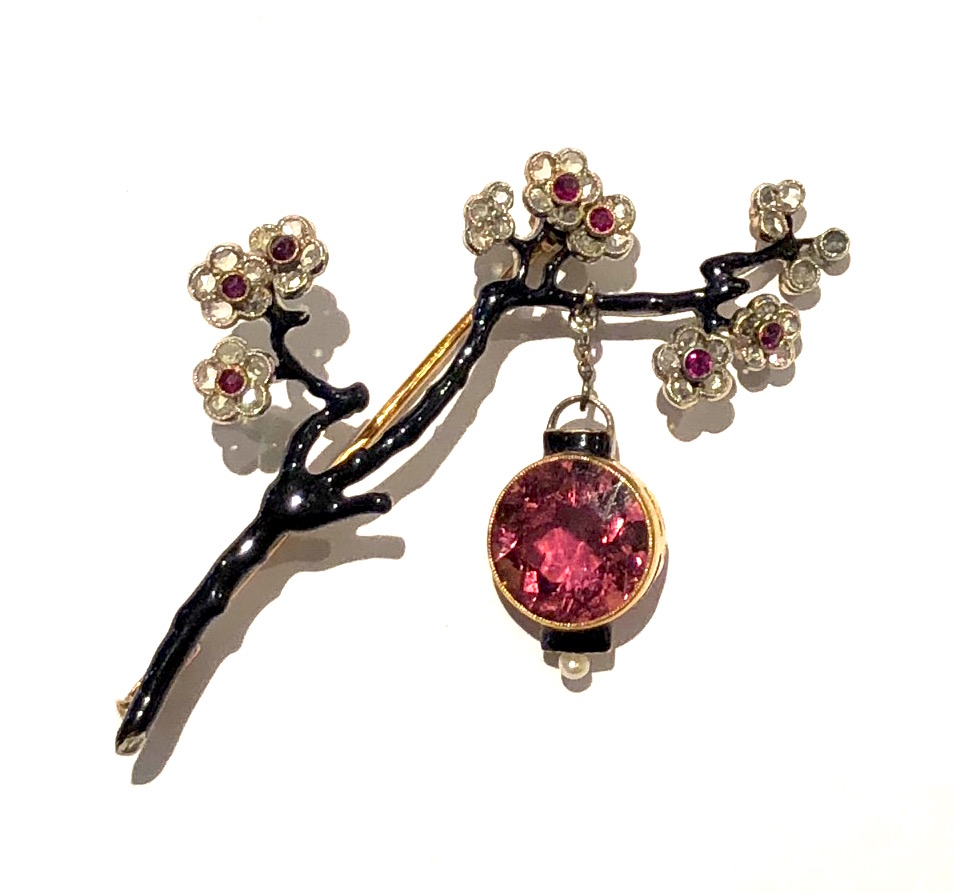
Sigmund Zuckermandl, Vienna, “Cherry Blossom” brooch, enameled 18K gold set with diamonds and pink tourmalines further set with a large round pink tourmaline as a hanging lantern and a pearl, signed, c. 1890
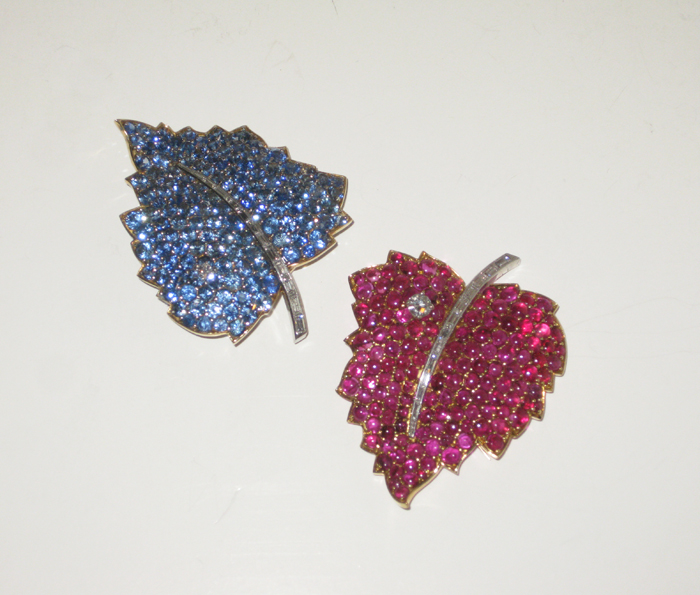
American Retro “Leaf” brooches, Burma sapphires (approx. 12+ carats), cabochon rubies (approx. 12+ carats) and baguette and round diamonds all set in 18K gold and platinum, marked, c. 1950
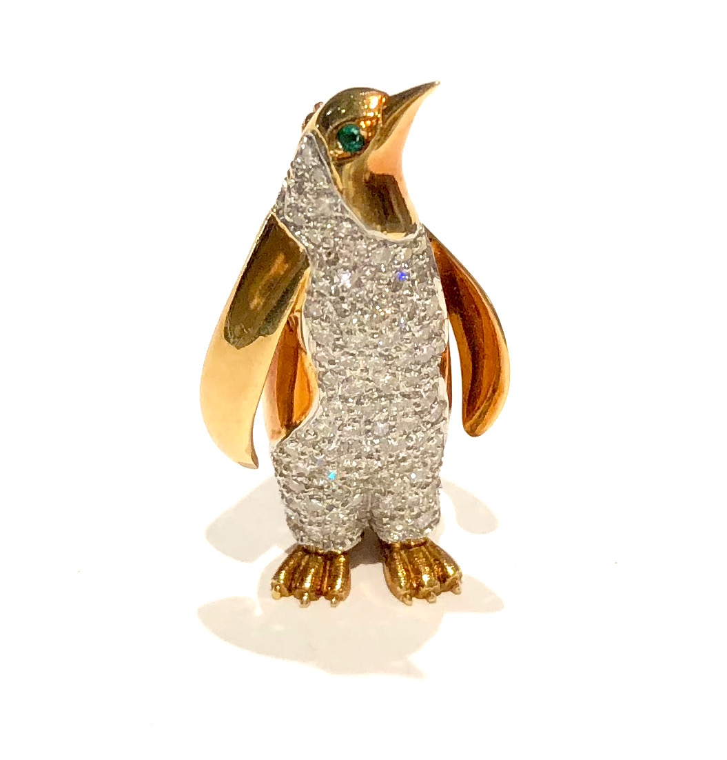
Walter P. McTeigue Penguin brooch, platinum set with pave diamonds (approx. 3 carats TW), 18k gold body further set with two cabochon emerald eyes, signed, c.1940’s
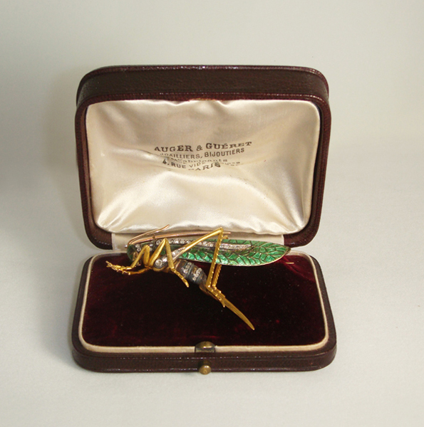
Auger & Gueret (Alphonse Auger et Antoine Gueret) , Paris, “Grasshopper” brooch in finely detailed 18K gold, enamel and rose cut diamonds, original leather box, signed, c. 1895
Ettore Sottsass / Cleto Munari Diagonal stripe and pyramid ring, 18K gold architectural with inset onyx stripes on a diagonal, inset with approx. 8 carats TW of pave diamonds, signed: Sottsass (script signature), No. 1, CM (Cleto Munari), a star 1611, VI (all in a lozenge), 750, Cleto Munari, c. 1985
Ettore Sottsass / Cleto Munari ring illustrated in Jewelry By Architects: From the Collection of Cleto Munari by Barbara Radice (Rizzoli, 1988)
Art Deco ruby and diamond ring set with 5 square-cut natural rubies (approx. 3 carats TW) and further set with 44 round diamonds (approx. 2.50 carats TW) all set in a geometric cut-out design throughout, c.1930