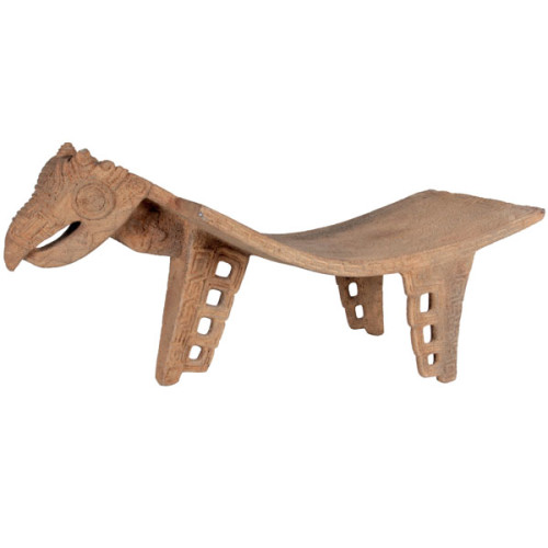
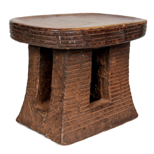
African Tribal Nupe stool Nigeria, early to mid 20th Century
NUPE TRIBE, Nigeria
Nupe stool, Nigeria early to mid 20th Century
Hand carved and decorated wood with a rich developed brown black patina.
This finely hand carved African stool was created by the Nupe tribe of Nigeria. The stool is carved from one piece of wood with intricate refined geometric patterns carved into the top and has seven tapered legs.
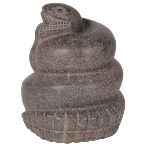
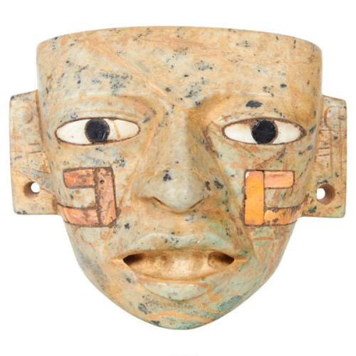
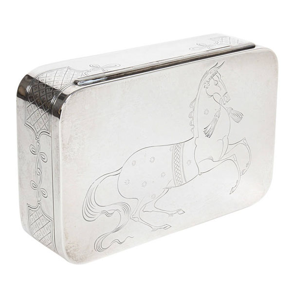
Aztec AD 1325-1475 Important stone carved sculpture of a coiled serpent
AZTEC AD 1325-1475 Mexico.
Important stone carved sculpture of a coiled serpent, AD 1325-1475 Mexico.
***Two scientific authentication reports are available with this sculpture.
H: 10″ x D: 8″
The serpent played a very important role in Aztec religion and was represented in a variety of forms. The majority of the serpents represented in Aztec sculpture are rattlesnakes.
Mexican mythology indicates the snake is a symbol of veneration, worship and honor. Often a symbol of great power, resurrection and rebirth, the snake continues to be a powerful emblem of renewal and transition.
Further, the snake is recognized as a symbol of humanity as a whole. Interestingly, the Mexican perspective provides hope for mankind to aspire to great heights as it correlates the shedding of the serpent’s skin to man’s ability to change his own circumstances and overcome adversity.
The Aztecs build an impressive empire in the valley of Mexico. This thriving area, known as Tenochitlan, was the cultural, religious and trading center of Mesoamerica. Aztecs were the Native American people who dominated northern Mexico at the time of the Spanish conquest led by Hernan Cortez in the early 16th century. According to their own legends, they originated from a place called Aztlan, somewhere in north or northwest Mexico. At that time the Aztecs (who referred to themselves as the Mexica, or Tenochca) were a small, nomadic, Nahuatl-speaking aggregation of tribal peoples living on the margins of civilized Mesoamerica. Sometime in the 12th century they embarked on a period of wandering and in the 13th century settled in the central basin of México. Continually dislodged by the small city-states that fought one another in shifting alliances, the Aztecs finally found refuge on small islands in Lake Texcoco where, in 1325, they founded the town of Tenochtitlan (modern-day Mexico City). The term Aztec, originally associated with the migrant Mexica, is today a collective term, applied to all the peoples linked by trade, custom, religion, and language to these founders. Warriors and pragmatic builders, the Aztecs created an empire during the 15th century that was surpassed in size in the Americas only by that of the Incas in Peru. As early texts and modern archaeology continue to reveal, beyond their conquests and many of their religious practices, the Aztecs had many positive achievements: the formation of a highly specialized and stratified society and an imperial administration, the expansion of a trading network as well as a tribute system, the development and maintenance of a sophisticated agricultural economy (which was carefully adjusted to the land) and the cultivation of an intellectual and religious outlook that held society to be an integral part of the cosmos.
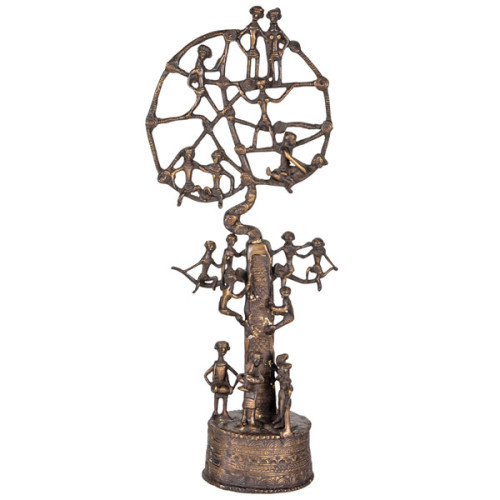
African Bronze “Tree of Life” Sculpture 20th Century
African Bronze “Tree of Life” Sculpture 20th Century
Sand cast bronze with a brown black patina with golden highlights in an open work design depicting 18 figures perched on a tree form with various intricate pattern details.
***As a Primitive / Tribal sculpture this piece visually relates to some of the sculpture and painting of the renowned French artist Jean Dubuffet.
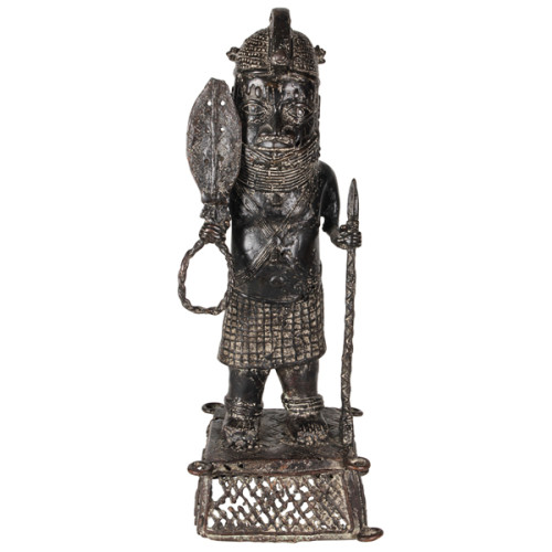
Benin King Oba bronze standing figure, Nigeria, 20th Century
Benin King Oba bronze standing figure, Nigeria, 20th Century
Lost wax cast bronze with a rich brown and black patina with light desert sand patina in some of the recessed areas.
The art of Benin is the product of an urban royal court, and is meant to symbolize and to extol the power, mystique, grandeur, continuity, and endurance of the ruling dynasty and its governing institutions. From the 14th century until its fall in 1897, Benin was ruled by the Oba, a divine ruler at the head of the political system of titled chiefs. Under royal support, a number of craftsman's guilds produced bronze, brass, and wood sculptures and embroidered cloth, all of which have become prized by museums and collectors.
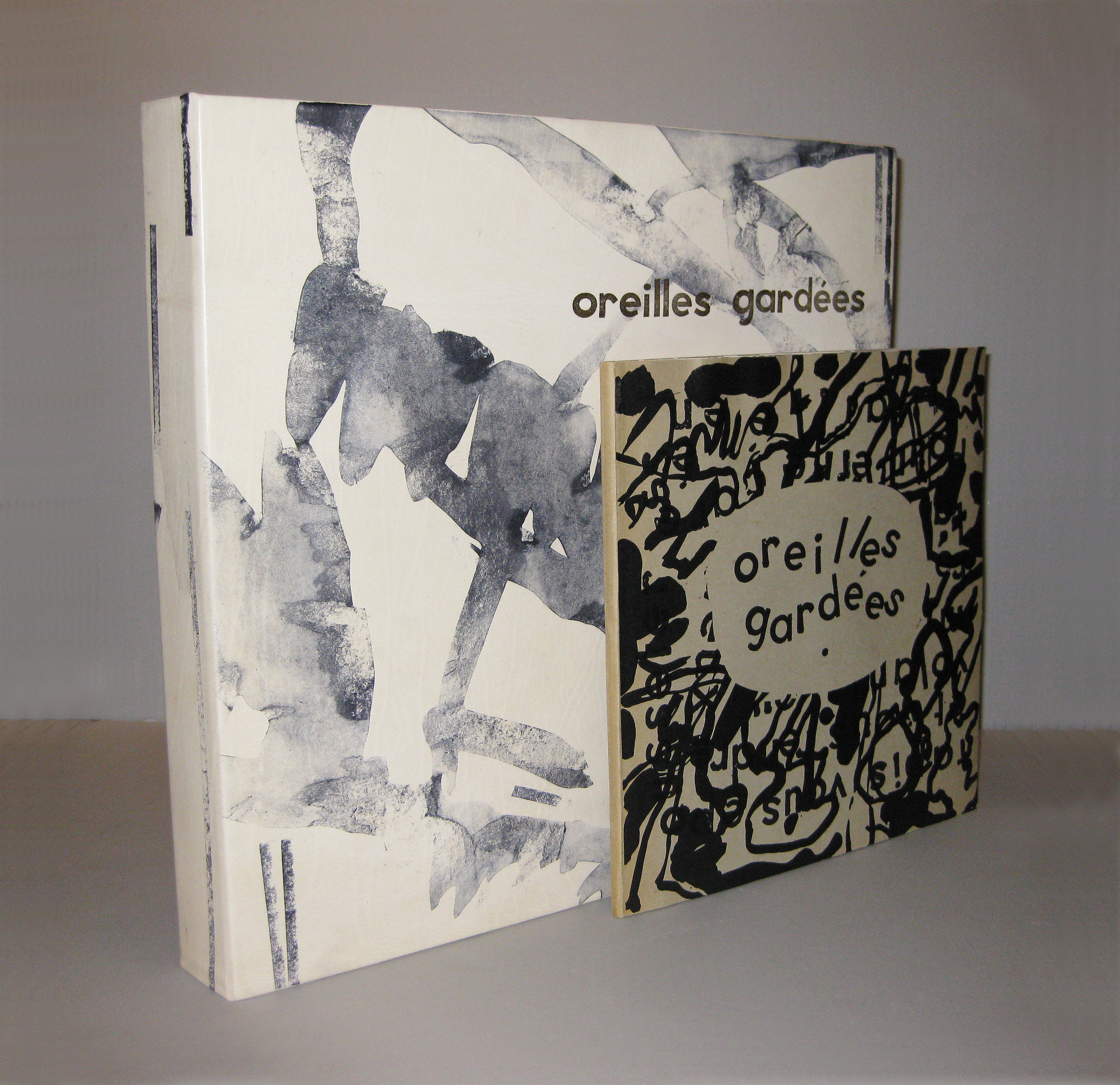
Jean Dubuffet, Pierre-Andre-Benoit, “Oreilles Gardees” 1962
JEAN DUBUFFET (1901-1985) France
PIERRE-ANDRE-BENOIT (1921-1993) France
“Oreilles Gardees” 1962
No. 149 out of 300 numbered copies
Published by PAB, Paris. Original illustrated wrappers: illustrated book with eleven lithographs. In this Dubuffet and Pierre-André Benoit collaboration numerous drawings by Dubuffet are interspersed with an imaginatively designed text reproduced from hand-stamped letters.
Dimensions:
Book: H: 9 7/8” x W: 10 ¼” x D: 3/8”
Custom leather box 2008: H: 14 ¾” x W: 14 ¼” x D: 2”
Custom silk slipcase: H: 15 3/8” x W: 15 3/8” x D: 2 7/8”
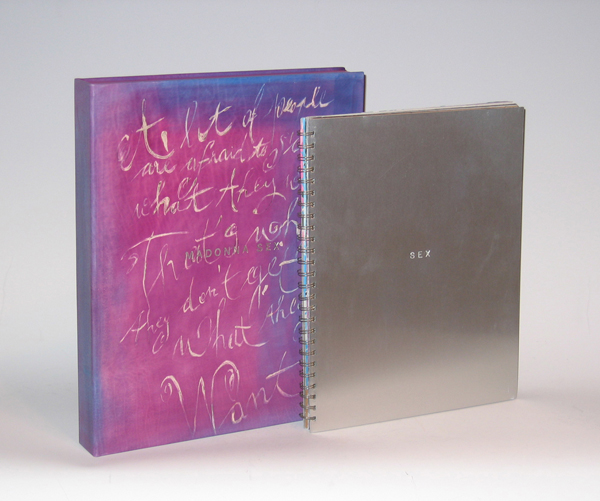
Spiral-bound aluminum hardcover, CD included
Photography by Steven Meisel Studio & Fabien Baron
Edited by Glenn O’Brien
Published by Warner Books, Div. of Time Warner, 1992
Dimensions:
Book: H: 13 7/8” x W: 11”
Custom leather box: H: 15 ¾” x W: 12 5/8” x D: 2 ¼”
Custom silk slipcase: H: 16 1/6” x W: 13 3/16” x D: 2 5/8”
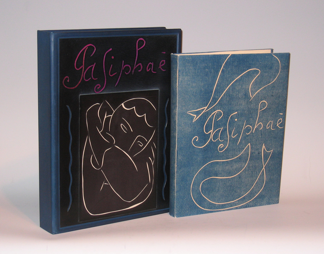
HENRI MATISSE (1869-1954) France
“Pasiphae” 1944
Limited edition No. 48/250.
Published by Martin Fabiani, Paris.
Dimensions:
Book: H: 13 3/16” x W: 10 3/8”
Custom leather box: H: 15 1/4” x W: 11 11/16” x D: 2 5/8”
Custom cloth slipcase: H: 16 1/8” x W: 12 3/16” x D: 3”
Signed by Matisse on the justification page.
Matisse’s Pasiphae is a singularly thrilling work and the plates were destroyed after the printing of this edition.
“A Contemporary retelling of the story of Parisphae and the Minoan bull was the impetus for one of Matisse’s most intensive printmaking experiences. Working with linoleum, a fairly easy material to use, Matisse cut many blocks of each image to achieve the perfect flow of line and relationship of forms. Intent on matching the spirit and ambience of the classical tale, Matisse took as his model ancient Greek playground vase painting”.
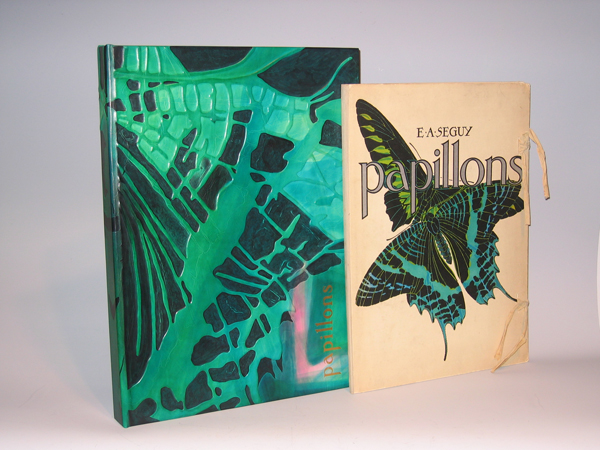
Twenty pochoir over photogravure plates (hand painted collotypes) in paper portfolio with cotton ties
Pochoir is process by which rich color is applied layer by layer by hand with the aid of stencils, resulting in intense hues similar to those in stained glass windows.
Published by Editions Duchartre et Van Buggenhoudt, Paris, France
Dimensions:
Book: H: 18” x W: 13 1/8” x D: 1 ½”
Custom leather box: H: 20” x W: 14 5/8” x D: 1 ¾”
Brilliantly and boldly colored butterflies from around the world are shown in interesting arrangements in pochoir prints from a set of 20 by the French designer and author E.A. Seguy. Plates 1 to 16 show large specimens in colorful arrangements, often overlapping, emphasizing colors, and patterns and shapes of wings and wing veins. Plates 17 through 20 are composite uses of butterfly patterns, in geometric boxes, like fabric or wallpaper designs.
In his foreword to Papillons, Seguy describes the prints as “un monde somptueux de formes et de couleurs” — a world of sumptuous forms and colors. He explains that they are intended to provide a record of rare, exotic specimens from museums and private collections, within an aesthetic context, thereby making them more widely accessible as inspiration for decorative arts designers. Nonetheless, Seguy based his images of butterflies and insects on illustrations in scientific publications, thereby maintaining scientific accuracy. They were enlarged up to 10 to 15 times to reveal intricacies of their design not visible without magnification. Also included with the set was a Table Des Noms Scientifiques [Table of Scientific Names], providing the technical species and genus names as well as the countries or regions of habitat for the species shown in Plates 1 through 16.
Eugene Alain Seguy produced eleven albums of illustrations and designs from the turn of the century to the 1930s, and his style reflected the influences of both Art Nouveau and Art Deco. His various color portfolios of visual ideas for artists and designers often featured motifs based on the natural world, including flowers, foliage, crystals and animals. Although his compositions were design oriented, he made the depictions scientifically accurate. His later works showed an increased interest in geometric and cubist designs. The prints in the portfolios were produced using the pochoir technique characterized by rich, intense color. This printing process, utilized in the early 20th century for high quality prints, involved applying colors to each plate with a number of stencils. Seguy’s works include Les Fleurs et Leurs Applications Decoratives (1900), Samarkande – 20 Compositions en Couleurs dans le Style Oriental (1914), Floreal (1920), Papillons (1924), Insectes (1924), Primavera –Dessins et Coloris Nouveaux (1929), Suggestions (1930), and Prismes – 40 Planches de Dessins et Coloris Nouveaux (1931).
Collections of prints like those produced by Seguy provided source material for designers of fabrics, wallpaper, ceramics, book illustrations, posters, and advertisements, and were popular in the late 19th and early 20th century. The leading Victorian publication of this type was Owen Jones’s Grammar of Ornament, first issued in a folio edition in London in 1856. Other trendsetting styles in art, design, decoration and fashion in the second half of the 19th century, and early 20th century, came from Paris, Austria, and Germany, and many such print collections were published there, including designs by Emile Belet, Armand Guérinet, Ernst Haeckel, Arsène Herbinier, and Anton Seder. To search our site for more Art Nouveau designs by such artists please type “Art Nouveau” into our search engine.
Editions Duchartre et Van Buggenhoudt was a publisher located at 15 Rue Ernest-Cresson, Paris. The series also was published by Tolmer Editeur, 13 Quai d’Danjou, Paris.
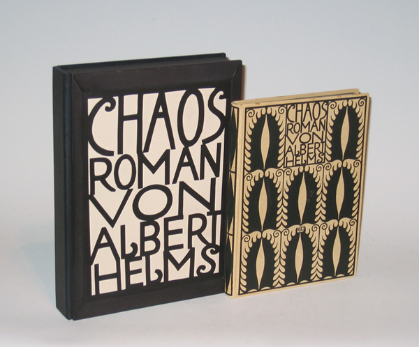
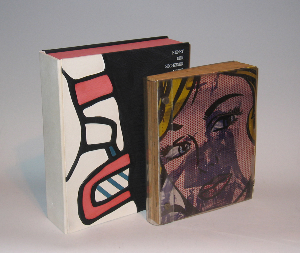
ART OF THE SIXTIES, “Die Kunst der sechziger Jahre im Wallraf – Richarts Museum Köln” 1969
ART OF THE SIXTIES
“Die Kunst der sechziger Jahre im Wallraf – Richarts Museum Köln” 1969
Published by Gert von der Osten und Horst Keller.
Designed by Wolf Vostell.
First edition.
Dimensions:
Book: H: 12” x W: 10”
Custom leather box: H: 14” x W: 11 1/2” x D: 3 1/2”
Custom linen slipcase: H: 15” x W: 12 1/8” x D: 4”
This famous and striking exhibition catalogue is a work of art. Wolf Vostell designed the catalogue for the Ludwig collection of contemporary art, given as a permanent loan to the Wallraf-Richartz Museum in Cologne. The work of 92 artists is represented, including objects by Dine, Dubuffet, Hockney, Jasper Johns, Lichtenstein, Oldenburg, Picasso, Rauschenberg, Vostell, Warhol, and Wols.
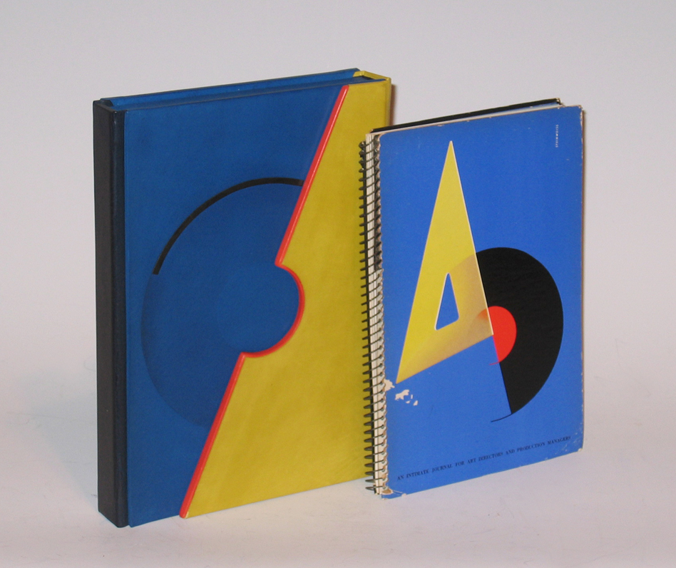
AD, “An Intimate Journal for Art Directors and Production Managers” 1941
AD
“An Intimate Journal for Art Directors and Production Managers” 1941
Published by Steinweiss
Dimensions:
Book: H: 8 1/8” x W: 5 ¾”
Custom leather box: H: 9 1/16” x W: 6 9/16” x D: 1 7/16”
Custom silk slipcase: H: 12 9/16” x W: 9 3/16” x D: 2 ¾”
An Intimate Journal For Art Directors, production Managers, and their Associates
The Alex Steinweiss Issue
[Alex Steinweiss] Robert L. Leslie and Percy Seitlin [Editors]: A-D [AN INTIMATE JOURNAL FOR ART DIRECTORS, PRODUCTION MANAGERS, AND THEIR ASSOCIATES]. New York: The Composing Room/P.M. Publishing Co., June-July 1941 [Volume 7, No. 5]. Original edition. Spiral-bound paper-covered boards printed in 4-color letterpress. Screen-printed acetate frontis. Cover faintly creased. Interior contents unmarked and very clean. Letterpress cover designed by Alex Steinweiss. One of the hardest issues of PM/AD to find in collectible condition. A nearly fine copy.
This Steinweiss cover is widely recognized as a singular high point in American Graphic Design that has been reproduced in countless histories and anthologies.
5.5 x 8 digest with 68 [16] pages including numerous color and b/w reproductions. The artwork is reproduced in four-color letterpress, and magnificent b/w photo engraving. There is even a screen-printed acetate title page! Truly an increbible single issue of a trend-setting publication.
Contents for this issue:
• 16 page color profile of Alex Steinweiss, Art Director for Columbia Records (many examples of cutting edge streamline moderne graphics).
• Herbert Bayer’s Design Class: 13 b/w pages of student photomontages by William Taber, Gene Federico, E. G. Lukacs, Eleanor Mayer, Ernest Cabat, Jere Donovan, Fritz Brosius, Sol Benenson, David Weisman, Robert Pliskin, R. H. Blend, Eugene Zion, Edmund Marein.
• What is Taught and Why – A Footnote to the Recent Bayer Classwork Exhibit at the A-D Gallery.
• Designs in Glass by contemporary Artists from the Steuben Collection: 16 b/w pages including full-page reproductions of the art-glass work of Jean Cocteau, Salvador Dali, Raoul Dufy, Duncan Grant, Jean hugo, Peter Hurd, Fernand Leger, Aristide Maillol, Henri Matisse, Georgia oπKeefe and others.
• Peter Takal: 8 pages of b/w illustrations
• A-D Shorts mention Irving Pasternack , Herbert Roan, Bill Crawford, Leon Friend, Robert L. Leslie.
• Books Reviewed: Animal Drawing by John Skeaping; The Suicide Club by Robert Louis Stevenson
Nineteenth Annual of Advertising Art – 1940
• Trade advertising for Arrow Engraving Co., The Composing Room, Inc., Wilbar Photo Engraving Co. , Ludlow Typograph Co., Supreme Printing Service, Strathmore Paper Co., Reliance Reproduction Co., Flower Electrotypes, Pioneer Moss, Walker Rackliff, Fuchs and Lang Mfg. Co., Spiral, United Looseleaf Corp., Lumarith Protectoid.
In 1939, at the age of 23, Alex Steinweiss revolutionized the way records were packaged and marketed. As the first art director for the recently formed Columbia Records, Steinweiss saw a creative opportunity in the company’s packaging for its 78 rpm shellac records. The plain cardboard covers traditionally displayed only the title of the work and the artist. “They were so drab, so unattractive,” says Steinweiss, “I convinced the executives to let me design a few.” For what he saw as 12-inch by 12-inch canvasses inspired by French and German poster styles, he envisioned original works of art to project the beauty of the music inside. In 1947, for the first LP, Steinweiss invented a paperboard jacket, which has become the standard for the industry for nearly 50 years.
Alex Steinweiss was born in 1917 in Brooklyn, New York. His father loved music and instilled the passion in him. In 1930, Steinweiss entered Abraham Lincoln High School. His first artistic endeavors resulted in beautifully articulated marionettes. These brought him to the attention of the art department chair, Leon Friend, co-author of Graphic Design (1936), the first comprehensive American book on the subject.
Steinweiss’s first day in Friend’s class was a magical experience. “To see these young men painting letters with flat-tipped brushes was one of the great inspirations of my life,” he says, “I had to get involved with that!” He learned the principles of design and how to apply them through daily contact with the endless array of beautiful examples of poster design, typography, drawing, and calligraphy. Friend exposed Steinweiss to the works of the great graphic designers of the time, including Lucian Bernhard, A.M. Cassandre, and Joseph Binder.
Upon graduation from high school, the School Art League awarded Steinweiss a one-year scholarship to Parsons School of Design in New York. He almost left after the first year, convinced, in spite of the depression, that he would be able to get a job. Before quitting school, however, he wrote to illustrator Boris Artzybasheff, who, instead of offering employment, advised Steinweiss to finish school.
Steinweiss followed his advice. Afterward he presented himself, unannounced, to the New York studio of Lucian Bernhard, the German master of poster and type design. Bernhard’s son, Carl, answered the door with a rankled, “Don’t you know you’re supposed to call for an appointment?” But Steinweiss confidently handed him his portfolio and requested that the master peruse it. Carl glanced at the work, was impressed, and brought it to his father. A half an hour later, Bernhard came out of his office and informed Steinweiss that he had already phoned Joseph Binder, the Viennese poster maker who was looking for an assistant. Steinweiss worked for Binder for almost three years until he quit to form his own studio. Six months later he got a call from Robert L. Leslie, who recommended him as an art director to Columbia Records.
At Columbia, Steinweiss evolved a unique cover art style mingling musical and cultural symbols. His first cover, for a collection of Rodgers and Hart music, featured a theater marquee with the album’s title appearing in lights. He designed images for jazz recordings by Louis Armstrong and Earl Hines, and numerous classical, folk and pop recordings. Newsweek reported that sales of Brt/no Walter’s recording of Beethoven’s “Eroica” symphony “increased 895%” with its new Steinweiss cover.” His signature, the “Steinweiss scrawl,” became ubiquitous on album covers in the 1940s.
A-D magazine was the leading voice of the U. S. Graphic Arts Industry from its inception in 1934 (originally titled PM) to its end in 1942. As a publication produced by and for professionals, it spotlighted cutting-edge production technology, such as acetate inserts, 4-color letterpress printing, custom binding and the highest possible quality reproduction techniques (from engraving to plates). PM and A-D also championed the Modern movement by showcasing work from the vanguard of the European Avant-Garde well before this type of work was known to a wide audience.
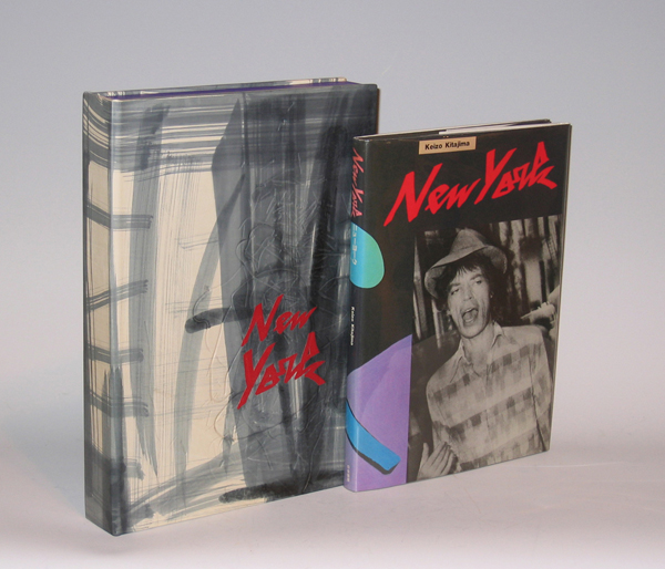
Custom leather box: H: 13 5/8” x W: 9 3/4” x D: 1 7/8”
Custom cloth case: H: 14 11/16” x W: 10 7/16” x D: 2 9/16”
These days, the Japanese photographer Keizo Kitajima, born in 1954, lives in Tokyo and specializes in urban photography. But in 1981, he spent about six months in New York, hanging out in New Wave clubs or roaming the streets, taking pictures — often by simply pointing and shooting. More than three dozen of these gritty black-and-white images form his robust New York gallery debut. The lush blacks of Mr. Kitajima’s images, which were initially published in a book and only recently printed, bring to mind his friend and mentor Daido Moriyama. But Mr. Kitajima’s aesthetic, at least here, is all about round edges and people who are anything but average. Some are hard-working immigrants whose faces loomed close to Mr. Kitajima’s lens as they hurried along the street. Others are celebrities (Mick Jagger) or soon-to-be celebrities (the young Madonna, when her face still had pores), drag queens or denizens of the Mudd Club or CBGB’s. Some are simply people waiting for something to happen, like the rogues’ gallery of five men behind a police barrier on Fifth Avenue.
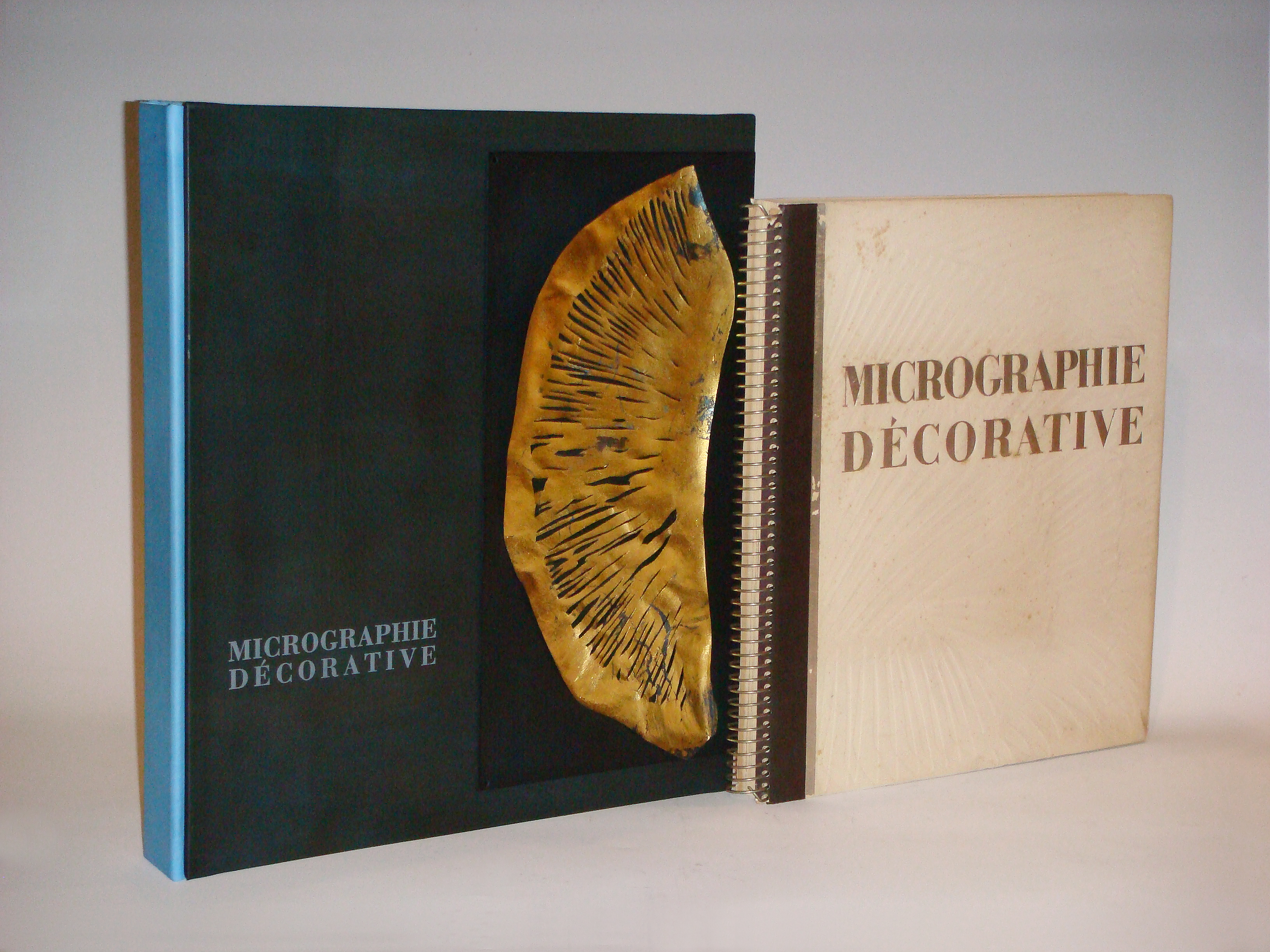
LAURE ALBIN-GUILLOT (1879-1962) France
Micrographie Decorative 1931
Preface by M. Paul Leon, 20 photogravure plates in a variety of inks and papers, including silver and gold foil, all tipped-in and matted, text in French, limited to 300 numbered copies, folio, spiral-bound bds.
Published by Draeger Freres, Paris.
Micrographie Décorative was created as a tribute to Laure's husband after his death.
Dimensions:
Book: H: 16 ¾” x W: 15” x D: 1 3/8”
Custom leather box 2008: H: 19” x W: 16 5/8” x D: 2 5/8”
Custom silk slipcase: H: 20 1/8” x W: 17 ¼” x D: 4”
Albin-Guillot, Laure (née Meffredi; 1879-1962), French photographer who became interested in photography soon after her marriage in 1897 to the physician/scientist Dr Albin Guillot. At first, her husband's circle of friends, which included architects, writers, and politicians, provided her with portrait subjects. During the 1920s and 1930s she was engaged by the design precepts of the New Vision, and produced more sharply focused close-ups of objects for clients like Bon Marché and Renault. At the same time, she continued to create soft-focus pictorialist nudes that appeared in artistic photography journals and as illustrations in volumes of poetry. Many of her images were exhibited during the 1920s and reproduced in Arts et métiers graphiques. At a time when many photographers were indifferent to the quality of prints intended for reproduction, Albin-Guillot sought to invest hers with artistry and individuality. Engrossed by her husband's lifelong research in micrography, in 1931, in collaboration with Pierre Fresson, she published in his memory a volume of 24 photomicrographs of crystals, exquisitely printed on various coloured and metallic papers. Later, she and Fresson also collaborated on similar works, which were used as decoration on the liner Normandie.
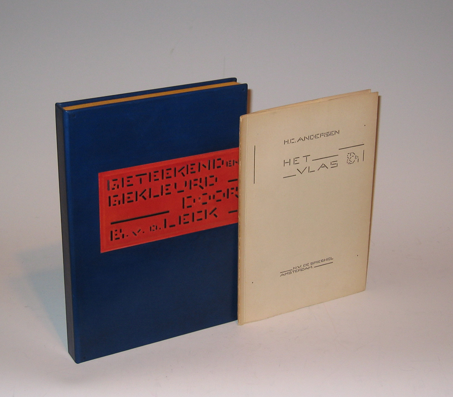
Hans Christian Andersen, “Het Vlas” portfolio 1941
HANS CHRISTIAN ANDERSEN (1805-1875) Denmark
“Het Vlas” portfolio 1941
Maquette with original gouache and ink and pencil annotations.
10 sheets of coated paper, matted, in cloth portfolio.
Limited edition 223/500.
Published by N.V. De Spieghel, Amsterdam, 1941
Dimensions:
Book: H: 9 7/8” x W: 7”
Custom leather box: H: 11 3/32” x W: 7 7/8”
Custom silk slipcase: H: 11 13/16” x W: 8 3/16” x D: 1 ½”
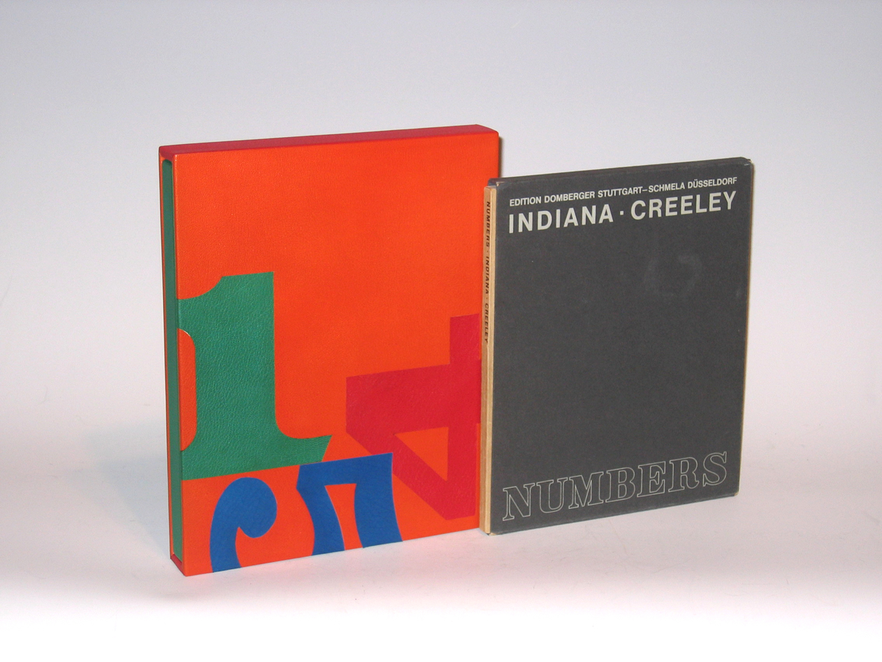
ROBERT INDIANA (1928-) USA
ROBERT CREELEY (1926-2005) USA
“Numbers” 1968
Folio, illustrated with 10 original silkscreen prints, stiff boards, printed dust jacket
Published by Domberger Stuttgart-Schmela Düsseldorf
Dimensions:
Book: 9 15/16” x W: 8 3/8”
Custom leather box: H: 11 3/8” x W: 9 1/16” x D: 1 3/8”
Custom silk slipcase: H: 12 3/8” x W: 9 ¾” x D: 2 1/16”
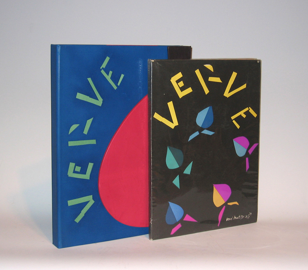
HENRI MATISSE (1869-1954) France
“Verve” Vol. II No. 8 1939
Revue artistique et littéraire paraissant quatre fois par an
Published by E. Tériade, 4, Rue Férou (VI) Paris
Dimensions:
Book: H: 14 1/4” x W: 10 3/16”
Custom leather box: H: 15 5/16” x W: 11 1/2” x D: 1 5/8”
Custom linen case: H: 16 1/2” x W: 12 1/4” x D: 2 3/8”
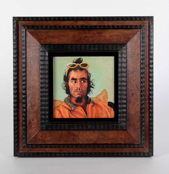
Jack Richard Smith “Spiros Antonopoulos” Oil on Copper 2004
JACK RICHARD SMITH (1950-) Taos, NM
“Spiros Antonopoulos” 2004
Blackoil, wax, lead salts on copper, burl wood and ebonized wood Dutch old master style frame
Exhibited: “Taos Portraits” by Jack Smith, Harwood Museum of Art, University of New Mexico, Taos, New Mexico, May 14th – August 15th, 2004
Illustrated: “Taos Portraits” by Jack Smith, May 14th – August 15th, 2004, exhibition catalogue (Taos, NM: Harwood Museum of Art, University of New Mexico) illustr. 16
Painting: 6” x 6”
Framed: 13 3/4” x 13 11/16”
Price: $14,500
Incorporating blackoil, wax, lead salts, and copper Smith’s small format portraits and paintings are detailed and intimate depictions of creative individuals and charged tableaux. Smith’s singular style of portraits glow with a warm inner light and present honest, straightforward images that speak of personal narratives. Smith’s interest in miniatures developed first as a matter of convenience. In 1982, while preparing for a winter of travel in Mexico, he experienced logistical problems traveling with the larger size painting materials he was using at the time. The solution seemed to be a block of watercolor paper and casein, a milk base paint of versatile possibilities and vehement drying power. Suddenly, his paintings went from three by five feet to three by five inches. The history of oil painting, principally centered around the Dutch schools and their development of a method called black oil painting, often executed in miniature, also captured his interest. Black oil, an oleoresin comprised of white beeswax, raw linseed oil and litharge of lead, suspends the pigment above the painting ground, which was traditionally wood panel, linen or copper plate. This medium seems to suspend the pigment, allowing light to penetrate and reflect from the surface and illuminate the imaged from behind, a sort of light from within. The small format is an act of compression that requires the viewer to draw in close to a more intimate proximity and will, if the painting works, hopefully approach Joseph Campbell’s description of art as an “object of fascination” to engage the viewer and stop for a moment one’s busy mind. Jack Smith was born in 1950. At age 16, he began his training at the Interlochen Arts Academy in Michigan before moving to Ohio to attend Columbus College of Art and Design. He also studied for a brief time at the Instituto de Allende, at San Miguel de Allende, GTO, Mexico. He now resides in New Mexico. Reflecting a profound knowledge of art history and and an alchemist’s sense of the painting craft, contemporary painter Jack Smith has forged his own place amongst the most powerful of contemporary portraitists working in America. Jack Smith recently received a prestigious Past Achievement Award from the Peter and Madeleine Martin Foundation for the Creative Arts, following an important solo exhibition titled, Jack Smith: The Taos Portraits at the Harwood Museum of Art at the University of New Mexico in 2004. The exhibition featured fifty portraits of Taos, New Mexico residents, executed between 2000 and 2003. The series was intended as a visual biography of this unique artistic community at the turn of the century. Smith’s subjects range from the famous to the infamous — including artists, writers, art patrons, Native peoples, and street peoples. Spiros Antonopoulos’s (he always dropped the s in Spiros when saying his name) past is a little sketchy. I understand that he was trained as a musician and through that came to the world of computers, which he mastered immediately given his hot tub size brain pan. He also told me once that he had “done lots of drugs and some porn movies” while in college. Before we met he used to drive by my house in Arroyo Hondo, NM when he lived above us on the ridge road called Atalaya, about fifteen miles north of Taos and would make funny faces at me through the smudged window of his ghostly, lowrider station wagon. He was wildly eccentric dresser and had a selection of sunglasses that Elton would envy, mostly a thrift store wardrobe kind of guy. As I mentioned before, he tended to remind me of a mad computer geek samurai, which I tried to capture in this portrait. I’ve heard he now lives in the East Village and has forsaken his aforementioned life for obsessive Bikram yoga…… and that’s where the trail gets cold. The Taos portrait series was executed from 1999 to 2003 and was intended as a visual biography of this peculiar valley and town of Taos, NM. The subjects range from famous artists, writers and political activists to street people and what we affectionately call “sage bunnies”, or, folks that live out in the hinterlands in a grow hole with a goat or two and come to town once a month for provisions and bathe in patchuli oil, I presume, to save water. I would have liked to have had more of these folks but lining them up proved problematic as they tend to live in a parallel universe called locally, “the land of poco tiempo”, or “little time” , a condition caused, in their case, by smoking too much cheeba. This same time thing is true of my attempts at several more Native American friends from the pueblo…… it is something I greatly admire about them, unless of course you are scheduling a portrait sitting for the fourth time and they just had to go to Walmart without warning. But then “this is Taos” as John Nichols mentions in the forward to theexhibition catalogue and it is often referred to as an “open air asylum” for a myriad of good reasons. I thought it would be interesting to look back at some future time and see the weft and warp of the tapestry of Taos at the turn of themillennium. I could easily have done three hundred, but one must stop somewhere. The show was hanging in conjunction with Wayne Theibauld’s “City/ Country” exhibition at the Harwood Museum in Taos, New Mexico, June to September, 2004. – as told by Jack Smith, May 2006
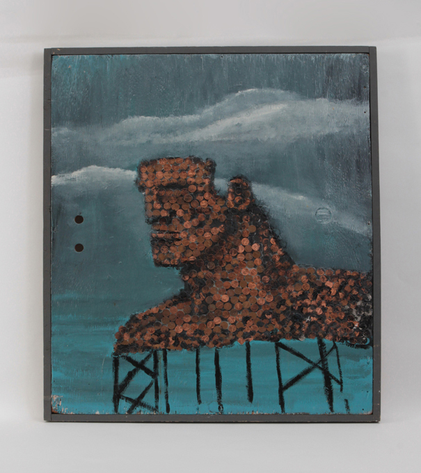
Robert Loughlin, “The Founder of the Empire”, Oil paint and pennies on plywood panel 1985
For more information on Robert Loughlin see: http://www.nytimes.com/2015/10/02/fashion/mens-style/the-legacy-of-robert-loughlin-artist-behind-the-brute.html?mwrsm=Email
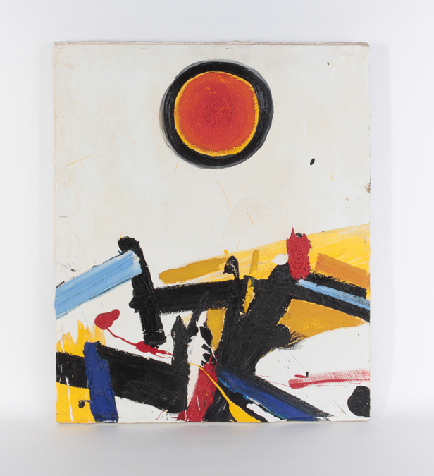
Signed: Napoli (scrafitto on front), Giuseppe Napoli 1965 “Shamballa”
(on back of board), Giuseppe Napoli (signed twice on stretcher)
H: 24” x W: 20”
A profoundly dynamic Abstract Expressionist painting by New York artist, Giuseppe Napoli. The painting is painted on board which is affixed to stretcher bars by staples.
Giuseppe Napoli was part of the New York School of the 1950’s and 60’s working out of a small studio in Greenwich Village. Napoli participated in numerous exhibitions but unfortunately his career was cut short by his suicide in 1967 the result of suffering from periods of depression.
Just as “Starry Night” is widely considered to have reflected the mental state of Van Gogh shortly before his death; this painting may also have reflected the mental state of Giuseppe Napoli who ended his own life only two years after creating this remarkable painting. The vigorous, heavy impasto, the ominous sun made impotent by the bold black ring that surrounds it and the jumbled landscape below, could be symbolic of the hope-against-hope, that eventually prevailed.
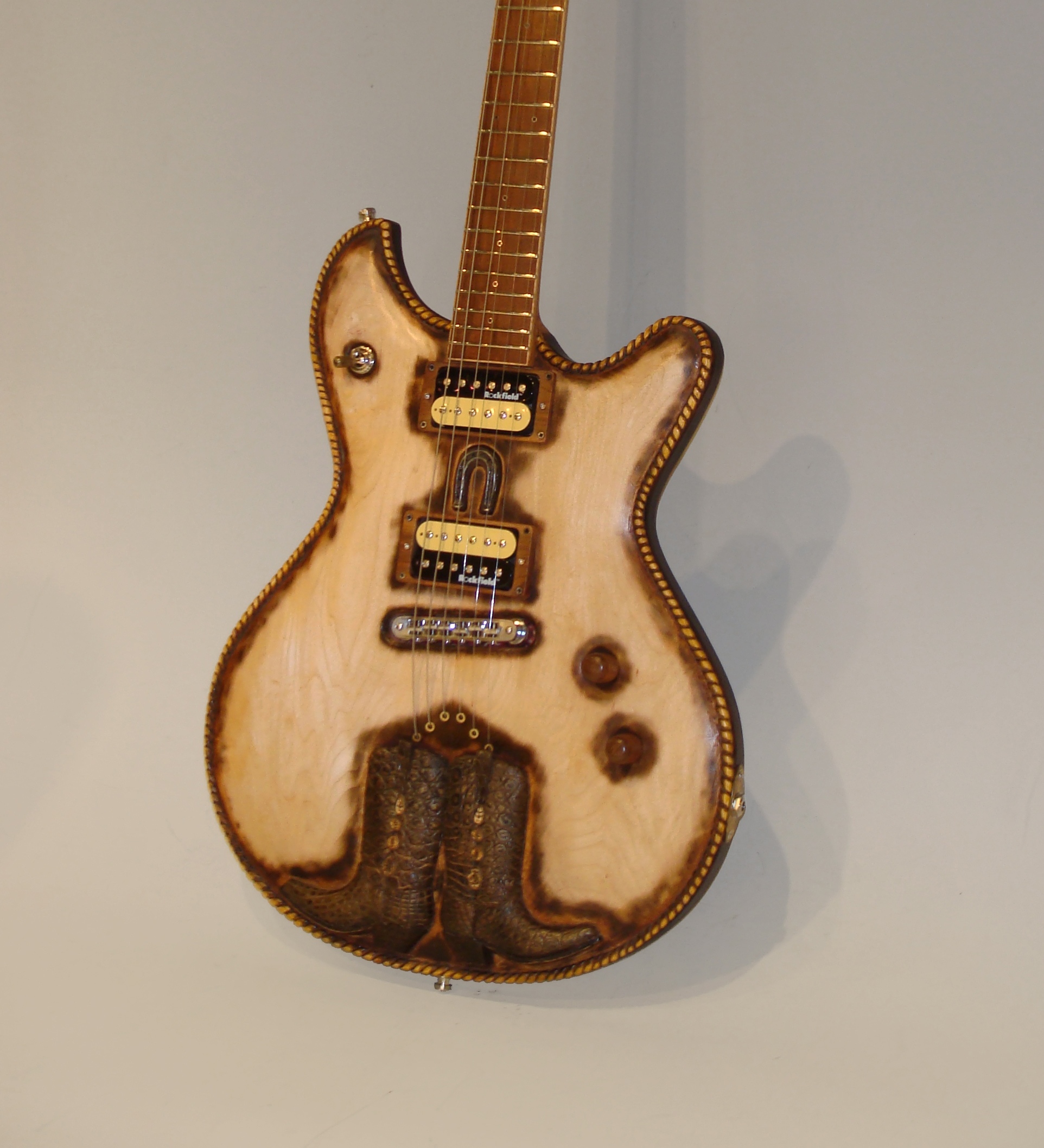
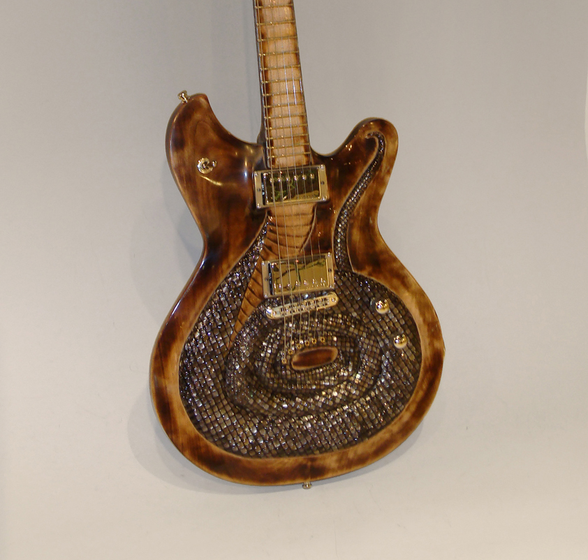
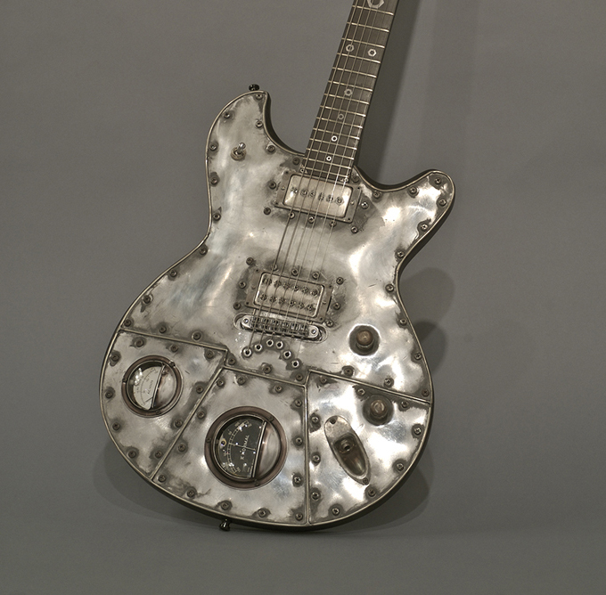
“These Boots Are Made For Walkin” – Sculpted mahogany body with hand carved wooden boots that are covered in real Nile Crocodile skin. The McSwain signature is hand made barbed wire and the horseshoe is forged from steel rod. The back cutaway is inlaid with a real bandana. Seymour Duncan pickups, Sperzel tuners. Signed by Dwight Yokham.
“The Snake” – This is a tone chambered mahogany body with a maple top that is carved/sculpted into a coiled King cobra. The scales are hand cut mother of pearl and abalone scales. There are over 1500 scales inlaid into the guitar top and back of the neck and headstock. The maple fretboard is stained and burned to represent a snake’s belly. The eyes are LEDs under rubies. They are illuminated by a push/pull volume control. Signed by Slash… a snake aficionado.
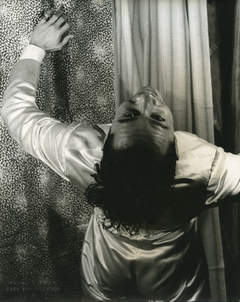
Signed: Cab Calloway, XIX b.28 (in ink on back); PHOTOGRAPH BY CARL VAN VECHTEN, 101 CENTRAL PARK WEST, CANNOT BE REPRODUCED WITHOUT PERMISSION (ink stamp on back)
Size: H: 9 15/16” x W: 8”
Cabell “Cab” Calloway III (1907-1994) was a famous African American jazz singer and bandleader. Calloway was a master of energetic scat singing and led one of the United States’ most popular African American big bands from the start of the 1930s through the late 1940s.
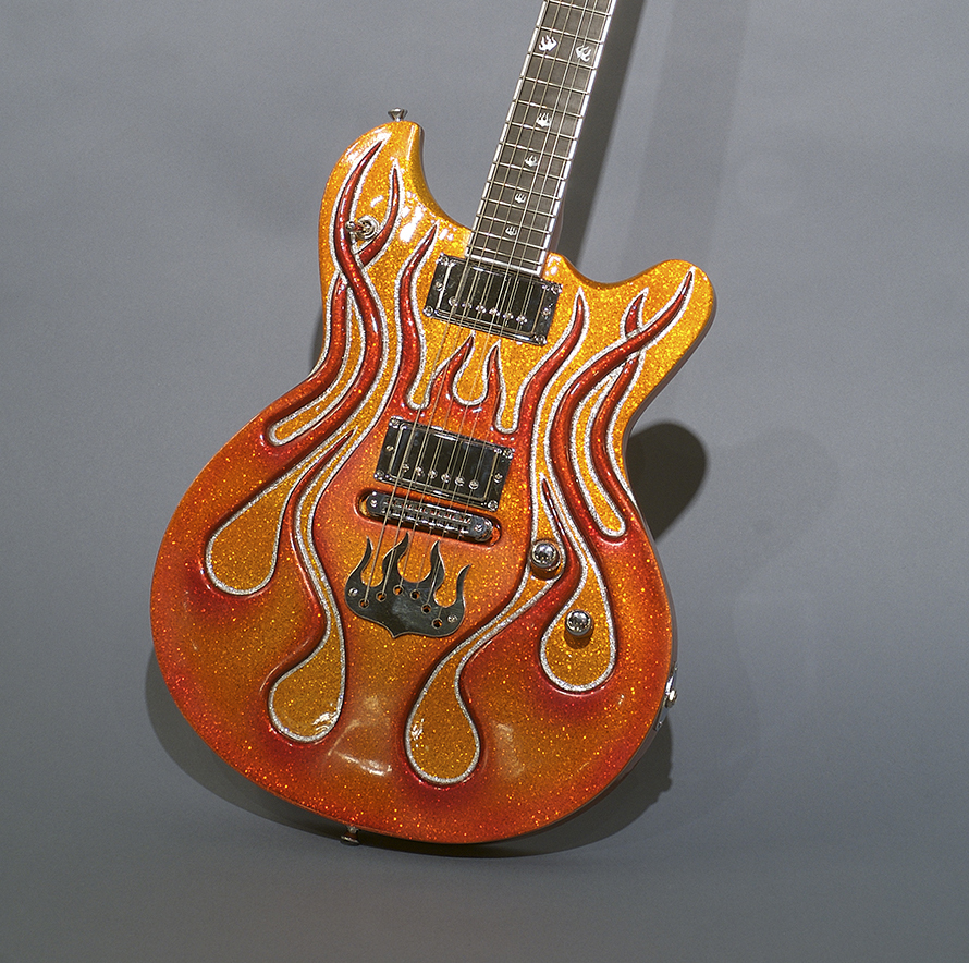
“Flames” – This is a hand carved mahogany body that is painted with metal flake hot rod candy colors. The flames are hand carved into the mahogany guitar top. Rockfield pickups, Sperzel tuners and a Tone Pros bridge.
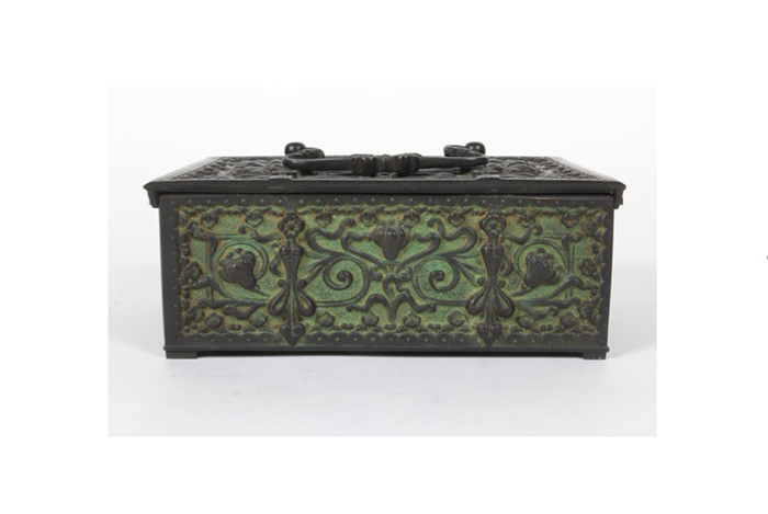
Walter Klein / Erhard & Soehne Verdegreen patinated bronze box with a whiplash floral motif, c. 1900
ERHARD & SÖHNE Germany (founded 1844)
Verdegreen patinated bronze box with a whiplash floral motif, c. 1900
For more information see: Metallkunst: Silber, Kupfer, Messing, Zinn vom Jugendstil zur Moderne (1889-1939), Band IV, Ingeborg Becker (Berlin: Bröhan-Museum, 1990)
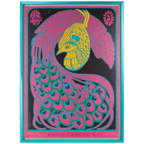
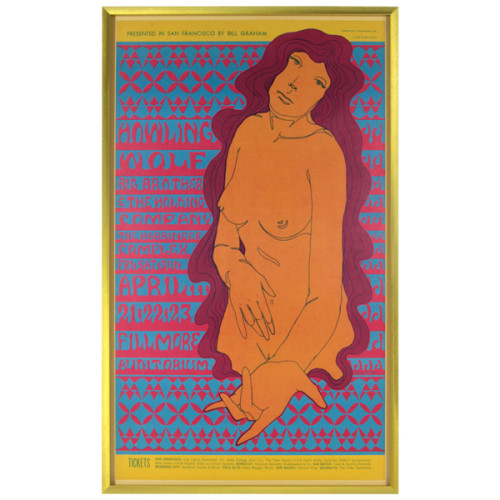
Victor Moscoso, Quicksilver Messenger Service, The Steve Miller Blues Band, The Daily Flash, Ben Van Meter, Rodger Hillyard: Peacock Ball at the Avalon Ballroom, March 10-11, 1967, 1st edition
VICTOR MOSCOSO USA
Quicksilver Messenger Service, The Steve Miller Blues Band, The Daily Flash, Ben Van Meter, Rodger Hillyard: Peacock Ball at the Avalon Ballroom March 10-11, 1967
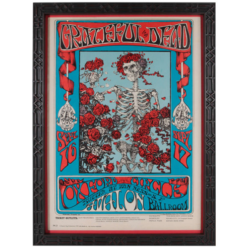
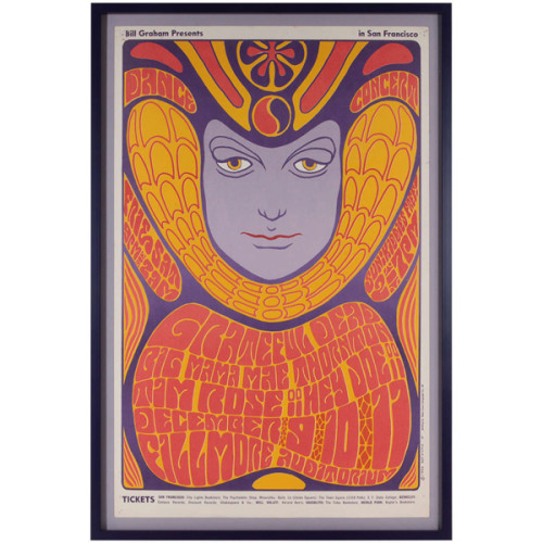
Stanley Mouse / Alton Kelley, Grateful Dead & Oxford Circle at the Avalon Ballroom September 16 -17, 1966
STANLEY MOUSE USA
ALTON KELLEY USA
Grateful Dead & Oxford Circle at the Avalon Ballroom September 16 -17, 1966
Marked: Mouse Studios 66, 26(3), (c) Family Dog Productions 1966 639 Gough St., San Francisco, Calif. 94102
H: 20″ x W: 14″
Born in Detroit, Stanley Miller became known as “Mouse” after illustrating countless notebooks with his signature rodent sketch. Miller found an outlet for his creativity in pin-striping cars and airbrushing hot rod designs on posters and T-shirts. Mouse migrated to San Francisco in 1964, where he first met the artists associated with Family Dog, the organization producing dance concerts at the Avalon Ballroom. With collaborator Alton Kelley, Mouse experimented broadly with composition, lettering and imagery: Kelley came up with the ideas and Mouse executed the designs. Mouse and Kelley helped to establish the psychedelic style of expression under the name Mouse Studios.
*** An example of this poster is in the permanent collection of the Museum of Modern Art in New York.
By 1967, Eric Burdon took the Animals into a harder, more psychedelic sound than the one listeners recognized from the band’s earlier incarnation. Burdon would later take this style even further when he teamed up with an obscure Los Angeles band known as War. The poster was printed only once before the concert
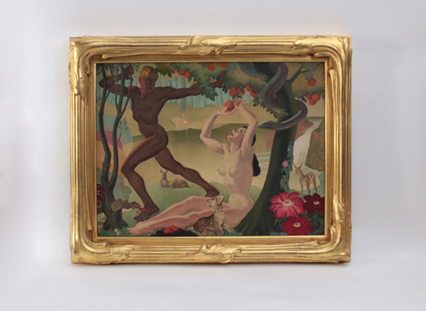
Alan Durman “Adam and Eve in the Garden of Eden” c. 1945
ALAN DURMAN (1905-1963) UK
Adam and Eve in the Garden of Eden c. 1945
Oil on aluminum panel on a wood structure, elaborately carved gilt wood frame
Painting: H: 23 1/4” x W: 30 3/16”
Framed: H: 28 3/4” x W: 35 9/16”
Alan Durman was born in Saltford, England and worked as a local muralist where his most important work is on display at the Saltford Community Hall. The largest mural of the three celebrates the community and shows the indigenous landscape as a backdrop to dancing and frolicking locals. The other two paintings show a view across Kelston village to Kelston Round Hill, a significant local landmark and in the other a verdant view featuring an ancient forest across to the River Avon. In the late 1930’s and 40’s Durman directed his talent as an illustrator and designed many posters. He created travel related posters for British Railways (BR) and the British Transport Commission (BTC) which featured stylish and active young families at sea side resorts.
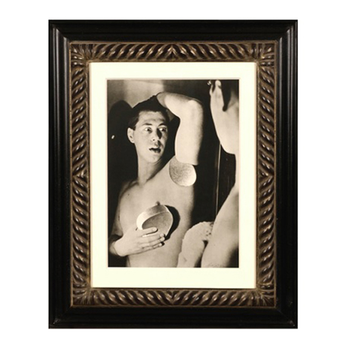
Herbert Bayer, Self Portrait, Gelatin silver print , 1932, printed later
HERBERT BAYER (1900-1985) Austria
Self portrait 1932 (printed later)
Silver gelatin print
Edition: 28/40
Signed: bayer 32 (in ink on bottom right corner)
Provenance: Kennedy Gallery, New York
H: 13 7/16” x W: 9 ½”
Framed size: H: 21 ½” x W: 17 ½”
Price: $16,000
Herbert Bayer (1900 – 1985) was an Austrian graphic designer, painter, photographer, and architect. Bayer apprenticed under the artist Georg Schmidthammer in Linz. Leaving the workshop to study at the Darmstadt Artists’ Colony, he became interested in Walter Gropius’s Bauhaus manifesto. After Bayer had studied for four years at the Bauhaus under such teachers as Wassily Kandinsky and László Moholy-Nagy, Gropius appointed Bayer director of printing and advertising. In the spirit of reductive minimalism, Bayer developed a crisp visual style and adopted use of all-lowercase, sans serif typefaces for most Bauhaus publications. Bayer is one of several typographers of the period including Kurt Schwitters and Jan Tschichold who experimented with the creation of a simplified more phonetic-based alphabet. Bayer designed the 1925 geometric sans-serif typeface, universal, now issued in digital form as Architype Bayer that bears comparison with the stylistically related typeface Architype Schwitters.
In 1928, Bayer left the Bauhaus to become art director of Vogue magazine’s Berlin office. He remained in Germany far later than most other progressives. In 1936 he designed a brochure for the Deutschland Ausstellung, an exhibition for tourists in Berlin during the 1936 Olympic Games. In 1938 he left Germany and settled in New York City where he had a long and distinguished career in nearly every aspect of the graphic arts. In 1946 Bayer relocated again. Hired by industrialist and visionary Walter Paepcke, Bayer moved to Aspen, Colorado as Paepcke promoted skiing as a popular sport. Bayer’s architectural work in the town included co-designing the Aspen Institute and restoring the Wheeler Opera House, but his production of promotional posters identified skiing with wit, excitement, and glamour. Bayer would remain associated with Aspen until the mid-1970s. Bayer gave the Denver Art Museum a collection of around 8,000 of his works. In 1959, he designed his “fonetik alfabet”, a phonetic alphabet, for English. It was sans-serif and without capital letters. He had special symbols for the endings -ed, -ory, -ing, and -ion, as well as the digraphs “ch”, “sh”, and “ng”. An underline indicated the doubling of a consonant in traditional orthography.
Christian Vogt has exhibited internationally at venues including The Photographer’s Gallery, (London), the ICP (New York), the Kunsthaus (Zürich), the Yajima Gallery (Montreal), the Tel Aviv Museum (Isreal), the Rencontres Internationales (Arles), the Centre Pompidou (Paris), the Galerie Watari (Tokyo), the Preuss Museum (Norway), the Edwynn Houk Gallery (Chicago), the CCD Galerie (Düsseldorf) and the Kunstmuseum (Hannover) among many others.
His photography is included in numerous important collections such as the Bibliotheque Nationale (Paris), the Swiss Foundation for Photography (Winterthur), the Musée de l’Elysee (Lausanne), the Modern Museet (Stockholm), the Tel Aviv Museum (Tel Aviv) and the Polaroid Collection (Cambridge, USA). He currently resides in Basel, Switzerland.
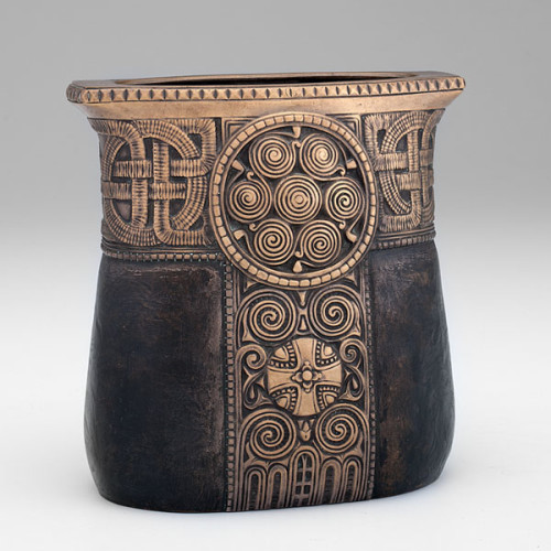
Gustav Gurschner, Secessionist / Byzantine Revival bronze vase c. 1905
GUSTAV GURSCHNER (1873-1970) Austria
Vase c. 1905
Cast bronze ovoid shaped vase with decorative Celtic motif, lightly gilded, the body of the vase simulating leather with a rich brown patina
Signed: GURSCHNER, M180 (stamped in the bronze)
Related works illustrated: The Studio, Special Summer Number 1906: The Art Revival in Austria, ill. no. D6; Studio Yearbook (London, 1909), pp. 139-140; Vienna Turn of the Century: Art and Design, Fischer Fine Art, exhib. cat. (London 1979), p. 23, illus. 1; Bronzes, sculptors & Founders, H. Berman, (Atglen 1994 III) p. 781, cat. nos. 2893, 2894; Decorative Art 1880-1980, Dan Klein & Margaret Bishop (Oxford, England: Phaidon and Christie’s Limited, 1986) p. 84, illus. 1
H: 7 1/4″ x D: 7″ x D: 4″
Price: $14,500
Gustav Gurschner was born in Tirol, Austria. He attended the Fachschule für Holzindustrie in Bozen from 1885-1888. After three years, his instructors encouraged him to attend the Austrian Museum for Applied Arts’ Kunstgewerbeschule in Vienna. After finishing his formal training, Gurschner pursued a career as a sculptor of monumental works. It was while he was in Paris in 1897, that he first turned his energies from the application of small-scale, sculptural works to the aesthetic design of household objects. Shortly thereafter, he returned to Vienna to join the Secessionists whose ideals he shared. By the turn-of-the-century, Gurschner was not only one of the better known artists working in Vienna but enjoyed a reputation that extended into other European countries as well.
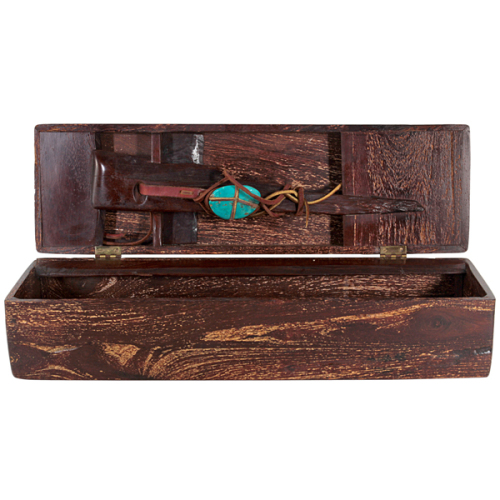
Jan de Swart hand carved Zebra wood Mystery box c. 1970
JAN DE SWART (1908-1987) Netherlands / USA
Mystery box c. 1970
Hand carved and assembled box form with a curiosity element of a large turquoise cabochon with raw hide wraps underneath the lid.
For more information see: Jan de Swart: A Day That Becomes a Lifetime, exhibition catalogue (California: Fine Arts Gallery at the San Fernando Valley State College, February 1972); Jan de Swart, Mike McGee and William G. Otton (Laguna Beach, California: Laguna Art Museum, 1986).
W: 16 1/2″ x H: 4 1/2″ x D: 5″
Price: $4,700
Constantly seeking and inventing new materials Jan de Swart was a true modernist. He was influenced by artists such as Isamu Noguchi, Harry Bertoia, Charles Eames, and later Sam Maloof and Wendell Castle. Although he had been creating small sculptures since his arrival in California from Holland in 1929, he had not been widely recognized until being introduced to John Entenza, publisher of Arts & Architecture magazine in 1947. Soon thereafter, he was able to create larger works and began collaborating with architects such as Whitney Smith and Victor Gruen on special commissions. His work is in the permanent collection of Los Angeles County Museum of Art, The Smithsonian, and the Ford Foundation. He was honored with the American Institute of Architects Gold Medal for Sculpture in 1965.
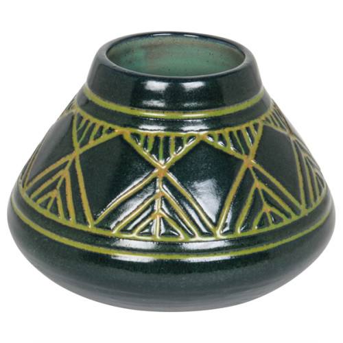
Julia Edna Mattson – Univ. of North Dakota American Art Pottery Vase circa 1913-20
JULIA EDNA MATTSON (d.1967) Grand Forks, ND
UNIVERSITY OF NORTH DAKOTA Grand Forks, ND
Vase c. 1913-1920
Earthen-ware with blue-green glaze, incised with lime-green linear decoration
Marks: University of North Dakota, Made at School of Mines, Barclay, Grand forks, ND (Cobalt blue seal), JM (Julia Mattson)
For more information see: Barr, Paul E. North Dakota Artists. Grand Forks: University of North Dakota Library, 1954; Miller, Don. University of North Dakota Pottery: The Cable Years. Grand Forks: University of North Dakota Visual Arts Dept., 1999; Palmer, Bertha Rachael. Beauty Spots in North Dakota. Boston: Bruce Humphries, Inc., 1939
H: 3 5/8″ x Dia: 5 1/4″
Price: $3,250
Julia Edna Mattson worked as an instructor and later as Assistant Professor in the University of North Dakota’s Ceramic department between the years 1924-1963. Her designs reflect an interest in the Arts and Crafts movement in America and American Indian pottery. Early UND pottery is characteristic of the Arts and Crafts and Art Nouveau movement. The decoration of this vessel recalls the graphic designs found on Indian basketry as well as the Prairie School windows of Frank Lloyd Wright.
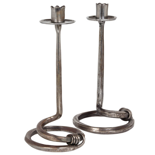
Edward Spencer/Artificers’ Guild (attr.) British Arts & Crafts wrought iron candlesticks c. 1910
Edward Spencer attr. (1872-1938) UK
Artificer’s Guild (1901-42) UK
Pair of candlesticks circa 1910.
Handwrought iron with a squared central support terminating in a attenuated vine like wrap.
H: 10 1/2″ x Dia: 5 1/2″
The Artificers’ Guild Ltd was founded in 1901 by the metalwork and enameler Nelson Dawson (1859-1942). It was one of the few guilds inspired by the Arts and Crafts movement to enjoy real commercial success, and remained in operation until 1938. It was bought out in 1903 by the Birmingham entrepreneur Montague Fordham and established on a more commercial footing, producing domestic metalwork, church plate and furnishings, presentation plate and jewelry.
Fordham promoted Edward Spencer (1873-1938), previously Dawson’s principal designer, to be Director of the Guild’s workshop in Hammersmith. The Guild also had a showroom originally located just off Regent Street. Spencer died in 1938, shortly after the firm was wound up. During its existence, the Guild operated as a substantial business, employing over 40 staff at its peak, including a large number of skilled craftsmen, many of whom would have been trained in the Guild’s workshop. Although unacknowledged for much of the 20th century, the Guild is now recognized as an important producer of high quality metalwork and jewelry during this period.
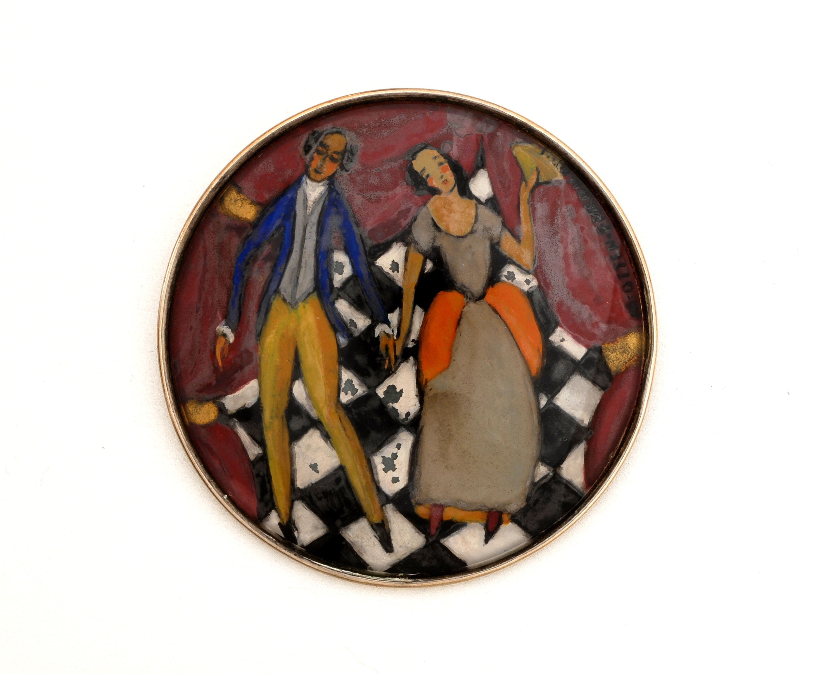
Mitzi Otten-Friedmann / Wiener Werkstaette reverse painted glass and silver brooch, signed c. 1915
MITZI OTTEN-FRIEDMANN (1884-1955) Austria
WIENER WERKSTÄTTE (1903-1932)
Brooch c. 1915
Reverse-painted glass depicting a couple set in a silver frame / back
Marks: M. OTTEN-FRIEDMANN on the front (right), the reverse stamped: WW, Vienna assay mark for 900 silver
D: 2 3/8”
Rosalia Marie Friedmann-Otten (“Mitzi”) * November 28, 1884 Vienna, † May 5, 1955 New York, NY
Student at the School of Applied Arts in Vienna (with Oskar Strnad), Friedmann-Otten participated in numerous exhibitions (including art shows in 1908, 1920; Neukunstgruppe 1909; German Women’s Art in 1925; Werkbundausstellung 1930). Member of the Austrian Werkbund, the Wiener Werkstätte and the Neukunstgruppe. One of the most versatile artists (commercial art, metalwork, jewelry, fashion, starting from 1920 mainly enamel works, including large-scale email pictures), Friedmann-Otten had to flee in 1938 to the United States.
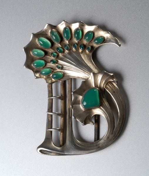
Paul Follot for La Maison Moderne, Art Nouveau waist clasp, silver and chrysoprase, signed c. 1900
PAUL FOLLOT Paris, France
LA MAISON MODERNE Paris, France
Art Nouveau waist clasp c.1900
Gilt silver with chased whiplash design set with 19 cabochons of chrysoprase.
Marks: P. FOLLOT, French swan mark (silver standard mark for small objects)
Illustrated: Documents sur l’Art Industriel au XXe Siecle (Paris: Edition de la Moderne) p. 20, plate 5, n. 53-11
PAUL FOLLOT (1877-1941) French
In the Late 1890’s, Follot studied under graphic designer Eugène Grasset at the Ecole Normale d’Enseignement du Dessin in Paris and later succeeded Grasset in that post. From 1901 to 1904, he designed metalwork, jewelry and textiles for La Maison Moderne, art critic Julius Meier-Graefe’s gallery in Paris. He became director of the interior design studio Pomone of the Paris department store Le Bon Marché in 1923, introducing the Art Deco style into many middle-class home.