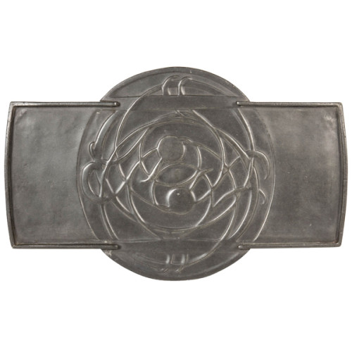
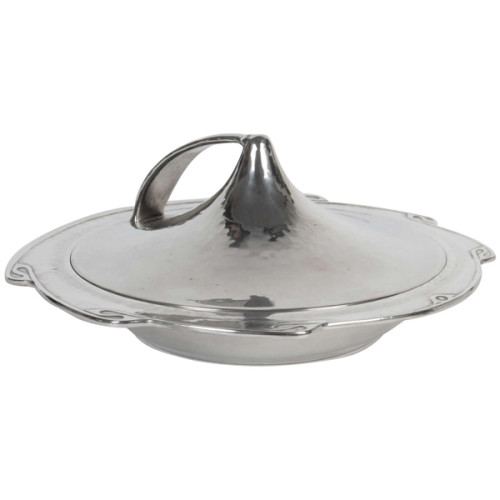
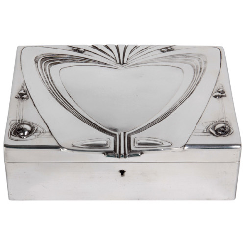
ARCHIBALD KNOX (1864-1933) UK
LIBERTY & CO. London
Tray c. 1902-05
Pewter with abstract Celtic floral design in bas-relief
Marks: Tudric, 0161, 6
For more information see: Archibald Knox, ed. by Stephen A. Martin (London: Academy Editions, 1995) ; Liberty Design 1874-1914, Barbara Morris (London: Pyramid Books, 1989); The Designs of Archibald Knox for Liberty & Co., A.J. Tilbrook (London: Ornament Press Ltd., 1976)
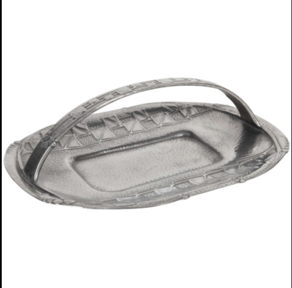
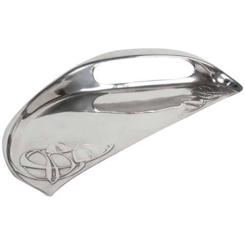
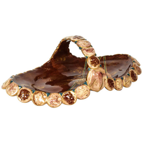
Archibald Knox / Liberty & Co. Cake tray with handle c. 1902-05
ARCHIBALD KNOX (1864-1933) UK
LIBERTY & CO. London
Cake tray with handle c. 1902-05
Hammered pewter with stylized leaf and berry motif in relief
Marks: MADE IN ENGLAND, “TUDRIC” RD449032 PEWTER, 0357 SOLKETS (retailer)
For more information see: The Designs of Archibald Knox for Liberty & Co., A.J. Tilbrook (London: Ornament Press Ltd., 1976); The Designs of Archibald Knox for Liberty & Co., A.J. Tilbrook (London: Ornament Press, 1976); Archibald Knox, ed. by S. Martin (London: Academy Editions,1995); Liberty’s 1875-1975, An Exhibition to mark the Firm’s Centenary (London: Victoria & Albert Museum, 1975).
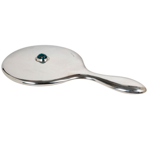
Archibald Knox / Liberty & Co. Sterling hand mirror 1908
ARCHIBALD KNOX (1864-1933) UK
LIBERTY & CO. London, UK
Hand mirror 1908
Sterling with large matrix cabochon turquoise
Marks: L & Co. cipher, Birmingham assay marks for 1908
Similar works with turquoise Illustrated: Archibald Knox, ed. by Stephen A. Martin (London: Academy Editions, 1995) ; Liberty Design 1874-1914, Barbara Morris (London: Pyramid Books, 1989) p. ; The Designs of Archibald Knox for Liberty & Co., A.J. Tilbrook (London: Ornament Press Ltd., 1976)
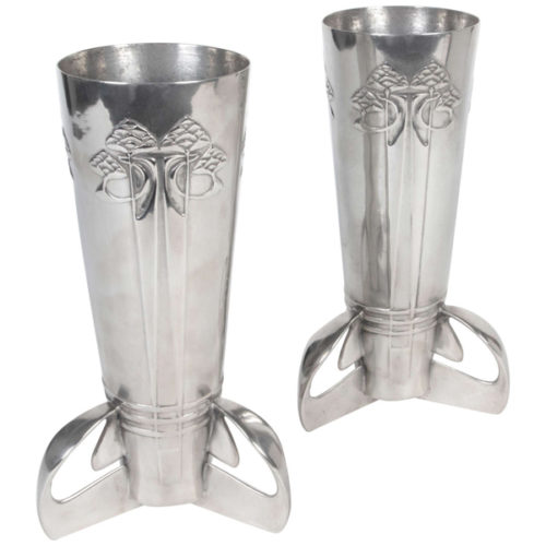
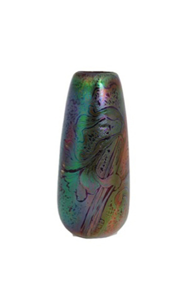
Archibald Knox / Liberty & Co. Pair of tri-footed vases c. 1902-05
ARCHIBALD KNOX (1864-1933) UK
LIBERTY & CO. London
Pair of tri-footed vases c. 1902-05
Pewter with abstract Celtic floral design in bas-relief on tri-footed base
Marks: 6, MADE BY LIBERTY & CO.., ENGLISH PEWTER 0227
Illustrated: Archibald Knox, ed. by Stephen A. Martin (London: Academy Editions, 1995) ; Liberty Design 1874-1914, Barbara Morris (London: Pyramid Books, 1989) p. ; The Designs of Archibald Knox for Liberty & Co., A.J. Tilbrook (London: Ornament Press Ltd., 1976)
Archibald Knox / Liberty & Co. Crumb tray c. 1902-05
ARCHIBALD KNOX (1864-1933) UK
LIBERTY & CO. London
Crumb tray c. 1902-05
Pewter with abstract Celtic design in bas-relief
Marks: 3, ENGLISH PEWTER 0532
Illustrated: Archibald Knox, ed. by Stephen A. Martin (London: Academy Editions, 1995) ; Liberty Design 1874-1914, Barbara Morris (London: Pyramid Books, 1989) p. ; The Designs of Archibald Knox for Liberty & Co., A.J. Tilbrook (London: Ornament Press Ltd., 1976)
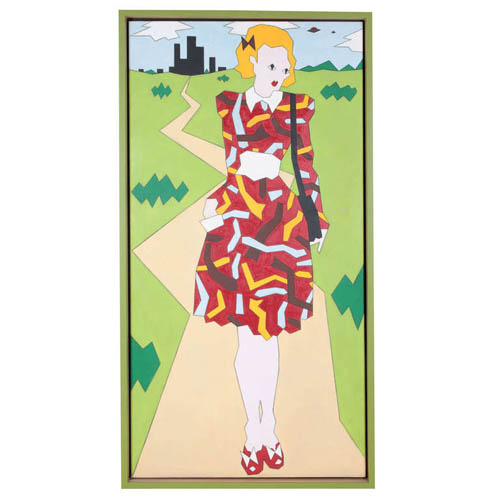
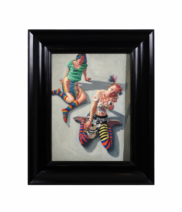
Duggie Fields, “Girl with Shoulder Bag”, Oil on linen 1970
DUGGIE FIELDS (1945-) London, UK
“Girl with Shoulder Bag” 1970
Oil on linen, custom wood and green lacquer Shadow box frame
Marks: “Girl with Shoulder Bag”, Winter 1970 (Dougie Field)
Canvas: H: 72” x W: 36”
Framed: H: 74 1/2″ x W: 38 1/2″
Duggie Fields was born in 1945 and brought up in the village of Tidworth. He spent his youth in the countryside, moving to the outer suburbs of London in his adolescence. He studied architecture, briefly, at Regent Street Polytechnic before going to Chelsea School of Art in 1964 where he stayed for four years, before leaving with a scholarship that took him on his first visit to the United States. As a student his work moved from Minimal, Conceptual and Constructivist phases to a more hard-edge post-Pop figuration. By the middle of the 1970s his work included many elements that were later defined as Post-Modernism. In 1983 in Tokyo, sponsored by the Shiseido Corporation, a gallery was created specially for his show, and the artist and his work were simultaneously featured in a television, magazine, billlboard and subway advertising campaign throughout the country. He started working with digital media in the late 1990’s describing his work in progress as Maximalist. Selected One-Man Exhibitions 1971 Hamet Gallery, London 1972 Bear Lane Gallery, Oxford; 1975 Kinsman-Morrison Gallery, London 1979 Kyle Gallery, London; 1980 lkon Gallery, Birmingham; Midland Group, Nottingham; New 57 Gallery, Edinburgh; Roundhouse Gallery, London 1982 Spacex Gallery, Exeter; B2 Gallery London 1983 Shiseido Exhibition, Tokyo 1987 Albermarle Gallery, London 1991 Rempire Gallery, New York 2000 Random Retrospective, Virtual Gallery, DuggieFields Selected Group Exhibitions 1976 New London in New York, Hal Bromm Gallery, New York 1979 The Figurative Show, Nicola Jacobs Gallery, London; Masks, The Ebury Gallery, London; Culture Shock, The Midland Group, Nottingham; Art and Artifice, B2 Gallery, London 1983 Taste, Victoria and Albert Museum, London 1984 The Male Nude, Homeworks Gallery, London 1985 Image-Codes, Art about Fashion, The Australian Centre for Contemporary Art, Melbourne; VisualAid, Royal Academy, London l986 The Embellishment of the Statue of Liberty, Cooper Hewitt Museum/Barney’s New York 1987 Twenty Artists Twenty Techniques, Albemarle Gallery, London 1989 Fashion and Surrealism, Victoria and Albert Museum, London 1988 Het Mannelisknaakt, Gallery Bruns, Amsterdsm, St. Judes Gallery, London 1990 Universal Language, Rempire Gallery, New York 1993 Tranche d’Art Contemporain Anglais, Tutesaal, Luxemburg 1998 Exquisite Corpse, Jibby Beane, London 1999 Art 1999, Jibby Beane, London; Flesh, Blains Fine Art, London Nerve, I.C.A. London 2000 Art 2000, Jibby Beane, London Up &Co., New York
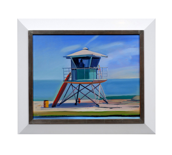
Hank Pitcher, “Life Guard Tower”, Oil on canvas c. 2002
HANK PITCHER (b. 1949) U.S.A.
“Life Guard Tower” c. 2002
Oil on canvas
Signed (on back)
For more information see: Hank Pitcher Surf, exhibit. cat. (Santa Barbara: Sullivan Goss Gallery, 2003); Surfboard Wax – A History, Jefferson “Zuma Jay” Wagner (Atglen, PA: Schiffer Publishing Ltd., 2005).
Canvas H: 15 7/8” x W: 19 7/8”
Framed: H: 21 3/8” x W: 25 3/8”
Pitcher’s surfboard paintings are the symbol of California beach culture…strong, definite, positive and euphoric statements about life in California. The surfboard’s power as totem is seen in its power to convey identity: surfer, Californian, Hank Pitcher. All are identifiable from this symbolic representation. Hank Pitcher is the voice of California culture. At the beach, in the surf, approaching the foothills, in the mountains, on the spit of Point Conception, in the crags of Big Sur, at a beach campfire in Santa Barbara, Pitcher paints the icons of California’s culture.
Hank Pitcher’s paintings are grounded in a particular sense of place. He was born in Pasadena, California on July 20, 1949, but his family moved to Isla Vista, near Santa Barbara, when he was two years old. When they came to Isla Vista it was an outpost on the beach, and Goleta was a farm town where kids rode their horses down the avenue to buy candy at the store. He was a football star at San Marcos High School and was recruited by big-name universities. Instead of football, he chose to attend the College of Creative Studies, an alternative program within the University of California at Santa Barbara (UCSB) where he now teaches painting. He splits his time between painting and surfing, pursuing each with the commitment and energy of a linebacker.
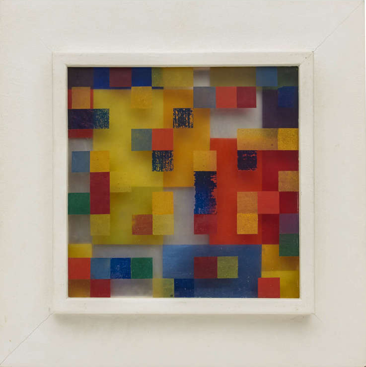
Charles W. Hess, “Abstraction”, Resin-oil on plexiglas, sheet aluminum 1948
CHARLES W. HESS (1921-1998) USA
Abstraction 1948
Resin-oil on plexiglas, sheet aluminum
Signed: CH (in a circle)
Exhibited: Solo Exhibition, Modernism, San Francisco, CA, 1981; Charles Hess and Leta English Hess: Joint Retrospective, University Art Gallery, University of California, Riverside, October 1 – November 10, 1985; Charles Hess: Neoplastic Works, Modernism, Art of the 20th Century, San Francisco, CA; June 6 – 29, 1991.
Painting illustrated: “On Transparency and Reflection,”
The Structurist No. 27/28, 1987/1988.
Painting H: 12” x W: 12” x D: 1”
Framed H: 22” x W: 22” x D: 1 1/2”
Price: $58,000
Born in 1921 in Long Beach, California, Charles Hess studied painting at UCLA, University of Chicago and University of California, Berkeley. In 1962 he joined the faculty of San Francisco State University where he taught until 1983. Hess’s paintings have been shown in numerous solo and group exhibitions including shows at the Pasadena Art Museum, the Corcoran Gallery of Art and the Art Institute of Chicago where his work is also in the permanent collection.
Working in the neo-plasticist style for over thirty years, Hess’s work explored the three-dimensional relationship between the basic elements of painting: color, form, and space. Abstraction is one of the few works to survive from this period; most pieces from this period were lost due to the 1991 fire in the Oakland, CA hills.
***Charles and Leta English Hess papers, 1895-1987 can be found at the Smithsonian Archives of American Art.
Included are ten letters from Stanton Macdonald-Wright to Hess (1954-1965) relating to his views of the relationship between patrons and artists, the 1956 Paris art scene, contemporary art criticism, the art market, and his break with the Duveen Graham Gallery.
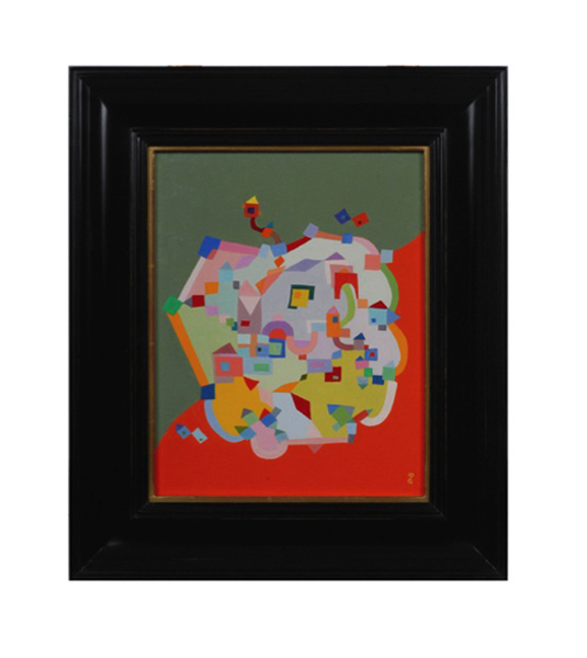
Michiel Gloeckner “Old Town No. 2”, Oil on Canvas 1960
MICHIEL GLOECKNER (1915-1989) Germany / USA
Old Town No. 2 1960
Oil on Canvas
Signed: MG (lower right corner)
Canvas: H: 14 1/16” x W: 11 1/16”
Framed: H: 19 9/16” x W: 16 9/16”
Price: 32,000
Michiel Gloeckner, known for his highly refined, balanced abstract, geometric style derived from natural forms, was the son of a well-known art collector. He graduated from the University of Dresden with a degree in mathematics and art history. He received a degree from the Royal Academy of Dresden where he studied under Otto Dix. Paul Klee also influenced Gloeckner’s work. After WWII Gloeckner moved to New York City. He continued to maintain a studio in New York at 115 East 70th Street, even after he moved to West Cornwall, Connecticut where he spent the later years of his life.
EXHIBITIONS
Gallery Seventy-Five, New York 1955, 1956, 1958
Jacques Seligman Galleries, New York 1960, 1961, 1962
Wadsworth Atheneum 1960
Wesleyan University 1961
Philadelphia Art Alliance 1962
Philadelphia Academy of Fine Arts 1963
World House Galleries, New York 1963, 1962, 1965, 1966
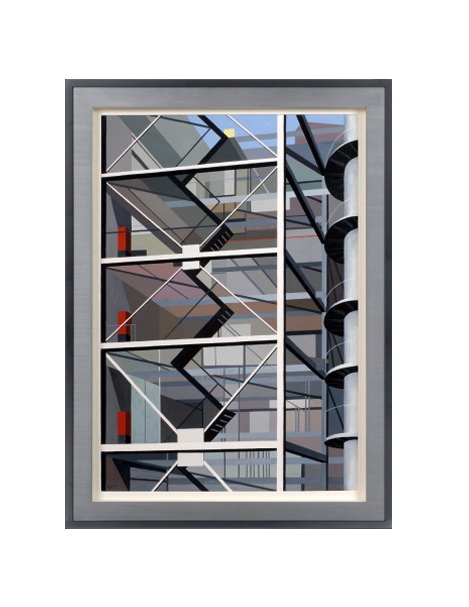
Richard Harold Redvers Taylor, “Modernist building staircase”, Gouache on paper c. 1949
RICHARD HAROLD REDVERS TAYLOR (1900-1975) United Kingdom
Modernist building staircase c. 1949
Gouache on paper, metal and wood frame
Signed: RHRT (lower left)
Marks: Gimpel Fils exhibition label (on back)
Exhibited: “An Exhibition in the Kettle’s Yard Loan Gallery: Sculpture & Painter,
14 February – 10 March, 1972” Gimpel Fils, London
Framed: H: 41 7/16” x W: 30 5/16”
Richard Harold Redvers Taylor (1900-1975) was born in Brighton on March 14th, 1900 and educated at Brighton College and Heatherleys School of Fine Art, Chelsea. His father, Harold Taylor, was a headmaster. Redvers Taylor retired from the Army (where he specialized in topographical surveying in Africa) in 1937 but was recalled for war service. In 1946 he began a new career as a professional painter. Between 1948 and 1958 Taylor was given a series of six one-man shows by Lefevre and Gimple Fils in London. In the 1960’s he turned to sculpture, and in 1972 an exhibition of his sculpture and paintings was held at the Kettle’s Yard Loan Gallery in Cambridge. His work is held in the permanent collection at the Beith Uri V Rami Museum in Israel. Louise Taylor (née Hayden), his wife, was an American and the adopted daughter and heiress of Alice B. Toklas, the companion of Gertrude Stein. Louise Taylor died on 21 July 1977.
Purism, otherwise known as l’esprit nouveau was directly inspired by a spare, functionalist aesthetic and is closely associated with the work of Le Corbusier and his circle in Paris in the second quarter of the 20th Century. In America this purist style was known as Precisionism, which explored similar imaginary during the late 1920’s and 30’s with artists like Charles Sheeler, Charles Demuth and Ralston Crawford at the forefront of this movement. In England, the Vorticist movement (1912-1915) was founded by Wyndham Lewis and others and was the precursor to the Purist movement in Great Britain in the 1930’s and 1940’s. Redvers Taylor created geometrical landscapes while reducing volumes to colored planes and outlines to ridges. His artwork combines depth and perspective with flattened cubist fields of color. Architecture of industrial buildings was his favorite subject, whereas people and nature were usually absent from his compositions.
Jack Richard Smith “10003” Blackoil, wax, lead salts on copper 2006
JACK SMITH (1950-) Taos, NM
“10003” 2006
Blackoil, wax, lead salts on copper, ebonized wood frame
For more information on Jack Smith see: “Taos Portraits” by Jack Smith, May 14th – August 15th, 2004, exhibition catalogue (Taos, NM: Harwood Museum of Art, University of New Mexico)
Canvas: H: 18” x W: 13 3/16”
Framed: H: 25 1/4” x W: 20 7/16”
Jack Smith was born in 1950. At age 16, he began his training at the Interlochen Arts Academy in Michigan before moving to Ohio to attend Columbus College of Art and Design. He also studied for a brief time at the Instituto de Allende, at San Miguel de Allende, GTO, Mexico. He now resides in New Mexico. Reflecting a profound knowledge of art history and and an alchemist’s sense of the painting craft, contemporary painter Jack Smith has forged his own place amongst the most powerful of contemporary portraitists working in America. Incorporating blackoil, wax, lead salts, and copper Smith’s small format portraits and paintings are detailed and intimate depictions of creative individuals and charged tableaux. Smith’s singular style of portraits glow with a warm inner light and present honest, straightforward images that speak of personal narratives.Jack Smith recently received a prestigious Past Achievement Award from the Peter and Madeleine Martin Foundation for the Creative Arts, following an important solo exhibition titled, Jack Smith: The Taos Portraits at the Harwood Museum of Art at the University of New Mexico in 2004. The exhibition featured fifty portraits of Taos, New Mexico residents, executed between 2000 and 2003. The series was intended as a visual biography of this unique artistic community at the turn of the century. Smith’s subjects range from the famous to the infamous – including artists, writers, art patrons, Native peoples, and street peoples.
Marks: Untitled, 1950, Robert Breer, 26×32, No. 29 in a circle (paper label)
Provenance: Robert Breer, Private Collection, Chicago
Canvas: H: 25 3/4” x W: 32”
Framed: H: 32 1/4” x W: 39″
“Breer acknowledges his respect for this purist, “cubist” cinema, which uses geometric shapes moving in time and space”
Robert Breer’s career as an artist and animator spans 50 years and his creative explorations have made him an international figure. He began his artistic pursuits as a painter while living in Paris from 1949-59. Using an old Bolex 16mm camera, his first films, such as “Form Phases”, were simple stop-motion studies based on his abstract paintings.
Breer has always been fascinated by the mechanics of film. Perhaps it was his father’s fascination with 3-D work that inspired Breer to tinker with early mechanical cinematic devices. His father was an engineer and designer of the legendary Chrysler Airflow automobile in 1934 and built a 3-D camera to film all the family vacations. After studying engineering at Stanford, Breer changed his focus toward handcrafted arts and began experimenting with flip books. These animations, done on ordinary 4″ by 6″ file cards have become the standard for all of Breer’s work in fim.
Like many of his generation, Breer did early work influenced by the various European modern art movements of the early 20th century, ranging from the abstract forms of the Russian Constructivists and the structuralist formulas of the Bauhaus, to the nonsensical universe of the Dadaists. As a result of his association with the Denise René Gallery, which specialized in geometric art, he saw the abstract films of such pioneers as Hans Richter, Viking Eggeling, Walter Ruttmann and Fernand Léger. Breer acknowledges his respect for this purist, “cubist” cinema, which uses geometric shapes moving in time and space.
In 1955, he helped organize and exhibited in a show in Paris entitled “Le Mouvement” (The Movement), which paved the way for new cinema aesthetics. During this period, Breer also met the poet Allen Ginsberg and introduced him to his film “Recreation” (1956), which made use of frame-by-frame experiments in a non-narrative structure. Although Breer resisted being labeled a beatnik, the film does capture some aspects of beat poetry and music.
When Breer returned to the United States in the late 1950s, the American avant-garde was thriving and films by Kenneth Anger, Stan Brakhage, Peter Kubelka and Maria Menken were creating a new visionary movement. Breer found kindred spirits within the New York experimental scene. As Pop Art emerged as a phenomenon in the 1960s, Breer befriended Claes Oldenburg and others. He worked on the TV show, “David Brinkley’s Journal”, filming pieces on art shows in Europe; at the same time, he made his debut documentary on the sculptor Jean Tinguely in 1961.
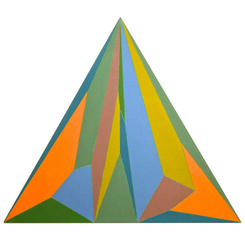
Peter Svenson, “Triangle Painting”, Oil on canvas 1976
PETER SVENSON (b. 1944)
“Triangle Painting” 1976
Oil on Canvas
Signed: Peter Svenson 1976, Turkey Shoot (on the stretcher) and canvas on verso.
H: 41 ½” x W: 48”
Nationally recognized artist and writer Peter Svenson was born in 1944 and received a bachelor of arts degree from Tufts University and a masters of fine arts in painting from the University of North Carolina.
Svenson created “Turkey Shoot” in 1976 based on color field painting theories. The triangular shaped canvas is unusual in this style of painting, the lines are precise, the paint is thinly laid on the primed canvas in flat primary and secondary colors. “During the late 1950s and 1960s, color field painters emerged in Great Britain, Canada, Washington, DC and the West Coast of the United States using formats of stripes, targets, simple geometric patterns and references to landscape imagery and to nature.” Some of the artists of the Washington Color School included Gene Davis, Morris Louis, Kenneth Noland and Sam Gilliam.
Peter Svenson’s work relates to this group of Washington color field artists working in the style in the 1950s, 60s and 70s.
Belgian art dealer Isy Brachot coined the French word Hyperréalisme, meaning Hyperrealism, as the title of a major exhibition and catalogue at his gallery in Brussels in 1973. The exhibition was dominated by such American Photorealists as Ralph Goings, Chuck Close, Don Eddy, Robert Bechtle and Richard McLean; but it included such influential European artists as Gnoli, Richter, Klapheck and Delcol. Since then, Hyperealisme has been used by European artists and dealers to apply to painters influenced by the Photorealists. However, Hyperrealism is contrasted with the literal approach found in traditional photorealist paintings of the late 20th century. Hyperrealist painters and sculptors use photographic images as a reference source from which to create a more definitive and detailed rendering, one that often, unlike Photorealism, is narrative and emotive in its depictions. Strict Photorealist painters tended to imitate photographic images, omitting or abstracting certain finite detail to maintain a consistent over-all pictorial design. They often omitted human emotion, political value, and narrative elements. Since it evolved from Pop Art, the photorealistic style of painting was uniquely tight, precise, and sharply mechanical with an emphasis on mundane, everyday imagery. Hyperrealism, although photographic in essence, often entails a softer, much more complex focus on the subject depicted, presenting it as a living, tangible object. These objects and scenes in Hyperrealism paintings and sculptures are meticulously detailed to create the illusion of a reality not seen in the original photo. That is not to say they’re surreal, as the illusion is a convincing depiction of (simulated) reality. Textures, surfaces, lighting effects, and shadows appear clearer and more distinct than the reference photo or even the actual subject itself.
Dorothy Reno Grover, “California Interior with black cat”, Oil on canvas c. 1950’s
DOROTHY RENO GROVER (1908-1975) USA
“California Interior with black cat” c. 1950’s
Oil on Canvas
Canvas: H: 40″ x W: 34 1/2″
Framed: H: 42″ x W: 36 1/2″
Born in Dallas, TX on Sept. 10, 1908 into a pioneer Texas family. (Her grandfather was mayor of Dallas, and Brownsville, Texas is named for him.) Dorothy Reno moved to California with her family at age ten and settled in San Mateo. After graduating from Mills College, she obtained an M.A. degree from UC Berkeley. She wed radio announcer John B. Grover in 1931 and settled in Oakland. In 1971 she bought the former home of artist Glenn Wessels in Berkeley where she remained until her death.
***24 layers of paint were applied to the surface and the painting is 24 inches high and wide. Erik Saxon was born in San Francisco in 1941 and now resides in New York City. He received both his Bachelor and Master of Arts from Berkeley (The University of California). Originally from San Francisco but based in NYC since 1968, Saxon was a core member of the Radical Painting Group active in NYC during the 1970s and 1980s. The RPG stressed a return to the core concerns of painting, focusing primarily on the monochrome. The group included Erik Saxon, Phil Sims, Merrill Wagner, Dale Henry, Doug Sanderson, Susanna Tanger, Anders Knutsson, Marcia Hafif, Jerry Zeniuk, Frederic Matys Thursz. In 1973 Saxon began making abstract work based on the grid format, initially using watercolor on paper and then industrial paint on raw canvas. The same year he began exploring the idea of monochromatic canvases – a series of acrylic drawings consisting of white and off-white squares arranged into groups of three to five panels – but tabled the idea a year later to focus his attention on paintings organized around a nine square grid structure. For the past thirty years, Saxon has worked with the monochrome and it’s relationship to its surroundings–the wall, the floor, its location within the exhibition space, and the viewer. In addition to his studio work, Saxon is a writer and has had his essays published in Artforum, Art in America, Appearances and other respectable art magazines. Radical Painting denotes an abstract art tendency in Europe and North America, which was in existence in the 1980s and 1990s and has to be seen in the light of Postmodernism. The term Radical Painting was used in the context of an exhibition at the Williams College Museum of Art in Williamstown (MA) in 1984 for the first time. It describes a self-referential art, which addresses topics of its immanent characteristics – especially color, but also image carriers, surface and structure. The Radical Painting artists and their monochrome painting are in the tradition of Post Painterly Abstraction of the 1950s and 1960s and shows notions of Minimal Art. The roots of radical art can also be found in the stylistic ambitions of Constructivism, Suprematism and Art Concret. In terms of style, radical painting is characterized by mostly monochrome works that focus on color effects, shading and material properties, entirely doing without external motifs. Radical Painting enables the observer to sensually experience the picture with its independently perceived color and light values, uniquely achieved by the painting technique, subtle coating methods or change of flows. Among the main artists of Radical Painting are Phil Sims, Marcia Hafif, Günter Umberg and Joseph Marioni; others radical artist are Jerry Zenuik, Andreas Exner, Frederic Matys Thursz, Rudolf De Crignis, Christiane Fuchs, Ingo Meller, Eric Saxon, Peter Tollens, Dieter Villinger, Ulrich Wellmann, Olivier Mosset and Winston Roeth.
Saxon’s works can be found in the following selected Public and Private Collections: artothek, Kolnisches Stadt Museum, Cologne, Germany. Bank of America, San Francisco. Fogg Museum, Havard University , Boston, MA Goteborg Museum of Art, Sweden Lita Hornik, New York IBM, San Jose, CA Wynn Kramarsky, New York Herbert Minkel, New York Mondriaanhuis, Museum voor Constructieve en Concrete Kunst, Amersfoort, Neatherlands. Morris and Helen Belkin Art Gallery, The University of British Columbia, Vancover,B.C., Canada Museo Cantonale d’Arte of Lugano , Switzerland Museum fur Kommunikation, Frankfurt, Germany Museum of Modern Art, Belgrade MOMA, Museum of Modern Art , New York . Gift of Wynn Kramarsky National Gallery of Art, Washington , D.C. UCLA Hammer Museum, Los Angeles , CA University of Kentucky Art Museum, Lexington, KY Yale University Art Gallery, New Haven, CT
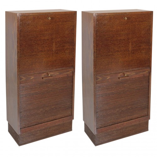
Pierre-Emile Legrain (attr.) Pair of French Art Deco drop and roll front cabinets c. 1927
PIERRE-EMILE LEGRAIN attr. (1889-1929) France
Matching Cabinets (pair) c. 1927
Golden cerused oak, roll-front and drop front doors,
original brass keys, reeded base
Provenance: Felix Marcilhac, Paris
For more information on Legrain see: Pierre-Emile Legrain 1889-1929 (Paris: exh. cat. Galerie Jacques de Vos,1996); Union des Artistes Modernes, Arlette Barré-Despond (Paris: Editions du Regard, 1986) 119-120.
H: 50 1/2 ” x W: 23 1/2” x D: 11 1/2”
The Art Deco movement centered in early 20th-century Paris sought to bridge the transition from academic art and craftsmanship to modern art and industrial production. Regarded by some as one of its founders, Pierre-Emile Legrain (1889-1929) worked at a time of great ferment in art, as well as in society. Legrain’s curiosity and receptiveness to these changes led him to adapt forms, materials and techniques from other cultures.
Legrain created two distinct bodies of work: an assemblage of approximately 1,200 bookbinding designs and a much smaller production of furniture made for couturiers in the French fashion trade. Both artistic endeavors shared fine craftsmanship, masterful use of rare and expensive materials, unusual combinations of textures and surfaces, and spare, geometrical forms. Nearly all of his creations were one-of-a-kind.
Reinhold Klaus / Carl Geyling Atelier Vienna “Cubist Man with top hat and flowers” stained glass window c. 1930
REINHOLD KLAUS (1881-1963) Vienna, Austria
CARL GEYLING ATELIER (founded 1841) Vienna, Austria
Man with tophat and flowers c. 1930
Window of stained and hand-painted leaded glass
Provenance: Estate of Carl Geyling (1814-1880), Vienna
H: 17 3/4″ x W: 14 1/2″
Reinhold Klaus studied from 1898-1902 with Alfred Roller at the Kaiserlich-Königliche Kunstgewerbeschule in Vienna. In 1914 Klaus married into the Carl Geyling family and became extensively involved with with stained glass painting. As early as 1918 Klaus worked on a stained glass window for the Siegestempel am Bisamberg in Vienna. In 1934 he became a professor of stained glass painting at the Kunstgewerbeschule, as well as creative director of the C. Geylings Erben glass painting company. Reinhold Klaus, a member of the Künstlerhaus since 1924 received many prizes and honors. He worked on commissions for the St. Veits cathedral in Prague, the St. Stephan cathedral in Vienna and many others.
Francois-Emile Decorchement French Art Deco “Bleu” pâte-de-crystal vase 1926
FRANÇOIS-EMILE DECORCHEMENT (1880-1971) France
“Bleu” pâte-de-crystal vase c. 1926
Cobalt blue pâte-de-crystal (lost wax cast crystal) with mauve inclusions, two low-relief friezes of varying abstract vine motifs
Impressed: DECORCHEMENT in a lunette seal, numbered A 865
For more information on Decorchement see: Art Deco, Victor Arwas (New York: Harry N. Abrams,1980) pp. 268-69, 298.
H: 4 1/2″ x Dia: 4 3/4″
Decorchement, Francois Emile. (1880-1970) He set up a glass house in Conches in 1902 producing exquisite pate-de-verre, statuettes, bowls and vases. He extended this range to encompass a rougher hewn surface with motifs of flowers and sometimes insects. His designs became increasingly abstract during the 1930s toward the outbreak of the Second World War; these were often executed in pate-de-cristal. Later the production continued although in a more restrained manner with softer semi-opaque and translucent colors.
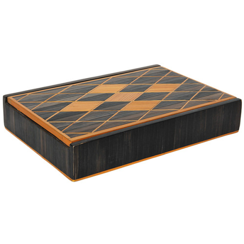
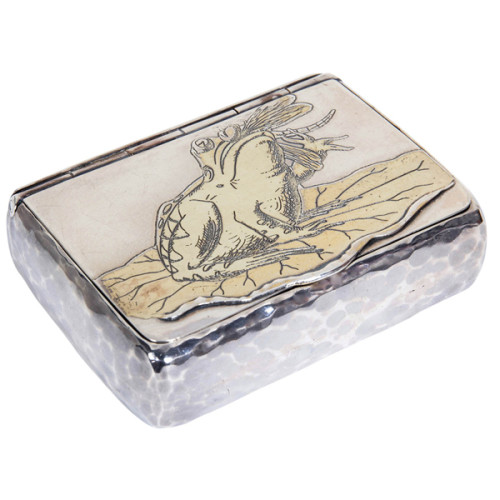
Andre Arbus (attr.) French Art Deco Straw Marquetry Box c. 1940
ANDRÉ ARBUS (attr.) (1903-1969) France
Straw marquetry box c. 1940
Natural gold and ebony stained straw inlaid in a design of a window pane diamond pattern on the hinged lid, original suede cloth/paper interior, wood frame
For more information see: André Arbus: architecture-décorateur des années 40, Yvonne Brunhammer (Paris: l’Editions NORMA, 1996).
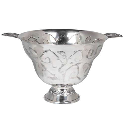
Scandinavian Modern / Art Deco Finnish Silver Presentation Bowl 1925
SUOMEN KULTASEPPÄ OY Turku, Finland
(FINNISH GOLDSMITH COMPANY, LTD.)
Silver bowl 1925
Hand wrought and repoussé silver with an overall scrolling leaf, blossom and vine motif, applied stylized open work silver handles
Marks: “TILL AIS och NILS WENER 19 [28-30/ IV] 26 ADI och ALLAN RÖNEHOLM,” maker’s mark (hammer with wings), government control mark (crown), 813 H (silver standard) U5 AT (date mark), city mark for Turku
H: 7 1/4″ x W: 13 1/2”
This Art Deco Finnish silver centerpiece was presented as a gift from Adi and Allan Röneholm to Ais and Nils Wener in 1926. By repute this piece was shown the year prior at the Paris 1925 exhibition.
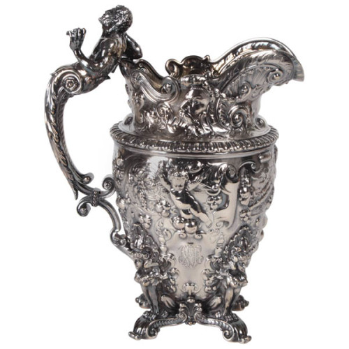
Gorham T.B. Starr Important Sterling “Macy” Renaissance Revival Pitcher 1893
GORHAM MFG. CO SILVERSMITHS Providence, RI
THEODORE B. STARR Retailer
Renaissance Revival pitcher 1893
A highly important Gorham sterling pitcher chased with mythological faces, putti and various scrolling foliate patterns, the handle in the form of Pan with four sphinx figures supporting the base, all with elaborate and exquisite hand chasing and repousse throughout. Extremely fine original condition with original gilded interior.
Marks: Lion, Anchor, G (Gorham silver touch marks), EX. (Exhibition), Theodore B. Starr, 6 pint, Sterling, 1805, double circle touch mark (date mark for 1893)
Provenance: Private Collection, New York; Private Collection Florida from 1984 to 2009; directly descended in the family of Thomas H. Macy (founder of Nantucket) prior to 1984
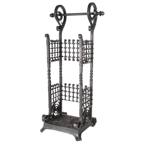
Thomas Jekyll (attr.) Aesthetic Movement Iron Umbrella or Cane Stand c.1885
THOMAS JEKYLL (attr.) (1827–1881)
BRITISH AESTHETIC MOVEMENT
Umbrella stand c. 1885
Black nickelled and patinated cast and wrought iron,
sunburst detail and decorative fretwork
H: 25 1/4” x W: 13” x D: 9 1/2”
Base W: 9 1/2”
Although he was a successful architect, Jeckyll is best known today for his “epoch-making” designs in metalwork. His architectural practice routinely included the design of gates, railings, and metal fittings for domestic commissions and of coronas, candelabra, and altar rails for ecclesiastical ones. But it was his exhibition pieces for the ironworks firm of Barnard, Bishop & Barnards of Norwich that brought him his greatest renown. His “Norwich Gates” for the 1862 London International Exhibition set in motion the 19th-century wrought iron revival in Great Britain. Subsequent creations, including his “Four Seasons Gates,” exhibited in Paris in 1867 and Vienna in 1873, and his cast iron pavilion for the 1876 Philadelphia Centennial Exhibition, received substantial praise, in particular for their creative use of Asian principles and motifs. His innovative Anglo-Japanese designs for stoves, stove fronts, fenders, fire irons, and other domestic metalwork were also produced and sold in large numbers. As these designs were both artistic and affordable, they allowed the incorporation of objects of beauty into middle-class homes. He was one of the few figures in the design reform movement in Britain who managed to unite beauty and utility.
A very intricately worked late Victorian or Aesthetic Movement wrought and cast iron tall stand for umbrellas or canes with delicately riveted cross hatch fretwork and curling details and handle motif along with an attached iron base with a sunburst design all in the original black nickel finish.
Muller Freres / French Art Deco Art Glass vase c. 1925
MULLER FRÈRES Lunéville, France
Vase c. 1925
Heavy cased clear glass over black glass with silver foil inclusions; acid-etched and deeply wheel-carved with a large zig zag motif
Signed: MULLER FRES LUNEVILLE (etched signature)
For more information see: Glass, Art Nouveau to Art Deco, Victor Arwas (New York: Harry N. Abrams, Inc., 1987) pp. 231-6;L’Europe de L’Art Verrier, des Precurseurs de l’Art Nouveau a l’Art Actuel 1850-1990, Giuseppe Cappa (Mardaga: Liège,1991) pp. 344-7.
D.I.M. (Decoration Intérieure Moderne) / French Art Deco / Rene Joubert & Philippe Petit Lounge Chair c. 1930
D.I.M. [Decoration Intérieure Moderne] France
Rene Joubert, Philippe Petit [designers]
Lounge chair circa 1930.
Primavera wood with Backhausen fabric designed by Robert Oerley
For more information see: Le Mobilier du XXe Siècle, Pierre Kjellberg (Paris: Editions de l’Amateur, 1994), pp. 165-7.
Fabric illustrated: Art Nouveau Textil-Dekor um 1900, Ruth Grönwoldt (Stuttgart: Württembergisches Landesmuseum, 1980) p 182-183.
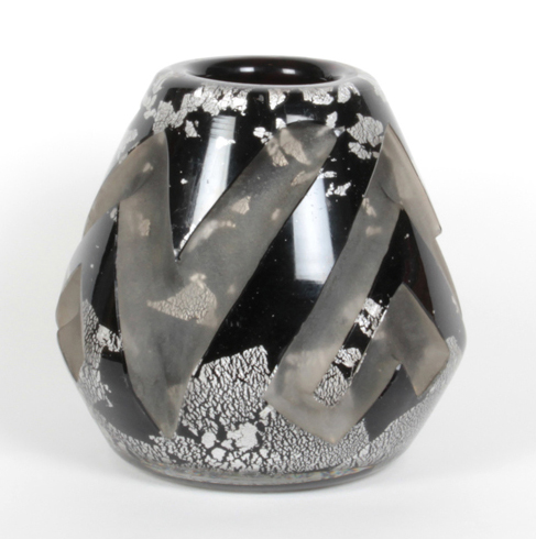
Flavio Poli for Seguso Large Murano Glass Bottle with Stopper c.1950’s
FLAVIO POLI (1900-1984) Italy
SEGUSO VETRI D’ARTE Italy
Bottle with stopper c. 1950’s
Spectacular large decanter or bottle with stopper with a golden cognac cased glass interior tear drop form suspended in a solid clear glass body by FLAVIO POLI (1900-1984) Italy for SEGUSO VETRI D’ARTE Italy
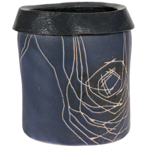
Luke Lietzke, Large Glazed Hand Thrown Stoneware Floor Vase c.1955
LUKE LIETZKE (1906-2000), USA
LIETZKE DESIGNS Mogodore, Ohio
Large floor vessel c. 1955-1960
Blue glazed stoneware cylindrical vessel which has been shaped at the top into an elliptical form; the black glazed lip is rolled over with a flaring collar-like edge and the body is decorated with an abstract incised sgraffito line decoration.
Signed on bottom: Lietzke (inscribed in oval)
H: 15″ x W: 14″ x D: 13″
Price: $17,500
Luke Lietzke studied art at Michigan State University and the Art Institute of Chicago. At Michigan State she met her husband and life-long partner in design, Rolland. They moved to Ohio when Rolland accepted a job with Goodyear Aerospace and in 1942, when Rolland took a job with Firestone, they moved to Akron, Ohio. It was there that Luke volunteered at the Akron Art Museum. This position quickly developed into a design curator’s position created especially for her. Her memorable exhibits included such notable artists as Charles Eames, George Nelson and Isamu Noguchi. In 1964 she left the Museum and for a short period worked as a design coordinator. In 1966, she and her husband created their own company where she functioned as an exhibition designer, an interior design consultant and most significantly: a designer craftsman. Her porcelain pieces consistently received exhibition awards since 1948 and are included in six museum collections. Her talents would often combine to develop special projects, such as the design for the Akron-Summit County Public Library. Both her pottery and jewelry reflect her wealth of knowledge as well as her exposure to the world of International art.
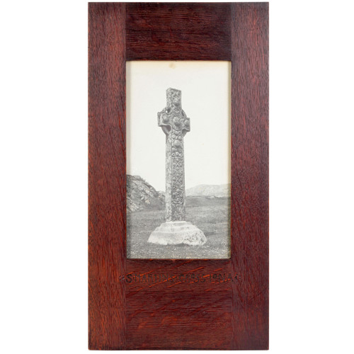
Sydney Pitcher “St. Martin’s Cross Iona” Arts & Crafts photograph c. 1900
SYDNEY PITCHER F.R.P.S. (d. 1950) England
ARTHUR H. PITCHER (Framer)
“St. Martin’s Cross Iona” c.1900
Carbon process photograph, hand carved oak frame with beautiful wood grain detail.
Marks: S MARTINS CROSS IONA (carved incised mark)
Art Nouveau paper label (on back): Framed by Arthur H. Pitcher, College Court, Gloucester, Moulding No…..
Photograph: H: 9 1/2″ x W: 5″
Frame: H: 16 3/4″ x W: 8 5/8″ D: 5/8″
Sydney A. Pitcher FRPS (active 1904-1939) was a photographer with an interest in monument and church architecture. He is listed in the 1927 Kelly’s Directory of the County of Gloucester as a commercial photographer, publisher and picture frame maker, operating from 5 & 7 College Court, Gloucester. Pitcher was involved primarily in the photography of Gloucestershire churches, but also took pictures of churches and cathedrals in neighbouring counties, and of medieval sculptures at Winchester College. He collaborated on the publication of Rushforth’s series of volumes The stained glass of Great Malvern Priory Church , Gloucester, 1916-1927.
He joined the Royal Photographic Society in 1904, was admitted as an Associate member in 1925, and became a Fellow in 1928.
Lucien Lelong / French Art Deco Handpainted Porcelain Vase circa 1935
LUCIEN LELONG (1889 – 1958) Paris, France
“Metaphysical” vase c. 1935
Hand painted and glazed porcelain with aqua, black and silver tones.
Marks: LL monogram, AB
H: 13 3/4″
Lucien Lelong was born in Paris, France on October 11, 1889. Lucien learned his trade from his father, Arthur Lelong, who owned a textile factory in 1896, and his mother Eleanore, a dressmaker. He discovered his vocation in the family business and as soon as World War I was over, he expanded the family business by creating his own fashion house in the late 1918.
He became immediately famous due to the neat tailoring of his designs and his skill in choosing and manufacturing fabrics. He did not actually create his own designs but hired the most prominent designers of the moment to design his collections such as Christian Dior, Pierre Balmain and Hubert Givenchy. Lelong was one of the first designers to diversify into lingerie and stockings. He introduced a line of ready-to-wear in 1934 which he labeled “editions.” In 1939, Lelong’s collections showed tightly waisted, full skirts; a style which became the “new Look” in Dior’s collection in 1947. After the war, in 1947, Lelong showed pencil-slim dresses; pleated, tiered, harem hemlines; and suits with wasp waists, cutaway fronts and square shoulders.
After a trip to the United States where he learned everything pertaining to the working methods in the mass production of clothes, he returns to France and creates a line of pret-a-porter (ready-to-wear) collection, branded “LL” Edition. Lelong used his double” LL” logo to influence his designs as well as refining the packaging design of his perfumes and cosmetics. He was a master of the use of knits and bias to shape the body in the most complementary way. His house’s trademark was their unique ability in designing with fur.
He was married to Natalie Paley who was the daughter of the Grand Duke Paul of Russia that assisted him with his business. Lelong was an active member of high society; socialized with the women he dressed, and did not miss the opportunity to capitalize on his name. From 1937 until the end of the war in 1948, Lelong was President of the Chambre Syndicale de la Couture Parisienne, in which role he was able to fight and hinder the transfer of the Parisian fashion houses to Berlin during the German occupation. It was largely due to his efforts that ninety-two houses stayed opened during the war.
Poor health caused the end of his career; Lelong retired in 1952, and died in 1958 of a heart attack.
American Art Deco Reed & Barton Sterling candlesticks 1928
REED & BARTON (active 1824 – present) Taunton, MA
Candlesticks 1928
Sterling silver with Hoffmann-like fluted base and bobêches with undulating stem and palm leaf like terminating detail.
Marks: eagle R (in a shield) lion, Sterling, 1000, cement reinforced, eagle (date mark for 1928).
Model illustrated: Vanity Fair (Dec. 1928, Vol. 31), p. 120., Reed & Barton Vintage Catalog, p. 10, plate number 1000.
For more information on Reed & Barton see: Encyclopedia of American Silver Manufacturers, Dorothy T. Rainwater (West Chester, PA: Schiffer Publishing Ltd., 1986), p. 156-160.
Andre Thuret French Art Deco Rare Handblown Art Glass Vase c. 1930
ANDRÉ THURET (1898-1965) France
“Organic” vase/bowl c. 1930
Handblown and formed clear glass with bubble technique encapsulating a frosty white oxide.
Signed: ANDRÉ THURET
H: 2 3/8″ x D: 4″ x W: 6 1/4″
Andre Thuret was one of the first modern French studio glass artists and a contemporary of Maurice Marinot. He was born on November 3, 1898 in Paris. It is by science that Andre Thuret came to art. It is in Thuret the engineer and the chemist who serve Thuret the vase artist. The scientist places at the disposal of the creator of forms, rates/rhythms and colors the fluid and transparent beauty of glass and the reactions of metallic oxides. He worked in a traditional glass blowing technique at a temperature often exceeding 1,000 degrees. Thuret exhibited at the Salon d’Automne in 1928 and 1932 and obtained his first plate of the Company of Encouragement to Art. He was invited to exhibit in the United States in 1929-1930. Andre Thuret received his Chevalier of the Legion of Honor in 1947.
Louis Majorelle French Art Nouveau “Fiddleback Fern” bowl c. 1900
LOUIS MAJORELLE (1859-1926) France
MOUGIN FRÈRES Nancy, France
Fiddleback Fern trefoil bowl c. 1900
A rare stoneware example of Majorelle and the L’Ecole de Nancy with a mauve and sea-green glaze, crystalline formations in interior in a trefoil loped form with fiddleback ferns at each interval.
Marks: Majorelle. de (impressed facsimile signature) MOUGIN NANCY, 10.K , L
Illustrated: Majorelle: Une Aventure Moderne, Roselyne Bouvier (Paris:
La Bibliothèque des Arts/Editions Serpenoise, 1991) p. 34, illus. 32.
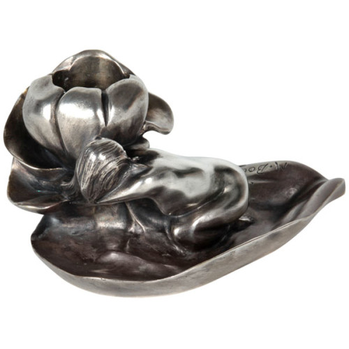
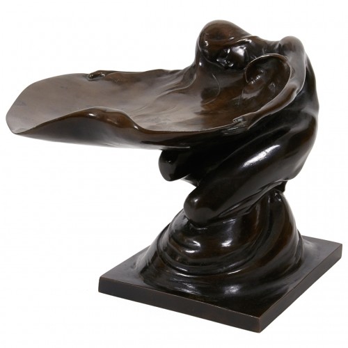
Maurice Bouval French Art Nouveau Nymph Silvered Bronze Candleholder c. 1900
MAURICE BOUVAL (born Toulouse, died 1920) France
M. COLIN France
“Nymph Embracing a Blossom” candle holder c.1900
Silvered cast bronze in the form of a nymph on a leaf embracing a blossom
Marks: M. Bouval (script signature) and COLIN, (Foundry) written above
For other examples of Bouval’s work see: The Paris Salons 1895-1914, Vol. V: Objets d’Art & Metalware, Alastair Duncan (Woodbridge, Suffolk: Antique Collectors’ Club, 1999), p. 127; Ecole to Deco, Small Sculptures from a Private Collection, Stephen C. McGough ed. (Oberlin, Ohio: Allen Memorial Art Museum, 1979) pp. 33-4; Art Nouveau Sculpture, Alastair Duncan (New York: Rizzoli, 1978) pp. 30-1.
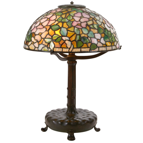
Louis C. Tiffany / Tiffany Studios Dogwood Blossom table lamp c. 1906
LOUIS C. TIFFANY (1848-1933) USA
TIFFANY STUDIOS New York
Dogwood Blossom table lamp c.1906
Stained glass shade in shades of pink, white, gold and green glass with rich brown/green patinated leading and a matching base with a rich brown/green patina.
Signed: TIFFANY STUDIOS NEW YORK (impressed bronze tag on shade); TIFFANY STUDIOS NEW YORK, 2588-1, Tiffany Glass & Decorating Company cipher (impressed on base)
Related model illustrated: Tiffany at Auction, Alastair Duncan (New York: Rizzoli, 1981), p. 98, illustration 268
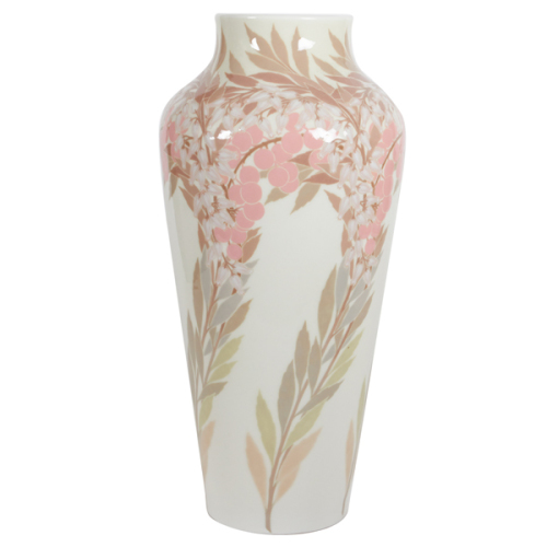
Sèvres / Genevieve Rault Rare French Art Nouveau grand vase 1907
MLLE GENEVIÈVE RAULT (décor 1907) France
MANUFACTURE NATIONALE DE SÈVRES France
Andromeda branches grand vase 1907
Glazed porcelain with pâte-sur-pâte applications. The multicolored “Andromeda” foliage and branches in shades of pink, salmon, green and taupe on a cream background.
Marks: underglaze green S and 1907 (in triangular cipher), MANUFACTURE RF NATIONALE surrounding DÉCORÉ A SÈVRES 1907, underglaze blue GR (conjoined monogram).
H: 16″ x Dia: 7 1/2″
This example from the Sèvres Manufacture is a tour-de-force of early 20th century porcelain. The graphic Art Nouveau design of the pastel foliage and white blossoms of the Andromeda vase is brought to life thanks to the fine detailing of every individual blossom made with hand-applied pâte-sur-pâte or paste porcelain.
Jacques Sicard / Weller Pottery French Art Nouveau iridescent vase c. 1901-1907
JACQUES SICARD (décor) (1865-1923) France
WELLER POTTERY (form) Zanesville, OH
Vase c. 1901-1907
Earthenware with handpainted multicolored iridescent glaze
Other works by Sicard illustrated: Decorative Art 1880-1980, Dan Klein & Margaret Bishop (Oxford: Christie’s Ltd./Phaidon,1986) p. 109; The Ideal Home: 1900-1920, ed. Janet Kardon (New York: American Craft Museum, 1993) p. 166.
H: 9″
In 1902, Samuel Weller invited Sicard and his assistant Henri Gelie to Zanesville, where they developed a spectacular line of iridescent pottery called “Sicardo-Weller”. Sicard left the Weller Pottery in 1907 and never revealed the secrets to their copper-lustre glaze.
Tiffany & Co. / Art Nouveau “Frog on a lily pad” covered snuff box 1880
TIFFANY & CO. New York, NY
“Frog on a lily pad” cigarette case 1880
Hand wrought sterling silver with repoussé and chased gold design of a frog sitting on a lily pad with a dragonfly in it’s mouth, “lap over edge” and hand hammered details, gilt interior and spring action to the hinge when the sides are pressed
Tiffany Archive Illustration: Design for Cigarette Case No. 5804, No. 1019, 249, stamped Tiffany & Co. New York, February 26, 1880
Model and Archive illustration: Bejewelled by Tiffany 1837-1987 Clare Phillips (New Haven and London: Yale University Press, 2006)
For more information see: Tiffany Silver, Charles H. Carpenter, Jr. (New York: Dodd, Mead & Company, 1978); The Silver of Tiffany & Co., 1850-1987, Charles H. Carpenter, Jr. and Janet Zapata (Boston: Museum of Fine Arts, 1987).
Marks: Tiffany & Co., 5804, M, 2540, Sterling-Silver, 1019
H: 3/4” x W: 2 7/8” x D: 2 1/8”
The Frog and the Dragonfly
from The Lost Lagoon
by Reg Down, 2010
Once upon a time a dragonfly lived beside a lake high in the mountains. He flitted from bulrush to bulrush – and zipped after mosquitoes. He snapped them out of the air so quickly that no one could ever quite see what he was doing.
One day, as he was flying across the water, his beautiful wings glistening like rainbows, he came across a frog.
“Ribbit!” said the frog. “Come here, Mr. Dragonfly. I would like to have a better look at you.”
But the dragonfly was clever. In fact, he was so clever that his eyes were made up of hundreds of eyes all put together on the top of his head. And each one of those eyes said to him: “That frog wants to eat me!”
So he landed on top of a bulrush where the frog could not get him, and said, “Yes, Mr. Frog, I am close enough for you. What do you want?”
“Ribbit! Ribbit!” croaked the frog, “I think you should come closer because my eyes are not very good.”
So the dragonfly came a little closer. He flitted to a flower floating on the water—but still not close enough for the frog to grab him with his mouth.
“Yes, Mr. Frog, what do you want?” he asked.
“Oh, Mr. Dragonfly,” said the frog, “I have an itch on the end of my nose and my legs aren”t long enough to reach it. But your legs are scratchy—they will be able to scratch my itchiness much better that I ever could.”
The dragonfly found this quite funny. He thought, “That frog wants to eat me! I am sure that frog wants to eat me!” So he flew behind the frog and landed on his back.
The frog could feel the dragonfly crawling on his back, but he could not turn around to grab him. “Oh, Mr. Dragonfly,” he said, “you have to come closer to my nose. In fact, my lips are getting very itchy—please come closer.”
So the dragonfly went and sat between the frog”s eyes. Now the frog”s eyes were looking into the dragonfly”s eyes, and the frog saw that the dragonfly had far, far more eyes than he had. So he said, “Oh, Mr. Dragonfly, you are surely much, much more wise than I am. You have so many eyes that you can see the whole world!”
And the dragonfly replied, “Of course I can see the whole world! I have so many eyes that I am the wisest of all flies!”
“Well,” said the frog, “I have a little tickle in the bottom of my throat—what is happening there?”
And the dragonfly looked, and looked, and looked…….and Snap! the frog ate him up.
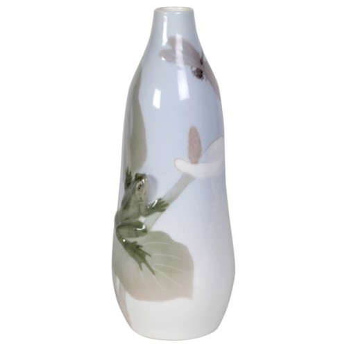
Christian Thomsen / RC Denmark Rare “Frog and Dragonfly” Art Nouveau vase 1901
CHRISTIAN THOMSEN (1860-1921) Denmark
ROYAL COPENHAGEN
“Frog and Dragonfly” vase 1901
Glazed porcelain with a frog in 3-D sculptural relief looking at a dragonfly seated on a calla lily leaf looking up at the blossom.
Form number 280
Marks: ROYAL COPENHAGEN, CROWN, 465/250, 3 wavy lines (Royal Copenhagen) insignia, inscribed A. 250
For more information see: Musterbuch KPF, um 1930, Illustration number 204; Porzellan, Kunst und Design 1889 bis 1939, vom Jugendstil zum Funktionalismus (Berlin: Bröhan-Museum, 1993) p. 467, ill. 435; Sammlung Bröhan: Kunsthandwerk 2, Metall, Porzellan (Berlin: Bröhan Museum, 1977), pp. 222-285.
H: 9″ x Dia: 3 1/2″
Christian Thomsen was employed at the Royal Porcelain Manufactory (Royal Copenhagen) in 1898, and was employed there until his death in 1921. Thomsen is said to have had a huge impact on Royal Copenhagen’s success throughout the 20th century. A large part of the recognition by the Royal Porcelain Factory has enjoyed over the years, they can thank Christian Thomsen for. He produced more than 100 different figurines, especially he had a fondness for agricultural characters, children figurines, figurines inspired by Hans Christian Andersen’s fairy tales, fauns and trolls, and not least charming animals and bird figures.
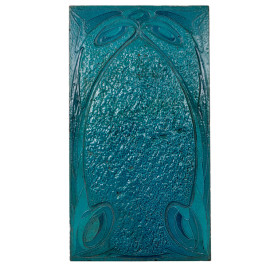
Hector Guimard for Maison Coilliot / Art Nouveau glazed lava tile 1898
HECTOR GUIMARD (1867-1942) France
MAISON COILLIOT Lille, France
Tile c. 1898
Fired and glazed lava with abstract whiplash motifs in various tones of aqua blue on the obverse and a partial graphic on the reverse with polychrome floral and linear details.
Marks: 16 (on top of tile)
French architect Hector Guimard (1867-1942) realized the decorative possibilities of glazed lava, a substance made from mixing pulverized lava with clay when he built a villa for Louis Coillot, (1898-1900) a ceramics manufacturer in Lille who monopolized the distribution of the material. Guimard sided the entire facade of Maison Coilliot in lava stone.
***A related glazed lava tile from the Castel Henriette is in the Collection of the Musee d’Orsay.
The Maison Coilliot is an Art Nouveau house located on 14, rue de Fleurus in Lille, France. Louis Coilliot, a French ceramic entrepreneur, was fond of enameled lava and wanted to popularize the technique. To do so, Coilliot commissioned Hector Guimard, an architect he’d met at the 1897 fair La Céramique et tous les arts du feu, (“Ceramic Arts & Glass Making”), to apply the technique to his house’s façade. Coilliot’s factory and warehouse were located to the rear of his house, and therefore the façade held a double
purpose, both decorating the front of his home and advertising his business.
For more information see: Hector Guimard, 1867-1942: Architektur in Paris um 1900 (Munich: Museum Villa Stuck, 1975)
Marks: stamped in black: E. Gallé, nancy depose, E G with cross of Lorraine
Designs for other Egyptian decoration illustrated: Les dessins de Gallé, Philippe Thiébaut (Paris: Réunion des musées nationaux, 1993) p. 98-99
Related forms and designs illustrated: La Ceramique de Gallé (Nancy: Musée de l’Ecole de Nancy, 1984) p. 119; Egyptomania: Egypt in Western Art, 1730-1930 (Paris: Éditions de la Réunion des Musées Nationaux and Ottawa: National Gallery of Canada, 1994), pp. 472=74.